 RSS Feed
 by Calculated Risk on 3/01/2021 04:00:00 PM
Monday, March 01, 2021
MBA Survey: "Share of Mortgage Loans in Forbearance Increases Slightly to 5.23%"
Note: This is as of February 21st.
From the MBA: Share of Mortgage Loans in Forbearance Increases Slightly to 5.23%
The Mortgage Bankers Association’s (MBA) latest Forbearance and Call Volume Survey revealed that the total number of loans now in forbearance increased by 1 basis point from 5.22% of servicers’ portfolio volume in the prior week to 5.23% as of February 21, 2021. According to MBA’s estimate, 2.6 million homeowners are in forbearance plans.
...
"A small increase in new forbearance requests, coupled with exits decreasing to match a survey low, led to the overall share of loans in forbearance increasing for the first time in five weeks,” said Mike Fratantoni, MBA’s Senior Vice President and Chief Economist. “The largest rise in the forbearance share was for portfolio and PLS loans, due to increases for both Ginnie Mae buyouts and other portfolio/PLS loans.”
Fratantoni added, “The winter storm that impacted Texas and other states did lead to some temporary disruptions at servicer call centers, but these centers quickly returned to full operations.”
emphasis added
 Click on graph for larger image.
This graph shows the percent of portfolio in forbearance by investor type over time. Most of the increase was in late March and early April, then trended down - and has mostly moved slowly down recently.
The MBA notes: "Total weekly forbearance requests as a percent of servicing portfolio volume (#) increased relative to the prior week: from 0.06% to 0.07%."
Update: Framing Lumber Prices More Than Double Year-over-year
by Calculated Risk on 3/01/2021 01:14:00 PM
Here is another monthly update on framing lumber prices.
This graph shows CME framing futures through Mar 1st.
 Click on graph for larger image in graph gallery.
This is up 142% year-over-year - more than double.
There is a seasonal pattern for lumber prices, and usually prices will increase in the Spring, and peak around May, and then bottom around October or November - although there is quite a bit of seasonal variability.
Clearly there is another surge in demand for lumber.
Construction Spending Increased 1.7% in January
by Calculated Risk on 3/01/2021 10:15:00 AM
From the Census Bureau reported that overall construction spending increased:
Construction spending during January 2021 was estimated at a seasonally adjusted annual rate of $1,521.5 billion, 1.7 percent above the revised December estimate of $1,496.5 billion. The January figure is 5.8 percent above the January 2020 estimate of $1,437.7 billion.Both private and public spending increased:
emphasis added
Spending on private construction was at a seasonally adjusted annual rate of $1,160.0 billion, 1.7 percent above the revised December estimate of $1,140.9 billion. ...
In January, the estimated seasonally adjusted annual rate of public construction spending was $361.5 billion, 1.7 percent above the revised December estimate of $355.5 billion.
 Click on graph for larger image.
This graph shows private residential and nonresidential construction spending, and public spending, since 1993. Note: nominal dollars, not inflation adjusted.
Residential spending is 5% above the bubble peak (in nominal terms - not adjusted for inflation).
Non-residential spending is 8% above the previous peak in January 2008 (nominal dollars), but has been weak recently.
Public construction spending is 1% above the previous peak in March 2009, and 38% above the austerity low in February 2014.
 The second graph shows the year-over-year change in construction spending.
On a year-over-year basis, private residential construction spending is up 21.0%. Non-residential spending is down 10.1% year-over-year. Public spending is up 6.8% year-over-year.
Construction was considered an essential service in most areas and did not decline sharply like many other sectors, but it seems likely that non-residential will be under pressure. For example, lodging is down 23% YoY, multi-retail down 31% YoY, and office down 4% YoY.
This was well above consensus expectations of a 0.7% increase in spending, and construction spending for the previous two months was revised up slightly. A strong report.
Housing Inventory March 1st Update: At Record Lows
by Calculated Risk on 3/01/2021 09:47:00 AM
One of the key questions for 2021 is: Will inventory increase as the pandemic subsides, or will inventory decrease further in 2021?
Tracking inventory will be very important this year.
 Click on graph for larger image in graph gallery.
This inventory graph is courtesy of Altos Research.
As of February 26th, inventory was at 325 thousand (7 day average), compared to 724 thousand the same week a year ago. That is a decline of 55%.
A week ago, inventory was at 337 thousand, and was down 53% YoY. Seasonally inventory should bottom in early March.
Mike Simonsen discusses this data regularly on Youtube.
Mike Simonsen discusses this data regularly on Youtube.
Seven High Frequency Indicators for the Economy
by Calculated Risk on 3/01/2021 08:24:00 AM
These indicators are mostly for travel and entertainment. It will interesting to watch these sectors recover as the vaccine is distributed.
IMPORTANT: Be safe now - if all goes well, we could all be vaccinated by Q2 2021.
----- Airlines: Transportation Security Administration -----
The TSA is providing daily travel numbers.
 Click on graph for larger image.
This data shows the seven day average of daily total traveler throughput from the TSA for 2019 (Light Blue), 2020 (Blue) and 2021 (Red).
The dashed line is the percent of 2019 for the seven day average.
This data is as of February 28th.
The seven day average is down 55.5% from the same week in 2019 (44.5% of last year). (Dashed line)
There was a slow increase from the bottom, with ups and downs due to the holidays - but TSA data has mostly moved sideways in 2021.
----- Restaurants: OpenTable -----
The second graph shows the 7 day average of the year-over-year change in diners as tabulated by OpenTable for the US and several selected cities.
 Thanks to OpenTable for providing this restaurant data:
This data is updated through February 27, 2021.
This data is "a sample of restaurants on the OpenTable network across all channels: online reservations, phone reservations, and walk-ins. For year-over-year comparisons by day, we compare to the same day of the week from the same week in the previous year."
Note that this data is for "only the restaurants that have chosen to reopen in a given market". Since some restaurants have not reopened, the actual year-over-year decline is worse than shown.
Dining picked up during the holidays, the slumped with the huge winter surge in cases. Dining is picking up again.
----- Movie Tickets: Box Office Mojo -----
 This data shows domestic box office for each week and the median for the years 2016 through 2019 (dashed light blue).
----- Hotel Occupancy: STR -----
 This graph shows the seasonal pattern for the hotel occupancy rate using the four week average.
The red line is for 2021, black is 2020, blue is the median, and dashed light blue is for 2009 (the worst year since the Great Depression for hotels - before 2020).
Even when occupancy increases to 2009 levels, hotels will still be hurting.
This data is through February 20th. Hotel occupancy is currently down 23.8% year-over-year. In a few weeks, the year-over-year comparisons will be easy - since occupancy declined sharply at the onset of the pandemic - but occupancy will still be down significantly from normal levels.
Notes: Y-axis doesn't start at zero to better show the seasonal change.
----- Gasoline Supplied: Energy Information Administration -----
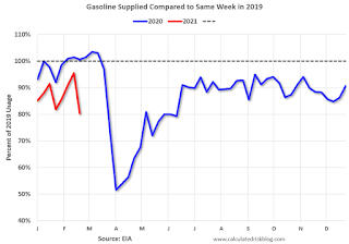 This graph, based on weekly data from the U.S. Energy Information Administration (EIA), shows gasoline supplied compared to the same week of 2019.
Blue is for 2020. At one point, gasoline supplied was off almost 50% YoY. Red is for 2021.
As of February 19th, gasoline supplied was off about 19.8% (about 80.2% of the same week in 2019).
Note: Gasoline supplied was impacted by the snowstorm in Texas and other states.
----- Transit: Apple Mobility -----
This graph is from Apple mobility. From Apple: "This data is generated by counting the number of requests made to Apple Maps for directions in select countries/regions, sub-regions, and cities." This is just a general guide - people that regularly commute probably don't ask for directions.
There is also some great data on mobility from the Dallas Fed Mobility and Engagement Index. However the index is set "relative to its weekday-specific average over January–February", and is not seasonally adjusted, so we can't tell if an increase in mobility is due to recovery or just the normal increase in the Spring and Summer.
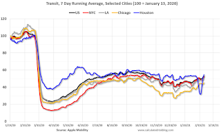 This data is through February 27th for the United States and several selected cities.
The graph is the running 7 day average to remove the impact of weekends.
IMPORTANT: All data is relative to January 13, 2020. This data is NOT Seasonally Adjusted. People walk and drive more when the weather is nice, so I'm just using the transit data.
According to the Apple data directions requests, public transit in the 7 day average for the US is at 53% of the January 2020 level. It is at 45% in Chicago, and 55% in Houston (the dip was a weather related decline) - and moving up a little recently.
----- New York City Subway Usage -----
Here is some interesting data on New York subway usage (HT BR).
 This graph is from Todd W Schneider. This is daily data since early 2020.
This data is through Friday, February 26th.
Schneider has graphs for each borough, and links to all the data sources.
He notes: "Data updates weekly from the MTA’s public turnstile data, usually on Saturday mornings".
The TSA is providing daily travel numbers.
 Click on graph for larger image.
This data shows the seven day average of daily total traveler throughput from the TSA for 2019 (Light Blue), 2020 (Blue) and 2021 (Red).
The dashed line is the percent of 2019 for the seven day average.
This data is as of February 28th.
The seven day average is down 55.5% from the same week in 2019 (44.5% of last year). (Dashed line)
There was a slow increase from the bottom, with ups and downs due to the holidays - but TSA data has mostly moved sideways in 2021.
The second graph shows the 7 day average of the year-over-year change in diners as tabulated by OpenTable for the US and several selected cities.
 Thanks to OpenTable for providing this restaurant data:
This data is updated through February 27, 2021.
This data is "a sample of restaurants on the OpenTable network across all channels: online reservations, phone reservations, and walk-ins. For year-over-year comparisons by day, we compare to the same day of the week from the same week in the previous year."
Note that this data is for "only the restaurants that have chosen to reopen in a given market". Since some restaurants have not reopened, the actual year-over-year decline is worse than shown.
Dining picked up during the holidays, the slumped with the huge winter surge in cases. Dining is picking up again.
 This data shows domestic box office for each week and the median for the years 2016 through 2019 (dashed light blue).
 Blue is 2020 and Red is 2021.
The data is from BoxOfficeMojo through February 25th.
Note that the data is usually noisy week-to-week and depends on when blockbusters are released.
Movie ticket sales were at $9 million last week, down about 94% from the median for the week.
Note that the data is usually noisy week-to-week and depends on when blockbusters are released.
Movie ticket sales were at $9 million last week, down about 94% from the median for the week.
 This graph shows the seasonal pattern for the hotel occupancy rate using the four week average.
 The red line is for 2021, black is 2020, blue is the median, and dashed light blue is for 2009 (the worst year since the Great Depression for hotels - before 2020).
Even when occupancy increases to 2009 levels, hotels will still be hurting.
This data is through February 20th. Hotel occupancy is currently down 23.8% year-over-year. In a few weeks, the year-over-year comparisons will be easy - since occupancy declined sharply at the onset of the pandemic - but occupancy will still be down significantly from normal levels.
Notes: Y-axis doesn't start at zero to better show the seasonal change.
 This graph, based on weekly data from the U.S. Energy Information Administration (EIA), shows gasoline supplied compared to the same week of 2019.
Blue is for 2020. At one point, gasoline supplied was off almost 50% YoY. Red is for 2021.
As of February 19th, gasoline supplied was off about 19.8% (about 80.2% of the same week in 2019).
Note: Gasoline supplied was impacted by the snowstorm in Texas and other states.
This graph is from Apple mobility. From Apple: "This data is generated by counting the number of requests made to Apple Maps for directions in select countries/regions, sub-regions, and cities." This is just a general guide - people that regularly commute probably don't ask for directions.
There is also some great data on mobility from the Dallas Fed Mobility and Engagement Index. However the index is set "relative to its weekday-specific average over January–February", and is not seasonally adjusted, so we can't tell if an increase in mobility is due to recovery or just the normal increase in the Spring and Summer.
 This data is through February 27th for the United States and several selected cities.
The graph is the running 7 day average to remove the impact of weekends.
IMPORTANT: All data is relative to January 13, 2020. This data is NOT Seasonally Adjusted. People walk and drive more when the weather is nice, so I'm just using the transit data.
According to the Apple data directions requests, public transit in the 7 day average for the US is at 53% of the January 2020 level. It is at 45% in Chicago, and 55% in Houston (the dip was a weather related decline) - and moving up a little recently.
Here is some interesting data on New York subway usage (HT BR).
 This graph is from Todd W Schneider. This is daily data since early 2020.
This data is through Friday, February 26th.
Schneider has graphs for each borough, and links to all the data sources.
He notes: "Data updates weekly from the MTA’s public turnstile data, usually on Saturday mornings".
Sunday, February 28, 2021
Monday: ISM Manufacturing, Construction Spending
by Calculated Risk on 2/28/2021 09:30:00 PM
Weekend:
• Schedule for Week of February 28, 2021
Monday:
• At 10:00 AM ET, ISM Manufacturing Index for January. The consensus is for the ISM to be at 58.9, up from 58.7 in January.
• Also at 10:00 AM, Construction Spending for December. The consensus is for a 0.7% increase in construction spending.
From CNBC: Pre-Market Data and Bloomberg futures S&P 500 futures are up 28 and DOW futures are up 208 (fair value).
Oil prices were up over the last week with WTI futures at $62.22 per barrel and Brent at $65.11 barrel. A year ago, WTI was at $45, and Brent was at $51 - so WTI oil prices are UP about 45% year-over-year.
Here is a graph from Gasbuddy.com for nationwide gasoline prices. Nationally prices are at $2.73 per gallon. A year ago prices were at $2.43 per gallon, so gasoline prices are up $0.30 per gallon year-over-year.
February 28 COVID-19 Test Results and Vaccinations
by Calculated Risk on 2/28/2021 07:16:00 PM
SPECIAL NOTE: The Covid Tracking Project will end daily updates on March 7th.
From Bloomberg on vaccinations as of Feb 28th.
"In the U.S., more Americans have now received at least one dose than have tested positive for the virus since the pandemic began. So far, 75.2 million doses have been given. In the last week, an average of 1.74 million doses per day were administered."Here is the CDC COVID Data Tracker. This site has data on vaccinations, cases and more.
The US is averaged 1.5 million tests per day over the last week. The percent positive over the last 7 days was 4.5%.
Based on the experience of other countries, for adequate test-and-trace (and isolation) to reduce infections, the percent positive needs to below 1%, so the US has far too many daily cases - and percent positive - to do effective test-and-trace.
There were 1,346,785 test results reported over the last 24 hours.
There were 54,288 positive tests.
Over 71,000 US deaths have been reported in February. This was the third worst month of the pandemic (2nd worst month on a per day basis). See the graph on US Daily Deaths here.
This data is from the COVID Tracking Project.
And check out COVID Act Now to see how each state is doing. (updated link to new site)
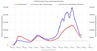
 Click on graph for larger image.
This graph shows the 7 day average of positive tests reported and daily hospitalizations.
There were 1,346,785 test results reported over the last 24 hours.
There were 54,288 positive tests.
Over 71,000 US deaths have been reported in February. This was the third worst month of the pandemic (2nd worst month on a per day basis). See the graph on US Daily Deaths here.
This data is from the COVID Tracking Project.
And check out COVID Act Now to see how each state is doing. (updated link to new site)
 Click on graph for larger image.
This graph shows the 7 day average of positive tests reported and daily hospitalizations.
The dashed line is the post-summer surge low for hospitalizations.
Update: A few comments on the Seasonal Pattern for House Prices
by Calculated Risk on 2/28/2021 11:22:00 AM
CR Note: This is a repeat of earlier posts with updated graphs.
A few key points:
1) There is a clear seasonal pattern for house prices.
2) The surge in distressed sales during the housing bust distorted the seasonal pattern.
3) Even though distressed sales are down significantly, the seasonal factor is based on several years of data - and the factor is now overstating the seasonal change (second graph below).
4) Still the seasonal index is probably a better indicator of actual price movements than the Not Seasonally Adjusted (NSA) index.
For in depth description of these issues, see Jed Kolko's article from 2014 (currently Chief Economist at Indeed) "Let’s Improve, Not Ignore, Seasonal Adjustment of Housing Data"
Note: I was one of several people to question the change in the seasonal factor (here is a post in 2009) - and this led to S&P Case-Shiller questioning the seasonal factor too (from April 2010). I still use the seasonal factor (I think it is better than using the NSA data).
 Click on graph for larger image.
This graph shows the month-to-month change in the NSA Case-Shiller National index since 1987 (through December 2020). The seasonal pattern was smaller back in the '90s and early '00s, and increased once the bubble burst.
The seasonal swings have declined since the bubble, although the recent price surge changed the month-over-year pattern.
 The second graph shows the seasonal factors for the Case-Shiller National index since 1987. The factors started to change near the peak of the bubble, and really increased during the bust.
The swings in the seasonal factors have started to decrease, and it seemed - as recent history is included in the factors - the seasonal factors had been moving back towards more normal levels.
The recent price surge might distort this a little.
Saturday, February 27, 2021
February 27 COVID-19 Test Results and Vaccinations
by Calculated Risk on 2/27/2021 07:42:00 PM
SPECIAL NOTE: The Covid Tracking Project will end daily updates on March 7th.
From Bloomberg on vaccinations as of Feb 27th.
"In the U.S., more Americans have now received at least one dose than have tested positive for the virus since the pandemic began. So far, 72.8 million doses have been given. In the last week, an average of 1.65 million doses per day were administered."Here is the CDC COVID Data Tracker. This site has data on vaccinations, cases and more.
The US is averaged 1.5 million tests per day over the last week. The percent positive over the last 7 days was 4.6%.
Based on the experience of other countries, for adequate test-and-trace (and isolation) to reduce infections, the percent positive needs to below 1%, so the US has far too many daily cases - and percent positive - to do effective test-and-trace.
There were 1,637,459 test results reported over the last 24 hours.
There were 70,622 positive tests.
Almost 70,000 US deaths have been reported in February. See the graph on US Daily Deaths here.
This data is from the COVID Tracking Project.
And check out COVID Act Now to see how each state is doing. (updated link to new site)
 Click on graph for larger image.
This graph shows the 7 day average of positive tests reported and daily hospitalizations.
The dashed line is the post-summer surge low for hospitalizations.
Real Personal Income less Transfer Payments
by Calculated Risk on 2/27/2021 11:45:00 AM
Government transfer payments increased sharply in January compared to December, and were $2.5 trillion (on SAAR basis) above the February 2020 level. Most of the increase in transfer payments - compared to the level prior to the crisis - is from unemployment insurance and "other" (includes direct payments).
This table shows the amount of unemployment insurance and "Other" transfer payments since February 2020 (pre-crisis level). The increase in "Other" was mostly due to other parts of the relief acts (including direct payments).
| Selected Transfer Payments Billions of dollars, SAAR | ||
|---|---|---|
| Other | Unemployment Insurance | |
| Feb-20 | $506 | $28 |
| Mar-20 | $515 | $74 |
| Apr-20 | $3,379 | $493 |
| May-20 | $1,360 | $1,356 |
| Jun-20 | $758 | $1,405 |
| Jul-20 | $760 | $1,331 |
| Aug-20 | $692 | $636 |
| Sep-20 | $936 | $359 |
| Oct-20 | $731 | $305 |
| Nov-20 | $619 | $281 |
| Dec-20 | $655 | $308 |
| Jan-21 | $2,337 | $571 |
A key measure of the health of the economy (Used by NBER in recession dating) is Real Personal Income less Transfer payments.
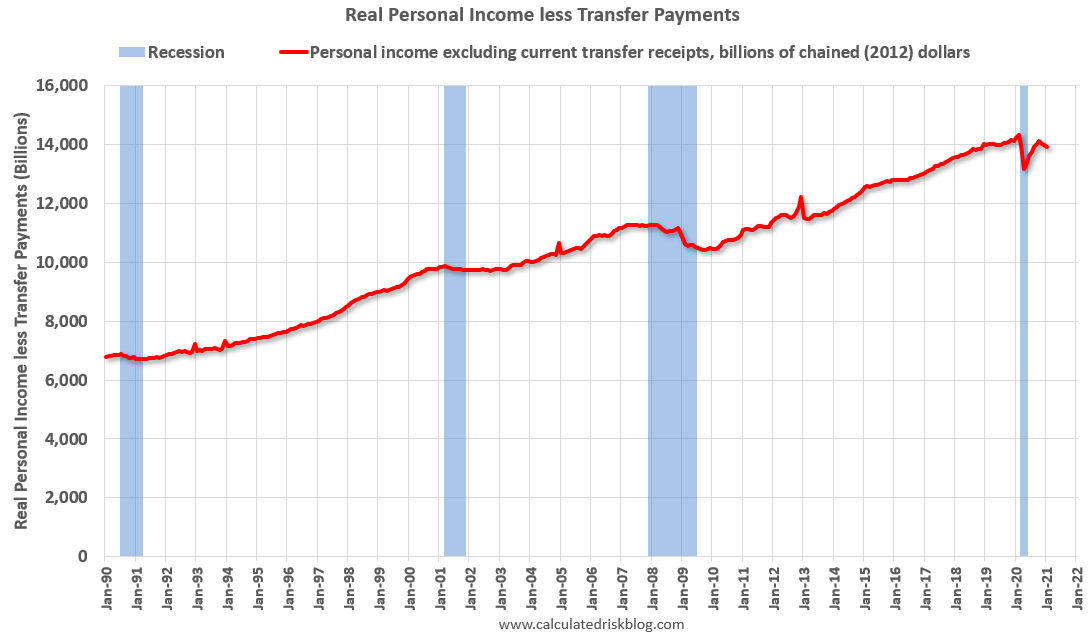 Click on graph for larger image.
This graph shows real personal income less transfer payments since 1990.
This measure of economic activity decreased 0.5% in January, compared to December, and was down 2.8% compared to February 2020 (previous peak).
 Another way to look at this data is as a percent of the previous peak.
Real personal income less transfer payments was off 8.1% in April. This was a larger decline than the worst of the great recession.
Currently personal income less transfer payments are still off 2.8% (dashed line).


