 RSS Feed
 by Calculated Risk on 1/19/2021 06:44:00 PM
Tuesday, January 19, 2021
January 19 COVID-19 Test Results
Note: Bloomberg has great data on vaccinations. "The U.S. has administered 15.6 million doses"
The testing data is probably still light due to the holiday, but it is possible the 7-day average cases has peaked. Stay safe! I'm looking forward to not posting this data in a few months.
The testing data is probably still light due to the holiday, but it is possible the 7-day average cases has peaked. Stay safe! I'm looking forward to not posting this data in a few months.
The US is now averaging close to 2 million tests per day. Based on the experience of other countries, for adequate test-and-trace (and isolation) to reduce infections, the percent positive needs to be under 5% (probably close to 1%), so the US has far too many daily cases - and percent positive - to do effective test-and-trace.
There were 1,698,121 test results reported over the last 24 hours.
There were 144,047 positive tests.
Over 55,000 US deaths have been reported so far in January. See the graph on US Daily Deaths here.
 Click on graph for larger image.
This data is from the COVID Tracking Project.
The percent positive over the last 24 hours was 8.5% (red line is 7 day average). The percent positive is calculated by dividing positive results by total tests (including pending).
And check out COVID Act Now to see how each state is doing. (updated link to new site)
 The second graph shows the 7 day average of positive tests reported and daily hospitalizations.
It is possible cases and hospitalizations have peaked, but are still at a very high level.
MBA Survey: "Share of Mortgage Loans in Forbearance Decreases to 5.37%"
by Calculated Risk on 1/19/2021 04:00:00 PM
Note: This is as of January 10th.
From the MBA: Share of Mortgage Loans in Forbearance Decreases to 5.37%
The Mortgage Bankers Association’s (MBA) latest Forbearance and Call Volume Survey revealed that the total number of loans now in forbearance decreased from 5.46% of servicers’ portfolio volume in the prior week to 5.37% as of January 10, 2021. According to MBA’s estimate, 2.7 million homeowners are in forbearance plans.
...
“The week of January 10th saw the largest – and only the second – decrease in the share of loans in forbearance in nine weeks, with declines across almost every tracked loan category,” said Mike Fratantoni, MBA’s Senior Vice President and Chief Economist. “The rate of exits from forbearance has picked up a bit over the past two weeks but remains much lower than what was seen in October and early November.”
Fratantoni added, “Job market data continue to indicate weakness, and that means many homeowners who remain unemployed will need ongoing relief in the form of forbearance. While new forbearance requests remain relatively low, the availability of relief remains a necessary support for many homeowners.”
emphasis added
 Click on graph for larger image.
This graph shows the percent of portfolio in forbearance by investor type over time. Most of the increase was in late March and early April, and has generally been trending down.
The MBA notes: "Total weekly forbearance requests as a percent of servicing portfolio volume (#) remained the same relative to the prior week at 0.07%."
Update Then and Now: With Column Excluding Pandemic
by Calculated Risk on 1/19/2021 03:01:00 PM
A few indicators comparing four years ago and today (and a column after three years - excluding the pandemic) ...
| Jan-17 | Jan-20 | Dec-20 | |
|---|---|---|---|
| Vehicle Sales1 | 16.7 | 16.9 | 16.4 |
| Employment change2 | 2,591 | 2,195 | -704 |
| Unemployment Rate3 | 4.7% | 3.5% | 6.7% |
| Participation Rate4 | 62.8% | 63.4% | 61.5% |
| Housing Starts5 | 1,056 | 1,262 | 1,278 |
| New Home Sales6 | 486 | 644 | 679 |
| Mortgage Delinquency Rate7 | 6.1% | 4.6% | 8.3% |
| GDP Growth8 | 2.3% | 2.5% | 1.0% |
| Budget Deficit9 | 3.2% | 4.6% | 16.0% |
| S&P 50010 | 2,269 | 3,317 | 3,800 |
| 1millions, SAAR (average previous 4 years, or 3 years for Jan 2020) 2Thousands (Average previous 4 years, or 3 years for Jan 2020) 3Most Recent Month 4Most Recent Month 5Thousands, SAAR (average previous 4 years, or 3 years for Jan 2020) 6Thousands, SAAR (average previous 4 years, or 3 years for Jan 2020) 7Annual GDP growth (over previous 4 years, or 3 years for Jan 2020). Q4 2020 estimated at 5.0% annual rate. 8Source: MBA, Quarterly including in-foreclosure (most recent quarter) 9Source: CBP: Annual, fiscal 2016, 2019, and 2020 10Jan 20, 2017, Jan 21, 2020 and Jan 19, 2021 | |||
Lawler: Early Read on Existing Home Sales in December
by Calculated Risk on 1/19/2021 01:41:00 PM
From housing economist Tom Lawler:
Based on publicly-available local realtor/MLS reports released across the country through today, I project that existing home sales as estimated by the National Association of Realtors ran at a seasonally adjusted annual rate of 6.62 million in December, down 1.0% from November’s preliminary pace and up 19.7% from last December’s seasonally adjusted pace.
Local realtor reports, as well as reports from national inventory trackers, suggest that the YOY decline in the inventory of existing homes for sale was slightly greater in December than November, though what that means for the NAR inventory estimate is unclear. As I’ve noted before, the inventory measure in most publicly-released local realtor/MLS reports excludes listings with pending contracts, but that is not the case for many of the reports sent to the NAR (referred to as the “NAR Report!”), Since the middle of last Spring inventory measures excluding pending listings have fallen much more sharply than inventory measures including such listings, and this latter inventory measure understates the decline in the effective inventory of homes for sale over the last several months.
Finally, local realtor/MLS reports suggest the median existing single-family home sales price last month was up by about 13% from last December.
CR Note: The National Association of Realtors (NAR) is scheduled to release December existing home sales on Friday, January 22, 2021 at 10:00 AM ET. The consensus is for 6.55 million SAAR.
Then and Now
by Calculated Risk on 1/19/2021 11:58:00 AM
A few indicators comparing four years ago and today ...
| Jan-17 | Dec-20 | |
|---|---|---|
| Vehicle Sales1 | 16.7 | 16.4 |
| Employment change2 | 10,364 | -2,818 |
| Unemployment Rate3 | 4.7% | 6.7% |
| Participation Rate4 | 62.8% | 61.5% |
| Housing Starts5 | 1,056 | 1,278 |
| New Home Sales6 | 486 | 679 |
| Mortgage Delinquency Rate7 | 6.1% | 8.3% |
| Budget Deficit8 | 3.2% | 16.0% |
| S&P 5009 | 2,269 | 3,790 |
| 1millions, SAAR (average previous 4 years) 2Thousands (over previous 4 years) 3Most Recent Month 4Most Recent Month 5Thousands, SAAR (average previous 4 years) 6Thousands, SAAR (average previous 4 years) 7Source: MBA, Quarterly including in-foreclosure (most recent quarter) 8Annual, fiscal 2016 vs. 2020 9Jan 20, 2017 vs Jan 19, 2021 | ||
A Positive Note from Merrill: "A light at the end of the COVID cave"
by Calculated Risk on 1/19/2021 08:56:00 AM
Here is a positive outlook on the 2021 economy.
Normally we write about COVID news in the back, but now it deserves front-page coverage; With COVID cases falling and vaccines accelerating, this is probably the beginning of the end of the COVID crisis. Here we argue:
• Renewed restrictions and the end to the holiday season seem to be bending the cases curve.
• The vaccine rollout should continue to accelerate as new resources and effort is put into the project.
• There is one major caveat: new more contagious strains have arrived in the US.
...
What does this mean for the economy? We continue to see upside risks to our above consensus forecast. We think the vulnerable population will be inoculated by March/April, cutting hospitalizations dramatically, and allowing a partial reopening. Michelle Meyer and team have already boosted their GDP forecast for 2021 from 4.6% to 5.0% based on a somewhat earlier and bigger stimulus package. Moreover, like most forecasters they have not incorporated the impact of a second package.
Monday, January 18, 2021
January 18 COVID-19 Test Results
by Calculated Risk on 1/18/2021 06:52:00 PM
Note: Holiday data is always light. But it is possible the 7-day average cases has peaked. Stay safe! I'm looking forward to not posting this data in a few months.
The US is now averaging close to 2 million tests per day. Based on the experience of other countries, for adequate test-and-trace (and isolation) to reduce infections, the percent positive needs to be under 5% (probably close to 1%), so the US has far too many daily cases - and percent positive - to do effective test-and-trace.
There were 2,079,206 test results reported over the last 24 hours.
There were 150,385 positive tests.
Over 53,000 US deaths have been reported so far in January. See the graph on US Daily Deaths here.
 Click on graph for larger image.
This data is from the COVID Tracking Project.
The percent positive over the last 24 hours was 7.2% (red line is 7 day average). The percent positive is calculated by dividing positive results by total tests (including pending).
And check out COVID Act Now to see how each state is doing. (updated link to new site)
 The second graph shows the 7 day average of positive tests reported and daily hospitalizations.
It is possible cases and hospitalizations have peaked, but are still at a very high level.
Housing Inventory Weekly Update: Starting the Year at Record Lows
by Calculated Risk on 1/18/2021 11:43:00 AM
One of the key questions for 2021 is: Will inventory increase as the pandemic subsides, or will inventory decrease further in 2021?
Tracking inventory will be very important this year, and I'll be using some weekly sources.
 Click on graph for larger image in graph gallery.
This inventory graph is courtesy of Altos Research.
As of January 15th, inventory is at 389 thousand (7 day average), compared to 740 thousand the same week a year ago. That is a decline of 47%.
A week ago, inventory was at 397 thousand, and seasonally inventory should bottom soon.
Mike Simonsen discusses this data regularly on Youtube.
Mike Simonsen discusses this data regularly on Youtube.
Seven High Frequency Indicators for the Economy
by Calculated Risk on 1/18/2021 08:27:00 AM
These indicators are mostly for travel and entertainment. It will interesting to watch these sectors recover as the vaccine is distributed.
IMPORTANT: Be safe now - if all goes well, we could all be vaccinated by Q2 2021.
----- Airlines: Transportation Security Administration -----
The TSA is providing daily travel numbers.
 Click on graph for larger image.
This data shows the seven day average of daily total traveler throughput from the TSA for 2019-2020 (Blue) and 2020-2021 (Red).
The dashed line is the percent of last year for the seven day average.
This data is as of January 17th.
The seven day average is down 59.0% from last year (41.0% of last year). (Dashed line)
There has been a slow increase from the bottom, with ups and downs due to the Thanksgiving and Christmas holidays.
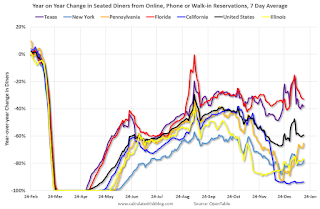
----- Restaurants: OpenTable -----
The second graph shows the 7 day average of the year-over-year change in diners as tabulated by OpenTable for the US and several selected cities.
 Thanks to OpenTable for providing this restaurant data:
This data is updated through January 16, 2021.
This data is "a sample of restaurants on the OpenTable network across all channels: online reservations, phone reservations, and walk-ins. For year-over-year comparisons by day, we compare to the same day of the week from the same week in the previous year."
Note that this data is for "only the restaurants that have chosen to reopen in a given market". Since some restaurants have not reopened, the actual year-over-year decline is worse than shown.
Dining picked up during the holidays. Note that dining is generally lower in the northern states - Illinois, Pennsylvania, and New York. Note that California dining is off sharply with the orders to close.
----- Movie Tickets: Box Office Mojo -----
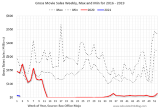 This data shows domestic box office for each week (red) and the maximum and minimum for the previous four years. Red is 2020 and Blue is 2021. Data is from BoxOfficeMojo through January 14th.
Note that the data is usually noisy week-to-week and depends on when blockbusters are released.
Movie ticket sales were at $11 million last week (compared to usually around $200 million per week at this time of year).
----- Hotel Occupancy: STR -----
 This graph shows the seasonal pattern for the hotel occupancy rate using the four week average.
The red line is for 2021, black is 2020, blue is the median, and dashed light blue is for 2009 (the worst year since the Great Depression for hotels - before 2020).
This data is through January 9th. Hotel occupancy is currently down 28.3% year-over-year. Seasonally we'd expect that business travel would start to pick up in the new year, but there will probably not be much pickup early in 2021.
Notes: Y-axis doesn't start at zero to better show the seasonal change.
----- Gasoline Supplied: Energy Information Administration -----
 This graph, based on weekly data from the U.S. Energy Information Administration (EIA), shows gasoline supplied compared to the same week of 2019.
Red is for 2020. At one point, gasoline supplied was off almost 50% YoY. Blue is for 2021.
As of January 8th, gasoline supplied was off about 12.1% (about 87.9% of the same week in 2019).
Note: People driving instead of flying might have boosted gasoline consumption over the summer.
----- Transit: Apple Mobility -----
This graph is from Apple mobility. From Apple: "This data is generated by counting the number of requests made to Apple Maps for directions in select countries/regions, sub-regions, and cities." This is just a general guide - people that regularly commute probably don't ask for directions.
There is also some great data on mobility from the Dallas Fed Mobility and Engagement Index. However the index is set "relative to its weekday-specific average over January–February", and is not seasonally adjusted, so we can't tell if an increase in mobility is due to recovery or just the normal increase in the Spring and Summer.
 This data is through January 16th for the United States and several selected cities.
The graph is the running 7 day average to remove the impact of weekends.
IMPORTANT: All data is relative to January 13, 2020. This data is NOT Seasonally Adjusted. People walk and drive more when the weather is nice, so I'm just using the transit data.
According to the Apple data directions requests, public transit in the 7 day average for the US is at 46% of the January level. It is at 35% in Chicago, and 51% in Houston - and mostly moving sideways.
----- New York City Subway Usage -----
Here is some interesting data on New York subway usage (HT BR).
 This graph is from Todd W Schneider. This is daily data since early 2020.
This data is through Friday, January 15th.
Schneider has graphs for each borough, and links to all the data sources.
He notes: "Data updates weekly from the MTA’s public turnstile data, usually on Saturday mornings".
The TSA is providing daily travel numbers.
 Click on graph for larger image.
This data shows the seven day average of daily total traveler throughput from the TSA for 2019-2020 (Blue) and 2020-2021 (Red).
The dashed line is the percent of last year for the seven day average.
This data is as of January 17th.
The seven day average is down 59.0% from last year (41.0% of last year). (Dashed line)
There has been a slow increase from the bottom, with ups and downs due to the Thanksgiving and Christmas holidays.
The second graph shows the 7 day average of the year-over-year change in diners as tabulated by OpenTable for the US and several selected cities.
 Thanks to OpenTable for providing this restaurant data:
This data is updated through January 16, 2021.
This data is "a sample of restaurants on the OpenTable network across all channels: online reservations, phone reservations, and walk-ins. For year-over-year comparisons by day, we compare to the same day of the week from the same week in the previous year."
Note that this data is for "only the restaurants that have chosen to reopen in a given market". Since some restaurants have not reopened, the actual year-over-year decline is worse than shown.
Dining picked up during the holidays. Note that dining is generally lower in the northern states - Illinois, Pennsylvania, and New York. Note that California dining is off sharply with the orders to close.
 This data shows domestic box office for each week (red) and the maximum and minimum for the previous four years. Red is 2020 and Blue is 2021. Data is from BoxOfficeMojo through January 14th.
Note that the data is usually noisy week-to-week and depends on when blockbusters are released.
Movie ticket sales were at $11 million last week (compared to usually around $200 million per week at this time of year).
 This graph shows the seasonal pattern for the hotel occupancy rate using the four week average.
 The red line is for 2021, black is 2020, blue is the median, and dashed light blue is for 2009 (the worst year since the Great Depression for hotels - before 2020).
This data is through January 9th. Hotel occupancy is currently down 28.3% year-over-year. Seasonally we'd expect that business travel would start to pick up in the new year, but there will probably not be much pickup early in 2021.
Notes: Y-axis doesn't start at zero to better show the seasonal change.
 This graph, based on weekly data from the U.S. Energy Information Administration (EIA), shows gasoline supplied compared to the same week of 2019.
Red is for 2020. At one point, gasoline supplied was off almost 50% YoY. Blue is for 2021.
As of January 8th, gasoline supplied was off about 12.1% (about 87.9% of the same week in 2019).
Note: People driving instead of flying might have boosted gasoline consumption over the summer.
This graph is from Apple mobility. From Apple: "This data is generated by counting the number of requests made to Apple Maps for directions in select countries/regions, sub-regions, and cities." This is just a general guide - people that regularly commute probably don't ask for directions.
There is also some great data on mobility from the Dallas Fed Mobility and Engagement Index. However the index is set "relative to its weekday-specific average over January–February", and is not seasonally adjusted, so we can't tell if an increase in mobility is due to recovery or just the normal increase in the Spring and Summer.
 This data is through January 16th for the United States and several selected cities.
The graph is the running 7 day average to remove the impact of weekends.
IMPORTANT: All data is relative to January 13, 2020. This data is NOT Seasonally Adjusted. People walk and drive more when the weather is nice, so I'm just using the transit data.
According to the Apple data directions requests, public transit in the 7 day average for the US is at 46% of the January level. It is at 35% in Chicago, and 51% in Houston - and mostly moving sideways.
Here is some interesting data on New York subway usage (HT BR).
 This graph is from Todd W Schneider. This is daily data since early 2020.
This data is through Friday, January 15th.
Schneider has graphs for each borough, and links to all the data sources.
He notes: "Data updates weekly from the MTA’s public turnstile data, usually on Saturday mornings".
Sunday, January 17, 2021
January 17 COVID-19 Test Results
by Calculated Risk on 1/17/2021 06:45:00 PM
Note: It is possible the 7-day average cases has peaked. Stay safe! I'm looking forward to not posting this data in a few months.
The US is now averaging close to 2 million tests per day. Based on the experience of other countries, for adequate test-and-trace (and isolation) to reduce infections, the percent positive needs to be under 5% (probably close to 1%), so the US has far too many daily cases - and percent positive - to do effective test-and-trace.
There were 1,836,498 test results reported over the last 24 hours.
There were 185,518 positive tests.
Over 52,000 US deaths have been reported so far in January. See the graph on US Daily Deaths here.
 Click on graph for larger image.
This data is from the COVID Tracking Project.
The percent positive over the last 24 hours was 10.1% (red line is 7 day average). The percent positive is calculated by dividing positive results by total tests (including pending).
And check out COVID Act Now to see how each state is doing. (updated link to new site)
 The second graph shows the 7 day average of positive tests reported and daily hospitalizations.
It is possible cases and hospitalizations have peaked, but are still at a very high level.


