by Calculated Risk on 10/08/2020 06:46:00 PM
Thursday, October 08, 2020
October 8 COVID-19 Test Results
The US is now mostly reporting 700 thousand to 1 million tests per day. Based on the experience of other countries, the percent positive needs to be well under 5% to really push down new infections (probably close to 1%), so the US still needs to increase the number of tests per day significantly (or take actions to push down the number of new infections).
There were 930,355 test results reported over the last 24 hours.
There were 54,870 positive tests.
Over 5,600 Americans deaths from COVID have been reported in October. See the graph on US Daily Deaths here.

This data is from the COVID Tracking Project.
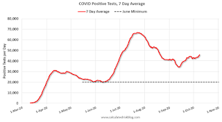
The percent positive over the last 24 hours was 5.9% (red line is 7 day average).
For the status of contact tracing by state, check out testandtrace.com.
And check out COVID Exit Strategy to see how each state is doing.

The dashed line is the June low.
Note that there were very few tests available in March and April, and many cases were missed (the percent positive was very high - see first graph). By June, the percent positive had dropped below 5%.
If people would stay vigilant, the number of cases might drop to the June low in November - but that is looking unlikely.
AAR: September Rail Carloads down 9.7% YoY, Intermodal Up 7.1% YoY
by Calculated Risk on 10/08/2020 03:32:00 PM
From the Association of American Railroads (AAR) Rail Time Indicators. Graphs and excerpts reprinted with permission.
U.S. rail volumes in September ranged from “generally getting better” to “already pretty good.”
On the “already pretty good” side, average weekly U.S. intermodal originations in September were 284,777 units. That’s the fourth most for any month in history and up 7.1% over September 2019 ...
U.S. rail carloads are in the “generally getting better” category. Total carloads in September were down 9.7% from last year. That’s still a sizable decline, to be sure, but it’s the smallest since March 2020.
emphasis added
 Click on graph for larger image.
This graph from the Rail Time Indicators report shows the six week average of U.S. Carloads in 2018, 2019 and 2020:
On the carload side, volumes are still down, but by less than they were. U.S. railroads originated an average of 223,909 total carloads per week in September 2020. That’s their lowest weekly average for September since sometime before 1988 (when our data begin). That said, total carloads in September 2020 were down 9.7% from September 2019 — their smallest monthly year-over-year percentage decline since March 2020, when the lockdowns began.
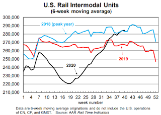
 The second graph shows the six week average of U.S. intermodal in 2018, 2019 and 2020: (using intermodal or shipping containers):
Like nearly every other rail category, intermodal fell sharply in the spring — it was down 12.6% in Q2 2020, including a 17.2% decline in April.Note that rail traffic was weak prior to the pandemic.
A few months later, things are very different. U.S. railroads originated 1.31 million containers and trailers in September 2020, up 7.1% over September 2019 — the biggest year-over-year percentage gain for intermodal since December 2016.
...
Why the change? U.S. imports of consumer goods are surging — they set an all-time monthly record in August 2020, with China supplying a huge share of them. After stalling in the spring, China’s export machine has come roaring back.
Seattle Real Estate in September: Sales up 59% YoY, Inventory UP 8% YoY
by Calculated Risk on 10/08/2020 02:24:00 PM
The Northwest Multiple Listing Service reported Northwest MLS brokers say September’s home sales reached highest level since June 2018
Northwest Multiple Listing Service brokers completed 10,175 sales transactions during September – the highest monthly volume since June 2018 when MLS members reported 10,072 closed sales. September’s closings also marked a jump of nearly 28% from the same month a year ago, according to the latest statistical summary from the MLS.There were 10,175 sales in September 2020, up 27.8% from 7,962 sales in September 2019.
“I believe this significant increase speaks to sellers becoming much more confident and buyers competing more effectively, most likely due to low interest rates,” remarked Mike Grady, president and COO at Coldwell Banker Bain. “It’s as if we just completed our typical ‘spring’ market,” he added.
emphasis added
The press release is for the Northwest. In King County, sales were up 41% year-over-year, and active inventory was down 27% year-over-year.
In Seattle, sales were up 58.5% year-over-year, and inventory was up 8.4% year-over-year.. This puts the months-of-supply in Seattle at just 1.8 months.
Hotels: Occupancy Rate Declined 29.6% Year-over-year
by Calculated Risk on 10/08/2020 12:16:00 PM
From HotelNewsNow.com: STR: US hotel results for week ending 3 October
U.S. hotel occupancy decreased slightly from the previous week, according to the latest data from STR through 3 October.The following graph shows the seasonal pattern for the hotel occupancy rate using the four week average.
27 September through 3 October 2020 (percentage change from comparable week in 2019):
• Occupancy: 47.9% (-29.6%)
• AAverage daily rate (ADR): US$95.63 (-26.3%)
• Revenue per available room (RevPAR): US$45.80 (-48.1%)
Year-over-year declines were less pronounced compared with previous weeks due to the Rosh Hashanah impact on the hotel calendar in 2019. Most of the markets with the highest occupancy levels were once again those in areas with displaced residents from natural disasters. Amid continued wildfires, California South/Central saw the highest occupancy level at 78.4%. In the aftermath of Hurricane Sally, Mobile, Alabama, reported the next highest occupancy level (73.6%).
emphasis added
 Click on graph for larger image.
The red line is for 2020, dash light blue is 2019, blue is the median, and black is for 2009 (the worst year since the Great Depression for hotels - before 2020).
There was some recent boost from natural disasters - perhaps 1 or 2 percentage points total based on previous disasters - but so far there has been little business travel pickup that usually happens in the Fall.
Note: Y-axis doesn't start at zero to better show the seasonal change.
NMHC: Rent Payment Tracker Shows Households Paying Rent Unchanged in October
by Calculated Risk on 10/08/2020 10:08:00 AM
From the NMHC: NMHC Rent Payment Tracker Finds 79.4 Percent of Apartment Households Paid Rent as of October 6
The National Multifamily Housing Council (NMHC)’s Rent Payment Tracker found 79.4 percent of apartment households made a full or partial rent payment by October 6 in its survey of 11.4 million units of professionally managed apartment units across the country.
This is unchanged from the share who paid rent through October 6, 2019 and compares to 76.4 percent that had paid by September 6, 2020. These data encompass a wide variety of market-rate rental properties across the United States, which can vary by size, type and average rental price.
“Our initial findings for October show that despite ongoing efforts by apartment community owners and operators to help residents facing financial distress through creative and nuanced payment plans, rent relief and other approaches, renters and the broader multifamily industry are confronting growing challenges,” said Doug Bibby, NMHC President.
emphasis added
This graph from the NMHC Rent Payment Tracker shows the percent of household making full or partial rent payments by the 6th of the month.
CR Note: This is mostly for large, professionally managed properties. There could be some timing issues, but rent payments are not falling off a cliff.
Weekly Initial Unemployment Claims at 840,000
by Calculated Risk on 10/08/2020 08:38:00 AM
Special technical note on California (two week pause).
The DOL reported:
In the week ending October 3, the advance figure for seasonally adjusted initial claims was 840,000, a decrease of 9,000 from the previous week's revised level. The previous week's level was revised up by 12,000 from 837,000 to 849,000. The 4-week moving average was 857,000, a decrease of 13,250 from the previous week's revised average. The previous week's average was revised up by 3,000 from 867,250 to 870,250.This does not include the 464,437 initial claims for Pandemic Unemployment Assistance (PUA) that was down from 508,707 the previous week. (There are some questions on PUA numbers).
emphasis added
The following graph shows the 4-week moving average of weekly claims since 1971.
 Click on graph for larger image.
The dashed line on the graph is the current 4-week average. The four-week average of weekly unemployment claims decreased to 857,000.
The previous week was revised up.
The second graph shows seasonally adjust continued claims since 1967 (lags initial by one week).
 At the worst of the Great Recession, continued claims peaked at 6.635 million, but then steadily declined.
Continued claims decreased to 10,976,000 (SA) from 11,979,000 (SA) last week and will likely stay at a high level until the crisis abates.
Note: There are an additional 11,394,832 receiving Pandemic Unemployment Assistance (PUA) that decreased from 11,828,338 the previous week (there are questions about these numbers). This is a special program for business owners, self-employed, independent contractors or gig workers not receiving other unemployment insurance.
Wednesday, October 07, 2020
Thursday: Unemployment Claims
by Calculated Risk on 10/07/2020 10:02:00 PM
Thursday:
• At 6:00 AM ET, NFIB Small Business Optimism Index for September.
• At 8:30 AM, The initial weekly unemployment claims report will be released. Initial claims were 837 thousand the previous week.
October 7 COVID-19 Test Results
by Calculated Risk on 10/07/2020 07:26:00 PM
The US is now mostly reporting 700 thousand to 1 million tests per day. Based on the experience of other countries, the percent positive needs to be well under 5% to really push down new infections (probably close to 1%), so the US still needs to increase the number of tests per day significantly (or take actions to push down the number of new infections).
There were 774,092 test results reported over the last 24 hours.
There were 50,602 positive tests.
Almost 4,700 Americans deaths from COVID have been reported in October. See the graph on US Daily Deaths here.

This data is from the COVID Tracking Project.
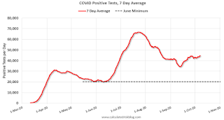
The percent positive over the last 24 hours was 6.5% (red line is 7 day average).
For the status of contact tracing by state, check out testandtrace.com.
And check out COVID Exit Strategy to see how each state is doing.

The dashed line is the June low.
Note that there were very few tests available in March and April, and many cases were missed (the percent positive was very high - see first graph). By June, the percent positive had dropped below 5%.
If people would stay vigilant, the number of cases might drop to the June low in November - but that is looking unlikely.
FOMC Minutes: "most forecasters were assuming that an additional pandemic-related fiscal package would be approved this year"
by Calculated Risk on 10/07/2020 02:38:00 PM
From the Fed: Minutes of the Federal Open Market Committee, September 15-16, 2020. A few excerpts:
While the economic outlook had brightened, market participants continued to see significant risks ahead. Some noted concerns about elevated asset valuations in certain sectors. Many also cited geopolitical events as heightening uncertainty. In addition, most forecasters were assuming that an additional pandemic-related fiscal package would be approved this year, and noted that, absent a new package, growth could decelerate at a faster-than-expected pace in the fourth quarter. In light of these and other risks, as well as the ongoing pandemic, market participants continued to suggest that the supportive policy environment and the backstops to market functioning remained important stabilizers.
...
Participants continued to see the uncertainty surrounding the economic outlook as very elevated, with the path of the economy highly dependent on the course of the virus; on how individuals, businesses, and public officials responded to it; and on the effectiveness of public health measures to address it. Participants cited several downside risks that could threaten the recovery. While the risk of another broad economic shutdown was seen as having receded, participants remained concerned about the possibility of additional virus outbreaks that could undermine the recovery. Such scenarios could result in increases in bankruptcies and defaults, put stress on the financial system, and lead to disruptions in the flow of credit to households and businesses. Most participants raised the concern that fiscal support so far for households, businesses, and state and local governments might not provide sufficient relief to these sectors. A couple of participants saw an upside risk that further fiscal stimulus could be larger than anticipated, though it might come later than had been expected. Several participants raised concerns regarding the longer-run effects of the pandemic, including how it could lead to a restructuring in some sectors of the economy that could slow employment growth or could accelerate technological disruption that was likely limiting the pricing power of firms.
emphasis added
By Request: Public and Private Sector Payroll Jobs During Presidential Terms
by Calculated Risk on 10/07/2020 01:00:00 PM
Note: I usually post this monthly, but I hesitated recently due to the COVID-19 pandemic. But I've received a number of requests lately - the recent numbers are ugly.
Here is another update of tracking employment during Presidential terms. We frequently use Presidential terms as time markers - we could use Speaker of the House, Fed Chair, or any other marker.
NOTE: Several readers have asked if I could add a lag to these graphs (obviously a new President has zero impact on employment for the month they are elected). But that would open a debate on the proper length of the lag, so I'll just stick to the beginning of each term.
Important: There are many differences between these periods. Overall employment was smaller in the '80s, however the participation rate was increasing in the '80s (younger population and women joining the labor force), and the participation rate is generally declining now. But these graphs give an overview of employment changes.
The first graph shows the change in private sector payroll jobs from when each president took office until the end of their term(s). Presidents Carter and George H.W. Bush only served one term.
Mr. G.W. Bush (red) took office following the bursting of the stock market bubble, and left during the bursting of the housing bubble. Mr. Obama (dark blue) took office during the financial crisis and great recession. There was also a significant recession in the early '80s right after Mr. Reagan (dark red) took office.
There was a recession towards the end of President G.H.W. Bush (light purple) term, and Mr. Clinton (light blue) served for eight years without a recession.

The first graph is for private employment only.
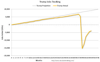
Mr. Trump is in Orange (44 months).
The employment recovery during Mr. G.W. Bush's (red) first term was sluggish, and private employment was down 824,000 jobs at the end of his first term. At the end of Mr. Bush's second term, private employment was collapsing, and there were net 387,000 private sector jobs lost during Mr. Bush's two terms.
Private sector employment increased by 20,970,000 under President Clinton (light blue), by 14,714,000 under President Reagan (dark red), 9,039,000 under President Carter (dashed green), 1,511,000 under President G.H.W. Bush (light purple), and 11,849,000 under President Obama (dark blue).
During the first 44 months of Mr. Trump's term, the economy has lost 3,408,000 private sector jobs.

The public sector grew during Mr. Carter's term (up 1,304,000), during Mr. Reagan's terms (up 1,414,000), during Mr. G.H.W. Bush's term (up 1,127,000), during Mr. Clinton's terms (up 1,934,000), and during Mr. G.W. Bush's terms (up 1,744,000 jobs). However the public sector declined significantly while Mr. Obama was in office (down 277,000 jobs).
During the 44 months of Mr. Trump's term, the economy has lost 499,000 public sector jobs.

After 44 months of Mr. Trump's presidency, the economy has lost 3,907,000 jobs, about 13,074,000 behind the projection.


