by Calculated Risk on 9/15/2020 03:28:00 PM
Tuesday, September 15, 2020
LA Area Port Inbound Traffic up to New Record High, Outbound Traffic Down Year-over-year in August
Note: The expansion to the Panama Canal was completed in 2016 (As I noted a few years ago), and some of the traffic that used the ports of Los Angeles and Long Beach is probably going through the canal. This might be impacting TEUs on the West Coast.
Container traffic gives us an idea about the volume of goods being exported and imported - and usually some hints about the trade report since LA area ports handle about 40% of the nation's container port traffic.
The following graphs are for inbound and outbound traffic at the ports of Los Angeles and Long Beach in TEUs (TEUs: 20-foot equivalent units or 20-foot-long cargo container).
To remove the strong seasonal component for inbound traffic, the first graph shows the rolling 12 month average.

On a rolling 12 month basis, inbound traffic was up 1.5% in August compared to the rolling 12 months ending in July. Outbound traffic was down 0.4% compared to the rolling 12 months ending the previous month.
The 2nd graph is the monthly data (with a strong seasonal pattern for imports).
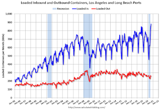
Imports were up 16% YoY in August to a new record high, and exports were down 5% YoY.
Technical Note: September Employment Report Will Probably Show a Decrease in Temporary Census Workers
by Calculated Risk on 9/15/2020 01:17:00 PM
The Census Bureau released an update today on 2020 Census Paid Temporary Workers
As of the August reference week, there were 288,204 decennial Census temporary workers. As of week of August 30 to September 5, there were 267,155 temp workers.
That was a decrease of around 21,000. Last week was the BLS reference week, and it seems likely there were even fewer temporary workers were on the payroll last week (to be released next week).
This means the September employment report will show a decrease in temporary Census employment. In August, the employment report showed a gain of 238,000 temporary 2020 Census workers, boosting the headline number.
"Income, Poverty and Health Insurance Coverage in the United States: 2019"
by Calculated Risk on 9/15/2020 10:59:00 AM
This survey was impacted by COVID, and the results are probably distorted (see last paragraph below).
From the Census Bureau: Income, Poverty and Health Insurance Coverage in the United States: 2019
The U.S. Census Bureau announced today that median household income in 2019 increased 6.8% from 2018, and the official poverty rate decreased 1.3 percentage points. Meanwhile the percentage of people with health insurance coverage for all or part of 2019 was 92.0% and 8.0% of people, or 26.1 million, did not have health insurance at any point during 2019, according to the 2020 Current Population Survey Annual Social and Economic Supplement (CPS ASEC).
Median household income was $68,703 in 2019, an increase of 6.8% from the 2018 median. Between 2018 and 2019, the real median earnings of all workers increased by 1.4%, while the real median earnings of full-time, year-round workers increased 0.8%.
The official poverty rate in 2019 was 10.5%, a decrease of 1.3 percentage points from 11.8% in 2018. This is the fifth consecutive annual decline in the national poverty rate. Since 2014, the poverty rate has fallen 4.3 percentage points, from 14.8% to 10.5%. The 2019 poverty rate of 10.5% is the lowest rate observed since estimates were initially published for 1959. The number of people in poverty in 2019 was 34.0 million, 4.2 million fewer people than 2018.
...
While the Census Bureau went to great lengths to complete interviews by telephone, the response rate for the CPS basic household survey was 73% in March 2020, about 10 percentage points lower than in preceding months and the same period in 2019, which were regularly above 80%. The change from conducting first interviews in person to making first contacts by telephone contributed to the lower response rates and it is likely that the characteristics of people for whom a telephone number was found may be systematically different from the people for whom the Census Bureau was unable to obtain a telephone number.
emphasis added
Industrial Production Increased 0.4 Percent in August; Still 7.2% Below Pre-Crisis Level
by Calculated Risk on 9/15/2020 09:23:00 AM
From the Fed: Industrial Production and Capacity Utilization
Industrial production rose 0.4 percent in August for its fourth consecutive monthly increase. However, even after the recent gains, the index in August was 7.3 percent below its pre-pandemic February level. Manufacturing output continued to improve in August, rising 1.0 percent, but the gains for most manufacturing industries have gradually slowed since June. Mining production fell 2.5 percent in August, as Tropical Storm Marco and Hurricane Laura caused sharp but temporary drops in oil and gas extraction and well drilling. The output of utilities moved down 0.4 percent. At 101.4 percent of its 2012 average, the level of total industrial production was 7.7 percent lower in August than it was a year earlier. Capacity utilization for the industrial sector increased 0.3 percentage point in August to 71.4 percent, a rate that is 8.4 percentage points below its long-run (1972–2019) average but 7.3 percentage points above its low in April.
emphasis added
 Click on graph for larger image.
This graph shows Capacity Utilization. This series is up from the record low set in April, but still well below the level in February 2020.
Capacity utilization at 71.4% is 8.4% below the average from 1972 to 2017.
Note: y-axis doesn't start at zero to better show the change.
 The second graph shows industrial production since 1967.
Industrial production increased in August to 101.4. This is 7.2% below the February 2020 level.
The change in industrial production was below consensus expectations, however industrial production in June and July were revised up.
NY Fed: Manufacturing "Business activity expanded at a solid clip in New York State" in September
by Calculated Risk on 9/15/2020 08:35:00 AM
From the NY Fed: Empire State Manufacturing Survey
Business activity expanded at a solid clip in New York State, according to firms responding to the September 2020 Empire State Manufacturing Survey. The headline general business conditions index climbed thirteen points to 17.0.This was above expectations, and showed activity expanded in September.
...
The index for number of employees held steady at 2.6, indicating little change in employment levels. The average workweek index rose fourteen points to 6.7, its first positive reading since the pandemic began, signaling an increase in hours worked.
emphasis added
Monday, September 14, 2020
Tuesday: Industrial Production, NY Fed Mfg
by Calculated Risk on 9/14/2020 09:12:00 PM
Tuesday:
• At 8:30 AM ET, The New York Fed Empire State manufacturing survey for September. The consensus is for a reading of 5.9, up from 3.7.
• At 9:15 AM, The Fed will release Industrial Production and Capacity Utilization for August. The consensus is for a 1.0% increase in Industrial Production, and for Capacity Utilization to increase to 71.5%.
September 14 COVID-19 Test Results
by Calculated Risk on 9/14/2020 07:11:00 PM
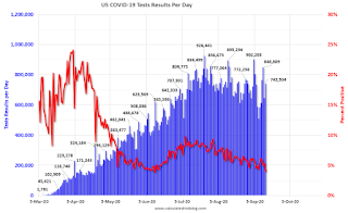
The US is now mostly reporting over 700,000 tests per day. Based on the experience of other countries, the percent positive needs to be well under 5% to really push down new infections, so the US still needs to increase the number of tests per day significantly (or take actions to push down the number of new infections).
There were 742,504 test results reported over the last 24 hours.
There were 29,853 positive tests.
See the graph on US Daily Deaths here.
This data is from the COVID Tracking Project.
The percent positive over the last 24 hours was 4.0% (red line).
For the status of contact tracing by state, check out testandtrace.com.
And check out COVID Exit Strategy to see how each state is doing.

The dashed line is the June low.
Note that there were very few tests available in March and April, and many cases were missed (the percent positive was very high - see first graph). By June, the percent positive had dropped below 5%.
If people stay vigilant, the number of cases might drop to the June low by the end of September (that would still be a large number of new cases, but progress).
MBA Survey: "Share of Mortgage Loans in Forbearance Declines to 7.01%", Forbearance Requests Increase
by Calculated Risk on 9/14/2020 04:00:00 PM
Note: This is as of September 6th.
From the MBA: Share of Mortgage Loans in Forbearance Declines to 7.01%
The Mortgage Bankers Association’s (MBA) latest Forbearance and Call Volume Survey revealed that the total number of loans now in forbearance decreased by 15 basis points from 7.16% of servicers’ portfolio volume in the prior week to 7.01% as of September 6, 2020. According to MBA’s estimate, 3.5 million homeowners are in forbearance plans.
...
“The beginning of September brought another drop in the share of loans in forbearance, with declines in both GSE and Ginnie Mae forbearance shares. However, at least a portion of the decline in the Ginnie Mae share was due to servicers buying delinquent loans out of pools and placing them on their portfolios. As a result of this transfer, the share of portfolio loans in forbearance increased,” said Mike Fratantoni, MBA’s Senior Vice President and Chief Economist. “Forbearance requests increased over the week, particularly for Ginnie Mae loans. With just under 1 million unemployment insurance claims still being filed every week, the lack of additional fiscal support for the unemployed could lead to even higher increases of those needing forbearance.”
By stage, 33.69% of total loans in forbearance are in the initial forbearance plan stage, while 65.35% are in a forbearance extension. The remaining 0.96% are forbearance re-entries.
emphasis added
 Click on graph for larger image.
This graph shows the percent of portfolio in forbearance by investor type over time. Most of the increase was in late March and early April, and has been trending down for the last ten weeks.
The MBA notes: "Total weekly forbearance requests as a percent of servicing portfolio volume (#) increased relative to the prior week: from 0.09% to 0.11%."
There hasn't been a pickup in forbearance activity related to the end of the extra unemployment benefits.
Recession Measures and NBER
by Calculated Risk on 9/14/2020 11:59:00 AM
Calling the beginning or end of a recession usually takes time. However, the economic decline in March was so severe that the National Bureau of Economic Research (NBER) has already called the end of the expansion in February.
The committee has determined that a peak in monthly economic activity occurred in the U.S. economy in February 2020. The peak marks the end of the expansion that began in June 2009 and the beginning of a recession. The expansion lasted 128 months, the longest in the history of U.S. business cycles dating back to 1854. The previous record was held by the business expansion that lasted for 120 months from March 1991 to March 2001.The NBER will probably wait some time before calling the end of the recession, this process can take from 18 months to two years or longer.
...
The usual definition of a recession involves a decline in economic activity that lasts more than a few months. However, in deciding whether to identify a recession, the committee weighs the depth of the contraction, its duration, and whether economic activity declined broadly across the economy (the diffusion of the downturn). The committee recognizes that the pandemic and the public health response have resulted in a downturn with different characteristics and dynamics than prior recessions. Nonetheless, it concluded that the unprecedented magnitude of the decline in employment and production, and its broad reach across the entire economy, warrants the designation of this episode as a recession, even if it turns out to be briefer than earlier contractions.
In the mean time, if the economy slides into recession again, the committee will only consider it a new recession if most major indicators were close to or above their previous highs. Otherwise it will just be considered a continuation of the previous recession.
A good example of the NBER calling two separate recessions was in the early '80s, from the NBER memo:
"The period following July 1980 will appear in the NBER chronology as an expansion. An important factor influencing that decision is that most major indicators, including real GNP, are already close to or above their previous highs."It will take some time for most major indicators to be above their previous high after the current recession because of the severe contraction as the graphs below show.
emphasis added
GDP is the key measure, as the NBER committee notes in their business cycle dating procedure:
The committee views real GDP as the single best measure of aggregate economic activity.
 Click on graph for larger image.
This graph is for real GDP through Q2 2020.
This is the key measure, and the NBER will probably use GDP and GDI to determine the trough of the recession (April and in Q2).
As of Q2, real GDP was 10.2% below the pre-recession peak.
Most forecasters expect GDP to rebound strongly in Q3, but even with a 30% annualized increase (about 6.8% QoQ), real GDP will be down about 4.2% from Q4 2019; a larger decline in real GDP than at the depth of the Great Recession.
It will take some time for real GDP to be above Q4 2019 levels.
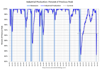 The second graph is for monthly industrial production based on data from the Federal Reserve through July 2020.
Industrial production is off over 9.4% from the pre-recession peak, and will probably increase further in August (to be released this week).
Note that industrial production was weak prior to the onset of the pandemic.
Industrial production usually takes a long time to recover after a significant decline.
 The third graph is for employment through August 2020.
Historically employment was a coincident indicator for the end of recessions, but that hasn't been true for the previous three recessions (1990-1991, 2001, 2007-2009).
Employment is currently off about 7.6% from the pre-recession peak (dashed line). This is an improvement from off 14.5% in April, but this was from returning temporary layoffs and not from an actual recovery.
It is likely that employment will not recover to pre-recession levels for some time.
 And the last graph is for real personal income excluding transfer payments through July 2020.
Real personal income less transfer payments was still off 5% in July.
Once again it will take a long time to return to pre-recession levels.
These graphs are useful in trying to identify peaks and troughs in economic activity.
Economic activity bottomed in Q2 (in April), but the pace of the actual recovery will depend on the course of the virus.
Seven High Frequency Indicators for the Economy
by Calculated Risk on 9/14/2020 08:28:00 AM
These indicators are mostly for travel and entertainment - some of the sectors that will recover very slowly.
The TSA is providing daily travel numbers.
 Click on graph for larger image.
This data shows the seven day average of daily total traveler throughput from the TSA for 2019 (Blue) and 2020 (Red).
This data is as of September 13th.
The seven day average is down 66% from last year (33% of last year).
There has been a slow increase from the bottom.
The second graph shows the 7 day average of the year-over-year change in diners as tabulated by OpenTable for the US and several selected cities.
 Thanks to OpenTable for providing this restaurant data:
This data is updated through September 12, 2020.
This data is "a sample of restaurants on the OpenTable network across all channels: online reservations, phone reservations, and walk-ins. For year-over-year comparisons by day, we compare to the same day of the week from the same week in the previous year."
Note that this data is for "only the restaurants that have chosen to reopen in a given market". Since some restaurants have not reopened, the actual year-over-year decline is worse than shown.
The 7 day average for New York is still off 62% YoY, and down 22% in Florida. There was a surge in restaurant dining around Labor Day - hopefully mostly outdoor dining.
 This data shows domestic box office for each week (red) and the maximum and minimum for the previous four years. Data is from BoxOfficeMojo through September 10th.
Note that the data is usually noisy week-to-week and depends on when blockbusters are released.
Movie ticket sales have picked up over the last few weeks, and were at $30 million last week (compared to usually under $200 million per week in the late Summer / early Fall).
Movie theaters are reopening (probably with limited seating at first).
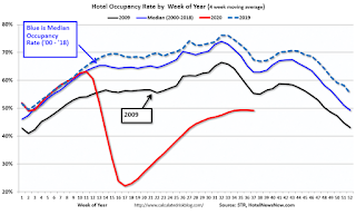 This graph shows the seasonal pattern for the hotel occupancy rate using the four week average.
 The red line is for 2020, dash light blue is 2019, blue is the median, and black is for 2009 (the worst year probably since the Great Depression for hotels).
This data is through September 5th.
COVID-19 crushed hotel occupancy, and is currently down 19% year-over-year (boosted by fires and a hurricane).
Notes: Y-axis doesn't start at zero to better show the seasonal change.
The leisure travel season usually peaks at the beginning of August, and then the occupancy rate typically declines sharply in the Fall.
With so many schools closed, the leisure travel season might have lasted longer than usual this year, but it is unlikely business travel will pickup significantly in the Fall.
 This graph, based on weekly data from the U.S. Energy Information Administration (EIA), shows gasoline supplied compared to the same week last year of .
At one point, gasoline supplied was off almost 50% YoY.
As of September 4th, gasoline supplied was only off about 14.5% YoY (about 85.5% of normal).
Note: I know several people that have driven to vacation spots - or to visit family - and they usually would have flown. So this might be boosting gasoline consumption over the summer - and summer vacation might have lasted a little longer this year.
This graph is from Apple mobility. From Apple: "This data is generated by counting the number of requests made to Apple Maps for directions in select countries/regions, sub-regions, and cities." This is just a general guide - people that regularly commute probably don't ask for directions.
There is also some great data on mobility from the Dallas Fed Mobility and Engagement Index. However the index is set "relative to its weekday-specific average over January–February", and is not seasonally adjusted, so we can't tell if an increase in mobility is due to recovery or just the normal increase in the Spring and Summer.
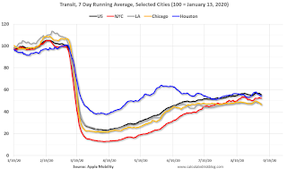 This data is through September 11th for the United States and several selected cities.
The graph is the running 7 day average to remove the impact of weekends.
IMPORTANT: All data is relative to January 13, 2020. This data is NOT Seasonally Adjusted. People walk and drive more when the weather is nice, so I'm just using the transit data.
According to the Apple data directions requests, public transit in the 7 day average for the US is still only about 56% of the January level. It is at 46% in Chicago, and 54% in Houston.
Here is some interesting data on New York subway usage (HT BR).
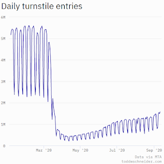 This graph is from Todd W Schneider.
This data is through Friday, September 11th.
Schneider has graphs for each borough, and links to all the data sources.
He notes: "Data updates weekly from the MTA’s public turnstile data, usually on Saturday mornings"


