by Calculated Risk on 6/26/2019 04:31:00 PM
Wednesday, June 26, 2019
Zillow Case-Shiller Forecast: Same YoY Price Gains in May as in April
The Case-Shiller house price indexes for April were released yesterday. Zillow forecasts Case-Shiller a month early, and I like to check the Zillow forecasts since they have been pretty close.
From Matthew Speakman at Zillow: April Case-Shiller Results and May Forecast: Getting Back to Normal
The housing market has continued to normalize throughout the spring, finding more balance between buyers and sellers and slowing to a pace of growth much more in line with historic norms.The Zillow forecast is for the year-over-year change for the Case-Shiller National index to be at 3.5% in May, the same as in April.
The Zillow forecast is for the 20-City index to decline to 2.4% YoY in May from 2.5% in April, and for the 10-City index to decline to 2.2% YoY compared to 2.3% YoY in April.
Chemical Activity Barometer "Flat" in June
by Calculated Risk on 6/26/2019 02:00:00 PM
Note: This appears to be a leading indicator for industrial production.
From the American Chemistry Council:
Chemical Activity Barometer Is Flat In June
The Chemical Activity Barometer (CAB), a leading economic indicator created by the American Chemistry Council (ACC), was flat (0.0 percent change) in June on a three-month moving average (3MMA) basis, following three monthly gains. On a year-over-year (Y/Y) basis, the barometer is up 0.3 percent (3MMA).
...
“The slowing economy and rising trade tensions have weighed on business confidence and investment, resulting in mixed manufacturing activity,” said Kevin Swift, chief economist at ACC. “In summary, the CAB reading continues to signal gains in U.S. commercial and industrial activity through late 2019, but at a moderated pace.”
...
Applying the CAB back to 1912, it has been shown to provide a lead of two to fourteen months, with an average lead of eight months at cycle peaks as determined by the National Bureau of Economic Research. The median lead was also eight months. At business cycle troughs, the CAB leads by one to seven months, with an average lead of four months. The median lead was three months. The CAB is rebased to the average lead (in months) of an average 100 in the base year (the year 2012 was used) of a reference time series. The latter is the Federal Reserve’s Industrial Production Index.
emphasis added
 Click on graph for larger image.
This graph shows the year-over-year change in the 3-month moving average for the Chemical Activity Barometer compared to Industrial Production. It does appear that CAB (red) generally leads Industrial Production (blue).
The year-over-year increase in the CAB suggests that the YoY increase in industrial production will probably slow further.
Real House Prices and Price-to-Rent Ratio in April
by Calculated Risk on 6/26/2019 10:56:00 AM
Here is the post yesterday on Case-Shiller: Case-Shiller: National House Price Index increased 3.5% year-over-year in April
It has been over eleven years since the bubble peak. In the Case-Shiller release yesterday, the seasonally adjusted National Index (SA), was reported as being 12.9% above the previous bubble peak. However, in real terms, the National index (SA) is still about 7.9% below the bubble peak (and historically there has been an upward slope to real house prices). The composite 20, in real terms, is still 14.7% below the bubble peak.
The year-over-year increase in prices has slowed to 3.5% nationally, and I expect price growth will slow a little more, but not turn negative this year.
Usually people graph nominal house prices, but it is also important to look at prices in real terms (inflation adjusted). Case-Shiller and others report nominal house prices. As an example, if a house price was $200,000 in January 2000, the price would be close to $287,000 today adjusted for inflation (43%). That is why the second graph below is important - this shows "real" prices (adjusted for inflation).
Nominal House Prices

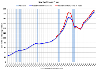
In nominal terms, the Case-Shiller National index (SA)and the Case-Shiller Composite 20 Index (SA) are both at new all times highs (above the bubble peak).
Real House Prices

In real terms, the National index is back to January 2005 levels, and the Composite 20 index is back to June 2004.
In real terms, house prices are at 2004/2005 levels.
Price-to-Rent
In October 2004, Fed economist John Krainer and researcher Chishen Wei wrote a Fed letter on price to rent ratios: House Prices and Fundamental Value. Kainer and Wei presented a price-to-rent ratio using the OFHEO house price index and the Owners' Equivalent Rent (OER) from the BLS.

This graph shows the price to rent ratio (January 2000 = 1.0).
On a price-to-rent basis, the Case-Shiller National index is back to February 2004 levels, and the Composite 20 index is back to October 2003 levels.
In real terms, prices are back to late 2004 levels, and the price-to-rent ratio is back to late 2003, early 2004.
MBA: Mortgage Applications Increased in Latest Weekly Survey
by Calculated Risk on 6/26/2019 07:00:00 AM
From the MBA: Mortgage Applications Increase in Latest MBA Weekly Survey
Mortgage applications increased 1.3 percent from one week earlier, according to data from the Mortgage Bankers Association’s (MBA) Weekly Mortgage Applications Survey for the week ending June 21, 2019.
... The Refinance Index increased 3 percent from the previous week. The seasonally adjusted Purchase Index decreased 1 percent from one week earlier. The unadjusted Purchase Index decreased 2 percent compared with the previous week and was 9 percent higher than the same week one year ago.
...
“Markets last week reacted to a more dovish FOMC statement and forecast, with Treasury yields falling after the meeting. Mortgage rates dropped again for most loan types, which led to an increase in refinance activity, partly driven by a 9 percent jump in VA applications,” said Joel Kan, MBA’s Associate Vice President of Economic and Industry Forecasting. “The 30-year fixed rate has now dropped in three of the last four weeks, and at 4.06 percent, reached its lowest level since September 2017. Despite these lower rates, purchase applications decreased 2 percent, but were still considerably higher (9 percent) than a year ago.”
Added Kan, “Now at almost the half-way mark of 2019, we have generally seen a stronger purchase market than last year, despite still-tight existing inventory and insufficient new construction.”
...
The average contract interest rate for 30-year fixed-rate mortgages with conforming loan balances ($484,350 or less) decreased to 4.06 percent from 4.14 percent, with points decreasing to 0.35 from 0.38 (including the origination fee) for 80 percent loan-to-value ratio (LTV) loans.
emphasis added
 Click on graph for larger image.
The first graph shows the refinance index since 1990.
Mortgage rates have declined from close to 5% late last year to around 4% now.
Just about anyone who bought or refinanced over the last year or so can refinance now. But it would take another significant decline in rates for a further large increase in refinance activity.
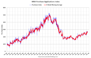
 The second graph shows the MBA mortgage purchase index
According to the MBA, purchase activity is up 9% year-over-year.
Tuesday, June 25, 2019
Freddie Mac: Mortgage Serious Delinquency Rate Decreased in May
by Calculated Risk on 6/25/2019 05:41:00 PM
Freddie Mac reported that the Single-Family serious delinquency rate in May was 0.63%, down from 0.65% in April. Freddie's rate is down from 0.87% in May 2018.
Freddie's serious delinquency rate peaked in February 2010 at 4.20%.
This is the lowest serious delinquency rate for Freddie Mac since November 2007.
These are mortgage loans that are "three monthly payments or more past due or in foreclosure".

I expect the delinquency rate to decline to a cycle bottom in the 0.4% to 0.6% range - so this is close to a bottom.
Note: Fannie Mae will report for May soon.
Update: A few comments on the Seasonal Pattern for House Prices
by Calculated Risk on 6/25/2019 02:53:00 PM
CR Note: This is a repeat of earlier posts with updated graphs.
A few key points:
1) There is a clear seasonal pattern for house prices.
2) The surge in distressed sales during the housing bust distorted the seasonal pattern.
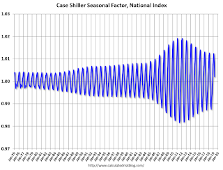
3) Even though distressed sales are down significantly, the seasonal factor is based on several years of data - and the factor is now overstating the seasonal change (second graph below).
4) Still the seasonal index is probably a better indicator of actual price movements than the Not Seasonally Adjusted (NSA) index.
For in depth description of these issues, see former Trulia chief economist Jed Kolko's article "Let’s Improve, Not Ignore, Seasonal Adjustment of Housing Data"
Note: I was one of several people to question the change in the seasonal factor (here is a post in 2009) - and this led to S&P Case-Shiller questioning the seasonal factor too (from April 2010). I still use the seasonal factor (I think it is better than using the NSA data).

This graph shows the month-to-month change in the NSA Case-Shiller National index since 1987 (through April 2019). The seasonal pattern was smaller back in the '90s and early '00s, and increased once the bubble burst.
The seasonal swings have declined since the bubble.

The swings in the seasonal factors has started to decrease, and I expect that over the next several years - as recent history is included in the factors - the seasonal factors will move back towards more normal levels.
However, as Kolko noted, there will be a lag with the seasonal factor since it is based on several years of recent data.
"A Conversation with Jerome H. Powell"
by Calculated Risk on 6/25/2019 01:03:00 PM
Live video for A Conversation with Jerome H. Powell
Speech by Chair Powell on the economic outlook and monetary policy review
The Fed is insulated from short-term political pressures—what is often referred to as our "independence." Congress chose to insulate the Fed this way because it had seen the damage that often arises when policy bends to short-term political interests. Central banks in major democracies around the world have similar independence.And on policy:
Let me turn now from the longer-term issues that are the focus of the review to the nearer-term outlook for the economy and for monetary policy. So far this year, the economy has performed reasonably well. Solid fundamentals are supporting continued growth and strong job creation, keeping the unemployment rate near historic lows. Although inflation has been running somewhat below our symmetric 2 percent objective, we have expected it to pick up, supported by solid growth and a strong job market. Along with this favorable picture, we have been mindful of some ongoing crosscurrents, including trade developments and concerns about global growth. When the FOMC met at the start of May, tentative evidence suggested these crosscurrents were moderating, and we saw no strong case for adjusting our policy rate.
Since then, the picture has changed. The crosscurrents have reemerged, with apparent progress on trade turning to greater uncertainty and with incoming data raising renewed concerns about the strength of the global economy. Our contacts in business and agriculture report heightened concerns over trade developments. These concerns may have contributed to the drop in business confidence in some recent surveys and may be starting to show through to incoming data. For example, the limited available evidence we have suggests that investment by businesses has slowed from the pace earlier in the year.
Against the backdrop of heightened uncertainties, the baseline outlook of my FOMC colleagues, like that of many other forecasters, remains favorable, with unemployment remaining near historic lows. Inflation is expected to return to 2 percent over time, but at a somewhat slower pace than we foresaw earlier in the year. However, the risks to this favorable baseline outlook appear to have grown.
A few Comments on May New Home Sales
by Calculated Risk on 6/25/2019 11:29:00 AM
New home sales for May were reported at 626,000 on a seasonally adjusted annual rate basis (SAAR). Sales for April were revised up slightly, and sales for March were revised down.
Earlier: New Home Sales decreased to 626,000 Annual Rate in May.

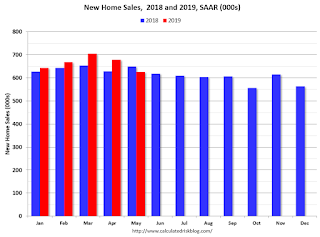
This graph shows new home sales for 2018 and 2019 by month (Seasonally Adjusted Annual Rate).
Sales in May were down 3.7% year-over-year compared to May 2018.
Year-to-date (just through May), sales are up 4.0% compared to the same period in 2018.
This comparison was the most difficult in the first half of 2018, so even with the disappointing sales in May, this is a solid start for 2019.
And here is another update to the "distressing gap" graph that I first started posting a number of years ago to show the emerging gap caused by distressed sales.

Following the housing bubble and bust, the "distressing gap" appeared mostly because of distressed sales.
Even though distressed sales are down significantly, following the bust, new home builders focused on more expensive homes - so the gap has only closed slowly.
I still expect this gap to close. However, this assumes that the builders will offer some smaller, less expensive homes.
Note: Existing home sales are counted when transactions are closed, and new home sales are counted when contracts are signed. So the timing of sales is different.
New Home Sales decreased to 626,000 Annual Rate in May
by Calculated Risk on 6/25/2019 10:14:00 AM
The Census Bureau reports New Home Sales in May were at a seasonally adjusted annual rate (SAAR) of 626 thousand.
The previous three months were revised down slightly, combined.
"Sales of new single‐family houses in May 2019 were at a seasonally adjusted annual rate of 626,000, according to estimates released jointly today by the U.S. Census Bureau and the Department of Housing and Urban Development. This is 7.8 percent below the revised April rate of 679,000 and is 3.7 percent below the May 2018 estimate of 650,000."
emphasis added
 Click on graph for larger image.
The first graph shows New Home Sales vs. recessions since 1963. The dashed line is the current sales rate.
Even with the increase in sales over the last several years, new home sales are still somewhat low historically.
The second graph shows New Home Months of Supply.
 The months of supply increased in May to 6.4 months from 5.9 months in April.
 The all time record was 12.1 months of supply in January 2009.
This is at the top of the normal range (less than 6 months supply is normal).
"The seasonally‐adjusted estimate of new houses for sale at the end of May was 333,000. This represents a supply of 6.4 months at the current sales rate."
 On inventory, according to the Census Bureau:
 "A house is considered for sale when a permit to build has been issued in permit-issuing places or work has begun on the footings or foundation in nonpermit areas and a sales contract has not been signed nor a deposit accepted."Starting in 1973 the Census Bureau broke this down into three categories: Not Started, Under Construction, and Completed.
The third graph shows the three categories of inventory starting in 1973.
The inventory of completed homes for sale is still somewhat low, and the combined total of completed and under construction is close to normal.
 The last graph shows sales NSA (monthly sales, not seasonally adjusted annual rate).
In May 2019 (red column), 60 thousand new homes were sold (NSA). Last year, 62 thousand homes were sold in May.
The all time high for May was 120 thousand in 2005, and the all time low for May was 30 thousand in 2011.
This was below expectations of 680 thousand sales SAAR, and sales in the three previous months were revised down slightly combined. I'll have more later today.
Case-Shiller: National House Price Index increased 3.5% year-over-year in April
by Calculated Risk on 6/25/2019 09:10:00 AM
S&P/Case-Shiller released the monthly Home Price Indices for March ("April" is a 3 month average of February, March and April prices).
This release includes prices for 20 individual cities, two composite indices (for 10 cities and 20 cities) and the monthly National index.
Note: Case-Shiller reports Not Seasonally Adjusted (NSA), I use the SA data for the graphs.
From S&P: Annual Home Price Gains Continue to Fall According to the S&P CoreLogic Case-Shiller Index
The S&P CoreLogic Case-Shiller U.S. National Home Price NSA Index, covering all nine U.S. census divisions, reported a 3.5% annual gain in April, down from 3.7% in the previous month. The 10-City Composite annual increase came in at 2.3%, up from 2.2% in the previous month. The 20-City Composite posted a 2.5% year-over-year gain, down from 2.6% in the previous month.
Las Vegas, Phoenix and Tampa reported the highest year-over-year gains among the 20 cities. In April, Las Vegas led the way with a 7.1% year-over-year price increase, followed by Phoenix with a 6.0% increase, and Tampa with a 5.6% increase. Nine of the 20 cities reported greater price increases in the year ending April 2019 versus the year ending March 2019.
...
Before seasonal adjustment, the National Index posted a month-over-month increase of 0.9% in April. The 10-City and 20-City Composites both reported 0.8% increases for the month. After seasonal adjustment, the National Index recorded a 0.3% month-over-month increase in April. The 10-City Composite posted a 0.2% month-over-month increases and the 20-City Composite did not report an increase. In April, 19 of 20 cities reported increases before seasonal adjustment, while 14 of 20 cities reported increases after seasonal adjustment.
“Home price gains continued in a trend of broad-based moderation,” says Philip Murphy, Managing Director and Global Head of Index Governance at S&P Dow Jones Indices. “Year-over-year price gains remain positive in most cities, though at diminishing rates of change. Seattle is a notable exception, where the YOY change has decreased from 13.1% in April 2018 to 0.0% in April 2019.“
emphasis added
 Click on graph for larger image.
 The first graph shows the nominal seasonally adjusted Composite 10, Composite 20 and National indices (the Composite 20 was started in January 2000).
The Composite 10 index is up slightly from the bubble peak, and up 0.2% in April (SA).
The Composite 20 index is 4.4% above the bubble peak, and unchanged (SA) in April.
The National index is 12.9% above the bubble peak (SA), and up 0.3% (SA) in April. The National index is up 52.6% from the post-bubble low set in December 2011 (SA).
 The second graph shows the Year over year change in all three indices.
The Composite 10 SA is up 2.3% compared to April 2018. The Composite 20 SA is up 2.5% year-over-year.
The National index SA is up 3.5% year-over-year.
Note: According to the data, prices increased in 16 of 20 cities month-over-month seasonally adjusted.
I'll have more later.


