by Calculated Risk on 3/28/2017 05:33:00 PM
Tuesday, March 28, 2017
A few comments on the Seasonal Pattern for House Prices
CR Note: This is a repeat of a previous post with updated graphs.
A few key points:
1) There is a clear seasonal pattern for house prices.
2) The surge in distressed sales during the housing bust distorted the seasonal pattern.
3) Even though distressed sales are down significantly, the seasonal factor is based on several years of data - and the factor is now overstating the seasonal change (second graph below).
4) Still the seasonal index is probably a better indicator of actual price movements than the Not Seasonally Adjusted (NSA) index.
For in depth description of these issues, see Trulia chief economist Jed Kolko's article "Let’s Improve, Not Ignore, Seasonal Adjustment of Housing Data"
Note: I was one of several people to question the change in the seasonal factor (here is a post in 2009) - and this led to S&P Case-Shiller questioning the seasonal factor too (from April 2010). I still use the seasonal factor (I think it is better than using the NSA data).

This graph shows the month-to-month change in the CoreLogic (through January 2017) and NSA Case-Shiller National index since 1987 (through January 2017). The seasonal pattern was smaller back in the '90s and early '00s, and once the bubble burst.
The seasonal swings have declined since the bubble.

The swings in the seasonal factors has started to decrease, and I expect that over the next several years - as the percent of distressed sales declines further and recent history is included in the factors - the seasonal factors will move back towards more normal levels. However, as Kolko noted, there will be a lag with the seasonal factor since it is based on several years of recent data.
Real House Prices and Price-to-Rent Ratio in January
by Calculated Risk on 3/28/2017 12:41:00 PM
Here is the earlier post on Case-Shiller: Case-Shiller: National House Price Index increased 5.9% year-over-year in January
It has been more than ten years since the bubble peak. In the Case-Shiller release this morning, the seasonally adjusted National Index (SA), was reported as being 1.9% above the previous bubble peak. However, in real terms, the National index (SA) is still about 14.5% below the bubble peak.
The year-over-year increase in prices is mostly moving sideways now just over 5%. In January, the index was up 5.9% YoY.
In the earlier post, I graphed nominal house prices, but it is also important to look at prices in real terms (inflation adjusted). Case-Shiller, CoreLogic and others report nominal house prices. As an example, if a house price was $200,000 in January 2000, the price would be close to $280,000 today adjusted for inflation (40%). That is why the second graph below is important - this shows "real" prices (adjusted for inflation).
Nominal House Prices

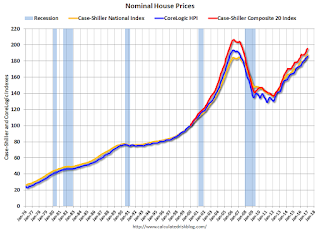
In nominal terms, the Case-Shiller National index (SA) is at a new peak, and the Case-Shiller Composite 20 Index (SA) is back to September 2005 levels, and the CoreLogic index (NSA) is back to September 2005.
Real House Prices

In real terms, the National index is back to April 2004 levels, the Composite 20 index is back to December 2003, and the CoreLogic index back to March 2004.
In real terms, house prices are back to late 2003 / early 2004 levels.
Price-to-Rent
In October 2004, Fed economist John Krainer and researcher Chishen Wei wrote a Fed letter on price to rent ratios: House Prices and Fundamental Value. Kainer and Wei presented a price-to-rent ratio using the OFHEO house price index and the Owners' Equivalent Rent (OER) from the BLS.

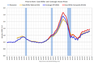
This graph shows the price to rent ratio (January 1998 = 1.0).
On a price-to-rent basis, the Case-Shiller National index is back to November 2003 levels, the Composite 20 index is back to August 2003 levels, and the CoreLogic index is back to July 2003.
In real terms, and as a price-to-rent ratio, prices are back to late 2003 / early 2004 - and the price-to-rent ratio maybe moving a little more sideways now.
Richmond Fed: Regional Manufacturing Activity Expanded in March
by Calculated Risk on 3/28/2017 10:56:00 AM
From the Richmond Fed: Manufacturing Firms Upbeat in March with Shipments, New Orders, and Employment Indexes Rising
Manufacturers in the Fifth District were generally upbeat in March, according to the latest survey by the Federal Reserve Bank of Richmond. The index for shipments and new orders both rose and employment gains were more common. This improvement led to a composite index for manufacturing that rose from 17 in February to 22 in March — the strongest reading for that index since April 2010. In addition to improvement in the employment index, more firms reported longer workweeks and wage increases appeared to be more widespread. ...This was the last of the regional Fed surveys for March.
emphasis added
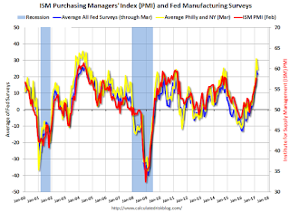
Here is a graph comparing the regional Fed surveys and the ISM manufacturing index:
 Click on graph for larger image.
The New York and Philly Fed surveys are averaged together (yellow, through March), and five Fed surveys are averaged (blue, through March) including New York, Philly, Richmond, Dallas and Kansas City. The Institute for Supply Management (ISM) PMI (red) is through February (right axis).
It seems likely the ISM manufacturing index will show solid expansion in March (to be released next week).
Case-Shiller: National House Price Index increased 5.9% year-over-year in January
by Calculated Risk on 3/28/2017 09:18:00 AM
S&P/Case-Shiller released the monthly Home Price Indices for January ("January" is a 3 month average of November, December and January prices).
This release includes prices for 20 individual cities, two composite indices (for 10 cities and 20 cities) and the monthly National index.
Note: Case-Shiller reports Not Seasonally Adjusted (NSA), I use the SA data for the graphs.
From S&P: S&P Corelogic Case-Shiller National Index Annual Return Sets 31-Month High
The S&P CoreLogic Case-Shiller U.S. National Home Price NSA Index, covering all nine U.S. census divisions, reported a 5.9% annual gain in January, up from 5.7% last month and setting a 31-month high. The 10-City Composite posted a 5.1% annual increase, up from 4.8% the previous month. The 20-City Composite reported a year-over-year gain of 5.7%, up from 5.5% in December
Seattle, Portland, and Denver reported the highest year-over-year gains among the 20 cities over each of the last 12 months. In January, Seattle led the way with an 11.3% year-over-year price increase, followed by Portland with 9.7%, and Denver with a 9.2% increase. Twelve cities reported greater price increases in the year ending January 2017 versus the year ending December 2016.
...
Before seasonal adjustment, the National Index posted a month-over-month gain of 0.2% in January. The 10-City Composite posted a 0.3% increase and the 20-City Composite reported a 0.2% increase in January. After seasonal adjustment, the National Index recorded a 0.6% month-over-month increase, while both the 10-City and 20-City Composites each reported a 0.9% month-over-month increase. Thirteen of 20 cities reported increases in January before seasonal adjustment; after seasonal adjustment, 19 cities saw prices rise.
emphasis added
 Click on graph for larger image.
 The first graph shows the nominal seasonally adjusted Composite 10, Composite 20 and National indices (the Composite 20 was started in January 2000).
The Composite 10 index is off 7.7% from the peak, and up 0.9% in January (SA).
The Composite 20 index is off 5.4% from the peak, and up 0.9% (SA) in January.
The National index is 1.9% above the bubble peak (SA), and up 0.6% (SA) in January. The National index is up 37.7% from the post-bubble low set in December 2011 (SA).
 The second graph shows the Year over year change in all three indices.
The Composite 10 SA is up 5.1% compared to January 2015.
The Composite 20 SA is up 5.7% year-over-year.
The National index SA is up 5.9% year-over-year.
Note: According to the data, prices increased in all 19 cities month-over-month seasonally adjusted.
I'll have more later.
Monday, March 27, 2017
Tuesday: Case-Shiller House Prices
by Calculated Risk on 3/27/2017 07:09:00 PM
Here is the Zillow forecast (They've been very close each month):
The January Case-Shiller national index is expected to grow 6 percent year-over-year and 0.5 percent from December, up from 5.8 percent annual growth recorded in November but down somewhat from 0.7 percent monthly growth in December. The smaller 10- and 20-city indices are both expected to grow by 0.7 percent month-over-month (SA), slower than the 0.9 percent monthly growth recorded in December. On an annual basis, the 10- and 20-city indices are expected to grow by 5.1 percent and 5.7 percent in January, respectively, up from 4.9 percent and 5.6 percent in November.Tuesday:
• At 9:00 AM ET, S&P/Case-Shiller House Price Index for January. Although this is the January report, it is really a 3 month average of November, December and January prices. The consensus is for a 5.7% year-over-year increase in the Comp 20 index for January.
• At 10:00 AM: Richmond Fed Survey of Manufacturing Activity for March. This is the last of the regional Fed surveys for March.
• At 12:50 PM: Speech by Fed Chair Janet Yellen, Addressing Workforce Development Challenges in Low-Income Communities, At the National Community Reinvestment Coalition Annual Conference, Washington, D.C.
Freddie Mac: Mortgage Serious Delinquency rate declines in February, Lowest since June 2008
by Calculated Risk on 3/27/2017 12:42:00 PM
Freddie Mac reported that the Single-Family serious delinquency rate in February was at 0.98%, down from 0.99% in January. Freddie's rate is down from 1.26% in February 2016.
Freddie's serious delinquency rate peaked in February 2010 at 4.20%.
This is the lowest serious delinquency rate since June 2008.
These are mortgage loans that are "three monthly payments or more past due or in foreclosure".

Although the rate is still declining, the rate of decline has slowed.
Maybe the rate will decline another 0.25 percentage points or so to a cycle bottom, but this is pretty close to normal.
Note: Fannie Mae will report soon.
Dallas Fed: "Texas Manufacturing Activity Strengthens" in March
by Calculated Risk on 3/27/2017 10:44:00 AM
From the Dallas Fed: Texas Manufacturing Activity Strengthens
Texas factory activity increased for the ninth consecutive month in March, according to business executives responding to the Texas Manufacturing Outlook Survey. The production index, a key measure of state manufacturing conditions, rose two points to 18.6, suggesting output growth picked up pace this month. ...The Richmond Fed manufacturing survey for March will be released tomorrow. Based on the surveys released so far, it appears the ISM index will be strong again in March.
...
The general business activity index fell eight points but remained positive at 16.9, and the company outlook index was largely unchanged at 17.9. The March figures represent the sixth and seventh positive readings in a row for general business activity and company outlook indexes, respectively.
...
Labor market measures indicated employment gains and longer workweeks in March. The employment index posted a third consecutive positive reading and edged down from 9.6 to 8.4. Nineteen percent of firms noted net hiring, compared with 10 percent noting net layoffs. The hours worked index moved up one point to 8.7. ...
emphasis added
Black Knight: House Price Index up 0.1% in January, Up 5.4% year-over-year
by Calculated Risk on 3/27/2017 07:01:00 AM
Note: I follow several house price indexes (Case-Shiller, CoreLogic, Black Knight, Zillow, FHFA, FNC and more). Note: Black Knight uses the current month closings only (not a three month average like Case-Shiller or a weighted average like CoreLogic), excludes short sales and REOs, and is not seasonally adjusted.
From Black Knight: Black Knight Home Price Index Report - January 2017 Transactions: U.S. Home Prices Up 0.1 Percent for the Month; Up 5.4 Percent Year-Over-Year
• U.S. home prices at the start of 2017 continued the trend of incremental monthly gains, rising 0.1 percent from DecemberThe year-over-year increase in this index has been about the same for the last year.
• January marks 57 consecutive months of annual national home price appreciation
• Home prices in three of the nation’s 20 largest states and nine of the 40 largest metros hit new peaks
Note that house prices are close to the bubble peak in nominal terms (just 0.3% below), but not in real terms (adjusted for inflation). Case-Shiller for January will be released tomorrow.
Sunday, March 26, 2017
Sunday Night Futures
by Calculated Risk on 3/26/2017 09:30:00 PM
Weekend:
• Schedule for Week of Mar 26, 2017
Monday:
• 10:30 AM: Dallas Fed Survey of Manufacturing Activity for March.
From CNBC: Pre-Market Data and Bloomberg futures: S&P futures are down 13 and DOW futures are down 90 (fair value).
Oil prices were down over the last week with WTI futures at $47.93 per barrel and Brent at $50.80 per barrel. A year ago, WTI was at $40, and Brent was at $40 - so oil prices are up about 25% year-over-year.
Here is a graph from Gasbuddy.com for nationwide gasoline prices. Nationally prices are at $2.28 per gallon - a year ago prices were at $2.05 per gallon - so gasoline prices are up about 23 cents a gallon year-over-year.
Fed: Q4 Household Debt Service Ratio Very Low
by Calculated Risk on 3/26/2017 12:59:00 PM
The Fed's Household Debt Service ratio through Q4 2016 was released on Friday: Household Debt Service and Financial Obligations Ratios. I used to track this quarterly back in 2005 and 2006 to point out that households were taking on excessive financial obligations.
These ratios show the percent of disposable personal income (DPI) dedicated to debt service (DSR) and financial obligations (FOR) for households. Note: The Fed changed the release in Q3 2013.
The household Debt Service Ratio (DSR) is the ratio of total required household debt payments to total disposable income.This data has limited value in terms of absolute numbers, but is useful in looking at trends. Here is a discussion from the Fed:
The DSR is divided into two parts. The Mortgage DSR is total quarterly required mortgage payments divided by total quarterly disposable personal income. The Consumer DSR is total quarterly scheduled consumer debt payments divided by total quarterly disposable personal income. The Mortgage DSR and the Consumer DSR sum to the DSR.
The limitations of current sources of data make the calculation of the ratio especially difficult. The ideal data set for such a calculation would have the required payments on every loan held by every household in the United States. Such a data set is not available, and thus the calculated series is only an approximation of the debt service ratio faced by households. Nonetheless, this approximation is useful to the extent that, by using the same method and data series over time, it generates a time series that captures the important changes in the household debt service burden.
 Click on graph for larger image.
The graph shows the Total Debt Service Ratio (DSR), and the DSR for mortgages (blue) and consumer debt (yellow).
The overall Debt Service Ratio decreased slightly in Q4, and has been moving sideways and is near a record low. Note: The financial obligation ratio (FOR) was decreased slightly in Q4 and is also near a record low (not shown)
The DSR for mortgages (blue) are near the low for the last 35 years. This ratio increased rapidly during the housing bubble, and continued to increase until 2007. With falling interest rates, and less mortgage debt (mostly due to foreclosures), the mortgage ratio has declined significantly.
The consumer debt DSR (yellow) has been increasing for the last four years.
This data suggests aggregate household cash flow has improved.


