 RSS Feed
 by Calculated Risk on 2/22/2017 11:01:00 AM
Wednesday, February 22, 2017
AIA: Architecture Billings Index decreased in January
Note: This index is a leading indicator primarily for new Commercial Real Estate (CRE) investment.
From the AIA: Entering 2017, architecture billings slip modestly
The Architecture Billings Index (ABI) dipped slightly into negative territory in January, after a very strong showing in December. As a leading economic indicator of construction activity, the ABI reflects the approximate nine to twelve month lead time between architecture billings and construction spending. The American Institute of Architects (AIA) reported the January ABI score was 49.5, down from a score of 55.6 in the previous month. This score reflects a minor decrease in design services (any score above 50 indicates an increase in billings). The new projects inquiry index was 60.0, up from a reading of 57.6 the previous month.
“This small decrease in activity, taking into consideration strong readings in project inquiries and new design contracts, isn’t exactly a cause for concern,” said AIA Chief Economist, Kermit Baker, Hon. AIA, PhD. “The fundamentals of a sound nonresidential design and construction market persist.”
...
• Regional averages: South (54.2), Northeast (53.0), Midwest (52.4), West (48.8)
• Sector index breakdown: institutional (54.6), commercial / industrial (53.4), mixed practice (48.1), multi-family residential (48.1)
emphasis added
 Click on graph for larger image.
This graph shows the Architecture Billings Index since 1996. The index was at 49.5 in January, down from 55.6 in December. Anything above 50 indicates expansion in demand for architects' services.
Note: This includes commercial and industrial facilities like hotels and office buildings, multi-family residential, as well as schools, hospitals and other institutions.
According to the AIA, there is an "approximate nine to twelve month lag time between architecture billings and construction spending" on non-residential construction. This index was positive in 9 of the last 12 months, suggesting a further increase in CRE investment in 2017.
NAR: "Existing-Home Sales Jump in January"
by Calculated Risk on 2/22/2017 10:09:00 AM
From the NAR: Existing-Home Sales Jump in January
Existing-home sales stepped out to a fast start in 2017, surpassing a recent cyclical high and increasing in January to the fastest pace in almost a decade, according to the National Association of Realtors®. All major regions except for the Midwest saw sales gains last month.
Total existing-home sales, which are completed transactions that include single-family homes, townhomes, condominiums and co-ops, expanded 3.3 percent to a seasonally adjusted annual rate of 5.69 million in January from an upwardly revised 5.51 million in December 2016. January's sales pace is 3.8 percent higher than a year ago (5.48 million) and surpasses November 2016 (5.60 million) as the strongest since February 2007 (5.79 million).
In December, existing sales decreased 2.8 percent to a seasonally adjusted annual rate of 5.49 million in December from an upwardly revised 5.65 million in November. With last month's slide, sales are only 0.7 percent higher than a year ago....
Total housing inventory at the end of January rose 2.4 percent to 1.69 million existing homes available for sale, but is still 7.1 percent lower than a year ago (1.82 million) and has fallen year-over-year for 20 straight months. Unsold inventory is at a 3.6-month supply at the current sales pace (unchanged from December 2016).
 Click on graph for larger image.
This graph shows existing home sales, on a Seasonally Adjusted Annual Rate (SAAR) basis since 1993.
Sales in January (5.69 million SAAR) were 3.3% higher than last month, and were 3.8% above the January 2016 rate.
The second graph shows nationwide inventory for existing homes.
 According to the NAR, inventory increased to 1.69 million in January from 1.65 million in December. Headline inventory is not seasonally adjusted, and inventory usually decreases to the seasonal lows in December and January, and peaks in mid-to-late summer.
The third graph shows the year-over-year (YoY) change in reported existing home inventory and months-of-supply. Since inventory is not seasonally adjusted, it really helps to look at the YoY change. Note: Months-of-supply is based on the seasonally adjusted sales and not seasonally adjusted inventory.
 Inventory decreased 7.1% year-over-year in January compared to January 2016.
 Months of supply was at 3.6 months in January.
This was above consensus expectations. For existing home sales, a key number is inventory - and inventory is still low. I'll have more later ...
MBA: Mortgage Applications Decrease in Latest Weekly Survey
by Calculated Risk on 2/22/2017 07:00:00 AM
From the MBA: Mortgage Applications Decrease in Latest MBA Weekly Survey
Mortgage applications decreased 2.0 percent from one week earlier, according to data from the Mortgage Bankers Association’s (MBA) Weekly Mortgage Applications Survey for the week ending February 17, 2017.
... The Refinance Index decreased 1 percent from the previous week to the lowest level since January 2017. The seasonally adjusted Purchase Index decreased 3 percent from one week earlier to the lowest level since November 2016. The unadjusted Purchase Index increased 2 percent compared with the previous week and was 10 percent higher than the same week one year ago which included the President’s Day holiday.
...
The average contract interest rate for 30-year fixed-rate mortgages with conforming loan balances ($424,100 or less) increased to 4.36 percent from 4.32 percent, with points increasing to 0.35 from 0.34 (including the origination fee) for 80 percent loan-to-value ratio (LTV) loans.
emphasis added
 Click on graph for larger image.
The first graph shows the refinance index since 1990.
It would take a substantial decrease in mortgage rates to see a significant increase in refinance activity.
 The second graph shows the MBA mortgage purchase index.
 Even with the recent increase in mortgage rates, purchase activity is still holding up.
However refinance activity has declined significantly since rates increased.
Tuesday, February 21, 2017
Wednesday: Existing Home Sales, FOMC Minutes
by Calculated Risk on 2/21/2017 07:09:00 PM
From Matthew Graham at Mortgage News Daily: Mortgage Rates Inch Higher Ahead of Fed Minutes
Mortgage rates were just slightly higher today, leaving them roughly in the center of a range that's persisted since mid-November. During that time the average top-tier conventional 30yr fixed rate has been briefly as high as 4.5% and as low as 4.0%. Those are the exceptions. The range has predominantly been a narrower 4.125-4.375%. The average lender is quoting 4.25% today, though there are a few offering 4.125%.Wednesday:
emphasis added
• At 7:00 AM ET, The Mortgage Bankers Association (MBA) will release the results for the mortgage purchase applications index.
• At 10:00 AM, Existing Home Sales for January from the National Association of Realtors (NAR). The consensus is for 5.55 million SAAR, up from 5.49 million in December. Housing economist Tom Lawler expects the NAR to report sales of 5.60 million SAAR in January.
• During the day: The AIA's Architecture Billings Index for January (a leading indicator for commercial real estate).
• At 2:00 PM, FOMC Minutes for the Meeting of January 31-February 1, 2017
Chemical Activity Barometer increases in February
by Calculated Risk on 2/21/2017 02:10:00 PM
Note: This appears to be a leading indicator for industrial production.
From the American Chemistry Council: Chemical Activity Barometer Continues Steady Climb; Consumer and Business Confidence Strengthening
The Chemical Activity Barometer (CAB), a leading economic indicator created by the American Chemistry Council (ACC), posted a strong gain in February of 0.4 percent, following a similar 0.4 percent gain in January. This follows a steady 0.3 percent gain every month during the third quarter of 2016. All data is measured on a three-month moving average (3MMA). Accounting for adjustments, the CAB is now up was up 5.0 percent over this time last year, marking its strongest year-over-year performance since September 2010.
...
In February all of the four core categories for the CAB improved, with the diffusion index strengthening to 71 percent. Production-related indicators were positive, with the housing report indicating slipping starts, but improving permits. This was coupled with an improvement in U.S. exports. Equity prices also improved at a robust pace, reflecting an improvement in consumer and business confidence. Overall the barometer continues to hint at gains in U.S. business activity through the third quarter.
...
Applying the CAB back to 1912, it has been shown to provide a lead of two to fourteen months, with an average lead of eight months at cycle peaks as determined by the National Bureau of Economic Research. The median lead was also eight months. At business cycle troughs, the CAB leads by one to seven months, with an average lead of four months. The median lead was three months. The CAB is rebased to the average lead (in months) of an average 100 in the base year (the year 2012 was used) of a reference time series. The latter is the Federal Reserve’s Industrial Production Index.
emphasis added
 Click on graph for larger image.
This graph shows the year-over-year change in the 3-month moving average for the Chemical Activity Barometer compared to Industrial Production. It does appear that CAB (red) generally leads Industrial Production (blue).
CAB has increased solidly over the last several months, and this suggests an increase in Industrial Production in 2017.
Peak Renter
by Calculated Risk on 2/21/2017 12:26:00 PM
It was six years ago that we started discussing the turnaround for apartments. Then, in January 2011, I attended the NMHC Apartment Strategies Conference in Palm Springs, and the atmosphere was very positive.
The drivers were 1) very low new supply, and 2) strong demand (favorable demographics, and people moving from owning to renting).
Demographics are now somewhat less favorable, and the move "from owning to renting" is mostly over. Multi-family construction peaked in June 2015 (as I noted at the time), however more supply than demand has still been coming online.
Note: The NMHC market tightness apartment survey has been indicating looser conditions for five consecutive quarters.
Today, from Laura Kusisto at the WSJ: Banks Retreat From Apartment Market
Swelling supplies of apartment units are prompting big banks to pull back from new projects, forcing developers to scramble for capital, in a sign that the U.S. apartment industry headed for a downturn. ... fresh supply is beginning to overwhelm demand. More than 378,000 new apartments are expected to be completed in 2017, a 30-year high, according to real estate researcher Axiometrics Inc.I expect the vacancy rate to increase and for rent increases to slow.
Mortgage Debt as Percent of GDP
by Calculated Risk on 2/21/2017 09:43:00 AM
Yesterday I excerpted from a post I wrote in February 2005 (yes, 12 years ago).
In that 2005 post, I included a graph of household mortgage debt as a percent of GDP. Several readers asked if I could update the graph.
First, from 2005:
The following chart shows household mortgage debt as a % of GDP. Although mortgage debt has been increasing for years, the last four years have seen a tremendous increase in debt. Last year alone mortgage debt increased close to $800 Billion - almost 7% of GDP.
Source: Federal Reserve

 The second graph shows household mortgage debt as a percent of GDP through Q4 2016.
Mortgage debt has declined by $1.21 trillion from the peak. Studies suggest most of the decline in debt has been because of foreclosures (or short sales), but some of the decline is from homeowners paying down debt (sometimes so they can refinance at better rates).
The "bubble" is pretty obvious on this graph, and the sharp increase in mortgage debt was one of the warning signs.
Monday, February 20, 2017
Monday Night Futures
by Calculated Risk on 2/20/2017 08:10:00 PM
Weekend:
• Schedule for Week of Feb 19, 2017
• Post from 2005: Mortgage Debt and the "Recovery"
• Demographics and GDP
From CNBC: Pre-Market Data and Bloomberg futures: S&P futures are up 4, and DOW futures are up 29 (fair value).
Oil prices were down slightly over the last week with WTI futures at $53.69 per barrel and Brent at $56.14 per barrel. A year ago, WTI was at $29, and Brent was at $32 - so oil prices are up sharply year-over-year.
Here is a graph from Gasbuddy.com for nationwide gasoline prices. Nationally prices are at $2.28 per gallon - a year ago prices were at $1.72 per gallon - so gasoline prices are up about 55 cents a gallon year-over-year.
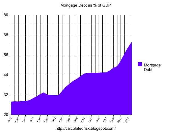
Post from 2005: Mortgage Debt and the "Recovery"
by Calculated Risk on 2/20/2017 12:49:00 PM
Here are some excerpts from a post I wrote in February 2005 (hard to believe this was 12 years ago).
Note: I think I've improved the graphs since then! From 2005:
The following chart shows household mortgage debt as a % of GDP. Although mortgage debt has been increasing for years, the last four years have seen a tremendous increase in debt. Last year alone mortgage debt increased close to $800 Billion - almost 7% of GDP.
Source: Federal Reserve
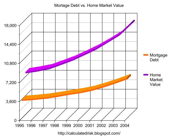
Some obervers have remarked that mortgage debt is still below 50% of household RE assets - and that is an accurate statement. In fact, if you plot mortgage debt vs. household RE assets everything looks reasonable.
Source: Federal Reserve
But lets plot household RE assets as a % of GDP.
Source: Federal Reserve
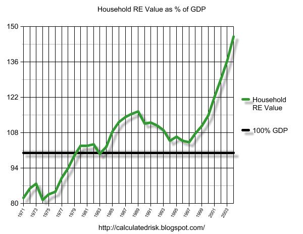
This final graph shows the potential problem. Household assets have really soared in the last few years. Many homeowners have refinanced their homes (or moved and taken cash out), in essence using their homes as an ATM.
It wouldn't take a RE bust to impact the general economy. Just a slowdown in both volume (to impact employment) and in prices (to slow down borrowing) might push the general economy into recession. An actual bust, especially with all of the extensive sub-prime lending, might cause a serious problem.
CR note: And a serious problem is what happened.
Fannie and Freddie: REO inventory declined in Q4, Down 33% Year-over-year
by Calculated Risk on 2/20/2017 10:36:00 AM
Fannie and Freddie reported results last week. Here is some information on Real Estate Owned (REOs).
Freddie Mac reported the number of REO declined to 11,418 at the end of Q4 2106 compared to 17,004 at the end of Q4 2015.
For Freddie, this is down 85% from the 74,897 peak number of REOs in Q3 2010. For Freddie, this is the lowest since at least 2007.
Fannie Mae reported the number of REO declined to 38,093 at the end of Q4 2016 compared to 57,253 at the end of Q4 2015.
For Fannie, this is down 77% from the 166,787 peak number of REOs in Q3 2010. For Fannie, this is the lowest since Q4 2007.
 Click on graph for larger image.
Here is a graph of Fannie and Freddie Real Estate Owned (REO).
REO inventory decreased in Q4 for both Fannie and Freddie, and combined inventory is down 33% year-over-year.
Delinquencies are falling, but there are still a number of properties in the foreclosure process with long time lines in judicial foreclosure states - but this is getting close to normal levels of REOs.


