by Calculated Risk on 2/13/2017 10:11:00 AM
Monday, February 13, 2017
Hotels: Solid Start to 2017
From HotelNewsNow.com: STR: US hotel results for week ending 4 February
he U.S. hotel industry reported mostly negative results in the three key performance metrics during the week of 29 January through 4 February 2017, according to data from STR.The following graph shows the seasonal pattern for the hotel occupancy rate using the four week average.
In a year-over-year comparison with the week of 31 January through 6 February 2016:
• Occupancy: -1.5% to 55.6%
• Average daily rate (ADR): +0.2% to US$119.58
• Revenue per available room (RevPAR): -1.3% to US$66.51
emphasis added
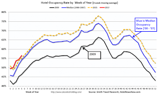 The red line is for 2017, dashed is 2015, blue is the median, and black is for 2009 - the worst year since the Great Depression for hotels.
2015 was the best year on record for hotels.
So far occupancy in 2017 is slightly ahead of 2015, and well ahead of the median rate.
For hotels, this is the slow season of the year, and occupancy will pick up into the Spring.
Data Source: STR, Courtesy of HotelNewsNow.com
Sunday, February 12, 2017
Sunday Night Futures
by Calculated Risk on 2/12/2017 07:42:00 PM
Weekend:
• Schedule for Week of Feb 12, 2017
From CNBC: Pre-Market Data and Bloomberg futures: S&P futures are up 2, and DOW futures are up 23 (fair value).
Oil prices were down over the last week with WTI futures at $53.74 per barrel and Brent at $56.56 per barrel. A year ago, WTI was at $29, and Brent was at $32 - so oil prices are up sharply year-over-year.
Here is a graph from Gasbuddy.com for nationwide gasoline prices. Nationally prices are at $2.28 per gallon - a year ago prices were at $1.70 per gallon - so gasoline prices are up almost 60 cents a gallon year-over-year.
Update: "Scariest jobs chart ever"
by Calculated Risk on 2/12/2017 12:51:00 PM
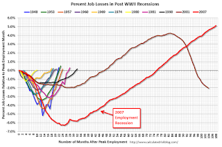
During and following the 2007 recession, every month I posted a graph showing the percent jobs lost during the recession compared to previous post-WWII recessions.
Some people started calling this the "scariest jobs chart ever". In 2009 it was pretty scary!
I retired the graph in May 2014 when employment finally exceeded the pre-recession peak.
I keep getting asked if I could post an update to the graph, and here it is through the January 2017 report.
This graph shows the job losses from the start of the employment recession, in percentage terms, compared to previous post WWII recessions. Since exceeding the pre-recession peak in May 2014, employment is now 5.2% above the previous peak.
Note: I ended the lines for most previous recessions when employment reached a new peak, although I continued the 2001 recession too on this graph. The downturn at the end of the 2001 recession is the beginning of the 2007 recession. I don't expect a downturn for employment any time soon (unlike in 2007 when I was forecasting a recession).
Saturday, February 11, 2017
Schedule for Week of Feb 12, 2017
by Calculated Risk on 2/11/2017 08:01:00 AM
The key economic reports this week are Retail Sales, Housing Starts, and the Consumer Price Index (CPI).
For manufacturing, January industrial production, and the February New York, and Philly Fed manufacturing surveys, will be released this week.
Fed Chair Janet Yellen is scheduled to deliver the Semiannual Monetary Policy Report to the Congress.
No major economic releases scheduled.
6:00 AM ET: NFIB Small Business Optimism Index for January.
8:30 AM: The Producer Price Index for January from the BLS. The consensus is for 0.3% increase in PPI, and a 0.2% increase in core PPI.
10:00 AM, Testimony by Fed Chair Janet Yellen, Semiannual Monetary Policy Report to the Congress, Before the Committee on Banking, Housing, and Urban Affairs, U.S. Senate, Washington, D.C.
7:00 AM ET: The Mortgage Bankers Association (MBA) will release the results for the mortgage purchase applications index.
 8:30 AM ET: Retail sales for January will be released. The consensus is for 0.1% increase in retail sales in January.
This graph shows retail sales since 1992 through December 2016.
8:30 AM: The Consumer Price Index for January from the BLS. The consensus is for 0.3% increase in CPI, and a 0.2% increase in core CPI.
8:30 AM ET: The New York Fed Empire State manufacturing survey for February. The consensus is for a reading of 7.5, up from 6.5.
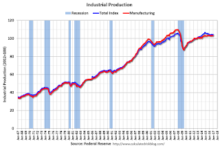 9:15 AM: The Fed will release Industrial Production and Capacity Utilization for January.
This graph shows industrial production since 1967.
The consensus is for no change in Industrial Production, and for Capacity Utilization to be unchanged at 75.5%.
10:00 AM: The February NAHB homebuilder survey. The consensus is for a reading of 68, up from 67 in January. Any number above 50 indicates that more builders view sales conditions as good than poor.
10:00 AM: Manufacturing and Trade: Inventories and Sales (business inventories) report for December. The consensus is for a 0.4% increase in inventories.
10:00 AM, Testimony by Fed Chair Janet Yellen, Semiannual Monetary Policy Report to the Congress, Before the Committee on Financial Services, U.S. House of Representatives, Washington, D.C.
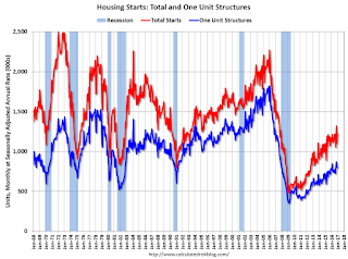 8:30 AM: Housing Starts for January.
 The consensus is for 1.232 million, up from the December rate of 1.226 million.
8:30 AM ET: The initial weekly unemployment claims report will be released. The consensus is for 246 thousand initial claims, up from 234 thousand the previous week.
8:30 AM: the Philly Fed manufacturing survey for February. The consensus is for a reading of 23.6, up from 19.3.
11:00 AM: The New York Fed will release their Q4 2016 Household Debt and Credit Report
No major economic releases scheduled.
Friday, February 10, 2017
Sacramento Housing in January: Sales up 14%, Active Inventory down 20% YoY
by Calculated Risk on 2/10/2017 06:55:00 PM
During the recession, I started following the Sacramento market to look for changes in the mix of houses sold (equity, REOs, and short sales). For several years, not much changed. But in 2012 and 2013, we saw some significant changes with a dramatic shift from distressed sales to more normal equity sales.
This data suggests healing in the Sacramento market and other distressed markets are showing similar improvement. Note: The Sacramento Association of REALTORS® started breaking out REOs in May 2008, and short sales in June 2009.
In January, total sales were up 14.3% from January 2016, and conventional equity sales were up 18.6% compared to the same month last year.
In January, 5.7% of all resales were distressed sales. This was up from 4.8% last month, and down from 9.1% in January 2016.
The percentage of REOs was at 3.2%, and the percentage of short sales was 2.5%.
Here are the statistics.

This graph shows the percent of REO sales, short sales and conventional sales.
There has been a sharp increase in conventional (equity) sales that started in 2012 (blue) as the percentage of distressed sales declined sharply.
Active Listing Inventory for single family homes decreased 19.7% year-over-year (YoY) in January. This was the 21st consecutive monthly YoY decrease in inventory in Sacramento.
Cash buyers accounted for 15.3% of all sales - this has been generally declining (frequently investors).
Summary: This data suggests a normal market with few distressed sales, and less investor buying - but with limited inventory.
Update: The Inland Empire Bust and Recovery
by Calculated Risk on 2/10/2017 04:35:00 PM
Way back in 2006 I disagreed with some analysts on the outlook for the Inland Empire in California. I wrote:
As the housing bubble unwinds, housing related employment will fall; and fall dramatically in areas like the Inland Empire. The more an area is dependent on housing, the larger the negative impact on the local economy will be.And sure enough, the economies of housing dependent areas like the Inland Empire were devastated during the housing bust. The good news is the Inland Empire is expanding solidly now.
So I think some pundits have it backwards: Instead of a strong local economy keeping housing afloat, I think the bursting housing bubble will significantly impact housing dependent local economies.
 Click on graph for larger image.
This graph shows the unemployment rate for the Inland Empire (using MSA: Riverside, San Bernardino, Ontario), and also the number of construction jobs as a percent of total employment.
The unemployment rate is falling, and is down to 5.2% (down from 14.4% in 2010). And construction employment is up from the lows (as a percent of total employment), but still somewhat low.
So the unemployment rate is back to a low level, but the economy isn't as heavily depending on construction.
Overall the Inland Empire economy is in much better shape today.
Preliminary February Consumer Sentiment declines to 95.7
by Calculated Risk on 2/10/2017 10:04:00 AM
The preliminary University of Michigan consumer sentiment index for February was at 95.7, down from 98.5 in January.
Consumer confidence retreated from the decade-peak recorded in January, with the decline centered in the Expectations Index. To be sure, confidence remains quite favorable, with only five higher readings in the past decade. Importantly, the data do not reflect any closing of the partisan divide. The Michigan survey includes several free-response questions which ask respondents to answer in their own words, without any prompting or proposed answer categories. When asked to describe any recent news that they had heard about the economy, 30% spontaneously mentioned some favorable aspect of Trump’s policies, and 29% unfavorably referred to Trump’s economic policies. Thus a total of nearly six-in-ten consumers made a positive or negative mention of government policies. In the long history of the surveys, this total had never reached even half that amount, except for five surveys in 2013 and 2014 that were solely dominated by negative references to the debt and fiscal cliff crises. Moreover, never before have these spontaneous references to economic policies had such a large impact on the Sentiment Index: a difference of 37 Index points between those that referred to favorable and unfavorable policies.
emphasis added

Click on graph for larger image.
Consumer sentiment is a concurrent indicator (not a leading indicator).
Merrill Lynch: Market Participants "underestimating the risk of an uncertainty shock to the economy"
by Calculated Risk on 2/10/2017 08:48:00 AM
A few excerpts from a piece by economist Ethan Harris at Merrill Lynch:
One of our key views is that some analysts are underestimating the risk of an uncertainty shock to the economy in the coming months. ... Thus far policy actions by President Trump have generally been positive for the markets and the economy. His most aggressive economic policy actions to date involve using appointments and executive orders to promote much lighter enforcement of existing regulations.
Beyond that, the likely path of policy remains very uncertain. ... It seems as though economists and investors have set aside these concerns as too hard to handicap.
We think this is a mistake. Until there is more clarity on policy we will remain in a very cautious mood. In particular, we think economic activity could slow and confidence could fade as consumers, investors and firms try to figure out whether they are net winners or losers from all of the policy changes.
Thursday, February 09, 2017
Prime Working-Age Population near 2007 Peak
by Calculated Risk on 2/09/2017 03:26:00 PM
The prime working age population peaked in 2007, and bottomed at the end of 2012. As of January 2017, there are still fewer people in the 25 to 54 age group than in 2007.
However the prime working age (25 to 54) will probably hit a new peak this year.
Changes in demographics are an important determinant of economic growth, and although most people focus on the aging of the "baby boomer" generation, the movement of younger cohorts into the prime working age is another key story. Here is a graph of the prime working age population (25 to 54 years old) - and prime plus (20 to 59 years old) from 1948 through January 2017.
Note: This is population, not work force.

There was a huge surge in the prime working age population in the '70s, '80s and '90s.
The prime working age labor force grew even quicker than the population in the '70s and '80s due to the increase in participation of women. In fact, the prime working age labor force was increasing 3%+ per year in the '80s!
So when we compare economic growth to the '70s, '80, or 90's we have to remember this difference in demographics (the '60s saw solid economic growth as near-prime age groups increased sharply).
The good news is the prime working age group has started to grow again, and is now growing at 0.5% per year - and this should boost economic activity. And it appears the prime working age group will exceed the previous peak this year.
If we look at the prime plus working age (20 to 59 age groups, the story is a little different. This prime plus group is still growing, but the growth will probably slow over the next few years as the younger boomers start retiring.

The cohorts with the next highest participation rates are 55 to 59 years old, and 20 to 24 years old. So these two groups are included in the first graph in the red line.
We could also add 60 to 64 too in the prime plus group (not included in first graph)
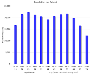
Note that 16 to 19 is only for four years; all other cohorts are five year groups.
The largest cohort is now in the 25 to 29 age group (this cohort is one reason I've been positive on rentals for the last 5+ years).
With these large cohorts moving into the prime working age - and the prime working age population growing again - this is a reason for optimism.
EIA: "U.S. energy trade with Mexico: U.S. export value more than twice import value in 2016"
by Calculated Risk on 2/09/2017 11:56:00 AM
From the EIA: U.S. energy trade with Mexico: U.S. export value more than twice import value in 2016
Energy trade between Mexico and the United States has historically been driven by Mexico’s sales of crude oil to the United States and by U.S. net exports of refined petroleum products to Mexico. Through 2014, Mexico’s exports of crude oil to the United States were the most valuable component of bilateral energy trade, with the overall value of Mexico’s U.S. crude oil sales far exceeding the value of U.S. net sales of petroleum products, primarily gasoline and diesel fuel, to Mexico. From 2006 through 2010, for example, the value of U.S. energy imports from Mexico were two to three times greater than the value of U.S. energy exports to Mexico.
The bilateral energy trade situation with Mexico has changed significantly in recent years. In 2015 and 2016, the value of U.S. energy exports to Mexico, including rapidly growing volumes of both petroleum products and natural gas, exceeded the value of U.S. energy imports from Mexico as volumes of Mexican crude oil sold in the United States continued to decline. For 2016, the value of U.S. energy exports to Mexico was $20.2 billion, while the value of U.S. energy imports from that country was $8.7 billion.
 CR Note: The recent change in energy trade with Mexico will probably come as a surprise to many.

