 RSS Feed
 by Calculated Risk on 10/23/2016 12:41:00 PM
Sunday, October 23, 2016
Vehicle Sales Forecasts: Sales Over 17 Million SAAR Again in October
The automakers will report October vehicle sales on Tuesday, November 1st.
Note: There were 26 selling days in October 2016, down from 28 in October 2015.
From WardsAuto: Forecast: October Daily Sales to Reach 15-Year High
A WardsAuto forecast calls for October U.S. light-vehicle sales to reach a 17.8 million-unit seasonally adjusted annual rate, making it the seventh month this year to surpass 17 million.From J.D. Power: New-Vehicle Retail Sales in October Slip; Sixth Monthly Decline of 2016
A 17.8 million SAAR is greatly higher than the 17.3 million recorded year-to-date through September, but does not beat the 18.1 million result recorded in the same month last year.
emphasis added
The SAAR for total sales is projected at 17.7 million units in October 2016, down from 18.1 million units a year ago.This graph shows light vehicle sales since the BEA started keeping data in 1967.
 The dashed line is the September sales rate.
Sales for 2016 - through the first nine months - were up slightly from the comparable period last year.
After increasing significantly for several years following the financial crisis, auto sales are now mostly moving sideways.
Saturday, October 22, 2016
Schedule for Week of Oct 23, 2016
by Calculated Risk on 10/22/2016 08:01:00 AM
The key economic reports this week are the advance estimate of Q3 GDP and September New Home Sales.
Also the Case-Shiller House Price Index for August will be released.
For manufacturing, the October Richmond and Kansas City Fed manufacturing surveys will be released this week.
8:30 AM ET: Chicago Fed National Activity Index for September. This is a composite index of other data.
9:00 AM: FHFA House Price Index for August 2016. This was originally a GSE only repeat sales, however there is also an expanded index. The consensus is for a 0.5% month-to-month increase for this index.
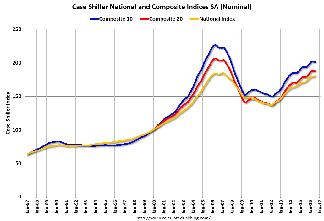 9:00 AM ET: S&P/Case-Shiller House Price Index for August. Although this is the August report, it is really a 3 month average of June, July and August prices.
This graph shows the nominal seasonally adjusted National Index, Composite 10 and Composite 20 indexes through the July 2016 report (the Composite 20 was started in January 2000).
The consensus is for a 5.1% year-over-year increase in the Comp 20 index for August. The Zillow forecast is for the National Index to increase 5.2% year-over-year in August.
10:00 AM: Richmond Fed Survey of Manufacturing Activity for October.
7:00 AM ET: The Mortgage Bankers Association (MBA) will release the results for the mortgage purchase applications index.
 10:00 AM ET: New Home Sales for September from the Census Bureau.
 This graph shows New Home Sales since 1963. The dashed line is the August sales rate.
The consensus is for an decrease in sales to 600 thousand Seasonally Adjusted Annual Rate (SAAR) in September from 609 thousand in August.
8:30 AM ET: The initial weekly unemployment claims report will be released. The consensus is for 255 thousand initial claims, down from 260 thousand the previous week. Note: I expect some further impact on claims due to Hurricane Matthew.
8:30 AM: Durable Goods Orders for September from the Census Bureau. The consensus is for a 0.2% increase in durable goods orders.
10:00 AM: Pending Home Sales Index for September. The consensus is for a 1.0% increase in the index.
10:00 AM: the Q3 Housing Vacancies and Homeownership from the Census Bureau.
11:00 AM: Kansas City Fed Survey of Manufacturing Activity for October.
8:30 AM ET: Gross Domestic Product, 3rd quarter 2016 (Advance estimate). The consensus is that real GDP increased 2.5% annualized in Q3.
10:00 AM: University of Michigan's Consumer sentiment index (final for October). The consensus is for a reading of 88.5, up from the preliminary reading 87.9.
Friday, October 21, 2016
"The Structural Factors Behind the Steady Fall in Labor Force Participation Rates of Prime Age Workers"
by Calculated Risk on 10/21/2016 05:38:00 PM
Here is some additional analysis on the labor force participation rate. Dr. Frank Lysy discusses the various reasons for the decline in the labor force participation rate for prime age workers - especially the multi-decade decline for prime working age men: The Structural Factors Behind the Steady Fall in Labor Force Participation Rates of Prime Age Workers. Here is the introduction:
Increasing attention has recently been directed to the decline in labor force participation rates observed for men over the last several decades, and for women since the late 1990s. The chart above tracks this. It has indeed been dubbed (for men) a “quiet catastrophe” in a new book by Nicholas Eberstadt titled “Men Without Work”.Dr. Lysy discusses the various reasons for the decline (disability, "Mr. Mom", more prime workers in school, etc.).
The issue has been taken up by those both on the right and on the left. Even President Obama, in one of the rare “By invitation” pieces that The Economist occasionally publishes, has highlighted the concern in an article under his name in last week’s issue (the issue of October 8). President Obama treats it as one of “four crucial areas of unfinished business” his successor will need to address. A chart similar to that above is shown. President Obama notes that in 1953, just 3% of men between the ages of 25 and 54 were not working, while the figure today is 12% (that is, the labor force participation rate fell from 97% to 88%). The share of women of the same age group not participating in the formal labor market has similarly been falling since 1999.
While Obama is careful in his wording not to say directly that all of this increase in those not working was due to “involuntary joblessness”, he does note that involuntary joblessness takes a devastating toll on those unable to find jobs. This is certainly correct. The fundamental question, however, is to what degree do we know whether the rise has been involuntary, and to what degree has it risen due to possibly more benign factors with rational choices being made.
Q3 GDP Forecasts
by Calculated Risk on 10/21/2016 02:03:00 PM
The advance GDP report for Q3 GDP will be released next Friday. The consensus is real GDP increased at a 2.5% Seasonally Adjusted Annual Rate in Q3.
From the Altanta Fed: GDPNow
The GDPNow model forecast for real GDP growth (seasonally adjusted annual rate) in the third quarter of 2016 is 2.0 percent on October 19, up from 1.9 percent on October 14.From the NY Fed Nowcasting Report
emphasis added
The FRBNY Staff Nowcast stands at 2.2% for 2016:Q3 and 1.4% for 2016:Q4.From Merrill Lynch:
We expect the first estimate of 3Q GDP to show growth of 2.5% qoq saar, an improvement from the 1.4% pace in 2Q and 0.8% gain in 1Q. Although consumer spending is expected to slow from the strong 4.3% increase in 2Q, we still expect a solid 2.6% increase in 3Q, owing to strong auto sales.CR Note: Looks like real GDP growth was around 2.0% to 2.5% in Q3.
BLS: Unemployment Rates stable in 42 states in September
by Calculated Risk on 10/21/2016 10:26:00 AM
From the BLS: Regional and State Employment and Unemployment Summary
Unemployment rates were significantly lower in September in 7 states, higher in 1 state, and stable in 42 states and the District of Columbia, the U.S. Bureau of Labor Statistics reported today.
...
New Hampshire and South Dakota had the lowest jobless rates in September, 2.9 percent each. Alaska had the highest unemployment rate, 6.9 percent.
emphasis added
 Click on graph for larger image.
This graph shows the current unemployment rate for each state (red), and the max during the recession (blue). All states are well below the maximum unemployment rate for the recession.
The size of the blue bar indicates the amount of improvement. The yellow squares are the lowest unemployment rate per state since 1976.
The states are ranked by the highest current unemployment rate. Alaska, at 6.9%, had the highest state unemployment rate. Note that the lowest unemployment rate in Alaska was 6.3%, so this is pretty close to the all time low.
 The second graph shows the number of states (and D.C.) with unemployment rates at or above certain levels since January 2006. At the worst of the employment recession, there were 11 states with an unemployment rate at or above 11% (red).
Currently no state has an unemployment rate at or above 7% (light blue); Only four states and D.C are at or above 6% (dark blue). The states are Alaska (6.9%), New Mexico (6.7%), Louisiana (6.4%), D.C. (6.1%), and Mississippi (6.0%).
"Labor force participation: what has happened since the peak?"
by Calculated Risk on 10/21/2016 08:41:00 AM
Some interesting analysis on the Labor Force Participation Rate from economist Steven Hipple at the BLS: Labor force participation: what has happened since the peak? (ht Invictus). Hipple discusses many of the trends we have discussed. (see the paper for Hipple's discussion of these trends):
After rising steadily for more than three decades, the overall labor force participation rate peaked at 67.3 percent in early 2000 and subsequently fell to 62.7 percent by mid-2016. In recent years, the movement of the baby-boom population into age groups that generally exhibit low labor force participation has placed downward pressure on the overall participation rate.CR Note: As I've mentioned before, most of the decline in the participation rate was expected, and was due to demographics and other long term trends.
From 2000 to 2015, the decline in participation occurred across most of the major demographic groups. Teenagers experienced the steepest drop in participation, which coincided with a rise in their school enrollment rate. Yet, labor force participation rates of both teenagers enrolled and not enrolled in school fell since 2000. Adults 20–24 years showed a decrease in labor force participation that was less steep than that of teenagers. The young adults least likely to participate in the labor force were those without a high school diploma, in particular young women, especially mothers.
The labor force participation of women 25–54 years also declined from 2000 to 2015. This decrease was most pronounced for women who did not attend college. Women with a college degree experienced a much smaller reduction in labor force participation. Since 2000, labor force participation of mothers with children under 18 years old has receded; the declines were larger among less-educated mothers.
The labor force participation of men 25–54 years continued to decline from 2000 to 2015. The decrease in participation among men with less education was greater than that of men with more education.
The labor force participation of men and women 55 years and older rose from 2000 to 2009 and subsequently leveled off. This plateau could be attributed partially to the fact that the oldest baby boomers reached age 62 in 2008 and became eligible for Social Security retirement benefits.
Thursday, October 20, 2016
NMHC: Apartment Market Tightness Index remained negative in October Survey
by Calculated Risk on 10/20/2016 03:39:00 PM
From the National Multifamily Housing Council (NMHC): Apartment Markets Retreat in the October NMHC Quarterly Survey
Apartment markets softened across all four indexes in the October 2016 National Multifamily Housing Council (NMHC) Quarterly Survey of Apartment Market Conditions. The Market Tightness (28), Sales Volume (42), Equity Financing (33) and Debt Financing (38) Indexes all landed below the breakeven level of 50 – showing weaker conditions from the previous quarter.
“The growing supply of new apartments, primarily in the Class A space, appears to have finally reached a level to slow the historically high rent growth. Additionally, debt and equity markets are more discerning in terms of what deals they are ready to take on, including the continued slowing of available construction loans,” said Mark Obrinsky, NMHC’s Senior Vice President of Research and Chief Economist. “Despite the softening due to the new development focus on Class A apartments, the overall fundamentals for apartments remain stable, indicated by the strong demand for Class B and C properties.”
The Market Tightness Index fell to 28, the lowest since July 2009 and the fourth quarter in a row showing declining conditions. Almost half of respondents (49 percent) reported looser conditions than three months ago. Likewise, only six percent noted tighter conditions. The remaining 45 percent reported no change at all.
emphasis added

Click on graph for larger image.
This graph shows the quarterly Apartment Tightness Index. Any reading below 50 indicates looser conditions from the previous quarter. This indicates market conditions were looser over the last quarter.
As I've mentioned before, this index helped me call the bottom for effective rents (and the top for the vacancy rate) early in 2010.
This is the fourth consecutive quarterly survey indicating looser conditions - it appears supply has caught up with demand - and I expect rent growth to slow (the vacancy rate is generally creeping up too).
A Few Comments on September Existing Home Sales
by Calculated Risk on 10/20/2016 12:12:00 PM
Earlier: Existing Home Sales increased in September to 5.47 million SAAR
Inventory remains a key issue. Here is a repeat of two paragraphs I wrote about inventory a few months ago:
I expected some increase in inventory last year, but that didn't happened. Inventory is still very low and falling year-over-year (down 6.8% year-over-year in September). More inventory would probably mean smaller price increases and slightly higher sales, and less inventory means lower sales and somewhat larger price increases.
Two of the key reasons inventory is low: 1) A large number of single family home and condos were converted to rental units. Last year, housing economist Tom Lawler estimated there were 17.5 million renter occupied single family homes in the U.S., up from 10.7 million in 2000. Many of these houses were purchased by investors, and rents have increased substantially, and the investors are not selling (even though prices have increased too). Most of these rental conversions were at the lower end, and that is limiting the supply for first time buyers. 2) Baby boomers are aging in place (people tend to downsize when they are 75 or 80, in another 10 to 20 years for the boomers). Instead we are seeing a surge in home improvement spending, and this is also limiting supply.
Of course low inventory keeps potential move-up buyers from selling too. If someone looks around for another home, and inventory is lean, they may decide to just stay and upgrade.
A key point: Some areas are seeing more inventory. For example, there is more inventory in some coastal areas of California, in New York city and for high rise condos in Miami.
I'd consider any existing home sales rate in the 5 to 5.5 million range solid based on the normal historical turnover of the existing stock. As always, it is important to remember that new home sales are more important for jobs and the economy than existing home sales. Since existing sales are existing stock, the only direct contribution to GDP is the broker's commission. There is usually some additional spending with an existing home purchase - new furniture, etc - but overall the economic impact is small compared to a new home sale.
The following graph shows existing home sales Not Seasonally Adjusted (NSA).
 Click on graph for larger image.
Sales NSA in September (red column) were the highest for September since 2006 (NSA).
Note that sales NSA are in the slower Fall period, and will really slow seasonally in January and February.
Existing Home Sales increased in September to 5.47 million SAAR
by Calculated Risk on 10/20/2016 10:12:00 AM
From the NAR: First-time Buyers Steer Existing-Home Sales Higher in September
Total existing-home sales, which are completed transactions that include single-family homes, townhomes, condominiums and co-ops, hiked 3.2 percent to a seasonally adjusted annual rate of 5.47 million in September from a downwardly revised 5.30 million in August. After last month's gain, sales are at their highest pace since June (5.57 million) and are 0.6 percent above a year ago (5.44 million)....
Total housing inventory at the end of September rose 1.5 percent to 2.04 million existing homes available for sale, but is still 6.8 percent lower than a year ago (2.19 million) and has now fallen year-over-year for 16 straight months. Unsold inventory is at a 4.5-month supply at the current sales pace, which is down from 4.6 months in August.
 Click on graph for larger image.
This graph shows existing home sales, on a Seasonally Adjusted Annual Rate (SAAR) basis since 1993.
Sales in September (5.47 million SAAR) were 3.2% higher than last month, and were 0.6% above the September 2015 rate.
The second graph shows nationwide inventory for existing homes.
 According to the NAR, inventory increased to 2.04 million in September from 2.01 million in August. Headline inventory is not seasonally adjusted, and inventory usually decreases to the seasonal lows in December and January, and peaks in mid-to-late summer.
The third graph shows the year-over-year (YoY) change in reported existing home inventory and months-of-supply. Since inventory is not seasonally adjusted, it really helps to look at the YoY change. Note: Months-of-supply is based on the seasonally adjusted sales and not seasonally adjusted inventory.
 Inventory decreased 6.8% year-over-year in September compared to September 2015.
 Months of supply was at 4.5 months in September.
This was above consensus expectations. For existing home sales, a key number is inventory - and inventory is still low. I'll have more later ...
Weekly Initial Unemployment Claims increase to 260,000
by Calculated Risk on 10/20/2016 08:35:00 AM
Note: I expected some increase this week due to Hurricane Matthew.
The DOL reported:
In the week ending October 15, the advance figure for seasonally adjusted initial claims was 260,000, an increase of 13,000 from the previous week's revised level. The previous week's level was revised up by 1,000 from 246,000 to 247,000. The 4-week moving average was 251,750, an increase of 2,250 from the previous week's revised average. The previous week's average was revised up by 250 from 249,250 to 249,500.The previous week was revised up.
There were no special factors impacting this week's initial claims. This marks 85 consecutive weeks of initial claims below 300,000, the longest streak since 1970.
The following graph shows the 4-week moving average of weekly claims since 1971.
 Click on graph for larger image.
The dashed line on the graph is the current 4-week average. The four-week average of weekly unemployment claims increased to 251,750.
This was above than the consensus forecast of 250,000. The low level of claims suggests relatively few layoffs.


