 RSS Feed
 by Calculated Risk on 6/05/2016 07:10:00 PM
Sunday, June 05, 2016
Monday: Yellen
Fed Chair Janet Yellen will speak on Monday at 12:30 PM ET. The speech may be viewed here live. This will be a key speech following the disappointing jobs report on Friday.
Monday:
• At 10:00 AM ET, The Fed will release the monthly Labor Market Conditions Index (LMCI).
• At 12:30 PM ET, Speech by Fed Chair Janet Yellen, Economic Outlook and Monetary Policy, To the World Affairs Council of Philadelphia, Philadelphia, Pa.
Weekend:
• Schedule for Week of June 5, 2016
From CNBC: Pre-Market Data and Bloomberg futures: S&P and DOW futures are up slightly (fair value).
Oil prices were down over the last week with WTI futures at $48.89 per barrel and Brent at $49.64 per barrel. A year ago, WTI was at $59, and Brent was at $60 - so prices are down almost 20% year-over-year.
Here is a graph from Gasbuddy.com for nationwide gasoline prices. Nationally prices are at $2.36 per gallon (down about $0.40 per gallon from a year ago).
Public and Private Sector Payroll Jobs: Carter, Reagan, Bush, Clinton, Bush, Obama
by Calculated Risk on 6/05/2016 11:18:00 AM
By request, here is another update of an earlier post through the May 2016 employment report including all revisions.
NOTE: Several readers have asked if I could add a lag to these graphs (obviously a new President has zero impact on employment for the month they are elected). But that would open a debate on the proper length of the lag, so I'll just stick to the beginning of each term.
Note: We frequently use Presidential terms as time markers - we could use Speaker of the House, or any other marker.
Important: There are many differences between these periods. Overall employment was smaller in the '80s, however the participation rate was increasing in the '80s (younger population and women joining the labor force), and the participation rate is generally declining now. But these graphs give an overview of employment changes.
First, here is a table for private sector jobs. The top two private sector terms were both under President Clinton. Reagan's 2nd term saw about the same job growth as during Carter's term. Note: There was a severe recession at the beginning of Reagan's first term (when Volcker raised rates to slow inflation) and a recession near the end of Carter's term (gas prices increased sharply and there was an oil embargo).
| Term | Private Sector Jobs Added (000s) |
|---|---|
| Carter | 9,041 |
| Reagan 1 | 5,360 |
| Reagan 2 | 9,357 |
| GHW Bush | 1,510 |
| Clinton 1 | 10,884 |
| Clinton 2 | 10,082 |
| GW Bush 1 | -811 |
| GW Bush 2 | 415 |
| Obama 1 | 1,921 |
| Obama 2 | 8,3851 |
| 140 months into 2nd term: 10,062 pace. | |
The first graph shows the change in private sector payroll jobs from when each president took office until the end of their term(s). Presidents Carter and George H.W. Bush only served one term, and President Obama is in the fourth year of his second term.
Mr. G.W. Bush (red) took office following the bursting of the stock market bubble, and left during the bursting of the housing bubble. Mr. Obama (blue) took office during the financial crisis and great recession. There was also a significant recession in the early '80s right after Mr. Reagan (yellow) took office.
There was a recession towards the end of President G.H.W. Bush (purple) term, and Mr Clinton (light blue) served for eight years without a recession.
 Click on graph for larger image.
The first graph is for private employment only.
The employment recovery during Mr. G.W. Bush's (red) first term was sluggish, and private employment was down 811,000 jobs at the end of his first term. At the end of Mr. Bush's second term, private employment was collapsing, and there were net 396,000 private sector jobs lost during Mr. Bush's two terms.
Private sector employment increased slightly under President G.H.W. Bush (purple), with 1,510,000 private sector jobs added.
Private sector employment increased by 20,966,000 under President Clinton (light blue), by 14,717,000 under President Reagan (yellow), and 9,041,000 under President Carter (dashed green).
There were only 1,921,000 more private sector jobs at the end of Mr. Obama's first term. Forty months into Mr. Obama's second term, there are now 10,306,000 more private sector jobs than when he initially took office.
 A big difference between the presidencies has been public sector employment. Note the bumps in public sector employment due to the decennial Census in 1980, 1990, 2000, and 2010.
 The public sector grew during Mr. Carter's term (up 1,304,000), during Mr. Reagan's terms (up 1,414,000), during Mr. G.H.W. Bush's term (up 1,127,000), during Mr. Clinton's terms (up 1,934,000), and during Mr. G.W. Bush's terms (up 1,744,000 jobs).
However the public sector has declined significantly since Mr. Obama took office (down 503,000 jobs). This has been a significant drag on overall employment.
And a table for public sector jobs. Public sector jobs declined the most during Obama's first term, and increased the most during Reagan's 2nd term.
| Term | Public Sector Jobs Added (000s) |
|---|---|
| Carter | 1,304 |
| Reagan 1 | -24 |
| Reagan 2 | 1,438 |
| GHW Bush | 1,127 |
| Clinton 1 | 692 |
| Clinton 2 | 1,242 |
| GW Bush 1 | 900 |
| GW Bush 2 | 844 |
| Obama 1 | -708 |
| Obama 2 | 2051 |
| 140 months into 2nd term, 246 pace | |
Looking forward, I expect the economy to continue to expand through 2016 (at least), so I don't expect a sharp decline in private employment as happened at the end of Mr. Bush's 2nd term (In 2005 and 2006 I was warning of a coming down turn due to the bursting of the housing bubble - and I predicted a recession in 2007).
For the public sector, the cutbacks are clearly over. Right now I'm expecting some increase in public employment during the remainder of Obama's 2nd term, but nothing like what happened during Reagan's second term.
Below is a table of the top three presidential terms for private job creation (they also happen to be the three best terms for total non-farm job creation).
Clinton's two terms were the best for both private and total non-farm job creation, followed by Reagan's 2nd term.
Currently Obama's 2nd term is on pace to be the 3rd best ever for private job creation. However, with very few public sector jobs added, Obama's 2nd term is only on pace to be the fourth best for total job creation.
Note: Only 205 thousand public sector jobs have been added during the first forty months of Obama's 2nd term (following a record loss of 708 thousand public sector jobs during Obama's 1st term). This is about 15% of the public sector jobs added during Reagan's 2nd term!
| Top Employment Gains per Presidential Terms (000s) | ||||
|---|---|---|---|---|
| Rank | Term | Private | Public | Total Non-Farm |
| 1 | Clinton 1 | 10,884 | 692 | 11,576 |
| 2 | Clinton 2 | 10,082 | 1,242 | 11,312 |
| 3 | Reagan 2 | 9,357 | 1,438 | 10,795 |
| Obama 21 | 8,385 | 205 | 8,590 | |
| Pace2 | 10,062 | 246 | 10,308 | |
| 140 Months into 2nd Term 2Current Pace for Obama's 2nd Term | ||||
The last table shows the jobs needed per month for Obama's 2nd term to be in the top three presidential terms. Right now it looks like Obama's 2nd term will be in the top 3 for private employment, but not for total employment.
| Average Jobs needed per month (000s) for remainder of Obama's 2nd Term | ||||
|---|---|---|---|---|
| to Rank | Private | Total | ||
| #1 | 312 | 373 | ||
| #2 | 212 | 342 | ||
| #3 | 122 | 276 | ||
Saturday, June 04, 2016
Schedule for Week of June 5, 2016
by Calculated Risk on 6/04/2016 08:09:00 AM
This will be a light week for economic data.
Fed Chair Janet Yellen will speak on Monday.
The Census Bureau will release the Q1 Quarterly Services Report on Wednesday, and the Fed will release the Q1 Flow of Funds report on Thursday.
10:00 AM ET: The Fed will release the monthly Labor Market Conditions Index (LMCI).
12:30 PM ET, Speech by Fed Chair Janet Yellen, Economic Outlook and Monetary Policy, To the World Affairs Council of Philadelphia, Philadelphia, Pa.
3:00 PM: Consumer credit from the Federal Reserve. The consensus is for a $18.0 billion increase in credit.
7:00 AM ET: The Mortgage Bankers Association (MBA) will release the results for the mortgage purchase applications index.
 10:00 AM: Job Openings and Labor Turnover Survey for April from the BLS.
 This graph shows job openings (yellow line), hires (purple), Layoff, Discharges and other (red column), and Quits (light blue column) from the JOLTS.
Jobs openings increased in March to 5.757 million from 5.608 million in February.
The number of job openings (yellow) were up 11% year-over-year, and Quits were up 9% year-over-year.
10:00 AM: The Q1 Quarterly Services Report from the Census Bureau.
8:30 AM: The initial weekly unemployment claims report will be released. The consensus is for 270 thousand initial claims, up from 267 thousand the previous week.
10:00 AM: Monthly Wholesale Trade: Sales and Inventories for April. The consensus is for a 0.1% increase in inventories.
12:00 PM: Q1 Flow of Funds Accounts of the United States from the Federal Reserve.
2:00 PM: The Monthly Treasury Budget Statement for May.
10:00 AM: University of Michigan's Consumer sentiment index (preliminary for June). The consensus is for a reading of 94.5, down from 94.7 in May.
Friday, June 03, 2016
Payroll Employment: Best Years, Worst Month
by Calculated Risk on 6/03/2016 05:22:00 PM
A couple of years ago - when there was a disappointing jobs report - I called out the people calling it a "disaster".
Here is my post from 2014: Payroll Employment: Best Years, Worst Month
In that post I noted that there were strong employment years with some weak employment months. Sure enough, 2014 saw strong employment growth of over 3 million jobs. Some "disaster"!
Other examples: In 1983, there was a month with 308 thousand jobs lost - but it was a strong year for employment gains. Or 1997, another strong year, with 31 thousand jobs lost in one month.
Job growth has slowed so far in 2016, but I still think we will see over 2 million jobs added this year.
Here is a table of the best years for job growth since 1980 with the worst month of the year (this is after revisions). Obviously there is a significant amount of volatility month-to-month in the employment report.
| Non-Farm Payroll: Best Years, Worst Month | ||
|---|---|---|
| Year | Annual (000s) | Worst Month (000s) |
| 1984 | 3,880 | 128 |
| 1994 | 3,852 | 200 |
| 1983 | 3,458 | -308 |
| 1997 | 3,407 | -31 |
| 1988 | 3,242 | 94 |
| 1999 | 3,179 | 107 |
| 1987 | 3,153 | 171 |
| 1998 | 3,047 | 129 |
| 2014 | 3,015 | 168 |
| 1996 | 2,825 | -19 |
| 1993 | 2,816 | -49 |
| 2015 | 2,744 | 84 |
| 2005 | 2,514 | 68 |
| 1985 | 2,502 | 124 |
| 2013 | 2,311 | 45 |
| 1995 | 2,158 | -15 |
| 2012 | 2,149 | 75 |
| 2006 | 2,092 | 4 |
| 2011 | 2,087 | 42 |
| 2004 | 2,042 | 44 |
| 2000 | 1,951 | -47 |
| 1989 | 1,943 | 40 |
| 1986 | 1,902 | -94 |
| 20161 | 1,795 | 38 |
| 12016 is the hiring pace through May. | ||
Earlier: ISM Non-Manufacturing Index decreased to 52.9% in May
by Calculated Risk on 6/03/2016 03:15:00 PM
Earlier: The May ISM Non-manufacturing index was at 52.9%, down from 55.7% in April. The employment index decreased in May to 49.7%, down from 53.0% in April. Note: Above 50 indicates expansion, below 50 contraction.
From the Institute for Supply Management:May 2016 Non-Manufacturing ISM Report On Business®
Economic activity in the non-manufacturing sector grew in May for the 76th consecutive month, say the nation's purchasing and supply executives in the latest Non-Manufacturing ISM® Report On Business®.
The report was issued today by Anthony Nieves, CPSM, C.P.M., CFPM, chair of the Institute for Supply Management® (ISM®) Non-Manufacturing Business Survey Committee. "The NMI® registered 52.9 percent in May, 2.8 percentage points lower than the April reading of 55.7 percent. This represents continued growth in the non-manufacturing sector at a slower rate. The Non-Manufacturing Business Activity Index decreased to 55.1 percent, 3.7 percentage points lower than the April reading of 58.8 percent, reflecting growth for the 82nd consecutive month, at a slower rate in May. The New Orders Index registered 54.2 percent, 5.7 percentage points lower than the reading of 59.9 percent in April. The Employment Index decreased 3.3 percentage points to 49.7 percent from the April reading of 53 percent and indicates contraction after two consecutive months of growth. The Prices Index increased 2.2 percentage points from the April reading of 53.4 percent to 55.6 percent, indicating prices increased in May for the second consecutive month. According to the NMI®, 14 non-manufacturing industries reported growth in May. Respondents’ comments are mixed and vary by industry and company. Overall, the report reflects a cooling-off and slowing in momentum from the previous months of growth for the non-manufacturing sector."
emphasis added
 Click on graph for larger image.
This graph shows the ISM non-manufacturing index (started in January 2008) and the ISM non-manufacturing employment diffusion index.
This was below the consensus forecast of 55.5, and suggests slower expansion in May than in April.
Note that the employment index was especially weak; similar to the BLS employment report.
Trade Deficit at $37.4 Billion in April
by Calculated Risk on 6/03/2016 12:31:00 PM
Earlier the Department of Commerce reported:
The U.S. Census Bureau and the U.S. Bureau of Economic Analysis, through the Department of Commerce, announced today that the goods and services deficit was $37.4 billion in April, up $1.9 billion from $35.5 billion in March, revised. April exports were $182.8 billion, $2.6 billion more than March exports. April imports were $220.2 billion, $4.5 billion more than March imports.The trade deficit was smaller than the consensus forecast of $41.0 billion.
Note: There were major revisions in this report, mostly exports were revised up for the last several years.
The first graph shows the monthly U.S. exports and imports in dollars through April 2016.
 Click on graph for larger image.
Both imports and exports increased in April.
Exports are 11% above the pre-recession peak and down 5% compared to April 2015; imports are 5% below the pre-recession peak, and down 5% compared to April 2015.
The second graph shows the U.S. trade deficit, with and without petroleum.
 The blue line is the total deficit, and the black line is the petroleum deficit, and the red line is the trade deficit ex-petroleum products.
Oil imports averaged $29.48 in April, up from $27.68 in March, and down from $46.47 in April 2015. The petroleum deficit has generally been declining and is the major reason the overall deficit has declined a little since early 2012.
The trade deficit with China decreased to $24.3 billion in April, from $26.8 billion in April 2015. (Note that there were labor issues last year, and the ships were unloaded in March and April - pushing up imports from China). The deficit with China is a substantial portion of the overall deficit.
Comments: A Disappointing Employment Report
by Calculated Risk on 6/03/2016 09:41:00 AM
The headline jobs number was very disappointing, and there were downward revisions to job growth for prior months. The key negatives were few jobs added (only 38 thousand, although the Verizon strike cut the job growth by about 37 thousand), a decline in the participation rate, and a sharp increase in the number of people working part time for economic reasons.
A few positives include wage growth, a lower unemployment rate (however, for the wrong reason - a lower participation rate), and fewer long term unemployed.
Earlier: May Employment Report: 38,000 Jobs, 4.7% Unemployment Rate
In May, the year-over-year change was 2.40 million jobs.
Average Hourly Earnings
 This graph is based on “Average Hourly Earnings” from the Current Employment Statistics (CES) (aka "Establishment") monthly employment report. Note: There are also two quarterly sources for earnings data: 1) “Hourly Compensation,” from the BLS’s Productivity and Costs; and 2) the Employment Cost Index which includes wage/salary and benefit compensation.
On a monthly basis, wages increased at a 2.4% annual rate in May, and April was revised up.
The graph shows the nominal year-over-year change in "Average Hourly Earnings" for all private employees. Nominal wage growth was at 2.5% YoY in May. This series is noisy, however overall wage growth is trending up.
Note: CPI has been running under 2%, so there has been real wage growth.
Part Time for Economic Reasons
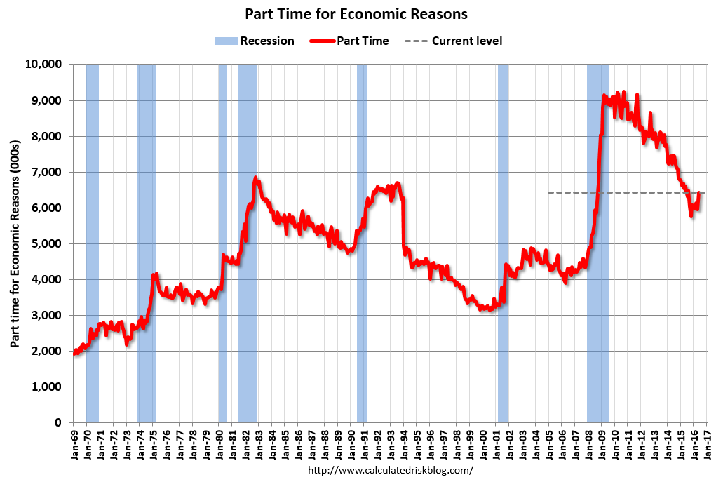 From the BLS report:
The number of persons employed part time for economic reasons (also referred to as involuntary part-time workers) increased by 468,000 to 6.4 million in May, after showing little movement since November. These individuals, who would have preferred full-time employment, were working part time because their hours had been cut back or because they were unable to find a full-time job.The number of persons working part time for economic reasons increased sharply in May. This level suggests slack still in the labor market.
These workers are included in the alternate measure of labor underutilization (U-6) that was unchanged at 9.7% in May.
Unemployed over 26 Weeks
 This graph shows the number of workers unemployed for 27 weeks or more.
 According to the BLS, there are 1.885 million workers who have been unemployed for more than 26 weeks and still want a job. This was down from 2.063 million in April, and the lowest since July 2008.
This is generally trending down, but is still high.
There are still signs of slack (as example, part time workers for economic reasons increase sharply, and elevated U-6), but there also signs the labor market is tightening (decline in long term unemployed, slight pickup in wages).
Overall this was a disappointing report.
May Employment Report: 38,000 Jobs, 4.7% Unemployment Rate
by Calculated Risk on 6/03/2016 08:43:00 AM
From the BLS:
The unemployment rate declined by 0.3 percentage point to 4.7 percent in May, and nonfarm payroll employment changed little (+38,000), the U.S. Bureau of Labor Statistics reported today. Employment increased in health care. Mining continued to lose jobs, and employment in information decreased due to a strike.
...
The change in total nonfarm payroll employment for March was revised from +208,000 to +186,000, and the change for April was revised from +160,000 to +123,000. With these revisions, employment gains in March and April combined were 59,000 less than previously reported. Over the past 3 months, job gains have averaged 116,000 per month.
...
In May, average hourly earnings for all employees on private nonfarm payrolls increased by 5 cents to $25.59, following an increase of 9 cents in April. Over the year, average hourly earnings have risen by 2.5 percent.
emphasis added
 Click on graph for larger image.
The first graph shows the monthly change in payroll jobs, ex-Census (meaning the impact of the decennial Census temporary hires and layoffs is removed - mostly in 2010 - to show the underlying payroll changes).
Total payrolls increased by 38 thousand in May (private payrolls increased 25 thousand).
Payrolls for March and April were revised down by a combined 59 thousand.
 This graph shows the year-over-year change in total non-farm employment since 1968.
In May, the year-over-year change was 2.39 million jobs. A solid gain.
The third graph shows the employment population ratio and the participation rate.
 The Labor Force Participation Rate decreased in May to 62.6%. This is the percentage of the working age population in the labor force. A large portion of the recent decline in the participation rate is due to demographics.
 The Employment-Population ratio was unchanged at 59.7% (black line).
I'll post the 25 to 54 age group employment-population ratio graph later.
 The fourth graph shows the unemployment rate.
 The unemployment rate declined in May to 4.7%.
This was way below expectations of 158,000 jobs.
I'll have much more later ...
Thursday, June 02, 2016
Friday: Jobs and Wages, Trade Deficit
by Calculated Risk on 6/02/2016 08:01:00 PM
Here is the BLS Strike Report (mentioned earlier). The report shows 35,100 Verizon workers on strike during the May reference period.
Earlier on the payroll report:
From CR: Preview of May Employment Report
And The Verizon Strike and the May Employment Report
And Goldman's May NFP Preview
"We forecast that nonfarm payroll employment increased by 165,000 in May [and] the U3 unemployment rate to decline to 4.9% [and] Average hourly earnings likely rose at a trend-like pace of 0.2% last month."Friday:
• At 8:30 AM ET, the Employment Report for May. The consensus is for an increase of 158,000 non-farm payroll jobs added in May, down from the 160,000 non-farm payroll jobs added in April. The consensus is for the unemployment rate to decline to 4.9%.
• Also at 8:30 AM, the Trade Balance report for April from the Census Bureau. The consensus is for the U.S. trade deficit to be at $41.0 billion in April from $40.4 billion in March.
• At 10:00 AM, the ISM non-Manufacturing Index for May. The consensus is for index to decrease to 55.5 from 55.7 in April.
• Also at 10:00 AM, Manufacturers' Shipments, Inventories and Orders (Factory Orders) for April. The consensus is a 2.0% increase in orders.
Preview of May Employment Report
by Calculated Risk on 6/02/2016 03:56:00 PM
On Friday at 8:30 AM ET, the BLS will release the employment report for May. The consensus, according to Bloomberg, is for an increase of 158,000 non-farm payroll jobs in May (with a range of estimates between 110,000 to 219,000, and for the unemployment rate to decline to 4.9%.
The BLS reported 160,000 jobs added in April.
Verizon Strike Note: See my previous post, but it appears the strike will reduce the NFP total by about 40,000 jobs in May. Since the strike has been settled, these jobs will be added back in June.
Here is a summary of recent data:
• The ADP employment report showed an increase of 173,000 private sector payroll jobs in May. This was close to expectations of 175,000 private sector payroll jobs added. The ADP report hasn't been very useful in predicting the BLS report for any one month, but in general, this suggests employment growth close to expectations.
• The ISM manufacturing employment index was unchanged in May at 49.2%. A historical correlation between the ISM manufacturing employment index and the BLS employment report for manufacturing, suggests that private sector BLS manufacturing payroll jobs decreased about 25,000 in May. The ADP report indicated 3,000 fewer manufacturing jobs. Note: Recently the ADP has been a better predictor for BLS reported manufacturing employment than the ISM survey.
The ISM non-manufacturing employment index for May will be released tomorrow.
• Initial weekly unemployment claims averaged 276,000 in May, up from 256,000 in April, and the lowest 4-week average since 1973. For the BLS reference week (includes the 12th of the month), initial claims were at 278,000, up from 247,000 during the reference week in April.
The increase during the reference suggests more layoffs in May as compared to April, however some of the increase is probably due to the Verizon strike.
• The final May University of Michigan consumer sentiment index increased to 94.7 from the April reading of 89.0. Sentiment is frequently coincident with changes in the labor market, but there are other factors too - like gasoline prices.
• Conclusion: Unfortunately none of the indicators above is very good at predicting the initial BLS employment report. The ADP report suggest a consensus report, and unemployment claims suggest weaker job growth.
My guess is the May report will be below the consensus forecast.


