by Calculated Risk on 2/24/2016 09:06:00 PM
Wednesday, February 24, 2016
Thursday: Unemployment Claims, Durable Goods
Thursday:
• At 8:30 AM ET, The initial weekly unemployment claims report will be released. The consensus is for 270 thousand initial claims, up from 262 thousand the previous week.
• Also at 8:30 AM, Durable Goods Orders for January from the Census Bureau. The consensus is for a 2.0% increase in durable goods orders.
• At 9:00 AM, FHFA House Price Index for December 2015. This was originally a GSE only repeat sales, however there is also an expanded index. The consensus is for a 0.5% month-to-month increase for this index.
• At 11:00 AM, the Kansas City Fed manufacturing survey for February.
Vehicle Sales Forecast: Sales to Reach 15-Year High for a February
by Calculated Risk on 2/24/2016 03:55:00 PM
The automakers will report February vehicle sales on Tuesday, March 1st.
Note: There were 24 selling days in February, unchanged from 24 in February 2015.
From WardsAuto: Forecast: February Sales Set to Reach 15-Year High
A WardsAuto forecast calls for U.S. automakers to deliver 1.34 million light vehicles in February, a 15-year high for the month. The forecasted daily sales rate of 55,868 over 24 days represents a 7.1% improvement from like-2015 (also 24 days).And from J.D. Power: New-Vehicle Sales in February Expected to Increase 8.1%
The report puts the seasonally adjusted annual rate of sales for the month at 17.50 million units, compared with year-ago’s 16.32 million and January’s 17.45 million mark.
emphasis added
New-vehicle sales in February 2016 are expected to increase 8.1% from a year ago, according to a monthly sales forecast developed jointly by J.D. Power and LMC Automotive.Looks like another strong month for car sales.
New-vehicle retail sales in February are projected to reach 1,046,700 units from 968,316 in February 2015, with the same number of selling days (24 days).
...
The SAAR for total sales is projected to reach 17.7 million units in February 2016, up 1.4 million units from 16.4 million a year ago and the highest rate since 2000 (18.9 million).
Comments on January New Home Sales
by Calculated Risk on 2/24/2016 01:48:00 PM
The new home sales report for January was below expectations at 494,000 on a seasonally adjusted annual rate basis (SAAR), however combined sales for October, November and December were revised up.
Sales were down 5.2% year-over-year (YoY) compared to January 2015. However, we have to remember January 2015 was a pretty strong month at 521,000 SAAR. Sales for all of 2015 were 501,000 (up 14.5% from 2014) - and since January (and February) were especially strong months last year, the YoY comparison is difficult.
Earlier: New Home Sales decreased to 494,000 Annual Rate in January.

This graph shows new home sales for 2015 and 2016 by month (Seasonally Adjusted Annual Rate).
The comparisons in early 2016 are difficult. And I also expect lower growth this year.
Houston (and other oil producing areas) will have a problem this year. Inventory of existing homes is increasing quickly and prices will probably decline in those areas. And that means new home construction will slow in those areas too.
And here is another update to the "distressing gap" graph that I first started posting a number of years ago to show the emerging gap caused by distressed sales. Now I'm looking for the gap to close over the next few years.
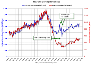
Following the housing bubble and bust, the "distressing gap" appeared mostly because of distressed sales.
I expect existing home sales to move more sideways, and I expect this gap to slowly close, mostly from an increase in new home sales.
However, this assumes that the builders will offer some smaller, less expensive homes.
Note: Existing home sales are counted when transactions are closed, and new home sales are counted when contracts are signed. So the timing of sales is different.
New Home Sales decreased to 494,000 Annual Rate in January
by Calculated Risk on 2/24/2016 10:13:00 AM
The Census Bureau reports New Home Sales in January were at a seasonally adjusted annual rate (SAAR) of 494 thousand.
The previous three months were revised up by a total of 28 thousand (SAAR).
"Sales of new single-family houses in January 2016 were at a seasonally adjusted annual rate of 494,000, according to estimates released jointly today by the U.S. Census Bureau and the Department of Housing and Urban Development. This is 9.2 percent below the revised December rate of 544,000 and is 5.2 percent below the January 2015 estimate of 521,000."
emphasis added
 Click on graph for larger image.
The first graph shows New Home Sales vs. recessions since 1963. The dashed line is the current sales rate.
Even with the increase in sales since the bottom, new home sales are still fairly low historically.
The second graph shows New Home Months of Supply.
 The months of supply increased in January to 5.8 months.
 The all time record was 12.1 months of supply in January 2009.
This is now in the normal range (less than 6 months supply is normal).
"The seasonally adjusted estimate of new houses for sale at the end of January was 238,000. This represents a supply of 5.8 months at the current sales rate."
 On inventory, according to the Census Bureau:
 "A house is considered for sale when a permit to build has been issued in permit-issuing places or work has begun on the footings or foundation in nonpermit areas and a sales contract has not been signed nor a deposit accepted."Starting in 1973 the Census Bureau broke this down into three categories: Not Started, Under Construction, and Completed.
The third graph shows the three categories of inventory starting in 1973.
The inventory of completed homes for sale is still low, and the combined total of completed and under construction is also low.
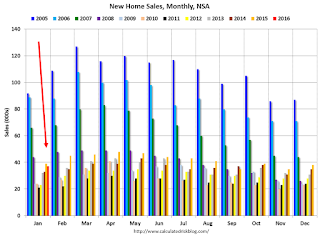 The last graph shows sales NSA (monthly sales, not seasonally adjusted annual rate).
In January 2016 (red column), 37 thousand new homes were sold (NSA). Last year 39 thousand homes were sold in January.
The all time high for January was 92 thousand in 2005, and the all time low for January was 21 thousand in 2011.
This was below expectations of 520,000 sales SAAR in January, however prior months were revised up slightly - although sales were down year-over-year. Still a decent report. I'll have more later today.
MBA: Mortgage Applications Decreased in Latest Weekly Survey, Purchase Applications up 27% YoY
by Calculated Risk on 2/24/2016 07:00:00 AM
From the MBA: Mortgage Applications Decrease in Latest MBA Weekly Survey
Mortgage applications decreased 4.3 percent from one week earlier, according to data from the Mortgage Bankers Association’s (MBA) Weekly Mortgage Applications Survey for the week ending February 19, 2016. This week’s results include an adjustment to account for the President’s Day holiday.
...
The Refinance Index decreased 8 percent from the previous week. The seasonally adjusted Purchase Index increased 2 percent from one week earlier. The unadjusted Purchase Index decreased 4 percent compared with the previous week and was 27 percent higher than the same week one year ago.
...
The average contract interest rate for 30-year fixed-rate mortgages with conforming loan balances ($417,000 or less) increased to 3.85 percent from 3.83 percent, with points increasing to 0.42 from 0.36 (including the origination fee) for 80 percent loan-to-value ratio (LTV) loans.
emphasis added
 Click on graph for larger image.
The first graph shows the refinance index since 1990.
Refinance activity was higher in 2015 than in 2014, but it was still the third lowest year since 2000.
Refinance activity has picked up recently as rates have declined.
 The second graph shows the MBA mortgage purchase index.
 According to the MBA, the unadjusted purchase index is 27% higher than a year ago.
Tuesday, February 23, 2016
Real Prices and Price-to-Rent Ratio in December
by Calculated Risk on 2/23/2016 06:39:00 PM
Here is the earlier post on Case-Shiller: Case-Shiller: National House Price Index increased 5.4% year-over-year in December
The year-over-year increase in prices is mostly moving sideways now around 5%. In December 2015, the index was up 5.4% YoY.
In the earlier post, I graphed nominal house prices, but it is also important to look at prices in real terms (inflation adjusted). Case-Shiller, CoreLogic and others report nominal house prices. As an example, if a house price was $200,000 in January 2000, the price would be close to $274,000 today adjusted for inflation (37%). That is why the second graph below is important - this shows "real" prices (adjusted for inflation).
It has been almost ten years since the bubble peak. In the Case-Shiller release this morning, the National Index was reported as being 3.7% below the bubble peak. However, in real terms, the National index is still about 18% below the bubble peak.
Nominal House Prices

In nominal terms, the Case-Shiller National index (SA) is back to October 2005 levels, and the Case-Shiller Composite 20 Index (SA) is back to April 2005 levels, and the CoreLogic index (NSA) is back to June 2005.
Real House Prices

In real terms, the National index is back to December 2003 levels, the Composite 20 index is back to September 2003, and the CoreLogic index back to December 2004.
In real terms, house prices are back to 2003 levels.
Note: CPI less Shelter is down 0.6% year-over-year, so this has been pushing up real prices recently.
Price-to-Rent
In October 2004, Fed economist John Krainer and researcher Chishen Wei wrote a Fed letter on price to rent ratios: House Prices and Fundamental Value. Kainer and Wei presented a price-to-rent ratio using the OFHEO house price index and the Owners' Equivalent Rent (OER) from the BLS.
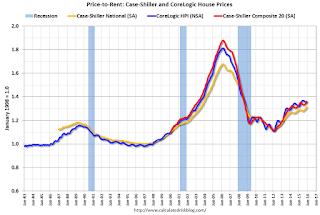
This graph shows the price to rent ratio (January 1998 = 1.0).
On a price-to-rent basis, the Case-Shiller National index is back to August 2003 levels, the Composite 20 index is back to April 2003 levels, and the CoreLogic index is back to July 2003.
In real terms, and as a price-to-rent ratio, prices are back to 2003 levels - and the price-to-rent ratio maybe moving a little sideways now.
A Few Comments on January Existing Home Sales
by Calculated Risk on 2/23/2016 03:56:00 PM
The January existing home sales report was stronger than expected, and even slightly stronger than the December report (that included a rebound from the decline in November related to the new TILA-RESPA Integrated Disclosure (TRID)). Note: TILA: Truth in Lending Act, and RESPA: the Real Estate Settlement Procedures Act of 1974.
Going forward, there are some economic reasons for some softness in existing home sales in certain areas. Low inventory is probably holding down sales in many areas, and there will be weakness in some oil producing areas (see: Houston has a problem).
Earlier: Existing Home Sales increased in January to 5.47 million SAAR
I expected some increase in inventory last year, but that didn't happened. Inventory is still very low and falling year-over-year (down 2.2% year-over-year in January). More inventory would probably mean smaller price increases and slightly higher sales, and less inventory means lower sales and somewhat larger price increases.
The following graph shows existing home sales Not Seasonally Adjusted (NSA).

Sales NSA in January (red column) were the highest since January 2007 (NSA).
This is a solid start to 2016.
Chemical Activity Barometer "Slips" in February
by Calculated Risk on 2/23/2016 12:42:00 PM
Here is an indicator that I'm following that appears to be a leading indicator for industrial production.
From the American Chemistry Council: Chemical Activity Barometer Slips in February
The Chemical Activity Barometer (CAB), a leading economic indicator created by the American Chemistry Council (ACC), slipped 0.1 percent in February following flat performance in January and two months of revised gains in November and December 2015. All data is measured on a three-month moving average (3MMA). Accounting for adjustments, the CAB remains up 1.5 percent over this time last year, a decline of fifty-percent from activity of one year ago when the barometer logged a 3.0 percent year-over-year gain from February 2014. On an unadjusted basis the CAB rose 0.1 percent following two consecutive monthly declines.
...
Applying the CAB back to 1919, it has been shown to provide a lead of two to 14 months, with an average lead of eight months at cycle peaks as determined by the National Bureau of Economic Research. The median lead was also eight months. At business cycle troughs, the CAB leads by one to seven months, with an average lead of four months. The median lead was three months. The CAB is rebased to the average lead (in months) of an average 100 in the base year (the year 2012 was used) of a reference time series. The latter is the Federal Reserve’s Industrial Production Index.
emphasis added
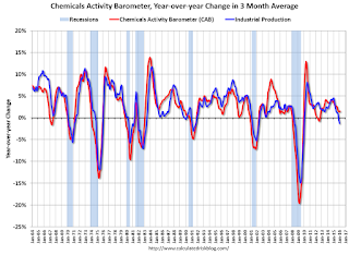 Click on graph for larger image.
This graph shows the year-over-year change in the 3-month moving average for the Chemical Activity Barometer compared to Industrial Production. It does appear that CAB (red) generally leads Industrial Production (blue).
Currently CAB is up slightly year-over-year, and this suggests a slight increase in Industrial Production over the next year is possible.
Existing Home Sales increased in January to 5.47 million SAAR
by Calculated Risk on 2/23/2016 10:10:00 AM
From the NAR: Existing-Home Sales Inch Forward in January, Price Growth Accelerates
Total existing-home sales, which are completed transactions that include single-family homes, townhomes, condominiums and co-ops, inched 0.4 percent to a seasonally adjusted annual rate of 5.47 million in January from a downwardly revised 5.45 million in December. Sales are now 11.0 percent higher than a year ago – the largest year-over-year gain since July 2013 (16.3 percent)....
Total housing inventory at the end of January increased 3.4 percent to 1.82 million existing homes available for sale, but is still 2.2 percent lower than a year ago (1.86 million). Unsold inventory is at a 4.0-month supply at the current sales pace, up slightly from 3.9 months in December 2015.
 Click on graph for larger image.
This graph shows existing home sales, on a Seasonally Adjusted Annual Rate (SAAR) basis since 1993.
Sales in January (5.47 million SAAR) were 0.4% hgiher than last month, and were 11.0% above the January 2015 rate.
The second graph shows nationwide inventory for existing homes.
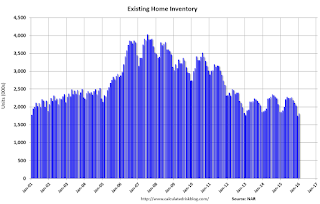 According to the NAR, inventory increased to 1.82 million in January from 1.76 million in December. Headline inventory is not seasonally adjusted, and inventory usually decreases to the seasonal lows in December and January, and peaks in mid-to-late summer.
The third graph shows the year-over-year (YoY) change in reported existing home inventory and months-of-supply. Since inventory is not seasonally adjusted, it really helps to look at the YoY change. Note: Months-of-supply is based on the seasonally adjusted sales and not seasonally adjusted inventory.
 Inventory decreased 2.2% year-over-year in January compared to January 2015.
 Months of supply was at 4.0 months in January.
This was above consensus expectations of sales of 5.32 million. For existing home sales, a key number is inventory - and inventory is still low. I'll have more later ...
Case-Shiller: National House Price Index increased 5.4% year-over-year in December
by Calculated Risk on 2/23/2016 09:21:00 AM
S&P/Case-Shiller released the monthly Home Price Indices for December ("December" is a 3 month average of October, November and December prices).
This release includes prices for 20 individual cities, two composite indices (for 10 cities and 20 cities) and the monthly National index.
Note: Case-Shiller reports Not Seasonally Adjusted (NSA), I use the SA data for the graphs.
From S&P: Home Prices Marginally Increased in December According to the S&P/Case-Shiller Home Price Indices
The S&P/Case-Shiller U.S. National Home Price Index, covering all nine U.S. census divisions, recorded a slightly higher year-over-year gain with a 5.4% annual increase in December 2015 versus a 5.2% increase in November 2015. The 10-City Composite increased 5.1% in the year to December compared to 5.2% previously. The 20-City Composite’s year-over-year gain was 5.7%, the same as November.
...
Before seasonal adjustment, the National Index posted a gain of 0.1% month-over-month in December. The 10- City Composite decreased by 0.1% and the 20-City Composite remained unchanged in December. After seasonal adjustment, the National and 20-City Composites Index both recorded a monthly increase of 0.8%. The 10-City Composite increased 0.7% month-over-month in December. Ten of 20 cities reported increases in December before seasonal adjustment; after seasonal adjustment, all 19 cities increased for the month.
emphasis added
 Click on graph for larger image.
 The first graph shows the nominal seasonally adjusted Composite 10, Composite 20 and National indices (the Composite 20 was started in January 2000).
The Composite 10 index is off 12.4% from the peak, and up 0.7% in December (SA).
The Composite 20 index is off 10.8% from the peak, and up 0.8% (SA) in December.
The National index is off 3.7% from the peak, and up 0.8% (SA) in December. The National index is up 30.1% from the post-bubble low set in December 2011 (SA).
 The second graph shows the Year over year change in all three indices.
The Composite 10 SA is up 5.1% compared to December 2014.
The Composite 20 SA is up 5.7% year-over-year..
The National index SA is up 5.4% year-over-year.
Prices increased (SA) in 19 of the 20 Case-Shiller cities in December seasonally adjusted. (Prices increased in 10 of the 20 cities NSA) Prices in Las Vegas are off 38.2% from the peak.
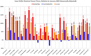 The last graph shows the bubble peak, the post bubble minimum, and current nominal prices relative to January 2000 prices for all the Case-Shiller cities in nominal terms.
As an example, at the peak, prices in Phoenix were 127% above the January 2000 level. Then prices in Phoenix fell slightly below the January 2000 level, and are now up 57% above January 2000 (57% nominal gain in almost 16 years).
These are nominal prices, and real prices (adjusted for inflation) are up about 40% since January 2000 - so the increase in Phoenix from January 2000 until now is about 17% above the change in overall prices due to inflation.
Six cities - Charlotte, Boston, Dallas, Denver, Portland and San Francisco - are above the bubble highs (Seattle is close). Detroit prices are barely above the January 2000 level.
I'll have more on house prices later.


