 RSS Feed
 by Calculated Risk on 2/08/2016 05:54:00 PM
Monday, February 08, 2016
Tuesday: Small Business Confidence, Job Openings
From the Boston Globe: Gasoline prices slide even lower in Mass.
Gasoline prices fell for the ninth consecutive week in Massachusetts, tumbling to an average of $1.77 a gallon on Monday, according to AAA Northeast.Tuesday:
...
It remains unclear whether prices have hit rock-bottom, as crude oil and gasoline inventories remain high. Last year around mid-February, prices climbed as oil refineries slowed their productions, said Mary Maguire, AAA Northeast’s director of public and legislative affairs.
• At 9:00 AM ET, NFIB Small Business Optimism Index for January.
• At 10:00 AM, Job Openings and Labor Turnover Survey for December from the BLS. Jobs openings increased in November to 5.431 million from 5.349 million in October. The number of job openings (yellow) were up 11% year-over-year, and Quits were up 6% year-over-year.
Update: The Inland Empire Bust and Recovery
by Calculated Risk on 2/08/2016 02:49:00 PM
Way back in 2006 I disagreed with some analysts on the outlook for the Inland Empire in California. I wrote:
As the housing bubble unwinds, housing related employment will fall; and fall dramatically in areas like the Inland Empire. The more an area is dependent on housing, the larger the negative impact on the local economy will be.And sure enough, the economies of housing dependent areas like the Inland Empire were devastated during the housing bust. The good news is the Inland Empire is now recovering.
So I think some pundits have it backwards: Instead of a strong local economy keeping housing afloat, I think the bursting housing bubble will significantly impact housing dependent local economies.
 Click on graph for larger image.
This graph shows the unemployment rate for the Inland Empire (using MSA: Riverside, San Bernardino, Ontario), and also the number of construction jobs as a percent of total employment.
The unemployment rate is falling, and is down to 5.9% (down from 15.0% in 2010). And construction employment is up from the lows (as a percent of total employment), but still fairly low.
Overall the outlook for the Inland Empire is much better today.
Update: Framing Lumber Prices down Sharply Year-over-year
by Calculated Risk on 2/08/2016 11:59:00 AM
Here is another graph on framing lumber prices. Early in 2013 lumber prices came close to the housing bubble highs.
The price increases in early 2013 were due to a surge in demand (more housing starts) and supply constraints (framing lumber suppliers were working to bring more capacity online).
Prices didn't increase as much early in 2014 (more supply, smaller "surge" in demand).
In 2015, even with the pickup in U.S. housing starts, prices were down year-over-year. Note: Multifamily starts do not use as much lumber as single family starts, and there was a surge in multi-family starts.
Overall the decline in prices is probably due to more supply, and less demand from China.
 Click on graph for larger image in graph gallery.
This graph shows two measures of lumber prices: 1) Framing Lumber from Random Lengths through January 2016 (via NAHB), and 2) CME framing futures.
Right now Random Lengths prices are down about 17% from a year ago, and CME futures are down around 22% year-over-year.
Las Vegas Real Estate in January: Sales Increased 5% YoY, Inventory Up Slightly
by Calculated Risk on 2/08/2016 09:11:00 AM
This is a key distressed market to follow since Las Vegas has seen the largest price decline of any of the Case-Shiller composite 20 cities.
The Greater Las Vegas Association of Realtors reported Local Housing Market Starts 2016 With Steadily Rising Home Prices
According to GLVAR, the total number of existing local homes, condominiums and townhomes sold in January was 2,348, up from 2,239 in January of 2015. Compared to the same month one year ago, 4.7 percent more homes and 5.4 percent more condos and townhomes sold in January.1) Overall sales were up 5% year-over-year.
...
By the end of January, GLVAR reported 7,428 single-family homes listed without any sort of offer. That’s up 0.6 percent from one year ago. For condos and townhomes, the 2,216 properties listed without offers in January represented a 4.8 percent decrease from one year ago.
As it has for the past few years, GLVAR reported fewer distressed sales and more traditional home sales, where lenders are not controlling the transaction. In January, 7.0 percent of all local sales were short sales – which occur when lenders allow borrowers to sell a home for less than what they owe on the mortgage. That’s down from 9.7 percent of all sales one year ago. Another 7.9 percent of all January sales were bank-owned, down from 9.4 percent one year ago.
emphasis added
2) The percent of cash sales decreased year-over-year from 36% in Jan 2015 to 31.1% in Jan 2016. This has been trending down.
3) Non-contingent inventory for single-family homes was up 0.6% year-over-year. This followed several months with a year-over-year decline. The table below shows the year-over-year change for non-contingent inventory in Las Vegas. Inventory is important to watch - if inventory starts increasing again, then price increases will slow.
| Las Vegas: Year-over-year Change in Non-contingent Single-Family Inventory | |
|---|---|
| Month | YoY |
| Jan-13 | -58.3% |
| Feb-13 | -53.4% |
| Mar-13 | -42.1% |
| Apr-13 | -24.1% |
| May-13 | -13.2% |
| Jun-13 | 3.7% |
| Jul-13 | 9.0% |
| Aug-13 | 41.1% |
| Sep-13 | 60.5% |
| Oct-13 | 73.4% |
| Nov-13 | 77.4% |
| Dec-13 | 78.6% |
| Jan-14 | 96.2% |
| Feb-14 | 107.3% |
| Mar-14 | 127.9% |
| Apr-14 | 103.1% |
| May-14 | 100.6% |
| Jun-14 | 86.2% |
| Jul-14 | 55.2% |
| Aug-14 | 38.8% |
| Sep-14 | 29.5% |
| Oct-14 | 25.6% |
| Nov-14 | 20.0% |
| Dec-14 | 18.0% |
| Jan-15 | 12.9% |
| Feb-15 | 15.8% |
| Mar-15 | 12.2% |
| Apr-15 | 7.6% |
| May-15 | 7.8% |
| Jun-15 | 4.3% |
| Jul-15 | 5.1% |
| Aug-15 | 3.5% |
| Sep-15 | -0.8% |
| Oct-15 | -7.1% |
| Nov-15 | -5.2% |
| Dec-15 | -11.2% |
| Jan-16 | 0.6% |
Sunday, February 07, 2016
Sunday Night Futures
by Calculated Risk on 2/07/2016 10:52:00 PM
Weekend:
• Schedule for Week of February 7, 2016
• Update: "Scariest jobs chart ever"
Monday:
• At 10:00 AM ET, the Fed will release the monthly Labor Market Conditions Index (LMCI).
From CNBC: Pre-Market Data and Bloomberg futures: currently S&P futures are up 3 and DOW futures are up 15 (fair value).
Oil prices were down over the last week with WTI futures at $30.93 per barrel and Brent at $34.09 per barrel. A year ago, WTI was at $50, and Brent was at $55 - so prices are down about 40% year-over-year.
Here is a graph from Gasbuddy.com for nationwide gasoline prices. Nationally prices are at $1.74 per gallon (down over $0.40 per gallon from a year ago).
Update: "Scariest jobs chart ever"
by Calculated Risk on 2/07/2016 11:29:00 AM
During and following the 2007 recession, every month I posted a graph showing the percent jobs lost during the recession compared to previous post-WWII recessions.
Some people started calling this the "scariest jobs chart ever".
I retired the graph in May 2014 when employment finally exceeded the pre-recession peak.
I was asked if I could post an update to the graph, and here it is.

This graph shows the job losses from the start of the employment recession, in percentage terms, compared to previous post WWII recessions. Since exceeding the pre-recession peak in May 2014, employment is now 3.5% above the previous peak.
Note: I ended the lines for most previous recessions when employment reached a new peak, although I continued the 2001 recession too. The downturn at the end of the 2001 recession is the beginning of the 2007 recession. I don't expect a downturn for employment any time soon (unlike in 2007 when I was forecasting a recession).
Saturday, February 06, 2016
Schedule for Week of February 7, 2016
by Calculated Risk on 2/06/2016 08:11:00 AM
The key economic report this week is January retail sales on Friday.
The focus will be on Fed Chair Janet Yellen's Semiannual Monetary Policy testimony to the Congress.
10:00 AM ET: The Fed will release the monthly Labor Market Conditions Index (LMCI).
9:00 AM ET: NFIB Small Business Optimism Index for January.
 10:00 AM: Job Openings and Labor Turnover Survey for December from the BLS.
 This graph shows job openings (yellow line), hires (purple), Layoff, Discharges and other (red column), and Quits (light blue column) from the JOLTS.
Jobs openings increased in November to 5.431 million from 5.349 million in October.
The number of job openings (yellow) were up 11% year-over-year, and Quits were up 6% year-over-year.
7:00 AM ET: The Mortgage Bankers Association (MBA) will release the results for the mortgage purchase applications index.
10:00 AM: Testimony by Fed Chair Janet Yellen, Semiannual Monetary Policy Report to the Congress, Before the Committee on Financial Services, U.S. House of Representatives
2:00 PM: The Monthly Treasury Budget Statement for January.
8:30 AM: The initial weekly unemployment claims report will be released. The consensus is for 281 thousand initial claims, down from 285 thousand the previous week.
10:00 AM: Testimony by Fed Chair Janet Yellen, Semiannual Monetary Policy Report to the Congress, Before the Committee on Banking, Housing, and Urban Affairs, U.S. Senate
 8:30 AM ET: Retail sales for January will be released. The consensus is for retail sales to increase 0.2% in January.
This graph shows retail sales since 1992 through December 2015. This is monthly retail sales and food service, seasonally adjusted (total and ex-gasoline). On a monthly basis, retail sales were down 0.1% from November to December (seasonally adjusted), and sales were up 2.2% from December 2014.
10:00 AM: University of Michigan's Consumer sentiment index (preliminary for February). The consensus is for a reading of 92.5, up from 92.0 in January.
10:00 AM: Manufacturing and Trade: Inventories and Sales (business inventories) report for November. The consensus is for a 0.1% increase in inventories.
11:00 AM: The New York Fed will release their Q4 2015 Household Debt and Credit Report
Friday, February 05, 2016
Public and Private Sector Payroll Jobs: Carter, Reagan, Bush, Clinton, Bush, Obama
by Calculated Risk on 2/05/2016 06:42:00 PM
By request, here is another update of an earlier post through the January employment report including all revisions.
NOTE: Several readers have asked if I could add a lag to these graphs (obviously a new President has zero impact on employment for the month they are elected). But that would open a debate on the proper length of the lag, so I'll just stick to the beginning of each term.
Note: We frequently use Presidential terms as time markers - we could use Speaker of the House, or any other marker.
Important: There are many differences between these periods. Overall employment was smaller in the '80s, however the participation rate was increasing in the '80s (younger population and women joining the labor force), and the participation rate is generally declining now. But these graphs give an overview of employment changes.
First, here is a table for private sector jobs. The top two private sector terms were both under President Clinton. Reagan's 2nd term saw about the same job growth as during Carter's term. Note: There was a severe recession at the beginning of Reagan's first term (when Volcker raised rates to slow inflation) and a recession near the end of Carter's term (gas prices increased sharply and there was an oil embargo).
| Term | Private Sector Jobs Added (000s) |
|---|---|
| Carter | 9,041 |
| Reagan 1 | 5,360 |
| Reagan 2 | 9,357 |
| GHW Bush | 1,510 |
| Clinton 1 | 10,884 |
| Clinton 2 | 10,082 |
| GW Bush 1 | -811 |
| GW Bush 2 | 415 |
| Obama 1 | 1,921 |
| Obama 2 | 7,7031 |
| 136 months into 2nd term: 10,271 pace. | |
The first graph shows the change in private sector payroll jobs from when each president took office until the end of their term(s). President George H.W. Bush only served one term, and President Obama is in the third year of his second term.
Mr. G.W. Bush (red) took office following the bursting of the stock market bubble, and left during the bursting of the housing bubble. Mr. Obama (blue) took office during the financial crisis and great recession. There was also a significant recession in the early '80s right after Mr. Reagan (yellow) took office.
There was a recession towards the end of President G.H.W. Bush (purple) term, and Mr Clinton (light blue) served for eight years without a recession.
 Click on graph for larger image.
The first graph is for private employment only.
The employment recovery during Mr. G.W. Bush's (red) first term was sluggish, and private employment was down 811,000 jobs at the end of his first term. At the end of Mr. Bush's second term, private employment was collapsing, and there were net 396,000 private sector jobs lost during Mr. Bush's two terms.
Private sector employment increased slightly under President G.H.W. Bush (purple), with 1,510,000 private sector jobs added.
Private sector employment increased by 20,966,000 under President Clinton (light blue), by 14,717,000 under President Reagan (yellow), and 9,041,000 under President Carter (dashed green).
There were only 1,921,000 more private sector jobs at the end of Mr. Obama's first term. Thirty six months into Mr. Obama's second term, there are now 9,624,000 more private sector jobs than when he initially took office.
 A big difference between the presidencies has been public sector employment. Note the bumps in public sector employment due to the decennial Census in 1980, 1990, 2000, and 2010.
 The public sector grew during Mr. Carter's term (up 1,304,000), during Mr. Reagan's terms (up 1,414,000), during Mr. G.H.W. Bush's term (up 1,127,000), during Mr. Clinton's terms (up 1,934,000), and during Mr. G.W. Bush's terms (up 1,744,000 jobs).
However the public sector has declined significantly since Mr. Obama took office (down 540,000 jobs). These job losses had mostly been at the state and local level, but more recently at the Federal level. This has been a significant drag on overall employment.
And a table for public sector jobs. Public sector jobs declined the most during Obama's first term, and increased the most during Reagan's 2nd term.
| Term | Public Sector Jobs Added (000s) |
|---|---|
| Carter | 1,304 |
| Reagan 1 | -24 |
| Reagan 2 | 1,438 |
| GHW Bush | 1,127 |
| Clinton 1 | 692 |
| Clinton 2 | 1,242 |
| GW Bush 1 | 900 |
| GW Bush 2 | 844 |
| Obama 1 | -708 |
| Obama 2 | 1681 |
| 136 months into 2nd term, 224 pace | |
Looking forward, I expect the economy to continue to expand through 2016 (at least), so I don't expect a sharp decline in private employment as happened at the end of Mr. Bush's 2nd term (In 2005 and 2006 I was warning of a coming down turn due to the bursting of the housing bubble - and I predicted a recession in 2007).
For the public sector, the cutbacks are clearly over. Right now I'm expecting some increase in public employment during Obama's 2nd term, but nothing like what happened during Reagan's second term.
Below is a table of the top three presidential terms for private job creation (they also happen to be the three best terms for total non-farm job creation).
Clinton's two terms were the best for both private and total non-farm job creation, followed by Reagan's 2nd term.
Currently Obama's 2nd term is on pace to be the 2nd best ever for private job creation. However, with very few public sector jobs added, Obama's 2nd term is only on pace to be the fourth best for total job creation.
Note: Only 168 thousand public sector jobs have been added during the first thirty six months of Obama's 2nd term (following a record loss of 708 thousand public sector jobs during Obama's 1st term). This is less than 12% of the public sector jobs added during Reagan's 2nd term!
| Top Employment Gains per Presidential Terms (000s) | ||||
|---|---|---|---|---|
| Rank | Term | Private | Public | Total Non-Farm |
| 1 | Clinton 1 | 10,884 | 692 | 11,576 |
| 2 | Clinton 2 | 10,082 | 1,242 | 11,312 |
| 3 | Reagan 2 | 9,357 | 1,438 | 10,795 |
| Obama 21 | 7,703 | 168 | 7,871 | |
| Pace2 | 10,271 | 224 | 10,495 | |
| 136 Months into 2nd Term 2Current Pace for Obama's 2nd Term | ||||
The last table shows the jobs needed per month for Obama's 2nd term to be in the top three presidential terms. Right now it looks like Obama's 2nd term will be in the top 3 for private employment, but not for total employment gains.
| Average Jobs needed per month (000s) for remainder of Obama's 2nd Term | ||||
|---|---|---|---|---|
| to Rank | Private | Total | ||
| #1 | 265 | 309 | ||
| #2 | 198 | 288 | ||
| #3 | 138 | 244 | ||
Comments: A Solid Employment Report
by Calculated Risk on 2/05/2016 02:00:00 PM
My initial reaction was this was a "decent" employment report. However, with some further analysis, I think this should be characterized as a "solid" report.
The unemployment rate declined to 4.9% even as the participation rate increased (a strong household survey). Sure the headline number was below the consensus forecast, but this follows several months of above trend job gains (job gains averaged 279 thousand over the previous three months).
With current demographics, the unemployment rate would decline with job gains under 100 thousand, so 151 thousand is still solid.
And another positive sign is that wage growth picked up and was above the consensus forecast. From the BLS: "In January, average hourly earnings for all employees on private nonfarm payrolls increased by 12 cents to $25.39. Over the year, average hourly earnings have risen by 2.5 percent."
Earlier: January Employment Report: 151,000 Jobs, 4.9% Unemployment Rate (Graphs Included)
A few more numbers: Total employment is now 4.9 million above the previous peak. Total employment is up 13.6 million from the employment recession low.
Private payroll employment increased 158,000 in December, and private employment is now 5.2 million above the previous peak. Private employment is up 14.0 million from the recession low.
In January, the year-over-year change was 2.67 million jobs.
Employment-Population Ratio, 25 to 54 years old
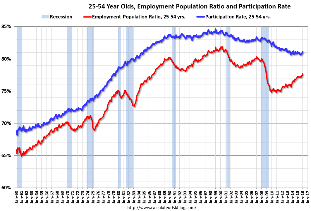 Since the overall participation rate has declined recently due to cyclical (recession) and demographic (aging population, younger people staying in school) reasons, here is the employment-population ratio for the key working age group: 25 to 54 years old.
In the earlier period the participation rate for this group was trending up as women joined the labor force. Since the early '90s, the participation rate moved more sideways, with a downward drift starting around '00 - and with ups and downs related to the business cycle.
The 25 to 54 participation rate increased in January to 81.1%, and the 25 to 54 employment population ratio increased to 77.7%. The participation rate for this group might increase a little more (or at least stabilize for a couple of years) - although the participation rate has been trending down for this group since the late '90s.
Average Hourly Earnings
 This graph is based on “Average Hourly Earnings” from the Current Employment Statistics (CES) (aka "Establishment") monthly employment report. Note: There are also two quarterly sources for earnings data: 1) “Hourly Compensation,” from the BLS’s Productivity and Costs; and 2) the Employment Cost Index which includes wage/salary and benefit compensation.
The graph shows the nominal year-over-year change in "Average Hourly Earnings" for all private employees. Nominal wage growth was at 2.5% YoY in January - and although the series is noisy - wage growth is trending up.
This was stronger than most forecasts and is a sign the labor market is tightening.
Note: CPI has been running under 2%, so there has been real wage growth.
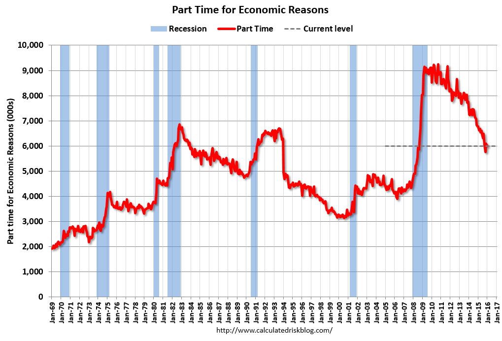
Part Time for Economic Reasons
 From the BLS report:
The number of persons employed part time for economic reasons (sometimes referred to as involuntary part-time workers) was little changed at 6.0 million in January but was down by 796,000 over the year. These individuals, who would have preferred full-time employment, were working part time because their hours had been cut back or because they were unable to find full-time jobs.The number of persons working part time for economic reasons was little changed in January. This level suggests slack still in the labor market.
These workers are included in the alternate measure of labor underutilization (U-6) that was unchanged at 9.9% in January.
Unemployed over 26 Weeks
 This graph shows the number of workers unemployed for 27 weeks or more.
 According to the BLS, there are 2.09 million workers who have been unemployed for more than 26 weeks and still want a job. This was up from 2.08 million in December.
This is generally trending down, but is still high.
There are still signs of slack (as example, part time workers for economic reasons and elevated U-6), but there also signs the labor market is tightening (wages and U-3). Overall this was a solid employment report.
Trade Deficit Increased in December to $43.4 Billion
by Calculated Risk on 2/05/2016 11:58:00 AM
Earlier the Department of Commerce reported:
The U.S. Census Bureau and the U.S. Bureau of Economic Analysis, through the Department of Commerce, announced today that the goods and services deficit was $43.4 billion in December, up $1.1 billion from $42.2 billion in November, revised. December exports were $181.5 billion, $0.5 billion less than November exports. December imports were $224.9 billion, up $0.6 billion from November.The trade deficit was slightly larger than the consensus forecast of $43.0 billion.
The first graph shows the monthly U.S. exports and imports in dollars through December 2015.
 Click on graph for larger image.
Imports increased and exports decreased in December.
Exports are 9% above the pre-recession peak and down 7% compared to December 2014; imports are 3% below the pre-recession peak, and down 7% compared to December 2014.
The second graph shows the U.S. trade deficit, with and without petroleum.
 The blue line is the total deficit, and the black line is the petroleum deficit, and the red line is the trade deficit ex-petroleum products.
Oil imports averaged $36.60 in December, down from $39.24 in November, and down from $82.92 in December 2014. The petroleum deficit has generally been declining and is the major reason the overall deficit has declined since early 2012.
The trade deficit with China decreased to $27.9 billion in December, from $28.1 billion in December 2014. The deficit with China is a substantial portion of the overall deficit.


