by Calculated Risk on 2/19/2015 07:43:00 PM
Thursday, February 19, 2015
Lawler: Preliminary Table of Distressed Sales and Cash buyers for Selected Cities in January
Economist Tom Lawler sent me the preliminary table below of short sales, foreclosures and cash buyers for a few selected cities in January.
On distressed: Total "distressed" share is down in most of these markets mostly due to a decline in short sales (Mid-Atlantic and Orlando are up year-over-year because of an increase foreclosure as lenders work through the backlog).
Short sales are down in these areas.
The All Cash Share (last two columns) is declining year-over-year. As investors pull back, the share of all cash buyers will probably continue to decline.
It is pretty amazing that distressed sales still make up almost 40% of sales in Orlando. Florida has been very slow to recover from the severe damage of the housing bubble.
| Short Sales Share | Foreclosure Sales Share | Total "Distressed" Share | All Cash Share | |||||
|---|---|---|---|---|---|---|---|---|
| Jan-15 | Jan-14 | Jan-15 | Jan-14 | Jan-15 | Jan-14 | Jan-15 | Jan-14 | |
| Las Vegas | 9.7% | 17.0% | 9.4% | 11.0% | 19.1% | 28.0% | 36.0% | 46.3% |
| Reno** | 10.0% | 16.0% | 6.0% | 9.0% | 16.0% | 25.0% | ||
| Phoenix | 3.7% | 6.8% | 6.5% | 9.6% | 10.2% | 16.5% | 32.0% | 36.3% |
| Sacramento | 6.9% | 11.8% | 9.5% | 8.4% | 16.4% | 20.2% | 22.7% | 26.6% |
| Minneapolis | 4.1% | 5.5% | 16.0% | 24.0% | 20.1% | 29.5% | ||
| Mid-Atlantic | 5.8% | 8.5% | 15.2% | 12.2% | 21.0% | 20.7% | 21.4% | 22.9% |
| Orlando | 5.3% | 11.7% | 33.9% | 25.7% | 39.2% | 37.4% | 47.1% | 49.2% |
| California * | 6.4% | 10.7% | 6.7% | 7.7% | 13.1% | 18.4% | ||
| Bay Area CA* | 4.0% | 8.5% | 4.5% | 5.2% | 8.5% | 13.7% | 22.6% | 25.8% |
| So. California* | 6.5% | 10.7% | 5.7% | 6.6% | 12.2% | 17.3% | 24.9% | 29.9% |
| Chicago (city) | 24.1% | 35.0% | ||||||
| Hampton Roads | 27.6% | 29.5% | ||||||
| Northeast Florida | 38.2% | 46.2% | ||||||
| Toledo | 37.6% | 43.9% | ||||||
| Tucson | 34.8% | 38.2% | ||||||
| Des Moines | 22.0% | 22.2% | ||||||
| Georgia*** | 31.3% | N/A | ||||||
| Omaha | 24.0% | 26.4% | ||||||
| Pensacola | 38.3% | 42.7% | ||||||
| Memphis* | 14.8% | 19.1% | ||||||
| Springfield IL** | 16.2% | 28.5% | ||||||
| *share of existing home sales, based on property records **Single Family Only ***GAMLS | ||||||||
Lawler: Early Read on Existing Home Sales in January
by Calculated Risk on 2/19/2015 03:45:00 PM
From housing economist Tom Lawler:
Based on local realtor/MLS reports from across the country, I estimate that US existing home sales as measured by the National Association of Realtors ran at a seasonally adjusted annual rate of 4.90 million in January, down 2.8% from December’s preliminary pace but up 6.1% from last January’s depressed pace. Unadjusted sales are likely to show a smaller YOY gain, reflecting the fewer number of business days this January compared to last January.
(Note: in this month’s release the NAR will incorporate its annual seasonal factor revision, which will impact the monthly pattern of seasonally adjusted sales over the past few years. I’ve attempted to “allow” for this revision.)
On the inventory front, while there were sizable differences across market, in aggregate I estimate that the inventory of existing homes for sale as measured by the NAR at the end of January was unchanged from December, and down 1.6% from a year earlier. The NAR’s “seasonally adjusted” (derivable from supplemental data) inventory estimate fell sharply during the last few months of last year, for reasons that are not clear.
Finally, based on local realtor/MLS data I project that the NAR’s median SF home sales price in January will be up about 5.4% from last January. I should note, however, that of late the increase in the NAR’s median sales price estimate has been higher than that suggest by local realtor reports.
CR Note: The NAR is scheduled to release January existing home sales on Monday, February 23, 2015, at 10 AM ET.
Quarterly Housing Starts by Intent
by Calculated Risk on 2/19/2015 01:03:00 PM
In addition to housing starts for January, the Census Bureau also released the Q4 "Started and Completed by Purpose of Construction" report yesterday.
It is important to remember that we can't directly compare single family housing starts to new home sales. For starts of single family structures, the Census Bureau includes owner built units and units built for rent that are not included in the new home sales report. For an explanation, see from the Census Bureau: Comparing New Home Sales and New Residential Construction
We are often asked why the numbers of new single-family housing units started and completed each month are larger than the number of new homes sold. This is because all new single-family houses are measured as part of the New Residential Construction series (starts and completions), but only those that are built for sale are included in the New Residential Sales series.However it is possible to compare "Single Family Starts, Built for Sale" to New Home sales on a quarterly basis.
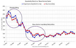
The quarterly report released yesterday showed there were 106,000 single family starts, built for sale, in Q4 2014, and that was above the 102,000 new homes sold for the same quarter, so inventory increased slightly in Q4 (Using Not Seasonally Adjusted data for both starts and sales).
The first graph shows quarterly single family starts, built for sale and new home sales (NSA).
 Click on graph for larger image.
In 2005, and most of 2006, starts were higher than sales, and inventories of new homes increased. The difference on this graph is pretty small, but the builders were starting about 30,000 more homes per quarter than they were selling (speculative building), and the inventory of new homes soared to record levels. Inventory of under construction and completed new home sales peaked at 477,000 in Q3 2006.
In 2008 and 2009, the home builders started far fewer homes than they sold as they worked off the excess inventory that they had built up in 2005 and 2006.
Now it looks like builders are generally starting about the same number of homes that they are selling, and the inventory of under construction and completed new home sales is still very low.
Note: new home sales are reported when contracts are signed, so it is appropriate to compare sales to starts (as opposed to completions). This is not perfect because of the handling of cancellations, but it does suggest the builders are keeping inventories under control.
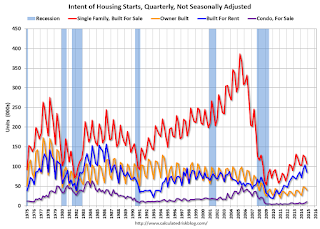
The second graph shows the NSA quarterly intent for four start categories since 1975: single family built for sale, owner built (includes contractor built for owner), starts built for rent, and condos built for sale.
 Single family starts built for sale were up about 2% compared to Q4 2013.
 Owner built starts were up 25% year-over-year. And condos built for sale are just above the record low.
The 'units built for rent' has increased significantly over the last few years, and is near the highest level since the mid-80s, and was at the same level as in Q4 2013.
Philly Fed Manufacturing Survey declines to 5.2 in February
by Calculated Risk on 2/19/2015 10:11:00 AM
From the Philly Fed: February Manufacturing Survey
Firms responding to the Manufacturing Business Outlook Survey indicated continued modest growth in the region’s manufacturing sector in February. Although the current activity index fell for the third consecutive month, it remained positive, and the employment indicator increased from its reading last month. The survey’s future activity index also fell but continues to reflect general optimism about manufacturing growth in the region over the next six months.This was below the consensus forecast of a reading of 8.5 for January.
...
The diffusion index for current general activity fell slightly, from a reading of 6.3 in January to 5.2 this month ...
The survey’s indicators for current labor market conditions suggest a slight improvement this month, as the employment index increased 6 points and returned to a positive reading ...
emphasis added
 Click on graph for larger image.
Here is a graph comparing the regional Fed surveys and the ISM manufacturing index. The light blue line is an average of the NY Fed (Empire State) and Philly Fed surveys through February. The ISM and total Fed surveys are through January.
The average of the Empire State and Philly Fed surveys declined in February, and this suggests a slightly weaker ISM report for February.
Weekly Initial Unemployment Claims decreased to 283,000
by Calculated Risk on 2/19/2015 08:33:00 AM
The DOL reported:
In the week ending February 14, the advance figure for seasonally adjusted initial claims was 283,000, a decrease of 21,000 from the previous week's unrevised level of 304,000. The 4-week moving average was 283,250, a decrease of 6,500 from the previous week's unrevised average of 289,750.The previous week was unrevised at 304,000.
There were no special factors impacting this week's initial claims.
The following graph shows the 4-week moving average of weekly claims since January 2000.
 Click on graph for larger image.
The dashed line on the graph is the current 4-week average. The four-week average of weekly unemployment claims decreased to 283,250.
This was below the consensus forecast of 290,000, and the low level of the 4-week average suggests few layoffs.


