by Calculated Risk on 1/27/2015 06:44:00 PM
Tuesday, January 27, 2015
BLS: Forty-two States had Unemployment Rate Decreases in December
From the BLS: Regional and State Employment and Unemployment Summary
Regional and state unemployment rates were generally lower in December. Forty-two states and the District of Columbia had unemployment rate decreases from November, four states had increases, and four states had no change, the U.S. Bureau of Labor Statistics reported today.
...
Mississippi had the highest unemployment rate among the states in December, 7.2 percent. The District of Columbia had a rate of 7.3 percent. North Dakota again had the lowest jobless rate, 2.8 percent.
 Click on graph for larger image.
This graph shows the current unemployment rate for each state (red), and the max during the recession (blue). All states are well below the maximum unemployment rate for the recession.
The size of the blue bar indicates the amount of improvement.
The states are ranked by the highest current unemployment rate. Mississippi, at 7.2%, had the highest state unemployment rate although D.C was higher.
 The second graph shows the number of states (and D.C.) with unemployment rates at or above certain levels since January 2006. At the worst of the employment recession, there were 10 states with an unemployment rate at or above 11% (red).
Currently no state has an unemployment rate at or above 8% (light blue); Two states and D.C. are still at or above 7% (dark blue).
House Prices: Better Seasonal Adjustment; Real Prices and Price-to-Rent Ratio in November
by Calculated Risk on 1/27/2015 03:57:00 PM
This morning, S&P reported that the National index increased 0.8% in October seasonally adjusted. However, it appears the seasonal adjustment has been distorted by the high level of distressed sales in recent years. Trulia's Jed Kolko wrote in August: "Let’s Improve, Not Ignore, Seasonal Adjustment of Housing Data"
The housing crisis substantially changed the seasonal pattern of housing activity: relative to conventional home sales, which peak in summer, distressed home sales are more evenly spread throughout the year and sell at a discount. As a result, in years when distressed sales constitute a larger share of overall sales, the seasonal swings in home prices get bigger while the seasonal swings in sales volumes get smaller.
Sharply changing seasonal patterns create problems for seasonal adjustment methods, which typically estimate seasonal adjustment factors by averaging several years’ worth of observed seasonal patterns. A sharp but ultimately temporary change in the seasonal pattern for housing activity affects seasonal adjustment factors more gradually and for more years than it should. Despite the recent normalizing of the housing market, seasonal adjustment factors are still based, in part, on patterns observed at the height of the foreclosure crisis, causing home price indices to be over-adjusted in some months and under-adjusted in others.
 Kolko proposed a better seasonal adjustment:
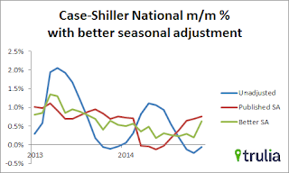
This graph from Kolko shows the weighted seasonal adjustment (see Kolko's article for a description of his method). Kolko calculates that prices increased 0.6% on a weighted seasonal adjustment basis in November - as opposed to the 0.8% SA increase and 0.1% NSA decrease reported by Case-Shiller.
The "better" SA (green) shows prices are still increasing, but more slowly than the Case-Shiller SA.
The expected slowdown in year-over-year price increases is ongoing. In November 2013, the Comp 20 index was up 13.8% year-over-year (YoY). Now the index is only up 4.3% YoY. This is the smallest YoY increase since October 2012 (the National index was up 10.9% YoY in October 2013, is now up 4.7% - a little more than the YoY change last month).
Looking forward, I expect the YoY increases for the indexes to move more sideways (as opposed to down). Two points: 1) I don't expect the indexes to turn negative YoY (in 2015) , and 2) I think most of the slowdown on a YoY basis is now behind us. This slowdown in price increases was expected by several key analysts, and I think it is good news for housing and the economy.
In the earlier post, I graphed nominal house prices, but it is also important to look at prices in real terms (inflation adjusted). Case-Shiller, CoreLogic and others report nominal house prices. As an example, if a house price was $200,000 in January 2000, the price would be close to $277,000 today adjusted for inflation (39%). That is why the second graph below is important - this shows "real" prices (adjusted for inflation).
Another point on real prices: In the Case-Shiller release this morning, the National Index was reported as being 9.1% below the bubble peak. However, in real terms, the National index is still about 23% below the bubble peak.
Nominal House Prices
 The first graph shows the monthly Case-Shiller National Index SA, the monthly Case-Shiller Composite 20 SA, and the CoreLogic House Price Indexes (through November) in nominal terms as reported.
In nominal terms, the Case-Shiller National index (SA) is back to April 2005 levels, and the Case-Shiller Composite 20 Index (SA) is back to November 2004 levels, and the CoreLogic index (NSA) is back to February 2005.
Real House Prices
 The second graph shows the same three indexes in real terms (adjusted for inflation using CPI less Shelter). Note: some people use other inflation measures to adjust for real prices.
In real terms, the National index is back to March 2003 levels, the Composite 20 index is back to September 2002, and the CoreLogic index back to March 2003.
In real terms, house prices are back to early '00s levels.
Price-to-Rent
In October 2004, Fed economist John Krainer and researcher Chishen Wei wrote a Fed letter on price to rent ratios: House Prices and Fundamental Value. Kainer and Wei presented a price-to-rent ratio using the OFHEO house price index and the Owners' Equivalent Rent (OER) from the BLS.
 Here is a similar graph using the Case-Shiller National, Composite 20 and CoreLogic House Price Indexes.
This graph shows the price to rent ratio (January 1998 = 1.0).
On a price-to-rent basis, the Case-Shiller National index is back to April 2003 levels, the Composite 20 index is back to October 2002 levels, and the CoreLogic index is back to April 2003.
In real terms, and as a price-to-rent ratio, prices are mostly back to early 2000 levels - and maybe moving a little sideways now.
Comments on New Home Sales
by Calculated Risk on 1/27/2015 12:10:00 PM
Earlier: New Home Sales at 481,000 Annual Rate in December, Highest December since 2007
The new home sales for December were at 481 thousand on a seasonally adjusted annual rate basis (SAAR). This was the highest level of sales in over 6 years (best December since 2007).
However sales in 2014 were only up 1.2% from 2013 (1.4% rounded in table below). Here is a table of new home sales since 2000 and the change from the previous year:
| New Home Sales (000s) | ||
|---|---|---|
| Year | Sales | Change |
| 2000 | 877 | -0.3% |
| 2001 | 908 | 3.5% |
| 2002 | 973 | 7.2% |
| 2003 | 1,086 | 11.6% |
| 2004 | 1,203 | 10.8% |
| 2005 | 1,283 | 6.7% |
| 2006 | 1,051 | -18.1% |
| 2007 | 776 | -26.2% |
| 2008 | 485 | -37.5% |
| 2009 | 375 | -22.7% |
| 2010 | 323 | -13.9% |
| 2011 | 306 | -5.3% |
| 2012 | 368 | 20.3% |
| 2013 | 429 | 16.6% |
| 2014 | 435 | 1.4% |
There are two ways to look at 2014: 1) sales were below expectations, or 2) this just means more growth over the next several years! Both are correct, and what matters now is the present (sales are picking up), and the future (still bright).
Based on the low level of sales, more lots coming available, changing builder designs and demographics, I expect sales to increase over the next several years.
As I noted last month, it is important to remember that demographics is a slow moving - but unstoppable - force!
It was over four years ago that we started discussing the turnaround for apartments. Then, in January 2011, I attended the NMHC Apartment Strategies Conference in Palm Springs, and the atmosphere was very positive. One major reason for that optimism was demographics - a large cohort was moving into the renting age group.
Now demographics are slowly becoming more favorable for home buying.
 Click on graph for larger image.
This graph shows the longer term trend for several key age groups: 20 to 29, 25 to 34, and 30 to 39 (the groups overlap).
This graph is from 1990 to 2060 (all data from BLS: 1990 to 2013 is actual, 2014 to 2060 is projected).
We can see the surge in the 20 to 29 age group (red). Once this group exceeded the peak in earlier periods, there was an increase in apartment construction. This age group will peak in 2018 (until the 2030s), and the 25 to 34 age group (orange, dashed) will peak in 2023. This suggests demand for apartments will soften starting around 2020 +/-.
For buying, the 30 to 39 age group (blue) is important (note: see Demographics and Behavior for some reasons for changing behavior). The population in this age group is increasing, and will increase significantly over the next 10+ years.
This demographics is positive for home buying, and this is a key reason I expect single family housing starts - and new home sales - to continue to increase in coming years.
 This graph shows new home sales for 2013 and 2014 by month (Seasonally Adjusted Annual Rate).
It it important not to be influenced too much by one month of data, but if sales averaged the December rate in 2015 - just moved sideways - then sales for 2015 would be up 10.6%.
There are several reasons to expect a return to double digit (or close) new home sales growth in 2015: Builders bringing lower priced homes on the market, more finished lots available, looser credit and demographics (as discussed above). The housing recovery is ongoing.
And here is another update to the "distressing gap" graph that I first started posting several years ago to show the emerging gap caused by distressed sales. Now I'm looking for the gap to close over the next few years.
 The "distressing gap" graph shows existing home sales (left axis) and new home sales (right axis) through December 2014. This graph starts in 1994, but the relationship has been fairly steady back to the '60s.
 Following the housing bubble and bust, the "distressing gap" appeared mostly because of distressed sales.
I expect existing home sales to mostly move sideways (distressed sales will continue to decline and be offset by more conventional / equity sales). And I expect this gap to slowly close, mostly from an increase in new home sales.
Note: Existing home sales are counted when transactions are closed, and new home sales are counted when contracts are signed. So the timing of sales is different.
New Home Sales at 481,000 Annual Rate in December, Highest December since 2007
by Calculated Risk on 1/27/2015 10:00:00 AM
The Census Bureau reports New Home Sales in December were at a seasonally adjusted annual rate (SAAR) of 481 thousand.
October sales were revised up from 445 thousand to 462 thousand, and November sales were revised down from 438 thousand to 431 thousand.
"Sales of new single-family houses in December 2014 were at a seasonally adjusted annual rate of 481,000, according to estimates released jointly today by the U.S. Census Bureau and the Department of Housing and Urban Development. This is 11.6 percent above the revised November rate of 431,000 and is 8.8 percent above the December 2013 estimate of 442,000."
 Click on graph for larger image.
The first graph shows New Home Sales vs. recessions since 1963. The dashed line is the current sales rate.
Even with the increase in sales over the previous two years, new home sales are still close to the bottom for previous recessions.
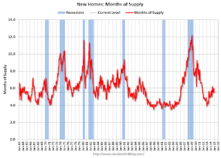
The second graph shows New Home Months of Supply.
 The months of supply decreased in December to 5.5 months from 6.0 months in November.
 The all time record was 12.1 months of supply in January 2009.
This is now in the normal range (less than 6 months supply is normal).
"The seasonally adjusted estimate of new houses for sale at the end of December was 219,000. This represents a supply of 5.5 months at the current sales rate."
 On inventory, according to the Census Bureau:
 "A house is considered for sale when a permit to build has been issued in permit-issuing places or work has begun on the footings or foundation in nonpermit areas and a sales contract has not been signed nor a deposit accepted."Starting in 1973 the Census Bureau broke this down into three categories: Not Started, Under Construction, and Completed.
The third graph shows the three categories of inventory starting in 1973.
The inventory of completed homes for sale is still low, and the combined total of completed and under construction is also low.
 The last graph shows sales NSA (monthly sales, not seasonally adjusted annual rate).
In December 2014 (red column), 34 thousand new homes were sold (NSA). Last year 31 thousand homes were sold in December. This is the highest for December since 2007.
The high for December was 87 thousand in 2005, and the low for December was 23 thousand in 1966 and in 2010.
This was above expectations of 450,000 sales in December, and with a decent finish to 2014, sales increased 1.2% from 2013. "An estimated 435,000 new homes were sold in 2014. This is 1.2 percent above the 2013 figure of 429,000."
I'll have more later today.
Case-Shiller: National House Price Index increased 4.7% year-over-year in November
by Calculated Risk on 1/27/2015 09:05:00 AM
S&P/Case-Shiller released the monthly Home Price Indices for November ("November" is a 3 month average of September, October and November prices).
This release includes prices for 20 individual cities, two composite indices (for 10 cities and 20 cities) and the monthly National index.
Note: Case-Shiller reports Not Seasonally Adjusted (NSA), I use the SA data for the graphs.
From S&P: Home Price Gains Continue to Slow According to the S&P/Case-Shiller Home Price Indices
Data released today for November 2014 shows a continued slowdown in home prices nationwide, but with price increases in nine cities. ... Both the 10-City and 20-City Composites saw year-over-year growth rates decline in November compared to October. The 10-City Composite gained 4.2% year-over-year, down from 4.4% in October. The 20-City Composite gained 4.3% year-over-year, compared to 4.5% in October. The S&P/Case-Shiller U.S. National Home Price Index, which covers all nine U.S. census divisions, recorded a 4.7% annual gain in November 2014 versus 4.6% in October 2014.
...
The National and Composite Indices were both marginally negative in November. The 10 and 20-City Composites reported declines of -0.3% and -0.2%, while the National Index posted a decline of -0.1% for the month. Tampa led all cities in November with an increase of 0.8%. Chicago and Detroit offset those gains by reporting decreases of -1.1% and -0.9% respectively.
 Click on graph for larger image.
 The first graph shows the nominal seasonally adjusted Composite 10, Composite 20 and National indices (the Composite 20 was started in January 2000).
The Composite 10 index is off 17.4% from the peak, and up 0.7% in November (SA).
The Composite 20 index is off 16.4% from the peak, and up 0.7% (SA) in November.
The National index is off 9.1% from the peak, and up 0.8% (SA) in November. The National index is up 22.8% from the post-bubble low set in Dec 2011 (SA).
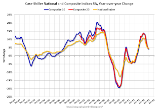
 The second graph shows the Year over year change in all three indices.
The Composite 10 SA is up 4.2% compared to November 2013.
The Composite 20 SA is up 4.3% year-over-year..
The National index SA is up 4.7% year-over-year.
Prices increased (SA) in all 20 of the 20 Case-Shiller cities in November seasonally adjusted. (Prices increased in 11 of the 20 cities NSA) Prices in Las Vegas are off 41.7% from the peak, and prices in Denver and Dallas are at new highs (SA).
This was close to the consensus forecast for a 4.6% YoY increase for the National index, and suggests a slight further slowdown in price increases. I'll have more on house prices later.


