by Calculated Risk on 4/08/2013 09:24:00 PM
Monday, April 08, 2013
Tuesday: Small Business Confidence, Job Openings
From Fed Chairman Ben Bernanke: Stress Testing Banks: What Have We Learned?
[T]he banking system is much stronger since the implementation of the SCAP four years ago, which in turn has contributed to the improvement in the overall economy. The use of supervisory stress tests--a practice now codified in statute--has helped foster these gains. Methodologically, stress tests are forward looking and focus on unlikely but plausible risks, as opposed to "normal" risks. Consequently, they complement more conventional capital and leverage ratios. The disclosure of the results of supervisory stress tests, coupled with firms' disclosures of their own stress test results, provide market participants deeper insight not only into the financial strength of each bank but also into the quality of its risk management and capital planning. Stress testing is also proving highly complementary to supervisors' monitoring and analysis of potential systemic risks. We will continue to make refinements to our implementation of stress testing and our CCAR process as we learn from experience.I was an early advocate of stress testing, and I think these tests played a key role in understanding the impact of the financial crisis on large banks.
As I have noted, one of the most important aspects of regular stress testing is that it forces banks (and their supervisors) to develop the capacity to quickly and accurately assess the enterprise-wide exposures of their institutions to diverse risks, and to use that information routinely to help ensure that they maintain adequate capital and liquidity. The development and ongoing refinement of that risk-management capacity is itself critical for protecting individual banks and the banking system, upon which the health of our economy depends.
Tuesday economic releases:
• 7:30 AM ET, NFIB Small Business Optimism Index for March. The consensus is for a decrease to 90.6 from 90.8 in February.
• At 10:00 AM, The BLS will released the Job Openings and Labor Turnover Survey for February. The number of job openings (yellow) has generally been trending up, and openings were up 8% year-over-year in January.
• Also at 10:00 AM, Monthly Wholesale Trade: Sales and Inventories for February. The consensus is for a 0.5% increase in inventories.
Existing Home Inventory is up 8.5% year-to-date on April 8th
by Calculated Risk on 4/08/2013 06:25:00 PM
Weekly Update: One of key questions for 2013 is Will Housing inventory bottom this year?. Since this is a very important question, I'm tracking inventory weekly this year.
In normal times, there is a clear seasonal pattern for inventory, with the low point for inventory in late December or early January, and then peaking in mid-to-late summer.
The NAR data is monthly and released with a lag. However Ben at Housing Tracker (Department of Numbers) has provided me some weekly inventory data for the last several years. This is displayed on the graph below as a percentage change from the first week of the year (to normalize the data).
In 2010 (blue), inventory mostly followed the normal seasonal pattern, however in 2011 and 2012, there was only a small increase in inventory early in the year, followed by a sharp decline for the rest of the year.
So far - through April 8th - inventory is increasing faster than in 2011 and 2012.
 Click on graph for larger image.
Note: the data is a little weird for early 2011 (spikes down briefly).
In 2010, inventory was up 15% by the end of March, and close to 20% by the end of April.
For 2011 and 2012, inventory only increased about 5% at the peak and then declined for the remainder of the year.
So far in 2013, inventory is up 8.5% (above the peak percentage increase for 2011 and 2012). Right now I think inventory will not bottom until 2014, but it is still possible that inventory will bottom this year.
 This graph shows the NAR estimate of existing home inventory through February (left axis) and the HousingTracker data for the 54 metro areas through early April.
Since the NAR released their revisions for sales and inventory in 2011, the NAR and HousingTracker inventory numbers have tracked pretty well.
The third graph shows the year-over-year change in inventory for both the NAR and HousingTracker.
 HousingTracker reported that the early April listings, for the 54 metro areas, declined 20.0% from the same period last year.
The year-over-year declines will probably start to get smaller since inventory is already very low.
Lawler: Goldman's Pretty Weak Argument that “National” Home Prices Last Year “Really” Increased by 3-4%
by Calculated Risk on 4/08/2013 05:38:00 PM
From housing economist Tom Lawler:
In Goldman Sach’s weekly “Mortgage Analyst” report (April 4), Goldman analysts argue that the 7-8% “national” home price growth rate in 2012 suggested by some “major” home price indexes overstated the likely “true” growth rate in US home prices, and that “national” home prices more likely increased 3-4%” last year. Here is a quote from the piece.
“(W)e argue that national indices weighted by transactions (flow weighted) rather than housing stock (stock weighted) inflate the measured growth rate. If one controls for the “weighting effect” as well as the effect of a declining share of distressed sales, national house prices more likely increased 3-4% than 7-8% in 2012.”Interestingly, the piece includes a table showing the 2012 growth rates in a number of different “national” home price indexes, some of which include distressed sales but others that don’t; some of which are “flow” based; some of which are housing stock based; some of which are “hedonic”; and one of which (the S&P Case-Shiller “national” HPI is a “flow/stock hybrid” (flow based for Census Division HPIs, but stock based (in value) when aggregating the Census Divisions into a “national” HPI).
 Click on table for larger image.
What Goldman analysts don’t explain, however, is if “national” home prices adjusted for adjusted for shifting “distressed” sales shares and “stock vs. flow” weighting “really” increased by 3.4%, then why did EVERY HPI that excludes distressed (or at least foreclosure) sales and which is “stock” weighted increase by MORE than 3-4%?
The piece does, in a sloppy way, make a good point (which I’ve made many times): how one “builds up” local home price indexes to “national” home price indexes (e.g., unit vs. value stock weights, granularity of geographic HPIs, etc.) can have a substantial impact on the “national” HPI. But it’s estimate of “true” national home price growth last year is way too low.
CR Note: This is a great summary table, although, as usual, ignore the NAR's median sales price. This suggests to me that "national prices" increased about 6% to 7% in 2012, after falling about 4% in 2011.
Labor Force Participation Rate Update
by Calculated Risk on 4/08/2013 12:43:00 PM
A key point: The recent decline in the participation rate was mostly expected, and most of the decline in the participation rate was due to changing demographics (and long term trends), as opposed to economic weakness.
A few key long terms trends include:
• A decline in participation for those in the 16 to 24 age groups. This is mostly due to higher enrollment rate in school (see the graph at Get the Lead Out Update). This is great news for the future and is directly related to removing lead from the environment (see from Brad Plumer at the WaPo: Study: Getting rid of lead does wonders for school performance)
• There is a general long term trend of declining participation for those in the key working years (25 to 54). See the second graph below.
• There has been an increase in participation among older age groups. This is probably a combination of financial need (not good news) and many workers staying healthy or engaged in less strenuous jobs.
Of course, even though the participation rate is increasing for older age groups, there are more people moving into those groups so the overall participation rate falls.
As an example, the participation rate for those in the "55 to 59" group has increased from 71.8% ten years ago, to 73.4% now. And the participation rate for those in the "60 to 64" age group has increased from 50.1% to 55% now. But even though the participation rate for each age group is increasing, when people move from the "55 to 59" age group to the "60 to 64" group, their participation rate falls (from 73.4% to 55%). And right now a large cohort is moving into these older age groups, and this is pushing down the overall participation rate.
Here is an update to a few graphs I've posted before. Tracking the participation rate for various age groups monthly is a little like watching grass grow, but the trends are important.
 Click on graph for larger image.
Here is a repeat of the graph I posted Friday showing the participation rate and employment-to-population ratio.
The Labor Force Participation Rate decreased to 63.3% in March (blue line). This is the percentage of the working age population in the labor force.
Here is a look at some of the long term trends (updating graphs through March 2013):
 This graph shows the changes in the participation rates for men and women since 1960 (in the 25 to 54 age group - the prime working years).
The participation rate for women increased significantly from the mid 30s to the mid 70s and has mostly flattened out. The participation rate for women in March was 73.9% (the lowest level since the early '90s).
The participation rate for men decreased from the high 90s decades ago, to 88.5% in March.
This is just above the lowest level recorded for prime working age men. This declining participation is a long term trend.
 This graph shows that participation rates for several key age groups.
There are a few key long term trends:
• The participation rate for the '16 to 19' age group has been falling for some time (red).
• The participation rate for the 'over 55' age group has been rising since the mid '90s (purple), although this has stalled out a little recently.
• The participation rate for the '20 to 24' age group fell recently too (more education before joining the labor force). This appears to have stabilized.
 This graph shows the participation rate for several over 55 age groups. The red line is the '55 and over' total seasonally adjusted. All of the other age groups are Not Seasonally Adjusted (NSA).
The participation rate is generally trending up for all older age groups.
The increase in participation of older cohorts might push up the '55 and over' participation rate over the next few years, however eventually the 'over 55' participation rate will start to decline as the oldest baby boomers move into even older age groups.
The key point is most of the decline in the participation rate was expected. For much more, see: Understanding the Decline in the Participation Rate and Update: Further Discussion on Labor Force Participation Rate.
Over There: Portugal
by Calculated Risk on 4/08/2013 09:30:00 AM
From the NY Times: New Trouble for Euro in Portugal
In an address to his beleaguered nation on Sunday, Prime Minister Pedro Passos Coelho warned that his government would be forced to cut spending more and that lives “will become more difficult” after a court on Friday struck down some of the austerity measures put in place after a bailout package two years ago.Europe will remain a downside risk to the US and global economy for some time.
...
A critical moment for the latest trouble took place on Friday, when Portugal’s Constitutional Court struck down four of nine contested austerity measures that the government introduced as part of a 2013 budget that included about 5 billion euros, or $6.5 billion, of tax increases and spending cuts. The ruling left the government short about 1.4 billion euros of expected revenue, or more than one-fifth of the 2013 austerity package.
And updates from the Telegraph: Eurozone debt crisis: Portugal bail-out under threat - live
The eurozone has been plunged into fresh turmoil as the Portuguese constitutional court blocked four out of nine austerity measures aimed at meeting bail-out conditions.
Sunday, April 07, 2013
Sunday Night Futures
by Calculated Risk on 4/07/2013 09:45:00 PM
An interesting article from Nick Timiraos at the WSJ: Housing Prices Are on a Tear, Thanks to the Fed
Prices of existing homes rose 10% in February nationally from a year ago. They have been rising during the seasonally slow winter months—and they show signs of jumping further as the spring buying season gets under way. What's going on?I'm not sure about the source of the household formation data, but there has definitely been a strong increase in demand.
First, inventories of homes available to buy have fallen to 20-year lows. Home builders have added little in the way of new construction since 2008. Banks are selling fewer foreclosures. Investors have scooped up more homes, converting them to rentals.
Many borrowers, meanwhile, aren't willing or able to sell at prices that are down sharply from their 2006 highs, despite a greater inclination among banks to approve short sales. Tight lending standards mean some owners will hold back from selling because they aren't sure they would qualify for a mortgage on their next home.
Demand has also revved up, first from investors ... and later as rising rents and falling interest rates encouraged more first-time buyers to purchase homes ...
Improving home-price expectations have also unleashed pent up demand. The U.S. added around 1.3 million households a year for the 10-year period ending in 2007, after which household formation fell to more than half that level. Household formation was lower in the five years following the housing bust than any period since the 1960s, according to Altos Research, an analytics firm in Mountain View, Calif.
But the population never stopped growing. Households simply doubled up. Between 2008 and 2010, the country had around two million households that "couldn't wait to launch on their own," says Mike Simonsen, chief executive of Altos Research. Many of those new households have been renters, but more are opting to buy.
Weekend:
• Summary for Week Ending April 5th
• Schedule for Week of April 7th
The Asian markets are mixed with the Nikkei up sharply, but the Shanghai composite down.
From CNBC: Pre-Market Data and Bloomberg futures: the S&P futures are down 2 and Dow futures are down 20 (fair value).
Oil prices are down over the last week with WTI futures at $92.76 per barrel and Brent at $104.43 per barrel.
Below is a graph from Gasbuddy.com for nationwide gasoline prices. Nationally prices are down about 16 cents over the last six weeks after increasing more than 50 cents per gallon from the low last December.
If you click on "show crude oil prices", the graph displays oil prices for WTI, not Brent; gasoline prices in most of the U.S. are impacted more by Brent prices.
| Orange County Historical Gas Price Charts Provided by GasBuddy.com |
Graphs for Construction Employment, Duration of Unemployment, Unemployment by Education and Diffusion Indexes
by Calculated Risk on 4/07/2013 02:27:00 PM
Earlier on the employment report:
• March Employment Report: 88,000 Jobs, 7.6% Unemployment Rate
• Employment Report Comments and more Graphs
• All Employment Graphs
A few more employment graphs ...
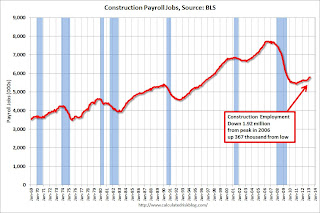 Construction is now a positive for the economy.
 Construction employment increased by 18,000 in March (up 91,000 in the first quarter). This still leaves construction with 1.92 million fewer payroll jobs compared to the peak in April 2006, but employment is up 367,000 from the low in January 2011.
I expect residential investment to make a solid positive contribution to GDP growth this year, and for construction employment to continue to increase.
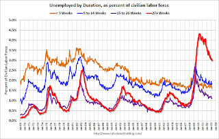 This graph shows the duration of unemployment as a percent of the civilian labor force. The graph shows the number of unemployed in four categories: less than 5 week, 6 to 14 weeks, 15 to 26 weeks, and 27 weeks or more.
The general trend is down for all categories, but only the less than 5 weeks is back to normal levels.
The long term unemployed is just under 3.0% of the labor force - the lowest since June 2009 - however the number (and percent) of long term unemployed remains a serious problem.
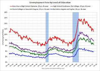 This graph shows the unemployment rate by four levels of education (all groups are 25 years and older).
Unfortunately this data only goes back to 1992 and only includes one previous recession (the stock / tech bust in 2001). Clearly education matters with regards to the unemployment rate - and it appears all four groups are generally trending down.
Although education matters for the unemployment rate, it doesn't appear to matter as far as finding new employment (all four categories are only gradually declining).
Note: This says nothing about the quality of jobs - as an example, a college graduate working at minimum wage would be considered "employed".
 This is a little more technical. The BLS diffusion index for total private employment was at 54.3 in March, down from 59.6 in February.
For manufacturing, the diffusion index decreased to 46.3, down from 54.3 in February.
Think of this as a measure of how widespread job gains are across industries. The further from 50 (above or below), the more widespread the job losses or gains reported by the BLS. From the BLS:
Figures are the percent of industries with employment increasing plus one-half of the industries with unchanged employment, where 50 percent indicates an equal balance between industries with increasing and decreasing employment.Job growth for both total private employment was fairly narrow for March. This is a not good sign and suggests only a few industries were hiring in March. For manufacturing, more companies were decreasing employment than adding jobs in March.
Earlier:
• Summary for Week Ending April 5th
• Schedule for Week of April 7th
Business Week on Jim the Realtor
by Calculated Risk on 4/07/2013 10:02:00 AM
I've been posting Jim the Realtor videos for years. The earlier videos were very funny as Jim toured REOs and drug houses. He also posted videos about short sale fraud, and recently on the buying frenzy in San Diego.
Peter Hong at the LA Times called Jim "The Hunter S. Thompson of real estate" and Nightline Truth in Advertising: One Realtor's Strategy to Sell Foreclosed Homes
Here is another story on Jim from Karen Weise at BusinessWeek: The 'Hunter S. Thompson of Real Estate' Chronicles the Bust—and Boom
Jim Klinge sighed as he made his way through a foreclosed home littered with empty bottles of rum and mattresses. It was 2008, and Klinge, a real estate agent, was filming a YouTube (GOOG) video for his blog documenting the housing crash in the cul-de-sacs and condos north of San Diego. As he opened a closet, daylight illuminated walls splattered with black mold spores, like a tie-dye project gone awry. “Oh, lovely,” Klinge said. “People were living in here like this, looks like. They were lucky to make it out alive.”There is much more in the article.
Five years later, Klinge’s videos tell a different story, one of limited inventory and jampacked open houses, bidding wars, and quick sales. ... He made the videos to shock sellers into lowering their unrealistic asking prices, but most clung to their illusions. Buyers, on the other hand, ate it up, as did economists and the press. The economics blog Calculated Risk began embedding Klinge’s videos, and in April 2009 the Los Angeles Times ran a front-page story calling Klinge “The Hunter S. Thompson of real estate.”
Here is an REO tour from Jim back in early 2009 (check on the difference in the MLS photos and Jim's video):
Saturday, April 06, 2013
Unofficial Problem Bank list declines to 790 Institutions, Q1 Transition Matrix
by Calculated Risk on 4/06/2013 06:56:00 PM
This is an unofficial list of Problem Banks compiled only from public sources.
Here is the unofficial problem bank list for Apr 5, 2013.
Changes and comments from surferdude808:
The failure last night is the only change to the Unofficial Problem Bank List this week. The removal leaves the list at 790 institutions with assets of $290.0 billion. A year ago the list held 946 institutions with assets of $376.5 billion. Gold Canyon Bank, Gold Canyon, AZ ($45 million Ticker: GCYO) is the fifth failure this year and the 13th bank to fail in Arizona since the on-set of the financial crisis.
With the first quarter of 2013 ending this past week, it is time for an update of the transition matrix. As seen in the table, there have been a total of 1,624 institutions with assets of $811.2 billion that have appeared on the list. For the first time since publication of the list, more than half of the institutions that have appeared on the list have been removed. Specifically, 833 institutions or 51.3 percent of the total are no longer on the list. Failure is still the primary removal reason as 351 institutions with assets of $290.8 billion have failed since appearing on the list. However, action terminations are rapidly approaching the number of failures. A total of 343 institutions with assets of $153.2 billion have improved enough for their enforcement action to be terminated. Other forms of exit include 129 institutions with assets of $55.9 billion finding a merger partner and 10 institutions with assets of $6.7 billion voluntarily surrendering their banking charters. The slowdown in action terminations noted last quarter reversed as 51 terminations occurred during the first quarter of 2013 compared to 40 in the fourth quarter of 2012. Next quarter, terminations will finally exceed failures.
| Unofficial Problem Bank List | |||
|---|---|---|---|
| Change Summary | |||
| Number of Institutions | Assets ($Thousands) | ||
| Start (8/7/2009) | 389 | 276,313,429 | |
| Subtractions | |||
| Action Terminated | 104 | (31,414,531) | |
| Unassisted Merger | 26 | (4,191,282) | |
| Voluntary Liquidation | 3 | (4,896,324) | |
| Failures | 148 | (182,228,947) | |
| Asset Change | (14,534,468) | ||
| Still on List at 12/28/2012 | 108 | 39,047,877 | |
| Additions | 683 | 250,947,679 | |
| End (12/28/2012) | 791 | 289,995,556 | |
| Intraperiod Deletions1 | |||
| Action Terminated | 239 | 121,805,500 | |
| Unassisted Merger | 103 | 51,745,000 | |
| Voluntary Liquidation | 7 | 1,760,816 | |
| Failures | 203 | 108,650,455 | |
| Total | 552 | 283,961,771 | |
| 1Institution not on 8/7/2009 or 3/31/2013 list but appeared on a weekly list. | |||
Earlier:
• Summary for Week Ending April 5th
• Schedule for Week of April 7th
Summary for Week ending April 5th
by Calculated Risk on 4/06/2013 02:12:00 PM
"Disappointing" and "below expectations" were the most used phrases to describe the economic releases last week. Even though growth in Q1 was better than in Q4 2012, it appears the first quarter ended sluggishly.
The employment report was well below expectations with only 88,000 payroll jobs added, the ISM manufacturing and service indexes indicated slower growth in March, initial weekly unemployment claims increased sharply, and even auto sales were a little disappointing.
On the positive side, construction spending increased, and it appears the layoffs at the state and local government level are ending (two of the key reasons I'm more optimistic this year).
But overall it was a disappointing week. I expect some slowdown over the next couple of quarters related to policy (sequestration), but I think the key drivers for growth are still positive.
Here is a summary of last week in graphs:
• March Employment Report: 88,000 Jobs, 7.6% Unemployment Rate
 Click on graph for larger image.
NOTE: This graph is ex-Census meaning the impact of the decennial Census temporary hires and layoffs is removed to show the underlying payroll changes.
From the BLS: "Nonfarm payroll employment edged up in March (+88,000), and the unemployment rate was little changed at 7.6 percent, the U.S. Bureau of Labor Statistics reported today. ... The change in total nonfarm payroll employment for January was revised from +119,000 to +148,000, and the change for February was revised from +236,000 to +268,000."
The headline number was well below expectations of 193,000 payroll jobs added. However employment for January and February were revised higher.
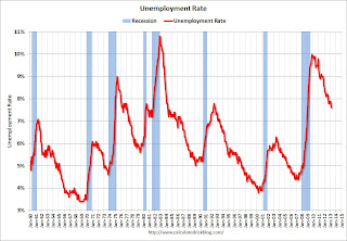 The second graph shows the unemployment rate.
The unemployment rate decreased to 7.6% from 7.7% in February.
The unemployment rate is from the household report and the household report showed a sharp decline in the labor force - and that meant a lower unemployment rate.
The labor force (household survey) declined from 155.524 million to 155.028 million - a decline of 496 thousand.
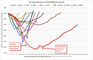 This graph shows the job losses from the start of the employment recession, in percentage terms, compared to previous post WWII recessions. The dotted line is ex-Census hiring.
This shows the depth of the recent employment recession - worse than any other post-war recession - and the relatively slow recovery due to the lingering effects of the housing bust and financial crisis.
This was a disappointing employment report and worse than expectations.
• ISM Manufacturing index declines in March to 51.3
 The ISM manufacturing index indicated expansion in March. The PMI was at 51.3% in March, down from 54.2% in February. The employment index was at 54.2%, up from 52.6%, and the new orders index was at 51.4%, down from 57.8% in February.
Here is a long term graph of the ISM manufacturing index.
This was below expectations of 54.0% and suggests manufacturing expanded at a slower pace in March.
• ISM Non-Manufacturing Index indicates slower expansion in March
 The March ISM Non-manufacturing index was at 54.4%, down from 56.0% in February. The employment index decreased in March to 53.3%, down from 57.2% in February. Note: Above 50 indicates expansion, below 50 contraction.
This graph shows the ISM non-manufacturing index (started in January 2008) and the ISM non-manufacturing employment diffusion index.
This was below the consensus forecast of 56.0% and indicates slower expansion in March than in February.
• U.S. Light Vehicle Sales decreased to 15.3 million annual rate in March
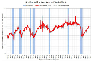 Based on an estimate from AutoData Corp, light vehicle sales were at a 15.27 million SAAR in March. That is up 8% from March 2012, and down slightly from the sales rate last month.
This was below the consensus forecast of 15.4 million SAAR (seasonally adjusted annual rate).
Note: dashed line is current estimated sales rate.
This is a solid start to the new year. After three consecutive years of double digit auto sales growth, the growth rate will probably slow in 2013 - but this will still be another positive year for the auto industry.
Even if sales average the Q1 rate all year, Total sales would be up about 6% from 2012.
• Construction Spending increased in February
 From Census Bureau: "The U.S. Census Bureau of the Department of Commerce announced today that construction spending during February 2013 was estimated at a seasonally adjusted annual rate of $885.1 billion, 1.2 percent above the revised January estimate of $874.8 billion. The February figure is 7.9 percent above the February 2012 estimate of $820.7 billion."
This graph shows private residential and nonresidential construction spending, and public spending, since 1993. Note: nominal dollars, not inflation adjusted.
 Private residential spending is 55% below the peak in early 2006, and up 36% from the post-bubble low. Non-residential spending is 25% below the peak in January 2008, and up about 37% from the recent low.
Public construction spending is now 16% below the peak in March 2009 and just above the lowest level since 2006 (not inflation adjusted).
The second graph shows the year-over-year change in construction spending.
On a year-over-year basis, private residential construction spending is now up 20%. Non-residential spending is up 6% year-over-year mostly due to energy spending (power and electric). Public spending is down 1.5% year-over-year.
• Trade Deficit declined in February to $43 Billion
 The Department of Commerce reported: "[T]otal February exports of $186.0 billion and imports of $228.9 billion resulted in a goods and services deficit of $43.0 billion, down from $44.5 billion in January, revised. February exports were $1.6 billion more than January exports of $184.4 billion. February imports were $0.1 billion more than January imports of $228.9 billion."
The trade deficit was below the consensus forecast of $44.8 billion.
Exports are 12% above the pre-recession peak and up 3.2% compared to February 2012; imports are slightly below the pre-recession peak, and up 2% compared to February 2012.
 This graph shows the U.S. trade deficit, with and without petroleum, through February.
The blue line is the total deficit, and the black line is the petroleum deficit, and the red line is the trade deficit ex-petroleum products.
The decrease in the trade deficit in February was mostly due to a decrease in the volume of petroleum imports.
Oil averaged $95.96 per barrel in February, up from $94.08 in January, but down from $103.63 in February 2012.
• Weekly Initial Unemployment Claims increase to 385,000
 From the DOL: "In the week ending March 30, the advance figure for seasonally adjusted initial claims was 385,000, an increase of 28,000 from the previous week's unrevised figure of 357,000."
The dashed line on the graph is the current 4-week average. The four-week average of weekly unemployment claims increased to 354,250 - the highest level since February.
Weekly claims were above the 350,000 consensus forecast. Note: This appears to be the beginning of the impact of the "sequestration" budget cuts.


