by Calculated Risk on 2/27/2013 09:09:00 AM
Wednesday, February 27, 2013
MBA: Mortgage Applications Decrease
From the MBA: Mortgage Applications Decrease in Latest MBA Weekly Survey
The Refinance Index decreased 3 percent from the previous week. The seasonally adjusted Purchase Index decreased 5 percent from one week earlier and is at its lowest level since the week ending December 28, 2012.
...
The average contract interest rate for 30-year fixed-rate mortgages with conforming loan balances ($417,500 or less) decreased to 3.77 percent from 3.78 percent, with points increasing to 0.48 from 0.40 (including the origination fee) for 80 percent loan-to-value ratio (LTV) loans.
emphasis added
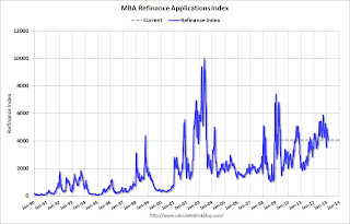 Click on graph for larger image.
The first graph shows the refinance index.
The refinance activity is down over the last five weeks. Activity is still very high, but is declining from the levels of 2012.
There has been a sustained refinance boom for over a year, and 77 percent of all mortgage applications are for refinancing.
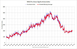 The second graph shows the MBA mortgage purchase index. The purchase index was at the low for the year last week, but the 4-week average of the index has generally been trending up over the last six months.
This index will probably continue to increase as conventional home purchase activity increases.
Tuesday, February 26, 2013
Wednesday: Durable Goods, Pending Home Sales, Bernanke
by Calculated Risk on 2/26/2013 09:40:00 PM
This is interesting, from the WSJ: Miami Condo Loan Marks Milestone
[A] group of lenders led by Birmingham, Ala.-based Regents Financial Corp. has agreed to lend $160 million to the developers of the Mansions at Acqualina, an ultraluxury, 47-story tower under construction in Sunny Isles Beach, near Miami.This is a pretty low risk loan - with the large number of presales and 50% downpayments - but it means lenders are a little more willing to make loans.
...
The loan is the first debt deal of more than $100 million for a new condo development since the housing boom ... The lender required the builder to have completed $320 million in presales, and stipulated 50% downpayments from buyers as a condition of the loan
Wednesday economic releases:
• At 7:00 AM ET, the Mortgage Bankers Association (MBA) will release the results for the mortgage purchase applications index.
• Also at 8:30 AM, Durable Goods Orders for January from the Census Bureau. The consensus is for a 4.0% decrease in durable goods orders.
• At 10:00 AM, Pending Home Sales Index for January. The consensus is for a 3.0% increase in the index.
• Also at 10:00 AM, Repeat to House: Fed Chairman Ben Bernanke will deliver the "Semiannual Monetary Policy Report to the Congress", Before the Committee on Financial Services, U.S. House of Representatives
Misc: Sales Ratio Existing to New Home Sales, FHFA House Prices, Richmond Fed Mfg Survey
by Calculated Risk on 2/26/2013 06:01:00 PM
A couple of earlier released ... another index shows house prices increased in 2012, and the Richmond Fed survey suggested regional manufacturing expanded in February.
• From the FHFA: U.S. House Prices Rose 1.4 Percent in Fourth Quarter 2012
U.S. house prices rose 1.4 percent from the third quarter to the fourth quarter of 2012 according to the Federal Housing Finance Agency’s (FHFA) seasonally adjusted purchase-only house price index (HPI). The HPI is calculated using home sales price information from Fannie Mae and Freddie Mac mortgages. Seasonally adjusted house prices rose 5.5 percent from the fourth quarter of 2011 to the fourth quarter of 2012. FHFA’s seasonally adjusted monthly index for December was up 0.6 percent from November.• From the Richmond Fed: Manufacturing Activity Rebounded In February; Expectations Rose
“The fourth quarter was another strong one for house prices, as it was the third consecutive quarter where U.S. price growth exceeded one percent,” said FHFA Principal Economist Andrew Leventis. “While a significant number of homes remained in the foreclosure pipeline, the actual number of homes available for sale was very low and fell over the course of the quarter.”
FHFA’s expanded-data house price index, a metric introduced in August 2011 that adds transaction information from county recorder offices and the Federal Housing Administration to the HPI data sample, rose 1.6 percent over the latest quarter. Over the latest four quarters, that index is also up 5.5 percent.
emphasis added
In February, the seasonally adjusted composite index of manufacturing activity — our broadest measure of manufacturing — gained eighteen points, settling at 6 from January's reading of −12. Among the index's components, shipments rose twenty-one points to 10, the gauge for new orders moved up seventeen points to end at 0, and the jobs index increased thirteen points to 8.• Earlier I posted a graph that shows the "distressing gap" between new and existing home sales. I've argued that this gap has been mostly caused by distressed sales (foreclosures and short sales) and that eventually the gap would close.
Other indicators also suggested strengthening in February. The index for capacity utilization moved higher, adding twenty-nine points to 11, and the index for backlogs of orders gained seven points to end at −12. The delivery times index stabilized, picking up four points to end at 4, while both our gauges for inventories were lower in February. The raw materials inventory index lost seven points to finish at 16, and the finished goods inventories moved down eleven points to end at 12.
Hiring activity at District plants was mixed in February. The manufacturing employment index moved up thirteen points to settle at 8, while the average workweek indicator remained weak, tacking on just two points to end at −2. However, the wage index held steady at 11.
Another way to look at this is a ratio of existing to new home sales.
This ratio was fairly stable from 1994 through 2006, and then the flood of distressed sales kept the number of existing home sales elevated and depressed new home sales. (Note: This ratio was fairly stable back to the early '70s, but I only have annual data for the earlier years).
 Click on graph for larger image.
In general the ratio has been trending down, and I expect this ratio to trend down over the next several years as the number of distressed sales declines and new home sales increase.
Note: Existing home sales are counted when transactions are closed, and new home sales are counted when contracts are signed. So the timing of sales is different.
Earlier on New Home Sales:
• New Home Sales at 437,000 SAAR in January
• A few Comments on New Home Sales
• New Home Sales graphs
Earlier on House Prices:
• Case-Shiller: Comp 20 House Prices increased 6.8% year-over-year in December
• Real House Prices and Price-to-Rent Ratio
• All Current House Price Graphs
Real House Prices and Price-to-Rent Ratio
by Calculated Risk on 2/26/2013 02:41:00 PM
For December, Case-Shiller reported the seventh consecutive year-over-year (YoY) gain in their house price indexes since 2010 - and the increase back in 2010 was related to the housing tax credit. Excluding the tax credit, the previous YoY increase was back in 2006. The YoY increase in December suggests that house prices probably bottomed earlier in 2012 (the YoY change lags the turning point for prices).
The following table shows the year-over-year increase for each month in 2012.
| Case-Shiller Composite 20 Index | |
|---|---|
| Month | YoY Change |
| Jan-12 | -3.9% |
| Feb-12 | -3.5% |
| Mar-12 | -2.6% |
| Apr-12 | -1.7% |
| May-12 | -0.5% |
| Jun-12 | 0.6% |
| Jul-12 | 1.1% |
| Aug-12 | 1.9% |
| Sep-12 | 2.9% |
| Oct-12 | 4.2% |
| Nov-12 | 5.5% |
| Dec-12 | 6.8% |
I expect the year-over-year change will slow going forward, but the lack of inventory might push prices up more than I expect in 2013. That is why I'm watching inventory closely.
Here are some updates to a few graphs ... Case-Shiller, CoreLogic and others report nominal house prices, and it is also useful to look at house prices in real terms (adjusted for inflation) and as a price-to-rent ratio.
As an example, if a house price was $200,000 in January 2000, the price would be close to $275,000 today adjusted for inflation.
Nominal House Prices
 The first graph shows the quarterly Case-Shiller National Index SA (through Q4 2012), and the monthly Case-Shiller Composite 20 SA and CoreLogic House Price Indexes (through December) in nominal terms as reported.
In nominal terms, the Case-Shiller National index (SA) is back to Q2 2003 levels (and also back up to Q3 2010), and the Case-Shiller Composite 20 Index (SA) is back to October 2003 levels, and the CoreLogic index (NSA) is back to January 2004.
Real House Prices
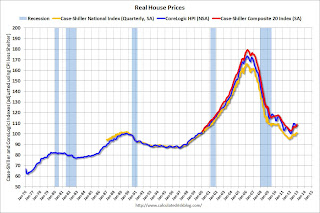 The second graph shows the same three indexes in real terms (adjusted for inflation using CPI less Shelter). Note: some people use other inflation measures to adjust for real prices.
In real terms, the National index is back to October 1999 levels, the Composite 20 index is back to October 2000, and the CoreLogic index back to February 2001.
In real terms, most of the appreciation in the last decade is gone.
Price-to-Rent
In October 2004, Fed economist John Krainer and researcher Chishen Wei wrote a Fed letter on price to rent ratios: House Prices and Fundamental Value. Kainer and Wei presented a price-to-rent ratio using the OFHEO house price index and the Owners' Equivalent Rent (OER) from the BLS.
 Here is a similar graph using the Case-Shiller National, Composite 20 and CoreLogic House Price Indexes.
This graph shows the price to rent ratio (January 1998 = 1.0).
On a price-to-rent basis, the Case-Shiller National index is back to Q4 1999 levels, the Composite 20 index is back to October 2000 levels, and the CoreLogic index is back to February 2001.
In real terms - and as a price-to-rent ratio - prices are mostly back to early 2000 levels.
A few Comments on New Home Sales
by Calculated Risk on 2/26/2013 12:36:00 PM
1) January is seasonally the weakest month of the year for new home sales, so January has the largest positive seasonal adjustment. Also this was just one month with a sales rate over 400 thousand - and we shouldn't read too much into one month of data. But this was the highest level since July 2008 and it is clear the housing recovery is ongoing.
2) Although there was a large increase in the sales rate, sales are still near the lows for previous recessions. This suggest significant upside over the next few years (based on estimates of household formation and demographics, I expect sales to increase to 750 to 800 thousand over the next several years).
3) Housing is historically the best leading indicator for the economy, and this is one of the reasons I think The future's so bright, I gotta wear shades. Note: The key downside risk is too much austerity too quickly, but that is a different post.
Note: For 2013, estimates are sales will increase to around 450 to 460 thousand, or an increase of around 22% to 25% on an annual basis for the 367 thousand in 2012.
And here is another update to the "distressing gap" graph that I first started posting over four years ago to show the emerging gap caused by distressed sales. Now I'm looking for the gap to start to close over the next few years.
The "distressing gap" graph shows existing home sales (left axis) and new home sales (right axis) through January. This graph starts in 1994, but the relationship has been fairly steady back to the '60s.
 Click on graph for larger image.
Following the housing bubble and bust, the "distressing gap" appeared mostly because of distressed sales. The flood of distressed sales kept existing home sales elevated, and depressed new home sales since builders weren't able to compete with the low prices of all the foreclosed properties.
I don't expect much of an increase in existing home sales (distressed sales will slowly decline and be offset by more conventional sales). But I do expect this gap to close - mostly from an increase in new home sales.
Note: Existing home sales are counted when transactions are closed, and new home sales are counted when contracts are signed. So the timing of sales is different.
Earlier:
• New Home Sales at 437,000 SAAR in January
• New Home Sales graphs
New Home Sales at 437,000 SAAR in January
by Calculated Risk on 2/26/2013 10:00:00 AM
NOTE: Federal Reserve Chairman Ben Bernanke testimony Testimony by Chairman Bernanke on the Semiannual Monetary Policy Report to the Congress
Here is the C-Span Link
On New Home Sales:
The Census Bureau reports New Home Sales in January were at a seasonally adjusted annual rate (SAAR) of 437 thousand. This was up from a revised 378 thousand SAAR in December (revised up from 369 thousand).
The first graph shows New Home Sales vs. recessions since 1963. The dashed line is the current sales rate.
"Sales of new single-family houses in January 2013 were at a seasonally adjusted annual rate of 437,000 ... This is 15.6 percent above the revised December rate of 378,000 and is 28.9 percent above the January 2012 estimate of 339,000."
 Click on graph for larger image in graph gallery.
The second graph shows New Home Months of Supply.
The months of supply decreased in January to 4.1 months from 4.8 months in December.
The all time record was 12.1 months of supply in January 2009.
 This is now in the normal range (less than 6 months supply is normal).
"The seasonally adjusted estimate of new houses for sale at the end of January was 150,000. This represents a supply of 4.1 months at the current sales rate."On inventory, according to the Census Bureau:
"A house is considered for sale when a permit to build has been issued in permit-issuing places or work has begun on the footings or foundation in nonpermit areas and a sales contract has not been signed nor a deposit accepted."Starting in 1973 the Census Bureau broke this down into three categories: Not Started, Under Construction, and Completed.
 This graph shows the three categories of inventory starting in 1973.
The inventory of completed homes for sale was just above the record low. The combined total of completed and under construction is also just above the record low.
The last graph shows sales NSA (monthly sales, not seasonally adjusted annual rate).
In January 2013 (red column), 31 thousand new homes were sold (NSA). Last year only 23 thousand homes were sold in January. This was the ninth weakest January since this data has been tracked. The high for January was 92 thousand in 2005.

This was above expectations of 381,000 sales in January. This is the strongest sales rate since 2008. This was another solid report. I'll have more soon ...
Case-Shiller: Comp 20 House Prices increased 6.8% year-over-year in December
by Calculated Risk on 2/26/2013 09:00:00 AM
S&P/Case-Shiller released the monthly Home Price Indices for December and Q4 ("December" is a 3 month average of October, November and December).
This release includes prices for 20 individual cities, two composite indices (for 10 cities and 20 cities), and the quarterly National Index.
Note: Case-Shiller reports Not Seasonally Adjusted (NSA), I use the SA data for the graphs.
From S&P: Home Prices Closed Out a Strong 2012 According to the S&P/Case-Shiller Home Price Indices
Data through December 2012, released today by S&P Dow Jones Indices for its S&P/Case-Shiller1 Home Price Indices, the leading measure of U.S. home prices, showed that all three headline composites ended the year with strong gains. The national composite posted an increase of 7.3% for 2012. The 10- and 20-City Composites reported annual returns of 5.9% and 6.8% in 2012. Month-over-month, both the 10- and 20-City Composites moved into positive territory with gains of 0.2%; more than reversing last month’s losses.
In addition to the three composites, nineteen of the 20 MSAs posted positive year-over-year growth – only New York fell.
“Home prices ended 2012 with solid gains,” says David M. Blitzer, Chairman of the Index Committee at S&P Dow Jones Indices. “Housing and residential construction led the economy in the 2012 fourth quarter. In December’s report all three headline composites and 19 of the 20 cities gained over their levels of a year ago. Month-over-month, 9 cities and both Composites posted positive monthly gains. Seasonally adjusted, there were no monthly declines across all 20 cities.
...
“Atlanta and Detroit posted their biggest year-over-year increases of 9.9% and 13.6% since the start of their indices in January 1991. Dallas, Denver, and Minneapolis recorded their largest annual increases since 2001. Phoenix continued its climb, posting an impressive year-over-year return of 23.0%; it posted eight consecutive months of double-digit annual growth.”
 Click on graph for larger image.
 The first graph shows the nominal seasonally adjusted Composite 10 and Composite 20 indices (the Composite 20 was started in January 2000).
The Composite 10 index is off 30.0% from the peak, and up 0.9% in December (SA). The Composite 10 is up 6.2% from the post bubble low set in March (SA).
The Composite 20 index is off 29.2% from the peak, and up 0.9% (SA) in December. The Composite 20 is up 7.0% from the post-bubble low set in March (SA).
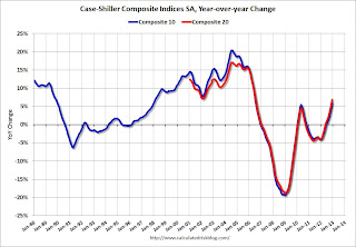 The second graph shows the Year over year change in both indices.
The Composite 10 SA is up 5.9% compared to December 2011.
The Composite 20 SA is up 6.8% compared to December 2011. This was the seventh consecutive month with a year-over-year gain since 2010 (when the tax credit boosted prices temporarily). This was the largest year-over-year gain for the Composite 20 index since 2006.
The third graph shows the price declines from the peak for each city included in S&P/Case-Shiller indices.
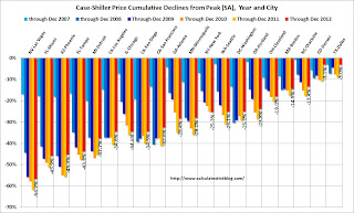 Prices increased (SA) in 20 of the 20 Case-Shiller cities in December seasonally adjusted (also 19 of 20 cities increased NSA). Prices in Las Vegas are off 56.7% from the peak, and prices in Dallas only off 3.0% from the peak. Note that the red column (cumulative decline through December 2012) is above previous declines for all cities.
This was at the consensus forecast for a 6.8% YoY increase. I'll have more on prices later.
Monday, February 25, 2013
Tuesday: New Home Sales, Case-Shiller House Prices, Bernanke
by Calculated Risk on 2/25/2013 08:57:00 PM
Tomorrow will be busy ... but first from Tim Duy: ECB Should Pledge to Not Do Anything Stupid
Market participants were rattled today by the election news out of Italy, as it looks like the economically-challenged nation is now politically adrift. ...Tuesday economic releases:
...
Why should we be concerned that Italy backslides on its commitment to austerity? After all, evidence of the economic damage wrought by such policies continues to mount. If anything, a reversal of recent austerity should be welcome.
I suspect, however, that it is not the austerity that worries market participants. It is the fear that European Central Bank head Mario Draghi will threaten to pull his pledge to do whatever is takes to save the Euro in the face of Italian intransigence. The fear that European policymakers are about to partake in another grand game of chicken that once again will bring the sustainability of the single currency back into question. In short, I think that market participants fear tight monetary policy much more than loose fiscal policy. ...
• At 9:00 AM ET, S&P/Case-Shiller House Price Index for December will be released. Although this is the December report, it is really a 3 month average of October, November and December. The consensus is for a 6.8% year-over-year increase in the Composite 20 index (NSA) for December. The Zillow forecast is for the Composite 20 to increase 6.7% year-over-year, and for prices to increase 0.7% month-to-month seasonally adjusted.
• Also at 9:00 AM, FHFA House Price Index for December 2012 will be released. This was original a GSE only repeat sales, however there is also an expanded index that deserves more attention. The consensus is for a 0.7% increase in house prices.
• At 10:00 AM, New Home Sales for January will be released by the Census Bureau. The consensus is for an increase in sales to 381 thousand Seasonally Adjusted Annual Rate (SAAR) in January from 369 thousand in December.
• Also at 10:00 AM, the Richmond Fed Survey of Manufacturing Activity for February. The consensus is for a a reading of minus 3 for this survey, up from minus 12 in January (Below zero is contraction).
• Also at 10:00 AM, the Conference Board's consumer confidence index for February. The consensus is for the index to increase to 61.0.
• Also at 10:00 AM, Fed Chairman Ben Bernanke will deliver the "Semiannual Monetary Policy Report to the Congress", Before the Committee on Banking, Housing, and Urban Affairs, U.S. Senate
Existing Home Inventory up 3.6% year-to-date in late February
by Calculated Risk on 2/25/2013 05:57:00 PM
Weekly Update: One of key questions for 2013 is Will Housing inventory bottom this year?. Since this is a very important question, I'll be tracking inventory weekly for the next few months.
If inventory does bottom, we probably will not know for sure until late in the year. In normal times, there is a clear seasonal pattern for inventory, with the low point for inventory in late December or early January, and then peaking in mid-to-late summer.
The NAR data is monthly and released with a lag. However Ben at Housing Tracker (Department of Numbers) kindly sent me some weekly inventory data for the last several years. This is displayed on the graph below as a percentage change from the first week of the year.
In 2010 (blue), inventory followed the normal seasonal pattern, however in 2011 and 2012, there was only a small increase in inventory early in the year, followed by a sharp decline for the rest of the year.
So far - through late February - it appears inventory is increasing at a sluggish rate.
 Click on graph for larger image.
Note: the data is a little weird for early 2011 (spikes down briefly).
The key will be to see how much inventory increases over the next few months. In 2010, inventory was up 8% by early March, and up 15% by the end of March.
For 2011 and 2012, inventory only increased about 5% at the peak.
So far in 2013, inventory is up 3.6%. If inventory doesn't increase more soon, then the bottom for inventory might not be until 2014.
Market Update
by Calculated Risk on 2/25/2013 04:51:00 PM

Click on graph for larger image.
By request - following the sell off today - here are a couple of stock market graphs I haven't posted in several months. The first graph shows the S&P 500 since 1990 (this excludes dividends).
The dashed line is the closing price today. The S&P 500 was first at this level in March 2000; almost 13 years ago.
The second graph (click on graph for larger image) is from Doug Short and shows the S&P 500 since the 2007 high ...


