by Calculated Risk on 5/05/2012 10:55:00 PM
Saturday, May 05, 2012
France and Greece Election Times
The Greek polls will be open until noon ET Sunday, and the French polls will be open until 2 PM ET.
The Greek polls will be open from 7 AM to 7 PM local time according to the Athens News.
Voting in the 2012 general election will get underway at 7am on Sunday ... Polling stations will remain open until 7pm.No party will win a majority in Greece; the leading party (New Democracy) will try to form a collation government with one or more of the smaller parties - so the drama will probably drag on for some time.
Unofficial exit polls will be announced, via the media, by the country’s polling agencies shortly after the closing of polling stations.
The authorities say that they expect results from a quarter of polling stations by 9.30[pm], while the first indicative results are anticipated no sooner than 11[pm] on Sunday night.
The vote should be completed in the early hours of Monday morning
The French polls will be open from 8 AM to 8 PM local time (from 2 AM ET to 2 PM ET).
Unless there is a major surprise, the media will declare François Hollande the winner pretty early in France.
Earlier:
• Summary for Week Ending May 4th
• Schedule for Week of May 6th
Employment posts yesterday:
• April Employment Report: 115,000 Jobs, 8.1% Unemployment Rate
• April Employment Summary and Discussion
• More Graphs: Construction Employment, Duration of Unemployment, Unemployment by Education and Diffusion Indexes
• All Current Employment Graphs
AAR: Rail Traffic "mixed" in April
by Calculated Risk on 5/05/2012 08:35:00 PM
Once again rail traffic was "mixed". This was because of the sharp decline in coal traffic (mild winter, low natural gas prices), and also for grains. Other commodities were up, such as building related commodities such as lumber and crushed stone, gravel, sand.
From the Association of American Railroads (AAR): Reports Mixed Rail Traffic for April
The Association of American Railroads (AAR) reported U.S. rail carloads originated in April 2012 totaled 1,113,105, down 64,335 carloads or 5.5 percent, compared with April 2011. Intermodal volume in April 2012 was 946,951 trailers and containers, up 32,505 units or up 3.6 percent, compared with April 2011.
...
Commodities with carload declines in April were led by coal, down 85,719 carloads, or 16.6 percent compared with April 2011. This was coal’s biggest year-over-year percentage decline in rail traffic on record.
 Click on graph for larger image.
This graph shows U.S. average weekly rail carloads (NSA).
Once again, coal was the main reason for the decline in total carloads. Coal carloads were down 16.6% (85,719 carloads) in April 2012, their biggest year-over-year percentage decline on record. A warm winter, low natural gas prices that make gas-based electricity generation more competitive vis-à-vis coal-based generation, and environmental pressures are all reducing U.S. coal consumption, and thus rail coal carloads.
Meanwhile, U.S. rail grain carloads were down 17.2% (16,402 carloads) in April 2012 from April 2011, their 10th straight significant decline. Grain carloads are hurting largely because U.S. grain exports are down.
 The second graph is just for coal and shows the sharp decline this year.
Just when you thought coal couldn’t get worse, it did. U.S. coal carloads fell 16.6% (85,719 carloads) in April 2012 from April 2011, the biggest monthly decline on record. (Our data begin in 1988.) Average U.S. coal carloads of 107,379 in April 2012 were the lowest of any month since July 1993. ...The third graph is for intermodal traffic (using intermodal or shipping containers):
Again this month, rail traffic is more encouraging if you forget about coal and grain. Excluding coal, U.S. rail carloads were up 3.2% (21,384 carloads) in April 2012 over April 2011.
 Graphs reprinted with permission.
Intermodal traffic is now close to the peak year of 2006.
U.S. intermodal traffic — containers and trailers on railroad flat cars — was up 3.6% (32,505 units) in April 2012 over April 2011 to 946,951 units, its 29th straight year-over-year monthly increase. The average in April 2012 was 236,738 intermodal units per week, the second highest average of any April in history (just behind April 2006’s 237,062) and the 13th highest of any month in history. (Most of the top months are in the fall, when intermodal tends to peak.)
Earlier:
• Summary for Week Ending May 4th
• Schedule for Week of May 6th
Employment posts yesterday:
• April Employment Report: 115,000 Jobs, 8.1% Unemployment Rate
• April Employment Summary and Discussion
• More Graphs: Construction Employment, Duration of Unemployment, Unemployment by Education and Diffusion Indexes
• All Current Employment Graphs
Unofficial Problem Bank list declines to 925 Institutions
by Calculated Risk on 5/05/2012 04:47:00 PM
This is an unofficial list of Problem Banks compiled only from public sources.
Here is the unofficial problem bank list for May 4, 2012. (table is sortable by assets, state, etc.)
Changes and comments from surferdude808:
Relatively quiet week for the Unofficial Problem Bank List with five removals. The removals lower the institution list count to 925 with assets of $361.1 billion. A year-ago, the list held 983 institutions with assets of $422.2 billion.Earlier:
One removal was due to failure -- Security Bank, National Association, North Lauderdale, Florida ($95 million); two removals from action termination by the Federal Reserve-- MidSouth Bank, Murfreesboro, TN ($239 million) and North Valley Bank, Zanesville, OH ($153 million); and two from unassisted mergers -- Farmers National Bank, Walton, KY ($85 million) and State Bank of Cokato, Cokato, MN ($53 million). Perhaps next week the OCC will release its actions through mid-April 2012.
• Summary for Week Ending May 4th
• Schedule for Week of May 6th
Employment posts yesterday:
• April Employment Report: 115,000 Jobs, 8.1% Unemployment Rate
• April Employment Summary and Discussion
• More Graphs: Construction Employment, Duration of Unemployment, Unemployment by Education and Diffusion Indexes
• All Current Employment Graphs
Schedule for Week of May 6th
by Calculated Risk on 5/05/2012 01:01:00 PM
Earlier:
• Summary for Week Ending May 4th
This will be a light week for economic releases. The key economic release is the March trade balance report to be released on Thursday.
There will be several speeches by Fed officials, including from Fed Chairman Ben Bernanke on bank regulation.
The elections in Europe will be a focus on Sunday.
On Sunday, France and Greece will hold elections. In France, François Hollande is expected to win, although recent polls are close.
In Greece, no party will win a majority and many of the minor parties are expected to get a boost from the anti-austerity vote.
3:00 PM: Consumer Credit for March. The consensus is for a $9.8 billion increase in consumer credit.
 7:30 AM: NFIB Small Business Optimism Index for April.
 Click on graph for larger image in graph gallery.
This graph shows the small business optimism index since 1986. The index declined to 92.5 in March from 94.3 in February.
The consensus is for an increase to 93.0 in April.
 10:00 AM ET: Job Openings and Labor Turnover Survey for March from the BLS.
 This graph shows job openings (yellow line), hires (purple), Layoff, Discharges and other (red column), and Quits (light blue column) from the JOLTS.
Jobs openings increased slightly in February, and the number of job openings (yellow) has generally been trending up. Quits also increased in February, and quits are now at the highest level since 2008. These are voluntary separations and more quits might indicate some improvement in the labor market.
7:00 AM: The Mortgage Bankers Association (MBA) will release the mortgage purchase applications index. This index has been weak this year, although this does not include all the cash buyers.
10:00 AM: Monthly Wholesale Trade: Sales and Inventories for March. The consensus is for a 0.6% increase in inventories.
8:30 AM: The initial weekly unemployment claims report will be released. The consensus is for claims an increased to 366,000 from 365,000 last week.
 8:30 AM: Trade Balance report for March from the Census Bureau.
 Exports increased slightly in February, while imports decreased sharply. Exports are well above the pre-recession peak and up 9% compared to February 2011; imports are near the pre-recession high and imports are up about 8% compared to February 2011.
The consensus is for the U.S. trade deficit to increase to $49.5 billion in March, up from from $46.0 billion in February. Export activity to Europe will be closely watched due to economic weakness.
8:30 AM: Import and Export Prices for March. The consensus is a for a 0.2% decrease in import prices.
9:30 AM: Speech by Fed Chairman Ben Bernanke, "Banks and Bank Lending: The State of Play", At the 48th Annual Conference on Bank Structure and Competition, Chicago, Illinois
8:30 AM: Producer Price Index for April. The consensus is for no change in producer prices (0.2% increase in core).
9:55 AM: Reuter's/University of Michigan's Consumer sentiment index (preliminary for May). The consensus is for sentiment to decline to 76.2 from 76.4 in April.
Summary for Week ending May 4th
by Calculated Risk on 5/05/2012 08:05:00 AM
The key report – the April employment report – was disappointing. With only 115 thousand jobs added in April, this has raised a key question: Is this a slowdown in hiring, or were the January and February numbers boosted by the mild weather, and the apparently slowdown in March and April was just some "payback"?
If the former, hiring has slowed to about 135,000 per month (or less); if the later, the economy is adding about 200,000 jobs per month. Note: Through the first four months of 2012, the economy has added 803 thousand payroll jobs, a better pace than in 2011.
There are some positives we’ve discussed lately: it appears state and local government layoffs are slowing (although there was a little increase in April), residential investment (and construction employment) is increasing from a very low level, and it appears the drag from several sectors of non-residential investment will end mid-year. So my guess is job growth will pick up from the March and April pace, but remain sluggish compared to the slack in the labor force.
The other data was mixed. The ISM manufacturing index was above expectations, but the ISM service index was below. The Chicago PMI was soft, but auto sales were solid at a 14.4 million seasonally adjusted annual rate (SAAR).
Here is a summary in graphs:
• April Employment Report: 115,000 Jobs, 8.1% Unemployment Rate
 Click on graph for larger image.
There were 115,000 payroll jobs added in April, with 130,000 private sector jobs added, and 15,000 government jobs lost. The unemployment rate declined to 8.1%. The participation rate decreased to 63.6% from 63.8% (a new cycle low) and the employment population ratio also decreased slightly to 58.4%.
The change in February payroll employment was revised up from +240,000 to +259,000, and February was revised up from +120,000 to +154,000.
This was below expectations of 165,000 payroll jobs added.
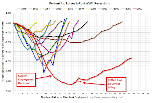 The second graph shows the job losses from the start of the employment recession, in percentage terms. The dotted line is ex-Census hiring.
This shows the depth of the recent employment recession - worse than any other post-war recession - and the relatively slow recovery due to the lingering effects of the housing bust and financial crisis.
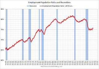 Since the participation rate has declined recently due to cyclical (recession) and demographic (aging population) reasons, an important graph is the employment-population ratio for the key working age group: 25 to 54 years old.
In the earlier period the employment-population ratio for this group was trending up as women joined the labor force. The ratio has been mostly moving sideways since the early '90s, with ups and downs related to the business cycle.
This ratio should probably move back to or above 80% as the economy recovers. So far the ratio has only increased slightly from a low of 74.7% to 75.7% in April (this was down slightly in April from March.)
• ISM Manufacturing index indicates faster expansion in April
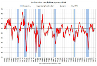 PMI was at 54.8% in April, up from 53.4% in March. The employment index was at 57.3%, up from 56.1%, and new orders index was at 58.2%, up from 54.5%.
Here is a long term graph of the ISM manufacturing index.
This was above expectations of 53.0%. This suggests manufacturing expanded at a faster rate in April than in March. It appears manufacturing employment expanded faster in April with the employment index at 57.3%.
• U.S. Light Vehicle Sales at 14.42 million annual rate
 Based on an estimate from Autodata Corp, light vehicle sales were at a 14.42 million SAAR in April. That is up 9.8% from April 2011, and up 0.7% from the sales rate last month (14.3 million SAAR in March 2012).
This was at the consensus forecast of 14.4 million SAAR (seasonally adjusted annual rate).
This graph shows the huge collapse in sales in the 2007 recession. This also shows the impact of the tsunami and supply chain issues on sales, especially in May and June of last year.
• Construction Spending increases slightly in March
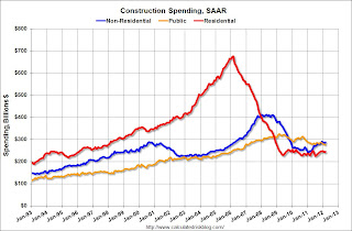 This graph shows private residential and nonresidential construction spending, and public spending, since 1993. Note: nominal dollars, not inflation adjusted.
Private residential spending is 64% below the peak in early 2006, and up 8.4% from the recent low. Non-residential spending is 30% below the peak in January 2008, and up about 18% from the recent low.
Public construction spending is now 15% below the peak in March 2009 and at a new post-bubble low.
On a year-over-year basis, both private residential and non-residential construction spending are positive, but public spending is down on a year-over-year basis. The year-over-year improvements in private non-residential are mostly due to energy spending (power and electric).
• ISM Non-Manufacturing Index indicates slower expansion in April
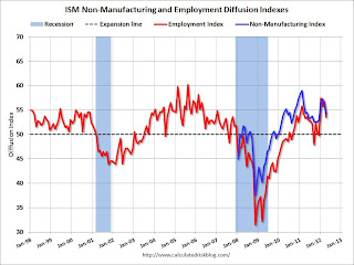 The April ISM Non-manufacturing index was at 53.5%, down from 56.0% in March. The employment index decreased in April to 54.2%, down from 56.7% in March. Note: Above 50 indicates expansion, below 50 contraction.
 This graph shows the ISM non-manufacturing index (started in January 2008) and the ISM non-manufacturing employment diffusion index.
This was below the consensus forecast of 55.9% and indicates slower expansion in April than in March.
• Weekly Initial Unemployment Claims decline to 365,000
 The DOL reports:
In the week ending April 28, the advance figure for seasonally adjusted initial claims was 365,000, a decrease of 27,000 from the previous week's revised figure of 392,000. The 4-week moving average was 383,500, an increase of 750 from the previous week's revised average of 382,750.The dashed line on the graph is the current 4-week average. The four-week average of weekly unemployment claims increased to 383,500.
This is the highest level for the 4-week moving average since last December.
This was below the consensus of 378,000. However, even though weekly claims declined, the 4-week average has increased for four straight weeks and is at the highest level this year.
• Other Economic Stories ...
• Trulia on Houses: Asking Prices increase slightly Year-over-year in April
• LPS: March Foreclosure Starts increase, Foreclosure Sales lowest since December 2010
• ADP: Private Employment increased 119,000 in April
• Chicago PMI declines to 56.2
• Personal Income increased 0.4% in March, Spending 0.3%
• Q1 2012 GDP Details: Office and Mall Investment falls to record low, Single Family investment increases
• Restaurant Performance Index increases in March
• Fannie Mae and Freddie Mac Serious Delinquency rates declined in March
Friday, May 04, 2012
Bank Failure #23 in 2012: Security Bank, National Association, North Lauderdale, Florida
by Calculated Risk on 5/04/2012 09:22:00 PM
Once graceful on a tight rope
Fell as gator chum
by Soylent Green is People
From the FDIC: Banesco USA, Coral Gables, Florida, Assumes All of the Deposits of Security Bank, National Association, North Lauderdale, Florida
As of March 31, 2012, Security Bank, National Association had approximately $101.0 million in total assets and $99.1 million in total deposits. ... The FDIC estimates that the cost to the Deposit Insurance Fund (DIF) will be $10.8 million. ... Security Bank, National Association is the 23rd FDIC-insured institution to fail in the nation this year, and the third in Florida.Earlier on the employment report:
• April Employment Report: 115,000 Jobs, 8.1% Unemployment Rate
• April Employment Summary and Discussion
• More Graphs: Construction Employment, Duration of Unemployment, Unemployment by Education and Diffusion Indexes
• All Current Employment Graphs
More Graphs: Construction Employment, Duration of Unemployment, Unemployment by Education and Diffusion Indexes
by Calculated Risk on 5/04/2012 05:43:00 PM
The first graph below shows the number of total construction payroll jobs in the U.S. including both residential and non-residential since 1969.
Construction employment decreased by 2 thousand jobs in April, but previous months were revised up slightly. Last year was the first year with an increase in construction employment since 2006, and the first with an increase in residential construction employment since 2005.
Unfortunately this graph is a combination of both residential and non-residential construction employment. The BLS only started breaking out residential construction employment fairly recently (residential specialty trade contractors in 2001).
 Click on graph for larger image.
Usually residential investment leads the economy out of a recession, and non-residential construction usually lags the economy. Because this graph is a blend, it masks the usual pickup in residential construction following previous recessions. Of course there was no pickup for residential construction this time because of the large excess supply of vacant homes - although that appears to be changing.
Construction employment is now generally increasing, and construction will add to both GDP and employment growth in 2012.
 This graph shows the duration of unemployment as a percent of the civilian labor force. The graph shows the number of unemployed in four categories: less than 5 week, 6 to 14 weeks, 15 to 26 weeks, and 27 weeks or more.
All categories are generally moving down. The less than 5 week category is back to normal levels, and the other categories are still elevated.
The the long term unemployed declined to 3.3% of the labor force - this is still very high, but the lowest since August 2009.
 This graph shows the unemployment rate by four levels of education (all groups are 25 years and older).
Unfortunately this data only goes back to 1992 and only includes one previous recession (the stock / tech bust in 2001). Clearly education matters with regards to the unemployment rate - and it appears all four groups are generally trending down. The unemployment rate for those with a bachelors degree has fallen to 4% for the first time since early 2009.
Note: This says nothing about the quality of jobs - as an example, a college graduate working at minimum wage would be considered "employed".
 This is a little more technical. The BLS diffusion index for total private employment was at 56.8 in April, down from 64.7 in March. For manufacturing, the diffusion index declined to 59.9, down from 69.8 in March.
 Think of this as a measure of how widespread job gains are across industries. The further from 50 (above or below), the more widespread the job losses or gains reported by the BLS. From the BLS:
Figures are the percent of industries with employment increasing plus one-half of the industries with unchanged employment, where 50 percent indicates an equal balance between industries with increasing and decreasing employment.Job growth was not as widespread in April as in March.
We'd like to see the diffusion indexes consistently above 60 - and even in the 70s like in the '1990s.
Earlier on the employment report:
• April Employment Report: 115,000 Jobs, 8.1% Unemployment Rate
• April Employment Summary and Discussion
• All Current Employment Graphs
Another Housing Bear leaves the Woods
by Calculated Risk on 5/04/2012 04:26:00 PM
The list of former housing bears arguing that house prices are now at or near the bottom is growing. Even Professor Robert Shiller - without making a prediction and suggesting prices could "overshoot" - said this week on CNBC that "[house prices] are back to normal levels".
Even your local Grizzly Bear left the woods earlier this year.
Now from Mark Kiesel at Pimco: Back In
I’m back in. Yes, I’ve finally purchased a house after renting for the past six years. I sold my previous house in May 2006 after nearly a decade of being a homeowner because I was convinced U.S. housing prices were set to fall, and I wrote about it in prior Credit Perspectives pieces, “For Sale” (June 2006) and “Still Renting” (May 2007). Many of my friends, family and colleagues have asked me over the past several years, “Are you still renting?” In fact, that is probably the question I’ve heard most often from clients, consultants and the media over the years.And from Bloomberg: Pimco Housing Bear Kiesel Says It’s Time to Start Buying
So, next weekend I’ll be moving into a house. My decision to buy was mainly driven by the improved relative value of U.S. housing. ...
Today, however, U.S. housing looks like a decent place to put money over the next several years. I’m not sure if U.S. housing prices have bottomed – only time will tell – but there are many more positives today than there were six years ago when I sold my house
...
For those of you renting or on the sidelines, I recommend you at least consider getting “back in” and buying a house in the U.S., particularly in an area of the country where supportive fundamentals and policies could cause inventories to fall and job growth to improve.
Earlier on the employment report:
• April Employment Report: 115,000 Jobs, 8.1% Unemployment Rate
• April Employment Summary and Discussion
• All Current Employment Graphs
Graph: U.S. Housing Market Summary
by Calculated Risk on 5/04/2012 02:14:00 PM
Wayne Yamano at John Burns Real Estate Consulting sent me the following graphic last night. This provides a summary of the U.S. housing market in one graph.
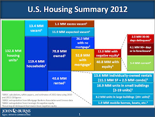
Posted with permission: Source: John Burns Real Estate Consulting
The sources are listed on the graph. Wayne noted in his email to me: "We had to make some simplifying assumptions to make the chart look readable. One of those assumptions is that all delinquent borrows have negative equity. That’s obviously not true, but showing the overlap would have been exceedingly complicated."
The numbers on the left (total, vacant and occupied housing units) are extrapolations from the 2010 Census (the Census was a snapshot as of April 1, 2010 - over 2 years ago).
As an example, Yamano estimates that the number of housing units has increased from 131.7 million on April 1, 2010 to 132.8 million today. That is an increase of only 1.1 million housing units over the last two years - and that is probably close with the record low number of housing completions over that period.
I think the estimate of excess vacant housing units is too high. Using the Census 2010 state data, I estimated that the number of excess vacant housing units was above 1.8 million on April 1, 2010 (the date of the Census). See: The Excess Vacant Housing Supply. The number of excess units is lower today, and I think it is now less than 1 million units nationwide. A key difference is that I used both the 1990 and 2000 Census data to estimate the excess supply, and Yamano only used the 2000 Census data.
As Yamano noted, he made a "simplifying assumption" on delinquencies to make the chart readable (I think the chart is great). However it is important to remember that not all delinquent borrowers have negative equity, especially those in the 30 to 90 day delinquent category. Even in good times, around 2 million borrowers are one to two payments delinquent, and that is probably happening now too. This probably means there are another 1 to 2 million borrowers with negative equity that are current than shown on the chart. That is a key category since these properties could become distressed sales in the future - and that is why these borrowers are the main target of the HARP refinance program.
Also on delinquencies: I think the total of 6.6 million delinquencies is too high. Yamano used data from the MBA and extrapolated to the entire market, but the recent LPS release suggests there are about 5.6 million total delinquent loans (The MBA will probably show a significant decrease in Q1 too).
I think this graph provides a nice quick overview of the U.S. housing market. My thanks to Wayne.
Earlier on the employment report:
• April Employment Report: 115,000 Jobs, 8.1% Unemployment Rate
• April Employment Summary and Discussion
• All Current Employment Graphs
April Employment Summary and Discussion
by Calculated Risk on 5/04/2012 10:29:00 AM
Another disappointing report indicating sluggish employment growth.
It is probably worth a mention that there are now more private sector jobs than when President Obama took office, but the public sector is continuing to hemorrhage jobs (see third and fourth graphs).
Some numbers: There were 115,000 payroll jobs added in April, with 130,000 private sector jobs added, and 15,000 government jobs lost. The unemployment rate declined to 8.1%. U-6, an alternate measure of labor underutilization that includes part time workers and marginally attached workers, was unchanged at 14.5%. This remains very high - U-6 was in the 8% range in 2007 - but this is the lowest level of U-6 since early 2009.
The participation rate decreased to 63.6% from 63.8% (a new cycle low) and the employment population ratio also decreased slightly to 58.4%.
The change in February payroll employment was revised up from +240,000 to +259,000, and February was revised up from +120,000 to +154,000.
The average workweek was unchanged at 34.5 hours, and average hourly earnings were essentially unchanged. "The average workweek for all employees on private nonfarm payrolls was unchanged at 34.5 hours in April. ... In April, average hourly earnings for all employees on private nonfarm payrolls rose by 1 cent to $23.38. Over the past 12 months, average hourly earnings have increased by 1.8 percent." This is sluggish earnings growth, and less than inflation. Earnings are still being impacted by the large number of unemployed and marginally employed workers.
There are a total of 12.5 million Americans unemployed and 5.1 million have been unemployed for more than 6 months. These numbers are declining, but still very high.
Through the first four months of 2012, the economy has added 803 thousand total nonfarm jobs - this is a better pace than in 2011, but still sluggish.
Employment-Population Ratio, 25 to 54 years old
 Click on graph for larger image.
Since the participation rate has declined recently due to cyclical (recession) and demographic (aging population) reasons, an important graph is the employment-population ratio for the key working age group: 25 to 54 years old.
In the earlier period the employment-population ratio for this group was trending up as women joined the labor force. The ratio has been mostly moving sideways since the early '90s, with ups and downs related to the business cycle.
This ratio should probably move back to or above 80% as the economy recovers. So far the ratio has only increased slightly from a low of 74.7% to 75.7% in April (this was down slightly in April from March.)
Percent Job Losses During Recessions

This graph shows the job losses from the start of the employment recession, in percentage terms - this time aligned at maximum job losses.
In the previous post, the graph showed the job losses aligned at the start of the employment recession.
Private Sector Jobs Added
These two graphs compare public and private sector job losses (or added) for President George W. Bush's first term (following the stock market bust), and for President Obama's current term (following the housing bust and financial crisis). The Bush term is added for comparison purposes.
There are many differences between the two periods. Both followed the bursting of a bubble (stock and housing), although the housing bust also led to a severe financial crisis. As Reinhart and Rogoff noted, recoveries from financial crisis are usually very sluggish. See: "The Aftermath of Financial Crises".
The employment recovery during Mr. Bush's first term was very sluggish, and private employment was down 913,000 jobs at the end of his first term. The recovery has been sluggish under Mr. Obama's presidency too, but there are now 35 thousand more private sector payroll jobs than when Mr. Obama's term started.
Public Sector Jobs Lost
 A big difference between Mr. Bush's first term and Mr. Obama's presidency has been public sector employment. The public sector grew during Mr. Bush's term (up 900,000 jobs), but the public sector has declined since Obama took office (down 607,000 jobs). These job losses are at the state and local level, although the Federal government has been losing jobs over the last year. There job losses are still a significant drag on overall employment.
It appears the state and local public sector job losses are slowing, and it is likely that the decline in state and local public payrolls will end mid-year 2012. However the Federal government jobs losses will probably continue.
Part Time for Economic Reasons
 From the BLS report:
The number of persons employed part time for economic reasons (sometimes referred to as involuntary part-time workers) was essentially unchanged in April at 7.9 million. These individuals were working part time because their hours had been cut back or because they were unable to find a full-time job.The number of part time workers increased slightly in April to 7.85 millon.
These workers are included in the alternate measure of labor underutilization (U-6) that was unchanged at 14.5% in April - still very high, but the lowest level since early 2009.
Unemployed over 26 Weeks
 This graph shows the number of workers unemployed for 27 weeks or more.
 According to the BLS, there are 5.1 million workers who have been unemployed for more than 26 weeks and still want a job. This was down from 5.308 million in March. This is very high, but this is the lowest number since mid-2009.


