 RSS Feed
 by Calculated Risk on 4/05/2012 09:33:00 PM
Thursday, April 05, 2012
Existing Home Inventory declines 20% year-over-year in early April
Another update: I've been using inventory numbers from HousingTracker / DeptofNumbers to track changes in inventory. Tom Lawler mentioned this last year.
According to the deptofnumbers.com for (54 metro areas), inventory is off 20.4% compared to the same week last year. Unfortunately the deptofnumbers only started tracking inventory in April 2006.
This graph shows the NAR estimate of existing home inventory through February (left axis) and the HousingTracker data for the 54 metro areas through early April.
 Click on graph for larger image.
Since the NAR released their revisions for sales and inventory, the NAR and HousingTracker inventory numbers have tracked pretty well.
Seasonally housing inventory usually bottoms in December and January and then starts to increase again through mid to late summer. So seasonally inventory should increase over the next several months.
The second graph shows the year-over-year change in inventory for both the NAR and HousingTracker.
 HousingTracker reported that the early April listings - for the 54 metro areas - declined 20.4% from the same period last year. The year-over-year decline will probably start to slow since listed inventory is getting close to normal levels. Also if there is an increase in foreclosures (as expected), this will slow the year-over-year decline.
This is just inventory listed for sale, there is also a large "shadow inventory" that is currently not on the market, but is expected to be listed in the next few years. But this year-over-year decline remains a significant story.
Federal Reserve Issues Statement on Rental of REOs
by Calculated Risk on 4/05/2012 05:20:00 PM
This statement makes it clear that the Fed (and probably other regulators) will allow banks to rent residential Real Estate Owned (REO) for longer periods due to market conditions. I expect we will see more rental programs like the pilot program recently announced by BofA.
From the Federal Reserve:
The Federal Reserve Board on Thursday released a policy statement reiterating that statutes and Federal Reserve regulations permit rental of residential properties acquired in foreclosure as part of an orderly disposition strategy. The statement also outlines supervisory expectations for residential rental activities.Here is the statement.
The general policy of the Federal Reserve is that banking organizations should make good faith efforts to dispose of foreclosed properties (also known as "other real estate owned" or "OREO"), including single-family homes, at the earliest practicable date. In this context, and in light of the extraordinary market conditions that currently prevail, the policy statement explains that banking organizations may rent residential OREO properties within legal holding-period limits without demonstrating continuous active marketing of the property for sale, provided that suitable policies and procedures are followed.
Moreover, to the extent that OREO rental properties meet the definition of community development under the Community Reinvestment Act (CRA) regulations, the banking organizations would receive favorable CRA consideration. In all respects, banking organizations that rent OREO properties are expected to comply with all applicable federal, state, and local statutes and regulations, some of which the policy statement highlights. The policy statement, in providing guidance to banking organizations and examiners, also describes specific supervisory expectations for banking organizations with a larger number of rental OREO properties, generally more than 50 properties available for rent or rented.
The policy statement applies to banking organizations for which the Federal Reserve is the primary federal supervisor, including state member banks, bank holding companies, non-bank subsidiaries of bank holding companies, savings and loan holding companies, non-thrift subsidiaries of savings and loan holding companies, and U.S. branches and agencies of foreign banking organizations.
Employment Situation Preview
by Calculated Risk on 4/05/2012 02:55:00 PM
Tomorrow (Friday) the BLS will release the March Employment Situation Summary at 8:30 AM ET. Bloomberg is showing the consensus is for an increase of 201,000 payroll jobs in March, and for the unemployment rate to remain unchanged at 8.3%.
Note:
• The weather was mild in January and February, and it is possible that some hiring was pulled forward. Several analysts have pointed out that the BLS reported that few people were "not at work due to bad weather" in January and February. I looked back at previous years with mild weather (using the BLS "not at work, bad weather" measurement), and employment gains in March were solid following mild weather during January and February. So I don't expect much payback due to the weather.
• The economic questions for tomorrow (see pickem game on top right sidebar) is to take the over or under on the consensus for payroll jobs and to forecast the unemployment rate.
Here is a summary of recent data:
• The ADP employment report showed an increase of 209,000 private sector payroll jobs in March. Although ADP seems to track the BLS over time, the ADP report hasn't been very useful in predicting the BLS report. Also note that government payrolls declined by about 18,000 over the last three months (about 6,000 per month), so the ADP report suggests 209,000 private nonfarm payroll jobs added, minus 6,000 government workers - or around 203,000 total jobs added in March (close to the consensus).
• The ISM manufacturing employment index increased to 56.1% from 53.2% in February. A historical correlation between the ISM index and the BLS employment report for manufacturing, suggests that private sector BLS reported payroll jobs for manufacturing increased about 14,000 in March.
The ISM service employment index increased to 56.7% from 55.7% in March. Based on a historical correlation between the ISM non-manufacturing employment index and the BLS employment report for service, this reading suggests the gain of around 240,000 private payroll jobs for services in March.
Combined the ISM surveys suggest an employment report somewhat above the consensus.
• Initial weekly unemployment claims averaged about 366,000 in March, down slightly from 374,000 average in January and February.
For the BLS reference week (includes the 12th of the month), initial claims were at about the same level as in January and February when the economy added 284,000 and 227,000 payroll jobs respectively.
• The final March Reuters / University of Michigan consumer sentiment index increased to 76.2, up slightly from the February reading of 75.3. This is frequently coincident with changes in the labor market, but also strongly related to gasoline prices and other factors. This suggests a weak but improving labor market.
• And a little optimism from the NFIB (small business): NFIB Jobs Statement: Job Creation Shows Mixed Signals
“March came in like a lion on the job-front, but went out tempered by future job growth indicators. Overall, the March survey anticipates some strength in the job creation number with little change in the unemployment rate. With job openings and plans for job creation both falling, prospects for a surge in job creation in the small business sector are still not promising.The participants in the NFIB surveys still aren't doing much hiring, however the small business index from Intuit showed 65,000 small business jobs created in March.
Building on February’s increased jobs numbers, March’s survey gives us the best readings since January and February of 2011. The net change in employment per firm (seasonally adjusted) was 0.22, double the reading for February.
• And on the unemployment rate from Gallup: U.S. Unemployment Declines in March
U.S. unemployment, as measured by Gallup without seasonal adjustment, declined to 8.4% in March from 9.1% in February, while Gallup's seasonally adjusted rate fell to 8.1% from 8.6% in February.NOTE: The Gallup poll results are Not Seasonally Adjusted (NSA), so use with caution.
...
Gallup's monitoring of the unemployment situation includes the entire month, while the BLS uses a mid-month reference week.
Gallup's seasonally adjusted unemployment rate was essentially unchanged at 8.5% in mid-March from 8.6% in February, but then fell to 8.1% for all of March. How much of the sharp decline in unemployment during the second half of March will be picked up in the government's mid-month reference week is unclear.
There always seems to be some randomness to the employment report, but the overall situation has improved (lower initial weekly unemployment claims, more job openings). The ADP report suggests the consensus is close, and the ISM reports suggest the consensus is a little low.
Once again I'll take the over (above 201,000 payroll jobs), and I think a further decline in the unemployment rate is possible (this depends on the participation rate and if discouraged workers return to the labor force).
More: Office Vacancy Rate declines slightly to 17.2% in Q1
by Calculated Risk on 4/05/2012 12:43:00 PM
Early this morning I noted that Reis reported the office vacancy rate declined slightly to 17.2% in Q1 from 17.3% in Q4 2011. The vacancy rate was at 17.6% in Q1 2011.
Here are a few more comments and a long term graph from Reis.
Comments from Reis Senior Economist Ryan Severino:
National vacancies continued falling at a very modest pace in the first quarter, mirroring the tepid improvement in the labor market. The sector absorbed 5.998 million SF, the fifth consecutive quarterly gain in occupied stock since the beginning of 2011.
Although net absorption levels remain muted, five consecutive quarters of positive net absorption provide convincing evidence that the sector is indeed recovering. ... Given the rate of improvement that the sector is experiencing, it will be years before it is able to recover the space that was vacated during the recession and early stages of the economic recovery. The national vacancy rate has regressed back to levels unseen since 1993 and remains well above the cyclical low of 12.5% from 2007 before the onset of the recession.
...
National asking and effective rent growth improved slightly in the first quarter, continuing the slow upward trend that began in the first quarter of 2011. Annual gains of 1.6 and 2.1 percent, respectively, also indicate a moderate pace of improvement, but are unimpressive.
...
Weak supply growth remains a tailwind for improvement in the office sector. During the first quarter of 2012 only 1.917 million square feet of office space were completed. This represents the lowest quarterly level on record since Reis began tracking quarterly market data in 1999. ... With little supply being delivered, even the low levels of absorption that we are observing are sufficient enough to generate vacancy rate declines and rent growth.
 Click on graph for larger image.
This graph shows the office vacancy rate starting in 1980 (prior to 1999 the data is annual). Back in the early '80s, there was overbuilding in the office sector even as the vacancy rate was rising. This was due to the very loose lending that led to the S&L crisis.
In the '90s, office investment picked up as the vacancy rate fell. Following the bursting of the stock bubble, the vacancy rate increased sharply and office investment declined.
During the housing bubble, office investment started to increase even before the vacancy rate had fallen below 14%. This was due to loose lending - again. Investment essentially stopped following the financial crisis.
The good news is, as Severino noted, there is very little new office construction right now and the vacancy rate will probably continue to decline.
Office vacancy data courtesy of Reis.
Trulia announces new "mix adjusted" House Asking Price Monitor, Prices up 1.4% from Q4
by Calculated Risk on 4/05/2012 10:00:00 AM
This is an interesting new asking price monitor from Trulia. Usually people report median asking prices, but unfortunately the median is impacted by the mix of homes. However Trulia adjusts the asking prices both for the mix of homes listed for sale and for seasonal factors. Of course this is just asking prices, not sales prices, but this might provide an early hint at changes in house prices.
This has the advantage of giving a much earlier look at prices than the repeat sales indexes. As an example, the recent Case-Shiller report was for "January". But that was really a three month average of November, December and January - and the index is based on recorded closing prices - so some of this index was based on contracts signed last September. That is 6 or even 7 months ago.
The Trulia monitor will be released monthly, and the report today is for asking prices in March.
From Trulia:
Trulia today launched the Trulia Price Monitor and the Trulia Rent Monitor, the earliest leading indicators available of trends in home prices and rents. Based on the for-sale homes and rentals listed on Trulia.com, these Monitors take into account changes in the mix of listed homes, reflecting trends in prices and rents for similar homes in similar neighborhoods through March 31, 2012.
Nationally, asking prices on for-sale homes – which lead sales prices by approximately two or more months – were 1.4 percent higher in March than one quarter ago. Prices increased month over month 0.9 percent in March and 0.6 percent in February. The Trulia Price Monitor is seasonally adjusted, so these monthly and quarterly increases are on top of typical springtime price jumps. Unadjusted for seasonality, asking prices rose 2.4 percent quarter over quarter. According to the Monitor, asking prices had been declining prior to February and reached a low in January.
...
“Asking prices rose in February and March, but this doesn’t mean that the bottom is forever behind us. The robo-signing settlement will accelerate the foreclosure process, pushing more homes onto the market and dragging down prices in areas that suffered most from the housing crash,” said Jed Kolko, Trulia’s Chief Economist.
 Click on graph for larger image.
The first graph from Trulia shows the month over month prices changes (seasonally adjusted) as reported by the monitor. This shows asking prices were falling for most of 2011, but have turned up in early 2012.
Here is a list of price and rent changes for the 100 largest metro areas.
 And here is a map from Trulia showing the year-over-year change in asking prices.
On a year-over-year basis many MSAs are still in the red (as opposed to quarter-over-quarter or month-over-month). According to the list of cities, 41 MSAs (out of 100) had increasing asking prices year-over-year, and 67 quarter-over-quarter.
There are still many more distressed sales to come, and asking prices could turn down again - but this does suggest prices have turned up recently.
Weekly Initial Unemployment Claims decline to 357,000
by Calculated Risk on 4/05/2012 08:30:00 AM
The DOL reports:
In the week ending March 31, the advance figure for seasonally adjusted initial claims was 357,000, a decrease of 6,000 from the previous week's revised figure of 363,000. The 4-week moving average was 361,750, a decrease of 4,250 from the previous week's revised average of 366,000.The previous week was revised up to 363,000 from 359,000.
The following graph shows the 4-week moving average of weekly claims since January 2000.
 Click on graph for larger image.
The dashed line on the graph is the current 4-week average. The four-week average of weekly unemployment claims declined to 361,750.
The 4-week moving average is at the lowest level since early 2008 (including revisions).
And here is a long term graph of weekly claims:

Slow and steady improvement. This is the lowest level for claims since early 2008.
Reis: Office Vacancy Rate declines slightly in Q1 to 17.2%
by Calculated Risk on 4/05/2012 12:22:00 AM
From Reuters: Sluggish job growth crimps US office market rebound
The national vacancy rate slipped to 17.2 percent in the first quarter, a slight improvement from 17.3 percent in the 2011 fourth quarter, according to preliminary figures from Reis. A year earlier the vacancy rate was 17.6 percent. ... The national vacancy rate has risen to levels not seen since 1993 and remains well above the cyclical low of 12.5 percent posted in 2007 ...
The average U.S. office asking rent rate rose to $28.10 per square foot in the first quarter, up 0.5 percent from the 2011 fourth quarter. ...
Overall, the national office market has posted five quarters of improvement, leading Reis to believe the market is in the midst of a slow recovery. ... "The lack of new supply has been the saving grace for the office sector," Severino said. "The levels of demand that we're seeing right now, while they're positive, they're not really significant. It pales in comparison with cycles past."
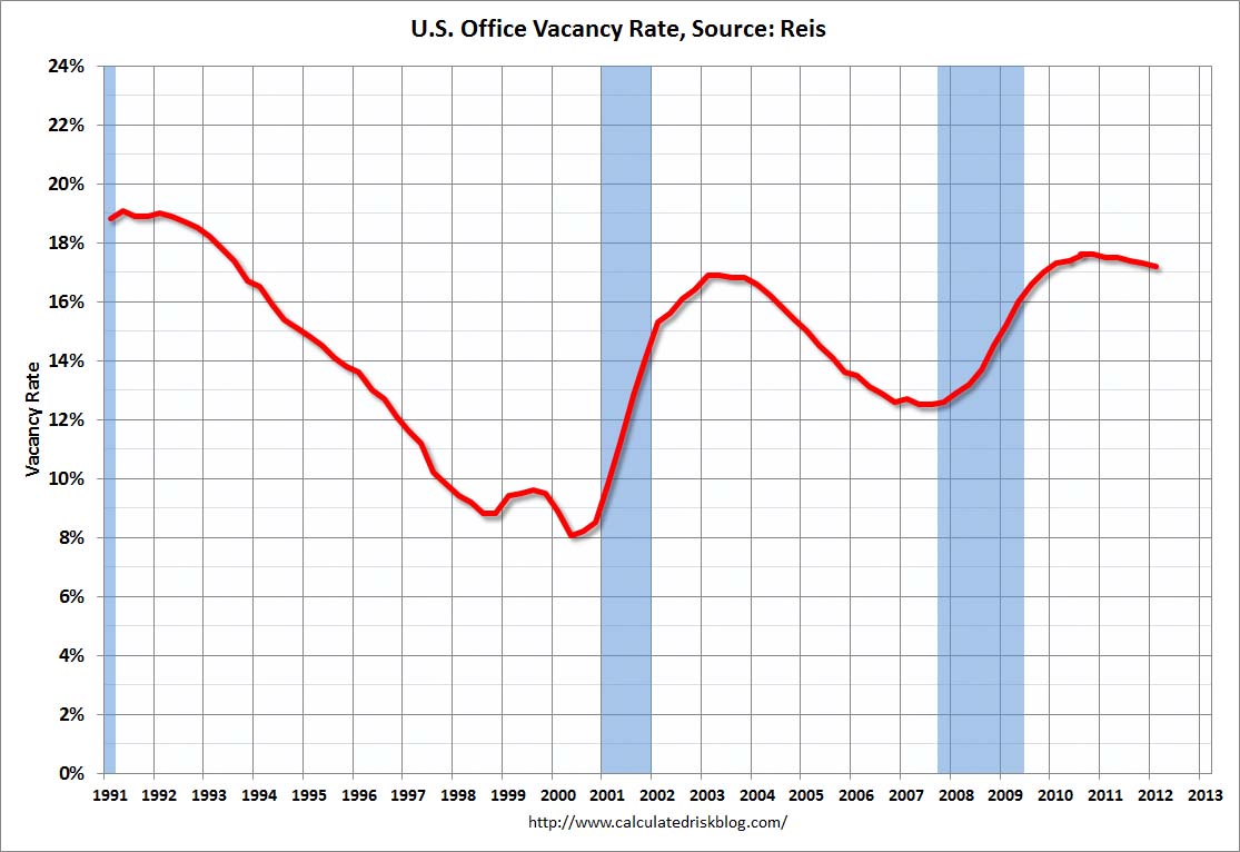 Click on graph for larger image.
This graph shows the office vacancy rate starting in 1991.
Reis is reporting the vacancy rate declined to 17.2% in Q1, down from 17.3% in Q4. The vacancy rate was at a cycle high of 17.6% in Q3 and Q4 2010. It appears the office vacancy rate peaked in 2010 and is declining very slowly.
As Reis noted, there are very few new office buildings being built in the US, and new construction will probably stay low for several years.
Wednesday, April 04, 2012
Jamie Dimon's "Brain Freeze" and Comments on Housing
by Calculated Risk on 4/04/2012 08:27:00 PM
The WSJ has JPM CEO Jamie Dimon's letter to shareholders (ht Brian) A couple of excerpts:
I suspect that the mortgage crisis will be the worst financial catastrophe of our lifetime. What the world experienced was almost a collective brain freeze ... It was a disaster hidden by rising home prices and false expectations, and once that price bubble burst, we all were in trouble.Some people didn't experience a "brain freeze", but unfortunately most lenders did. I think lender's will forget again, but hopefully not for some time.
We need to write a letter to the next generation that says, “Never forget: 80% loan to value and verify appropriate income.”
...
But [JP Morgan] did participate in this disaster by originating mortgages that wouldn’t have been given a decade earlier (and won’t be given a decade later).
And on housing:
There has been a tremendous focus on the fact that housing prices remain depressed and, in fact, are still going down some. The large “shadow inventory” of homes in delinquency or foreclosure that has not yet hit the sale market adds to the fears that this will continue for a long time. New home construction still is very depressed – so, to most, the future looks bleak. However, if one looks at the leading indicators, all signs are flashing green – the turn is coming if it is not here already. We don’t want to be blindly optimistic, but the facts are the facts:
• America has never stopped growing. The United States has added 3 million people a year since the crisis began four years ago. We will add 30 million people in the next 10 years.
• This population growth normally would create a need for 1.2 million additional housing units each year. Household formation has been half of that for the past four years. Our economists believe that there is huge pent-up demand and that household formation will return to 1.2 million a year as job conditions improve.
• Job conditions have been improving, albeit slowly. In the last 24 months, 3.45 million jobs have been created.
• On average, only 845,000 new U.S. housing units were built annually over the last four years – and the destruction of homes from demolition, disaster and dilapidation has averaged 250,000 a year. The growth of new households, even at a reduced rate, has been able to absorb all of this new supply, and more. [CR note: I wonder about the source for the number of homes demolished?]
• The total inventory of single-family homes and condos for sale currently is 2.7 million units, down from a peak of 4.4 million units in May 2007. It now would take only six months to sell all of the houses for sale at existing sales rates, down from 12 months two years ago. (This low of an inventory number normally would be considered a positive sign for future housing prices.)
• While the shadow inventory mentioned above still is significant, it has shown a visible declining trend since peaking at the end of 2009, when the number of loans delinquent 90+ days or in foreclosure was 5.1 million homes. It now totals 3.9 million, and we estimate it could be 3 million in 12 months. The shadow inventory also may move more quickly as mortgage servicers get better at packaged sales and short sales and as real money investors start to buy foreclosed homes and rent them out for a good profit. Home prices still are going down a little bit, and they will stay depressed for a while. Distressed sales (short sales, foreclosure sales, real estate-owned sales) still are 25% of all sales, and these sales typically are priced 30% lower than non-distressed sales. As the percentage of distressed sales comes down over the next 12-24 months, their negative effect on housing prices will start to diminish.
...
• It now is cheaper to buy than to rent in half of the markets in America – this has not been true for more than 15 years. Relatively high rental prices can be a precursor to increasing home prices.
• At the same time, American consumers are finding more solid financial footing relative to their debt. The household debt service ratio, which is the ratio of mortgage plus consumer debt payments to disposable personal income, stands at its lowest level since 1994. This is a result of rapid consumer deleveraging – household mortgage debt now is down $1 trillion from its 2008 peak. (Reported U.S. mortgage data do not remove mortgage debt from an individual’s debt obligations until there is an actual foreclosure. It is estimated that $600 billion of the $9 trillion in currently outstanding mortgage debt is not paying interest today and effectively could be removed now from these numbers.)
• Recent senior loan officer surveys by the Federal Reserve show that, while there are not yet clear signs of credit loosening for new mortgages, at least the rush to tighten mortgage lending standards has abated.
...
More jobs, more households, more Americans, good value – it’s just a matter of time.
FHFA's DeMarco: FHFA to make decision on GSE Principal Reductions this month
by Calculated Risk on 4/04/2012 04:50:00 PM
From a speech today by FHFA acting director Edward DeMarco:
On a nationwide basis, Fannie Mae and Freddie Mac own or guarantee 60 percent of the mortgages outstanding, but they account for only 29 percent of seriously delinquent loans, obviously a much lower proportion than their share of the market.CR Note: I'd like to see the data on "payment reduction, not loan-to-value, is the key indicator of success in loan modifications".
Even though the Enterprises have a smaller share of seriously delinquent loans than other market participants, they account for just over half of all Home Affordable Modification Program, or HAMP modifications. Between HAMP modifications and their own proprietary loan modifications, Fannie Mae and Freddie Mac have completed more than 1.1 million loan modifications since the fourth quarter of 2008.
It has been well-publicized that there is one form of loan modification that FHFA has not embraced, that being principal forgiveness. To be clear, the disagreement is not about helping borrowers. FHFA, with the Enterprises, has been making great efforts to assist troubled homeowners with underwater mortgages who have the ability to make a mortgage payment and a willingness to do so. While we are currently evaluating the recent Treasury changes to HAMP regarding principal forgiveness, I would like to explain the position we have taken to date.
The fundamental point of a loan modification is to adjust the borrower’s monthly payment to an affordable level. We have seen repeatedly that what matters most in successfully helping borrowers is a meaningful reduction in the monthly payment to an amount that helps stabilize the family’s finances. Indeed, we have found that payment reduction, not loan-to-value, is the key indicator of success in loan modifications.
For many underwater borrowers, we achieve this by forbearing on principal – that is, charging a zero rate of interest on the forbearance amount and deferring its repayment. This focus on making the monthly mortgage payment affordable is an efficient way to provide assistance to the borrower and keep them in their home. If the borrower remains successful in this modified loan, this approach preserves for taxpayers an ultimate recovery on the debt.
Stated differently, the principal forbearance mod being used by Fannie Mae and Freddie Mac produces the same, lower monthly payment as a modification based on principal forgiveness. If the borrower ends up defaulting even with the modification, the loss to the taxpayer is the same either way. But if the borrower is successful, the taxpayer retains the opportunity to benefit from the upside – a reasonable deal given the support the taxpayer has provided to assist the family in keeping their home.
Moreover, this approach recognizes that three out of every four deeply underwater borrowers in Fannie Mae’s and Freddie Mac’s book of business today are current on their loans. These borrowers are demonstrating a continued willingness to meet their mortgage obligations. This should be recognized and encouraged, not dampened with incentives for people to not continue paying. As I have stated previously, we are currently evaluating the recent Treasury Department proposal to HAMP regarding principal forgiveness and expect a decision this month.
DeMarco makes a key point that "three out of every four deeply underwater borrowers in Fannie Mae’s and Freddie Mac’s book of business today are current on their loans". The key problem with a principal reduction program is that even if it makes sense for an individual borrower, it might not makes sense overall if a large number of current borrowers decide to default hoping for a principal reduction.
One way around this problem - that has been effective for some banks - is to sell underwater loans to a 3rd party, and let them do the principal reduction. Since the biggest risk is that the word gets out, and everyone underwater stops making payments, selling to a 3rd party allows the bank (or GSE) to say they don't do principal reductions, but they would still get most of the benefit (with some shared with the 3rd party).
It sounds like the FHFA will make a decision this month. I hope they release the internal studies first.
More: Apartment Vacancy Rate falls to 4.9% in Q1
by Calculated Risk on 4/04/2012 03:05:00 PM
Early this morning I noted that Reis reported the apartment vacancy rate (82 markets) fell to 4.9% in Q1 from 5.2% in Q4 2011. The vacancy rate was at 6.1% in Q1 2010 and peaked at 8.0% at the end of 2009.
Here are a few more comments and a long term graph from Reis.
Comments from Ries:
The strong performance of the apartment sector has yet to show signs of letting up; national vacancies fell by 30 basis points in the first quarter to 4.9%, a level last observed more than ten years ago, back in 4Q2001. It is also significant to note that national vacancies have improved beyond the benchmark 5% level used as a rule of thumb by apartment landlords: for most markets, once vacancies tighten below 5%, effective rents tend to spike as landlords perceive that tight market conditions allow for greater pricing power.
...
Net absorption, or the net change in occupied stock, remained strong, with 36,484 units leasing up. As the economy begins to show signs of slow but steady improvement, households are flocking to rentals as expectations of single‐family home prices remain flat over the next year or two.
...
With demand for rentals benefiting from the continued moribund state of the for‐sale housing market, tight supply conditions are helping boost the performance of apartment properties around the nation. Only 7,342 apartment units came online in the first quarter – the lowest quarterly figure for new completions since Reis began publishing quarterly data in 1999. Risks may manifest later in the year, however. With multifamily remaining one of the few shining starts in commercial real estate, developers have begun building properties to take advantage of rising incomes. Unless there are delays, Reis expects about 70,000 units to come online in 2012. That is about double the rate of supply growth in 2011. Even more units are slated to come online in 2013, somewhere in the order of 150,000 to 200,000 units in the 79 main markets that Reis tracks.
 Click on graph for larger image.
This graph shows the apartment vacancy rate starting in 1980 (prior to 1999 the data is annual). Back in the early '80s, there was overbuilding in the apartment sector (just like for offices) with the very loose lending that led to the S&L crisis. Once the lending stopped, starts of built-for-rent units slowed, and the vacancy rate started to decline.
Following the financial crisis, starts and completions of multi-family units fell to record lows (there were a record low number of completions last year). Builders have increased construction, but it usually takes over a year to complete a multi-family building, so this new supply hasn't reached the market yet. As Reis noted, the number of completions will increase this year, but the vacancy rate will probably decline further.
This will also impact on house prices. The upward pressure on rents will make the price-to-rent ratio a little more favorable for buying.
Data courtesy of Reis.


