by Calculated Risk on 9/29/2009 04:12:00 PM
Tuesday, September 29, 2009
Market Update
Note: Looking ahead, Thursday and Friday will be heavy economic news days with vehicle sales (how bad will the post-clunker slump be?), construction spending, personal income and outlays for August, the employment report on Friday and more.
A couple of market graphs ... the S&P 500 was first at this level in March 1998; about 11 1/2 years ago.  Click on graph for larger image in new window.
The first graph shows the S&P 500 since 1990.
The dashed line is the closing price today.
The S&P 500 is up 57% from the bottom (384 points), and still off 32% from the peak (505 points below the max). The second graph is from Doug Short - Instead of comparing the markets from the peak (See: the Four Bad Bears), Doug Short matched up the market bottoms for four crashes (with an interim bottom for the Great Depression).
Note that the Great Depression crash is based on the DOW; the three others are for the S&P 500.
House Prices: Stress Test and Price-to-Rent
by Calculated Risk on 9/29/2009 12:56:00 PM
This following graph compares the Case-Shiller Composite 10 SA index with the Stress Test scenarios from the Treasury (stress test data is estimated from quarterly forecasts). The Stress Test scenarios use the Composite 10 index and start in December. Here are the numbers:
Case-Shiller Composite 10 Index (SA), July: 154.69
Stress Test Baseline Scenario, July: 147.23
Stress Test More Adverse Scenario, July: 138.14
Unlike with the unemployment rate (worse than both scenarios), house prices are performing better than the the stress test scenarios.
Price-to-Rent
In October 2004, Fed economist John Krainer and researcher Chishen Wei wrote a Fed letter on price to rent ratios: House Prices and Fundamental Value. Kainer and Wei presented a price-to-rent ratio using the OFHEO house price index and the Owners' Equivalent Rent (OER) from the BLS.
Here is a similar graph through July 2009 using the Case-Shiller Composite Indices (SA): Click on image for larger graph in new window.
This graph shows the price to rent ratio (January 2000 = 1.0) for the Case-Shiller composite indices. For rents, the national Owners' Equivalent Rent from the BLS is used.
Back in 2004 or 2005, it was obvious that prices were out of line with fundamentals. This was clear in the price-to-income and price-to-rent ratios - and there was also widespread speculation (the definition of a bubble).
Now, looking at the price-to-rent ratio based on the Case-Shiller indices, the adjustment in the price-to-rent ratio is mostly behind us. Although the ratio is still a little high. Note: some would argue the ratio being a little too high is reasonable based on mortgage rates and "affordability".
With rents now falling almost everywhere, a further downward adjustment in house prices seems likely.
FDIC Seeks $45 Billion in Prepayments from Banks
by Calculated Risk on 9/29/2009 11:03:00 AM
The Board of Directors of the Federal Deposit Insurance Corporation today adopted a Notice of Proposed Rulemaking (NPR) that would require insured institutions to prepay their estimated quarterly risk-based assessments for the fourth quarter of 2009 and for all of 2010, 2011 and 2012. The FDIC estimates that the total prepaid assessments collected would be approximately $45 billion.MarketWatch has more details: Fund to protect deposits has shrunk to low levels
Absent the prepaid premiums, the FDIC said that the agency's Deposit Insurance Fund ... would face a liquidity crunch early next year, and that it will be operating in the red by the end of this month.
The FDIC said that the prepayments would raise $45 billion for the fund. The board said it estimates that total bank failure losses could reach $100 billion by 2013.
emphasis added
Fannie Mae Serious Delinquency Rate increases Sharply
by Calculated Risk on 9/29/2009 10:33:00 AM
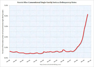
Here is a hockey stick graph ... Click on graph for larger image in new window.
Fannie Mae reported that the serious delinquency rate for conventional loans in its single-family guarantee business increased to 4.17 percent in July, up from 3.94 percent in June - and up from 1.45% in July 2008.
"Includes seriously delinquent conventional single-family loans as a percent of the total number of conventional single-family loans. These rates are based on conventional single-family mortgage loans and exclude reverse mortgages and non-Fannie Mae mortgage securities held in our portfolio."
Just more evidence of some shadow inventory and the next wave of foreclosures.
Update: These stats include Home Affordable Modification Program (HAMP) loans in trial modifications.
Case-Shiller House Prices increase in July
by Calculated Risk on 9/29/2009 09:00:00 AM
S&P/Case-Shiller released their monthly Home Price Indices for July this morning.
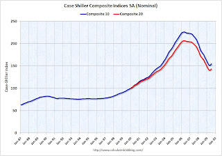
This monthly data includes prices for 20 individual cities, and two composite indices (10 cities and 20 cities). This is the Seasonally Adjusted data - others report the NSA data.  Click on graph for larger image in new window.
The first graph shows the nominal seasonally adjusted Composite 10 and Composite 20 indices (the Composite 20 was started in January 2000).
The Composite 10 index is off 31.6% from the peak, and up about 1.3% in July.
The Composite 20 index is off 30.6% from the peak, and up 1.2% in July. The second graph shows the Year over year change in both indices.
The Composite 10 is off 12.8% from July 2008.
The Composite 20 is off 11.5% from last year.
This is still a very strong YoY decline.
The third graph shows the price declines from the peak for each city included in S&P/Case-Shiller indices. Prices increased (SA) in 17 of the 20 Case-Shiller cities in July.
In Las Vegas, house prices have declined 55.2% from the peak. At the other end of the spectrum, prices in Dallas are only off about 4.9% from the peak - and up in 2009. Prices have declined by double digits almost everywhere.
The debate continues - is the price increase because of the seasonal mix (distressed sales vs. non-distressed sales), the impact of the first-time home buyer frenzy on prices, and the slowdown in the foreclosure process (with a huge shadow inventory), or have prices actually bottomed? I think we will see further house price declines in many areas.
I'll compare house prices to the stress test scenarios soon.
Monday, September 28, 2009
The Housing Tax Credit and the Consumer Price Index
by Calculated Risk on 9/28/2009 11:14:00 PM
Here are some unintended consequences ...
According to the NAR, the "first-time" homebuyer tax credit will lead to an additional 350 thousand homes sold in 2009. As I've mentioned before, this tax credit is inefficient and poorly targeted, costing taxpayers about $43,000 for each additional home sold.
And where are those 350 thousand buyers coming from? My guess is most were probably renters (a few might have been living in their parent's basements!). Click on graph for larger image in new window.
And what will be the impact on the rental vacancy rate?
The rental vacancy rate was already at a record 10.6% in Q2 2009. Some quick math suggests the tax credit will push the national vacancy rate above 11% soon.
And that means even more pressure on rents (rents are already falling). This is good news for renters, but this will also lead to more apartment defaults, higher default rates for apartment CMBS, and more losses for small and regional banks.
And falling rents are already pushing down owners' equivalent rent (OER), and my guess is OER will probably turn negative soon. Since OER is the largest component of CPI (and almost 40% of core CPI), this will push down CPI for some time.
Extend the tax credit and we might be looking at the core CPI showing deflation. Welcome to the Fed's nightmare.
MBIA Cut to Junk
by Calculated Risk on 9/28/2009 08:38:00 PM
From Reuters: S&P cuts MBIA, MBIA Insurance as losses continue
Standard & Poor's on Monday cut its ratings on MBIA Inc and its structured finance insurance arm, MBIA Insurance Corp, citing an expectation the company will continue to take significant losses from insuring risky loans. ... The outlook for both companies is negative ...From S&P:
We downgraded MBIA and the holding company because macroeconomic conditions continue to contribute to losses on the group's structured finance products. Losses on MBIA's 2005-2007 vintage direct RMBS and CDO of ABS could be higher than we had expected. However, the downgrade also reflects potentially increased losses in other asset classes, including but not limited to CMBS and--for other years prior to 2005--within RMBS.There is still significant counterparty risk for the banks from both MBIA and Ambac.
...
The negative outlook on MBIA and the holding company reflects our view that adverse loss development on the structured finance book could continue. In the next few years, liquidity will likely be adequate to meet debt-service and holding-company obligations (including operating expenses). However, increased losses and earnings volatility could still occur. ... Considering the runoff nature of the franchise, it is unlikely that we would raise the rating. Alternatively, if there were increased losses within the investment portfolio, potential reserve charges, or diminished liquidity, we could take a negative rating action.
emphasis added
FDIC Considers Having Banks Prepay Assessments
by Calculated Risk on 9/28/2009 04:25:00 PM
From the Financial Times: FDIC considers calling for bank advances
The FDIC’s board, which meets on Tuesday to discuss options, is currently leaning towards asking banks to pay several years’ worth of its fees in advance ...The other alternatives are 1) borrowing from the Treasury, 2) borrowing from healthy banks, or 3) assessing banks another special fee.
excerpted with permission
The options of borrowing from the Treasury, or from healthy banks, are apparently off the table for now. On Friday, FDIC Chairwoman Sheila Bair said about borrowing from banks: "It's a possibility, I assume. I don't see that as a preferred option, but it is something in the statute."
So it appears the FDIC will ask for three years of assessments in advance, or about $36 billion according to Reuters.
The advantage to the banks of prepaying assessments (as opposed to another special assessment) is the banks don't have to record the expense immediately.
PIMCO: Personal Saving Rate to Exceed 8 Percent
by Calculated Risk on 9/28/2009 01:08:00 PM
From Bloomberg: Pimco’s Clarida Says U.S. Savings Rate May Exceed 8%
Pacific Investment Management Co. strategic adviser Richard Clarida said the U.S. savings rate may exceed 8 percent, hurting consumer spending and weighing on the economic recovery.The article mentions that future data suggests traders believe there is a 72 percent change that the Fed will raise the Fed Funds rate by April. I agree with Clarida that the Fed will not hike rates until late 2010 - at the earliest.
“I’m in the glass is half empty camp,” Clarida said during an interview in New York on Bloomberg radio. “Traditionally the consumer comes to the rescue of economic recoveries. We’ll see a more subdued consumer.”
...
“Economic growth will be choppy,” Clarida said. “We see the economy recovering. There will be some quarters above two percent, and others below.”
...
“At some point as unemployment declines, the Fed will need to renormalize rates,” Clarida said. “It’s too soon to tell the pace at which they will renormalize. I don’t think there will be a Fed hike until late 2010 or 2011.”
And here is a graph of the annual saving rate back to 1929(1). Note: 2009 is through Q2.
 Click on graph for large image.
Notice that the saving rate went negative during the Depression as household used savings to supplement income. And the saving rate rose to over 25% during WWII.
There is a long period of a rising saving rate (from after WWII to 1974) and a long period of a declining saving rate (from 1975 to 2008).
Some of the change in saving rate was related to demographics. As the large baby boom cohort entered the work force in the mid '70s, the saving rate declined (younger families usually save less), however I expected the saving rate to start to rise as the boomers reached their mid-40s (in the late '90s). This didn't happen.
Perhaps the twin bubbles - stock market and housing - deluded the boomers into thinking they had saved more than they actually had. It definitely appears many families treated mortgage equity extraction as part of their income during the bubble years - and the Home ATM is now closed.
Whatever the reason, I expect the saving rate to continue to rise over the next year or two. And that raises a question: what will be the impact on PCE of a rising saving rate?
I created the following scatter graph for the period from 1955 through early 2009. This compares the annual change in PCE with the annual change in the saving rate.
 Note that R-squared is only .125, so there are other factors impacting PCE (like changes in income!).
But a rising saving rate does seem to suppress PCE (as expected). If the saving rate rises to 8% by the end of 2010 (as PIMCO expects), this suggests that real PCE growth will be about 1% below trend per year.
So with wages barely rising, and a rising saving rate suppressing PCE, I'd expect PCE growth to be sluggish for some time. And since PCE is usually one of the engines of recovery (along with residential investment), I expect the recovery to be very sluggish too (what Clarida calls "choppy").
(1)Note: much of this analysis is from MEW, Consumption and Personal Saving Rate in May.
Credit Indicators
by Calculated Risk on 9/28/2009 11:18:00 AM
I haven't posted this in some time. During the crisis these indicators showed the stress in the credit markets - now the LIBOR and TED spread just show that the Fed has been effective in lowering these rates. These might be interesting to watch as the Fed unwinds their various policy initiatives.
From Dow Jones: Key US Dollar Libor Downward Trend Stabilizes Monday
The cost of borrowing longer-term U.S. dollars in the London interbank market stabilized Monday, while the equivalent euro and sterling rates fell to record lows.That is good news for anyone with an ARM tied to the LIBOR.
Data from the BBA showed three-month dollar Libor ... remained unchanged from Friday at 0.2825%.
The three-month rate has fallen steeply since reaching 4.81875% on Oct. 10 2008, when interbank market tensions peaked.
 Click on graph for larger image in new window.
There has been improvement in the A2P2 spread. This has declined to 0.13. This is far below the record (for this cycle) of 5.86 after Thanksgiving, and is about the normal spread.
This is the spread between high and low quality 30 day nonfinancial commercial paper.
 The TED spread is now at the low end of the normal range of 19.22.
 This is the difference between the interbank rate for three month loans and the three month Treasury. The peak was 463 on Oct 10th and a normal spread is below 50 bps.
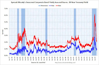
 The third graph shows the spread between 30 year Moody's Aaa and Baa rated bonds and the 30 year treasury.
The spread has decreased sharply, but the spreads are still high, especially for lower rated paper.
The Moody's data is from the St. Louis Fed:
Moody's tries to include bonds with remaining maturities as close as possible to 30 years. Moody's drops bonds if the remaining life falls below 20 years, if the bond is susceptible to redemption, or if the rating changes.


