 RSS Feed
 by Calculated Risk on 6/25/2009 11:00:00 AM
Thursday, June 25, 2009
WSJ Real Time Economics: Housing Bubble and Consumer Spending
Earlier this week, Charles W. Calomiris, Stanley D. Longhofer and William Miles wrote in Real Time Economics that the wealth effect from housing on consumption should be small. Atif Mian and Amir Sufi of the University of Chicago Booth School of Business respond that their data indicate the opposite.I commented on the Calomiris et. al. piece here: The Housing Wealth Effect? and I noted that Mian and Sufi disagreed.
Here are excerpts from Atif Mian and Amir Sufi's piece today:
... In the June 22nd entry for Real Time Economics, Calomiris, Longhofer, and Miles argue that ... “the reaction of consumption to housing wealth changes is probably very small.”
Findings in our research suggest the exact opposite: the rise in house prices from 2002 to 2006 was a main driver of economic growth during this time period, and the subsequent collapse of house prices is likely a main contributor to the historic consumption decline over the past year.
We agree with two key points made by Calomiris, Longhofer, and Miles. First, from the perspective of economic theory, it is not obvious that housing wealth should affect consumption. Second, it is difficult to measure the causal effect of housing wealth on consumption because other economic factors confound the relation. ...
These factors highlight the importance of quality data and sound methodology to estimate the effect of house prices on real economic activity. Our study samples 70,000 consumers in 1998 who were already homeowners at the time. We then follow the borrowing decisions of these households for eleven years until the end of 2008. Our data set represents a major advantage over prior studies; it allows us to see exactly how existing homeowners respond to increases in house prices.
In order to isolate the effect of house prices on consumption, we rely on a simple insight: in response to an equivalent increase in local housing demand, house prices will increase more in cities where, due to geography based factors, the cost of building a house is high. For example, consider a homeowner living in San Francisco and a homeowner living in Atlanta as of 1998. From 2002 to 2006, house prices rose sharply in San Francisco where it is difficult to build additional houses because of the limited geography. In contrast, in Atlanta, where home construction is cheaper, house price growth was moderate. In economics jargon, cities where housing supply is relatively “inelastic” will experience larger movement in house prices relative to “elastic” cities (see Figure I).
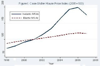
Our experimental design exploits this insight in order to test how house prices affect borrowing behavior. The “treatment” group consists of homeowners in inelastic housing supply cities (e.g., San Francisco) that experienced a sharp increase and subsequent collapse of house prices. The “control” group consists of homeowners in elastic housing supply cities (e.g., Atlanta) that experienced little change in house prices.
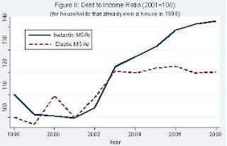
Using this methodology, we find striking results: from 2002 to 2006, homeowners borrowed $0.25 to $0.30 for every $1 increase in their home equity. Our microeconomic estimates suggest a large macroeconomic impact: withdrawals of home equity by households accounted for 2.3% of GDP each year from 2002 to 2006. Figure II illustrates the sharp increase in household leverage for homeowners living in inelastic cities.
A concern with our interpretation is that there are inherently different economic conditions in inelastic versus elastic housing supply cities that may have been responsible for the borrowing patterns we observe. However, several facts suggest that this is not a valid concern. First, inelastic cities do not experience a stronger income growth shock (i.e., a larger shock to their “permanent income”) during the housing boom. Second, the increase in debt among homeowners in high house price growth areas is concentrated in mortgage and home equity related debt.The results of Atif Mian and Amir Sufi fit with what I've observed.
Third, renters in inelastic areas did not experience a larger growth in their total debt. Finally, the effect of house prices on homeowner borrowing is isolated to homeowners with low credit scores and high credit card utilization rates. These “credit-constrained” households respond aggressively to house price growth, whereas the highest credit quality borrowers do not respond at all.
Our results demonstrate that homeowners in high house price areas borrowed heavily against the rise in home equity from 2002 to 2006. We also provide evidence that real outlays were a likely use of borrowed funds. Money withdrawn from home equity was not used to buy new homes, buy investment properties, or invest in financial assets. In fact, homeowners did not even use home equity withdrawals to pay down expensive credit card debt! These facts suggest that consumption and home improvement were the most likely use of borrowed funds, which is consistent with Federal Reserve survey evidence suggesting home equity extraction is used for real outlays.
...
Our analysis of the microeconomic data has led us to the conclusion that the severity of this economic downturn is rooted in the household leverage crisis, which in turn is closely related to the housing market. If the housing market continues to deteriorate, then further de-leveraging of the household sector will likely keep a lid on any rebound in consumption. In other words, the future of consumption and house prices are closely linked.
Bernanke to Testify on BofA and Merrill Lynch at 10 AM ET
by Calculated Risk on 6/25/2009 09:42:00 AM
Fed Chairman Ben Bernanke is to provide testimony before the House Committee on Oversight and Government Reform regarding the Bank of America's acquisition of Merrill Lynch. Might be interesting ...
UPDATE: Here is Bernanke's prepared testimony.
I appreciate the opportunity to discuss the Federal Reserve's role in the acquisition by the Bank of America Corporation of Merrill Lynch & Co., Inc. I believe that the Federal Reserve acted with the highest integrity throughout its discussions with Bank of America regarding that company's acquisition of Merrill Lynch. I will attempt in this testimony to respond to some of the questions that have been raised.Here is the CNBC feed.
And a live feed from C-SPAN.
Initial Unemployment Claims Increase
by Calculated Risk on 6/25/2009 08:30:00 AM
The DOL reports on weekly unemployment insurance claims:
In the week ending June 20, the advance figure for seasonally adjusted initial claims was 627,000, an increase of 15,000 from the previous week's revised figure of 612,000. The 4-week moving average was 617,250, an increase of 500 from the previous week's revised average of 616,750.
...
The advance number for seasonally adjusted insured unemployment during the week ending June 13 was 6,738,000, an increase of 29,000 from the preceding week's revised level of 6,709,000. The 4-week moving average was 6,759,750, a decrease of 3,250 from the preceding week's revised average of 6,763,000.
 Click on graph for larger image in new window.
This graph shows weekly claims and continued claims since 1971.
Continued claims decreased to 6.74 million. This is 5.0% of covered employment.
Note: continued claims peaked at 5.4% of covered employment in 1982 and 7.0% in 1975.
The four-week average of weekly unemployment claims increased this week by 500, and is now 41,500 below the peak of 10 weeks ago. There is a reasonable chance that claims have peaked for this cycle.
However the level of initial claims (over 627 thousand) is still very high, indicating significant weakness in the job market.
There was plenty of discussion about the decline in continuing claims last week. A few comments:
If we look back 26 weeks from last week, there was a huge jump in NSA initial claims (from 536 thousand to 760 thousand) or 224 thousand in one week back in December. Any of those people who are still unemployed (and many probably are) were moving off the standard unemployment benefits to extended benefits and are no longer counted in the continued claims. That probably counts for most of the decline last week. But it is also important to remember they are still receiving unemployment benefits (extended benefits).
When looking at this report, I'd focus on the 4-week moving average of initial claims, not continued claims.
Wednesday, June 24, 2009
CRE and Residential RE Prices
by Calculated Risk on 6/24/2009 11:31:00 PM
Here is the CRE report mentioned yesterday, from RC Analytics: Moody’s/REAL Commercial Property Price Indices, June 2009
The Moody’s/REAL National All Property Type Aggregate Index for April measures 135.31, a decrease of 8.6% from the previous month. The index now stands 25.3% below the level seen a year ago and 29.5% below the peak measured in October 2007. The index is 27.4% lower than it was two years ago. This report is based on data through the end of April.Note that the Moody's CRE price index is a repeat sales index like Case-Shiller.
...
The Moody’s/REAL Commercial Property Price Indices (CPPI) measure the change in actual transaction prices for commercial real estate assets based on the repeat sales of the same assets at different points in time. ... A summary or short version of the repeat sales methodology is available in a Moody’s Special Report. US CMBS: Moody’s Publishes the First Commercial Property Price Indices Based on Commercial Real Estate Repeat Sales Data. Sept. 19, 2007. This is available on Moodys.com > Structured Finance > Commercial MBS > CRE Indices. A very detailed and complete explanation of the methodology is available in a White Paper from MIT. David Geltner and Henry Pollakowski. A Set of Indexes for Trading Commercial Real Estate Based on the Real Capital Analytics Transaction Prices Database. MIT Center for Real Estate. Sept. 26, 2007.
 Click on graph for larger image in new window.
Here is figure 1 from the report. CRE prices are back to 2004.
The Case-Shiller Composite 20 residential index is added in red (with Dec 2000 set to 100).
This shows residential leading CRE (although we usually talk about residential investment leading CRE investment, but in this case also for prices), and this also shows that prices tend to fall faster for CRE than for residential.
More on the New and Existing Homes Sales Gap
by Calculated Risk on 6/24/2009 08:51:00 PM
Earlier today I posted some analysis of the gap between existing and new home sales: Distressing Gap: Ratio of Existing to New Home Sales (see the post for several graphs - including the ratio between new and existing home sales)
Professor Brian Peterson has more (including some thoughts prices): House Prices and New versus Existing Homes Sales
To get a feel for how the two series [New and existing home sales] move together, figure 2 plots the percentage deviation for each series from its mean from 1975-2008. We see clearly that from 1975 to 2006 (the solid lines) that new home sales and existing homes sales move around together, with a correlation of 0.944 over the the time period up to 2006. However, as shown by the dashed lines, a gap has developed post 2006, resulting in the correlation for the sample from 1975-2008 falling to 0.876. There seems to be some type of a shock that is driving existing homes sale up relative to new homes sales.

I find it strange that most analysts are looking at existing home sales for stability in the housing market. I think the new home market is the place to look.
BofE Mervyn King: U.K. Recovery may be "long, hard slog"
by Calculated Risk on 6/24/2009 07:46:00 PM
From Bloomberg: King Says U.K. Recovery May Be ‘Long, Hard Slog’ (ht Jonathan)
“There has to be a risk that it will be a long, hard slog” because of the problems in the banking system, King told lawmakers in London today. “I feel more uncertain now than ever. This is not the pattern of a recession coming into recovery that we’ve seen since the 1930s. Having an open mind and not pretending to foresee the future when it’s so uncertain is important.”
...
King said that there’s “not much evidence to change our view” since the bank released forecasts in May showing that the economy won’t return to growth on an annual basis until the second half of next year.
emphasis added
Appraisals
by Calculated Risk on 6/24/2009 04:12:00 PM
Much is being written about the complaints of the NAR (Realtors) and the NAHB (Builders) concerning the Home Valuation Code of Conduct. And the response from the Appraisal Institute.
From Lawrence Yun, NAR chief economist:
"[T]he increase in sales is less than expected because poor appraisals are stalling transactions. Pending home sales indicated much stronger activity, but some contracts are falling through from faulty valuations that keep buyers from getting a loan.”From Joe Robson, chairman of the National Association of Home Builders (NAHB):
emphasis added
“In the midst of the prime home buying season, builders report that a number of factors are limiting new-home sales. These include consumer concerns about job security, potential buyers’ inability to sell their existing homes, and problems with appraisals coming in too low. The latter issue is directly related to the use of distressed properties (foreclosures and short sales) as comps, which disproportionately impacts assessed values of nearby homes.”This change started when NY Attorney General Andrew M. Cuomo sued First American for conspiring with WaMu to inflate real estate appraisals back in November 2007.
“The independence of the appraiser is essential to maintaining the integrity of the mortgage industry. First American and eAppraiseIT violated that independence when Washington Mutual strong-armed them into a system designed to rip off homeowners and investors alike,” said Attorney General Cuomo. “The blatant actions of First American and eAppraiseIT have contributed to the growing foreclosure crisis and turmoil in the housing market. By allowing Washington Mutual to hand-pick appraisers who inflated values, First American helped set the current mortgage crisis in motion.”The email evidence was pretty damning. And the HVCC was part of the settlement.
This has been coming for some time, and should be no surprise.
For a good background on the appraisal process, see Tanta's What's Wrong With Approved Appraiser Lists. Tanta was writing about approved appraiser lists, but her posts explains the appraisal problem. Here is an excerpt:
[W]hat WaMu is alleged to have done is itself the kind of conduct that is an automatic “red flag” for anyone who knows anything about how the appraisal management business works. Since most of you are fortunate enough to be entirely innocent of that, I thought I’d go through some issues here.The HVCC is addressing a very real and widespread appraisal problem. That doesn't mean the solution is perfect - and this shows once again that incentives matter.
First off, I’m talking about how the business works, not about how the principles of appraiser independence are derived by the Appraisal Foundation or why they matter so much. I’m taking as a given that we accept the axiom that when an appraiser’s compensation is based on his or her willingness to come up with the answer an interested party wants, instead of the answer he or she thinks the facts of the subject property, the transaction requested, and the local real estate market warrant, an appraisal is nothing more than a ratification of the loan amount someone has already decided on, and that “someone” isn’t the ultimate bagholder. The real bagholder wants to know whether it is lending too much or risking owning an unsalable piece of REO. That an individual loan officer or broker just wants to know how high we can make the loan amount—and thus a commission—is an artifact of a business structure in which a lender’s own employees or agents are not aligned with its own corporate best interests. At some level the appraisal problem will never get solved until the compensation of loan processing employees and intermediaries gets solved, but that’s not today’s argument.
In the olden days of local lenders, you had either staff appraisers or “fee appraisers.” You could actually have appraisers on your payroll because you lent in a defined local area: you didn’t have to worry about needing an appraisal for a property six states away that your staff appraisers couldn’t get to, even if they were licensed in that state. If you relied on fee appraisers, possibly because it was too expensive to keep appraisers on the payroll during down-cycles in RE, you still worked in a local market, you got to know all of them, and you could order appraisals from people whose work was familiar. If you were smart, you worked with the best appraisers there were. If you were stupid, you channeled business to your golf buddies. A number of S&Ls did the latter, and they did not live happily ever after. We have this thing called FIRREA, which brought into being USPAP, in large part because of that second option.
Once local lenders became regional lenders and then national lenders, the distance between corporate headquarters, the Appraisal Department, and the actual properties and markets grew to the point that having staff appraisers was impractical and hiring fee appraisers was a crap-shoot. You can pick up the Yellow Pages to find an appraiser in a market you just entered, but this means you will learn by doing in terms of quality. That goes double if you entered this market via wholesale lending: you now have a broker you don’t know much about hiring an appraiser you don’t know anything about in an RE market you’ve never done business in before.
The early years of national wholesale lending supplied lots of excitement, as Podunk National Bank changed its name to Ubiquitous, Inc. and charged into market areas about which it knew nothing, on the assumption that, say, Miami is just like Podunk except the loan amounts are bigger. Sometimes this was actually retail lending: Ubiquitous, Inc. started buying up branches in all these new and exciting markets, with the plan of managing them long-distance from corporate headquarters. Often those branches (complete with their employees) could be acquired for amazingly cheap sums of money. The Lender Formerly Known As Podunk often didn’t ask itself why the current owner of that branch wanted out so badly, but that’s hardly a problem unique to mortgage lending or banking.
Eventually, everyone had to deal with the hard knocks. You might be able to justify taking risks on the unknown when you move into a new market, but you still have to do something about the problems that crop up. Everyone got at least some really bad appraisals from the Yellow Pages approach, and had to start making some lists. I really think that a major problem lurking in the industry happened right here, when wholesalers and correspondent lenders made a decision about what kind of list to make. Do you make an “Approved Appraiser” list of the ones you haven’t had problems with, or do you make an “Excluded Appraiser” list of the ones you have had problems with?
There is no question that logically, the most efficient thing to do is make the exclusion list. Even if you believe that there are more than just a few bad apples, you don’t get into the national mortgage lending business if you believe that bad appraisers outnumber good appraisers by a wide margin. Exclusionary lists are just shorter and easier to administrate.
If you’re still a retail lender (just a long-distance one), you can keep the shorter exclusionary list internal to your own organization. The major disadvantage of exclusionary lists developed for the wholesale and correspondent lenders, and for any lender in the “originate and sell” rather than “originate and hold” business. If you are contracting with brokers, correspondent lenders, third-party investors and servicers and other folks who need to conduct due diligence on your loans, you end up having to make your list available to all those parties. It becomes nearly impossible to keep it confidential.
And that started the defamation fear. Too many lenders faced real or imagined threats of lawsuits from appraisers who did not want their names appearing on what had basically become a public hall of shame list. (I hasten to add that these things were not “public” to you, the consumer. They were an open secret to everyone in the business except the consumer.) So even though an approved appraiser list was a much more expensive, time-consuming, cumbersome way to get there, more and more big operations started keeping one. (Why not go to the regulators and beg for a "safe harbor" against defamation liability for exclusion lists? Because lenders are almost never long-sighted enough to ask for regulation that benefits them. They're too afraid that it always comes with the wrong strings attached. Then after the criminal probes and class actions and general shirt-losing, we look back wistfully on those strings we were so afraid of, wondering why we didn't snap that deal right up.)
An appraiser who is paid only if the loan is made, and is given the target number in advance, has a perverse incentive to "hit the number". However an appraiser that is paid no matter what, possibly has an incentive to be overly conservative and deliver a low ball appraisal that the NAR and NAHB and others are complaining about.
However lenders are still in the business of making loans (hopefully loans that will be repaid) - and the appraisers work for the lenders - and the lenders don't make money if the loan isn't made. So there is still an incentive to get deals done.
Report: Record Credit Card Charge-offs
by Calculated Risk on 6/24/2009 03:26:00 PM
From Reuters: US credit card chargeoffs break new record - Moody's
The U.S. monthly credit card chargeoff rate surpassed 10 percent and hit a sixth straight record high in May, Moody's Investors Services said on Wednesday ...Another month, another record.
The chargeoff rate index -- which measures credit card loans the banks do not expect to be repaid -- rose to 10.62 percent in May from 9.97 percent in April.
"We expect the chargeoff rate index to continue to rise in the coming months but at a slower pace, as it peaks at around 12 percent in the second quarter of 2010," Moody's senior vice president William Black said in a statement.
I wouldn't be surprised if Chase sees an increase in chargeoffs after raising the monthly minimum payment from 2% to 5% for some credit card users.
As a reminder, the credit card indicative loss rates for the "more adverse" stress test scenario were 18% to 20% over two years. That might have been a little optimistic. The baseline scenario was 12% to 17% over two years - way too low.
FOMC Statement
by Calculated Risk on 6/24/2009 02:15:00 PM
Information received since the Federal Open Market Committee met in April suggests that the pace of economic contraction is slowing. Conditions in financial markets have generally improved in recent months. Household spending has shown further signs of stabilizing but remains constrained by ongoing job losses, lower housing wealth, and tight credit. Businesses are cutting back on fixed investment and staffing but appear to be making progress in bringing inventory stocks into better alignment with sales. Although economic activity is likely to remain weak for a time, the Committee continues to anticipate that policy actions to stabilize financial markets and institutions, fiscal and monetary stimulus, and market forces will contribute to a gradual resumption of sustainable economic growth in a context of price stability.Update: Deflation concern last month:
The prices of energy and other commodities have risen of late. However, substantial resource slack is likely to dampen cost pressures, and the Committee expects that inflation will remain subdued for some time.
In these circumstances, the Federal Reserve will employ all available tools to promote economic recovery and to preserve price stability. The Committee will maintain the target range for the federal funds rate at 0 to 1/4 percent and continues to anticipate that economic conditions are likely to warrant exceptionally low levels of the federal funds rate for an extended period. As previously announced, to provide support to mortgage lending and housing markets and to improve overall conditions in private credit markets, the Federal Reserve will purchase a total of up to $1.25 trillion of agency mortgage-backed securities and up to $200 billion of agency debt by the end of the year. In addition, the Federal Reserve will buy up to $300 billion of Treasury securities by autumn. The Committee will continue to evaluate the timing and overall amounts of its purchases of securities in light of the evolving economic outlook and conditions in financial markets. The Federal Reserve is monitoring the size and composition of its balance sheet and will make adjustments to its credit and liquidity programs as warranted.
In light of increasing economic slack here and abroad, the Committee expects that inflation will remain subdued. Moreover, the Committee sees some risk that inflation could persist for a time below rates that best foster economic growth and price stability in the longer term.This time:
The prices of energy and other commodities have risen of late. However, substantial resource slack is likely to dampen cost pressures, and the Committee expects that inflation will remain subdued for some time.
Shadow Housing Inventory: Walked Away, but Lender Hasn't Foreclosed
by Calculated Risk on 6/24/2009 12:30:00 PM
From the WaPo: Not Paying the Mortgage, Yet Stuck With the Keys (ht Bob_in_MA)
A growing number of American homeowners are falling into financial limbo: They're badly behind on payments, but their banks have not yet foreclosed.There is much more in the article.
The backlog of seriously delinquent mortgages, which so far affects about 1 million borrowers, is a shadow over hopes for a rebound in the nation's housing markets. It masks the full extent of the foreclosure crisis ...
"I have even begged them for a foreclosure," delinquent mortgage-holder Charlotte Jensen said. When she realized she couldn't save her Glen Allen home last year, she filed for bankruptcy, packed up her family and moved out. Nearly a year later, Bank of America has yet to take back the home.
...
Some of the backlog reflects the inability of lenders to keep up with the swelling rolls of delinquent properties.
... some of the backlog also reflects an intentional slowdown in the pace of foreclosures as government and industry step up efforts to help borrowers who want to save their homes. Fannie Mae and Freddie Mac, the government-run mortgage financing companies, put a temporary moratorium on foreclosures late last year and many of the country's largest lenders followed suit.
...
"What we're seeing more and more right now are cases of a lender threatening foreclosure and the foreclosure sale is canceled at the last minute," said Jeanne Hovenden, a Richmond bankruptcy attorney, who handled Jensen's case. "It's more like the lenders don't want to own any more real estate and are using foreclosures as a pressure tactic."
...
Jensen visits her home weekly to ensure it hasn't been vandalized or taken over by squatters. She pays landscapers to keep the lawn mowed.
...
For the Jensens, the delay has extended a painful period. "There was a sense of responsibility that until someone says we no longer own that property, we wanted to make sure it's handed off correctly," Jensen said. "We could have walked away like everyone else and said, 'We don't care.' But we loved our neighbors and our neighborhood. We hold ourselves responsible."
Distressing Gap: Ratio of Existing to New Home Sales
by Calculated Risk on 6/24/2009 11:47:00 AM
For graphs based on the new home sales report this morning, please see: New Home Sales: Record Low for May
Yesterday, the National Association of Realtors (NAR) reported that distressed properties accounted for one-third of all sales in May. Distressed sales include REO sales (foreclosure resales) and short sales, and based on the 4.77 million existing home sales (SAAR) that puts distressed sales at about a 1.6 million annual rate in April.
All this distressed sales activity has created a gap between new and existing sales as shown in the following graph that I've jokingly labeled the "Distressing" gap.
This is an update including May new and existing home sales data. Click on graph for larger image in new window.
This graph shows existing home sales (left axis) and new home sales (right axis) through March.
As I've noted before, I believe this gap was caused by distressed sales - in many areas home builders cannot compete with REO sales, and this has pushed down new home sales while keeping existing home sales activity elevated.  The second graph shows the same information, but as a ratio for existing home sales divided by new home sales.
Although distressed sales will stay elevated for some time, eventually I expect this ratio to decline - probably with a combination of falling existing home sales and eventually rising new home sales.  The third graph shows the ratio back to 1969 (annual data before 1994).
Note: the NAR has changed their data collection over time and the older data does not include condos: Single-family data collection began monthly in 1968, while condo data collection began quarterly in 1981; the series were combined in 1999 when monthly collection of condo data began.
New Home Sales: Record Low for May
by Calculated Risk on 6/24/2009 10:00:00 AM
The Census Bureau reports New Home Sales in May were at a seasonally adjusted annual rate (SAAR) of 342 thousand. This is essentially the same as the revised rate of 344 thousand in April. Click on graph for larger image in new window.
The first graph shows monthly new home sales (NSA - Not Seasonally Adjusted).
Note the Red columns for 2009. This is the lowest sales for May since the Census Bureau started tracking sales in 1963. (NSA, 32 thousand new homes were sold in May 2009; the record low was 36 thousand in May 1982).
As the graph indicates, sales in May 2009 were substantially worse than the previous years. The second graph shows New Home Sales vs. recessions for the last 45 years. New Home sales have fallen off a cliff.
Sales of new one-family houses in May 2009 were at a seasonally adjusted annual rate of 342,000 ...And another long term graph - this one for New Home Months of Supply.
This is 0.6 percent (±17.8%)* below the revised April rate of 344,000 and is 32.8 percent (±10.9%) below the May 2008 estimate of 509,000..
 There were 10.2 months of supply in May - significantly below the all time record of 12.4 months of supply set in January.
The seasonally adjusted estimate of new houses for sale at the end of May was 292,000. This represents a supply of 10.2 months at the current sales rate.
 The final graph shows new home inventory.
 Note that new home inventory does not include many condos (especially high rise condos), and areas with significant condo construction will have much higher inventory levels.
It appears the months-of-supply for inventory has peaked, and there is some chance that sales of new homes has bottomed for this cycle - but we won't know for many months. However any recovery in sales will likely be modest because of the huge overhang of existing homes for sale.
This is another weak report. I'll have more later ...
American Institute of Architects: Recovery has stalled
by Calculated Risk on 6/24/2009 08:38:00 AM
From Reuters: Architecture billings index steady in May - AIA
A leading indicator of U.S. nonresidential construction spending held steady for a second month in May, suggesting an economic recovery has stalled, an architects' trade group said on Wednesday.
The Architecture Billings Index edged up a tenth of a point to 42.9 last month after a slight decline in the prior month, according to the American Institute of Architects.
...
A measure of inquiries for projects dipped to 55.2, the third straight month that inquiries have held at a similar level but have not led to improved billings. The data indicated recovery has stalled, the AIA said.
"Numerous firms (have) bid for the same project, which is why the high level of inquiries is not necessarily translating into additional billings for project work at many firms," AIA Chief Economist Kermit Baker said in a statement.
 Click on graph for larger image in new window.
This graph shows the Architecture Billings Index since 1996. The index is still below 50 indicating falling demand.
Historically there is an "approximate nine to twelve month lag time between architecture billings and construction spending" on commercial real estate (CRE). This suggests further dramatic declines in CRE investment later this year.
MBA: Mortgage Rates Decrease Slightly
by Calculated Risk on 6/24/2009 08:25:00 AM
The MBA reports:
The Market Composite Index, a measure of mortgage loan application volume, was 548.2, an increase of 6.6 percent on a seasonally adjusted basis from 514.4 one week earlier.
...
The Refinance Index increased 5.9 percent to 2116.3 from 1998.1 the previous week and the seasonally adjusted Purchase Index increased 7.3 percent to 280.3 from 261.2 one week earlier.
...
The average contract interest rate for 30-year fixed-rate mortgages decreased to 5.44 percent from 5.50 percent ...
 Click on graph for larger image in new window.
This graph shows the MBA Purchase Index and four week moving average since 2002.
Note: The increase in 2007 was due to the method used to construct the index. Since the MBA surveyed mostly the major lenders, when lenders like New Century went under - this pushed more borrowers to lenders included in the survey. As smaller lenders went out of business, the remaining lenders saw more applications. Plus a number of borrowers started submitting multiple applications. Both factors distorted the index. That increase in 2007 fooled many people, like Alan Greenspan. See, from Bloomberg: Greenspan Says `Worst' May Be Past in U.S. Housing (Oct 6, 2006)
Although we can't compare directly to earlier periods because of the changes in the index, this shows no significant pick up in overall sales activity.
Tuesday, June 23, 2009
Housing Bust and Mobility
by Calculated Risk on 6/23/2009 10:52:00 PM
From the SF Gate: Housing, unemployment woes leave movers shaken
Sinking home prices and a weak job market have forced normally restless Americans to stay put in an uncharacteristic shift that has, among other things, clobbered the moving industry.A few previous mobility posts: Housing Bust Impacts Worker Mobility April 2008, Housing Bust Impacting Labor Mobility, Dec 2008, Housing Bust and Geographical Mobility, April 2009
"Property values have dropped so much people can't pick up and move the way they used to," said Michael Hicks, a demographer at Ball State University in Indiana who has tracked the nationwide slowdown using data from several sources, including moving companies.
That industry data mirrors a Census Bureau report that looked at moves in 2008, said William Frey, a demographer at the Brookings Institution in Washington, D.C.
"The annual migration rate has gone way down to historic low levels," Frey said. "This includes long distance moves and moving across town."
During the 1950s and 1960s, Frey said, as many as 20 percent of Americans moved in any given year. Mobility rates slowed to 15 percent to 16 percent during the 1990s. But in 2008, only 11.9 percent of Americans moved, he said.
Martin Wolf on Finanical Reform and Incentives
by Calculated Risk on 6/23/2009 08:19:00 PM
From Martin Wolf in the Financial Times: Reform of regulation has to start by altering incentives
Proposals for reform of financial regulation are now everywhere. The most significant have come from the US, where President Barack Obama’s administration last week put forward a comprehensive, albeit timid, set of ideas. But will such proposals make the system less crisis-prone? My answer is, no. The reason for my pessimism is that the crisis has exacerbated the sector’s weaknesses. It is unlikely that envisaged reforms will offset this danger.Wolf discusses how it is rational for management and shareholders to gamble when the risks are asymmetrical (huge potential winnings, limited losses). And he argues that "creditors ... appear to have lent to a bank. In reality, they have lent to the state." He also discusses how tighter regulation isn't enough because the banks will find a way round the new regulations.
At the heart of the financial industry are highly leveraged businesses. Their central activity is creating and trading assets of uncertain value, while their liabilities are, as we have been reminded, guaranteed by the state. This is a licence to gamble with taxpayers’ money. The mystery is that crises erupt so rarely.
Wolf concludes:
Such a crisis is not only the result of a rational response to incentives. Folly and ignorance play a part. Nor do I believe that bubbles and crises can be eliminated from capitalism. Yet it is hard to believe that the risks being run by huge institutions had nothing to do with incentives. The unpleasant truth is that, today, the incentive to behave in this risky way is, if anything, even bigger than it was before the crisis.Talk about pessimism.
Regulatory reform cannot end with incentives. But it has to start from incentives. A business that is too big to fail cannot be run in the interests of shareholders, since it is no longer part of the market. Either it must be possible to close it down or it has to be run in a different way. It is as simple – and brutal – as that.
Another financial crisis is unfortunately inevitable - all we hope to do with reform is to put it off for a couple of decades or more.
Another Hotel Defaults on Mortgage Debt
by Calculated Risk on 6/23/2009 04:50:00 PM
From the WSJ: Red Roof Inn Defaults on Mortgage Debt (hat tips to all in the comments!)
Red Roof Inn Inc. ... defaulted on $332 million of mortgage debt ... Red Roof confirmed the defaults Tuesday.The drop in occupancy rates are similar to the overall industry decline. And not only are occupancy rates off sharply, but so are room rates. Smith Travel Research reported last week that revenue per available room (RevPAR) was off 18.6 percent for the comparable week last year. I think this is just the beginning for the hotel related defaults.
All told, Red Roof's properties carry at least $1 billion in debt, including mortgages, mezzanine loans and other notes.
"As a result of the extraordinary stress in the hospitality industry and the economy overall, we have entered into some restructuring discussions with our lenders," said Andrew Alexander, an executive vice president of Red Roof.
...
Occupancy at Red Roof's properties, which averaged 62% when the mortgages were originated in 2007, sank to 50.7% in the first four months of this year.
Misleading House Price Data
by Calculated Risk on 6/23/2009 02:31:00 PM
From FHFA Director James B. Lockhart, June 23, 2009:
“Although monthly data are volatile, we may be starting to see signs of stabilization in prices for houses funded by conventional conforming loans, as the HPI is only down 0.3 percent for the first four months of the year.”From the National Association of Realtors, June 23, 2009:
The national median existing-home price for all housing types was $173,000 in May, down 16.8 percent from a year earlier. Distressed properties, which declined to 33 percent of all sales in May from 45 percent in April, continue to downwardly distort the median price because they generally sell at a discount relative to traditional homes.Which is it? The answer is both are flawed.
James Hagerty at the WSJ has a good analysis: FHFA Data May Signal False Bottom in Housing
The Realtors’ data cover a broader range of the market than does the FHFA index. ... But the Realtors’ median price is skewed by changes in the mix of homes sold each month. ...As the sales of mid-to-high end houses pick up (sales at the high end have slowed to a trickle in many areas), the median price might rise even as prices continue to fall because of change in the mix - and this will confuse some observers.
The FHFA index, like the S&P Case-Shiller index, is based on repeat sales of the same homes and so avoids the distortions of a shifting mix in sales. But the Case-Shiller index includes more foreclosure-related transactions and gives more weight to higher-priced homes than to lower-priced ones. Thus, when sales of higher-end homes increase, the Case-Shiller index is likely to look much worse, even as the Realtors’ median price will look better.
And the FHFA index is based on GSE loans, and as the most recent data showed, a higher percentage of the problem loans were non-GSE private label loans. Also, the FHFA misses many larger loans in general, and high end prices have held up better so far - but that will change when people realize there are few move-up buyers!
The following graphic (repeat) is from the Harvard Report on Housing 2009. Note: this data is informative, but use caution when using the Harvard analysis (see: Harvard on Housing 2005)
 Click on image for larger graph in new window.
This shows that the worst mortgages were the private label securities (as an example mortgages originated by New Century, and securitized by Bear Stearns).
The Freddie and Fannie portfolios accounted for 56% of all mortgages in Dec 2008, but only 20% of the seriously delinquent loans. So the FHFA index is based on some of the better performing loans. Case-Shiller (to be released next Tuesday) includes these other loans.
S&P Downgrades Prime Jumbo MBS
by Calculated Risk on 6/23/2009 01:56:00 PM
From MarketWatch: S&P downgrades prime jumbo mortgage securities
S&P said it lowered ratings on 102 classes from 33 U.S. prime jumbo residential mortgage-backed securities that were issued from 1998 to 2004. The rating agency also affirmed ratings on 669 classes from 32 of the downgraded deals, as well as 34 other deals.From 1998?
"The downgrades reflect our opinion that projected credit support for the affected classes is insufficient to maintain the previous ratings, given our current projected losses," S&P said in a statement.
Philly Fed State Coincident Indicators: Widespread Recession
by Calculated Risk on 6/23/2009 11:59:00 AM
 Click on map for larger image.
Here is a map of the three month change in the Philly Fed state coincident indicators. Forty nine states are showing declining three month activity.
This is what a widespread recession looks like based on the Philly Fed states indexes.
On a one month basis, activity decreased in 47 states in May, and was unchanged in 2 more states. Here is the Philadelphia Fed state coincident index release for May.
The Federal Reserve Bank of Philadelphia has released the coincident indexes for the 50 states for May 2009. In the past month, the indexes have increased in one state (North Dakota), decreased in 47, and were unchanged in the other two (South Dakota and Vermont), for a one-month diffusion index of -92. Over the past three months, the indexes have increased in one state (again, North Dakota) and decreased in the other 49 states, for a three-month diffusion index of -96.
 The second graph is of the monthly Philly Fed data of the number of states with one month increasing activity. Most of the U.S. was has been in recession since December 2007 based on this indicator.
Note: this graph includes states with minor increases (the Philly Fed lists as unchanged).
Almost all states showed declining activity in May. Still a very widespread recession ...


