 RSS Feed
 by Calculated Risk on 1/08/2007 12:20:00 PM
Monday, January 08, 2007
More BLS vs. ADP
The ADP report has taken quite a beating over the last few days. David Gaffen wrote at the WSJ blog on Friday: ADP in ICU, part II
... anyone who traded on the ADP numbers ahead of today’s report lost money. “There isn’t any hiding from that,” said ... Joel Prakken chairman of Macroeconomic Advisers, the economic consulting firm that partners with Automatic Data Processing to produce the private sector monthly jobs report.And Professor Duy comments on ADP in another great Fed Watch (Recommended reading!): Like a Broken Record
"I do not pay special attention to the ADP report. I simply don’t trust that it provides any useful information above that offered by a host of Wall Street economists. Moreover, when it misses, it misses big."On a slightly different note, Professor Hamilton discusses why he blends the ADP report with the BLS reports.
As I noted last week, I just ignore the ADP report. But I thought I'd take another look.
First, it's important to note that the ADP report is for private sector jobs only, and the headline BLS number includes government jobs. So, to compare the ADP report to the BLS payroll report, government jobs should be excluded from the BLS report.
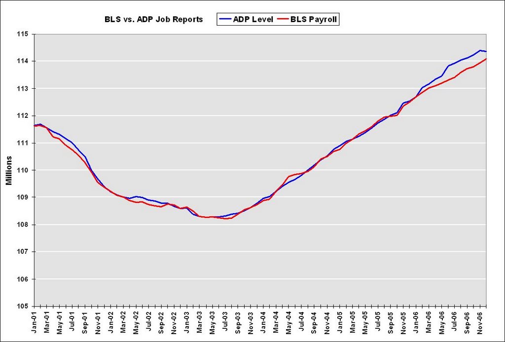 Click on graph for larger image.
This graph shows total private sector BLS payroll jobs vs. ADP jobs. Special thanks to Paul Kasriel of Northern Trust.
Note that the scale starts at 105 million to show the differences between the reports.
In recent months, the ADP report showed a total of almost 500K more jobs than the BLS report. After the weak December ADP report (showing a monthly decline of 40K jobs) and the strong BLS report (an increase of 150K private sector jobs, 167K including government jobs), the ADP report is showing about 300K more jobs than the BLS report.
This difference led me (and others) to discount the ADP report.
But maybe the ADP report has some merit. In October the BLS announced the preliminary estimate for the 2006 revision to the establishment survey - and the revision appears to be a "larger-than-normal" increase in jobs - perhaps an upwards revision of 800K jobs. So it is very possible, once the actual BLS revision is announced in February that the ADP report was actually pretty close earlier this year.
For now it's probably best to continue to ignore the ADP report (or use Hamilton's 10% suggestion), but I'll take another look at the January numbers.
Friday, January 05, 2007
Professor Case and Sticky House Prices
by Calculated Risk on 1/05/2007 04:35:00 PM
This research from Professor Case shows just how sticky prices are right now.
From the Boston Herald: Buyers vs. homesellers: Standoff could lead to recession
... Wellesley College housing guru Karl Case will release the results of a five-month groundbreaking survey of the housing market in Boston’s suburbs.I suspect a 6.3% price decline in Boston felt like a "price implosion" to some sellers!
And it’s not happy reading.
After tracking 628 homes on the market from July through November, Case found that fewer than a third actually sold.
It paints a picture of a market nearing a standstill, in which would-be sellers are opting to take their homes off the market rather than accept big markdowns.
Over such a lengthy period, even in a slow market, one could expect 70 percent of these homes to have sold, Case estimates.
But Case’s study found only 30 percent moved.
...
Despite the big drop in sales activity, there was no price implosion.
Instead, average selling prices fell just 6.3 percent.
After seeing the value of their homes soar during days of the real estate bubble, home owners are reluctant to give ground on price. Or, as Case puts it, it’s a case of “sticky” prices common to past market downturns.
...the drop in home sales activity could be a more serious economic threat, Case believes.
This research shows the impact of sticky house prices. In a classic housing bust, real estate prices display strong persistence and are sticky downward. Therefore housing price "bubbles" typically do not implode, rather prices deflate slowly in real terms, over several years. As Dr. Case notes, this typically leads to a drop in transactions and can negatively impact the economy.
Let's consider Case's research, and the projections of NAR's Lereah and Fannie Mae's Berson:
NAR Economist David Lereah recently said:
“We’ve entered a more sustainable period of home sales now, and we expect greater support for prices over time as inventory levels are eventually drawn down.”and
“Although some monthly declines are possible, when we look at the forecast for existing-home sales in 2007 on a quarterly basis, we see gradual improvement over the course of the year.”However I believe it is much more likely that sales of existing homes will decline again in 2007. Fannie Mae economist David Berson is forecasting existing home sales to decline to 5.925 million units in '07 (from 6.425 million in '06), and new home sales to 0.975 million units (from 1.05 million).
Partially because of the impact of sticky prices, I think Berson's 2007 estimate will be closer than Lereah's projection. In fact, I think Berson might be a little too optimistic.
Jobs: BLS vs. ADP
by Calculated Risk on 1/05/2007 01:12:00 PM
With regards to the differences between the BLS and ADP job reports, Professor Hamilton notes the
"reaction of many people to such disparate indicators is simply to disregard several of the measures."That describes me; I've just ignored the ADP report.
Dr. Hamilton suggests blending the three measures of employment (BLS Payroll, BLS Survey, ADP):
"I've been using a weighted average based on the assumption that the NFP is considerably more reliable than either of the other two, giving NFP a weight of 80% and each of the others 10%."That made me wonder if there is a lag, or some other consistent relationship, between the ADP and BLS reports of employment. I found this graph from Northern Trust's Asha Bangalore:
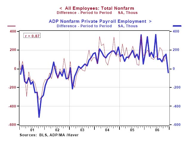 Click on graph for larger image.
Note that this graph does not include today' BLS numbers. There appears to be reasonably strong correlation over time, but the monthly differences between the reports can be significant.
It appears that the two series don't diverge for long, so I'd expect better correlation next month (something to remember). This also suggests Dr. Hamilton's blending approach might be helpful - although I'd like to see a graph with the survey data added.
December Employment Report
by Calculated Risk on 1/05/2007 02:50:00 AM
The BLS reports: U.S. nonfarm payrolls rose by 167,000 in December, after a revised 154,000 gain in November. The unemployment rate was steady at 4.5% in December. Click on graph for larger image.
Here is the cumulative nonfarm job growth for Bush's 2nd term. The gray area represents the expected job growth (from 6 million to 10 million jobs over the four year term). Job growth is about in the middle of the expected range.
The following two graphs are the areas I've been watching closely: residential construction and retail employment.
Residential construction employment decreased by 16,200 jobs in December and is down 133.6 thousand, or about 4.0%, from the peak in February. This is the beginning of the loss of several hundred thousand residential construction jobs over the next year or so.
Note the scale doesn't start from zero: this is to better show the change in employment.
Retail employment lost 9,200 jobs in December. The YoY change in retail employment is now -0.4%.
The YoY decrease in retail employment is concerning: see Retail Employment
Overall this is a solid report. The expected job losses in residential construction employment has just started, but the spillover to retail isn't significant yet. I expect the rate of residential construction job losses to increase over the next few months.
Housing Bust Gives Renters a Break
by Calculated Risk on 1/05/2007 12:15:00 AM
This is interesting. When the housing bust started a year ago, rents started to rise. But now it appears many frustrated homeowners are trying to rent their vacant homes, putting some downward pressure on rents.
From the WaPo: Cold Sales Give Renters a Break
As home sellers grew more frustrated with the slow local real estate market in recent months, they abandoned their for-sale signs and put their homes up for rent. That has increased choices and cooled prices for tenants in one of the tightest and most expensive parts of the country.Just this morning, Ivy Zelman of Credit Suisse wrote: Vacancy Sales Loom Large.
"This is the first sign that the cooling housing market is having an impact on the rental market," said Gregory H. Leisch, chief executive of Delta Associates ...
As competition for tenants intensified, apartment rents did not rise as sharply in the past three months of 2006 as they had earlier in the year, the report said.
"... we have not addressed the explosion of vacant listings and the implications on the housing market food chain, a factor that we and several of our private industry contacts believe deserves attention."
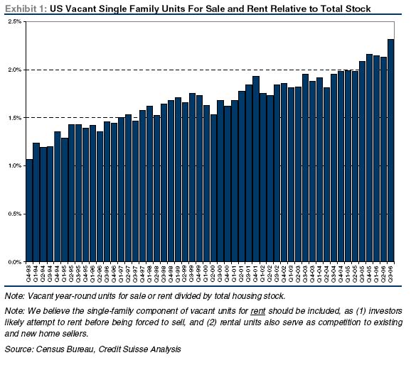 Click on graph for larger image.
"The proportion of single family vacant homes for sale and for rent relative to total housing stock is at the highest level since at least 1993 (as far back as our data series goes). The recent surge in vacant units for sale, as the capitulation by distressed sellers accelerates, may provide a persistent headwind to the [housing] recovery."This WaPo story suggests that these vacancies might also provide a headwind for rents.
Wednesday, January 03, 2007
MEW's Impact on 2007
by Calculated Risk on 1/03/2007 08:45:00 PM
First, I'd like to clarify a previous post on Mortgage Equity Withdrawal's (MEW) impact on GDP.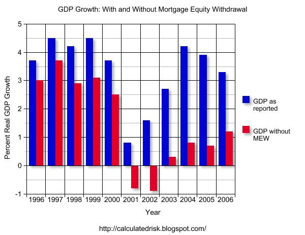 Click on graph for larger image.
To construct this graph, I used the reported GDP for the previous year, and then removed 50% of the Greenspan-Kennedy MEW from GDP for the target year. The intention was to show how important MEW has been in recent years.
Note: the 50% is Greenspan estimate of MEW flowing to consumption of domestic goods and services.
From the questions I've received, I clearly didn't provide an adequate description of this chart. Or perhaps the presentation is misleading.
Let's use 2004 and 2005 as an example. In 2004, MEW was $754.2 Billion, and in 2005 MEW was $743.7 Billion (about the same). We could make two seemingly contradictory statements:
1) MEW contributed $372 Billion to GDP in 2005 (half of total MEW).
2) The change in MEW had no impact (positive or negative) on 2005 GDP growth, since MEW was the same in 2004 and 2005.
Both statements are correct, but since I presented the first statement in terms of the impact on GDP growth in the chart for each specific year, this was clearly confusing. To clarify further, let's look at 2007:
MEW's Impact on 2007 GDP
For 2006, my estimate of MEW is $521 Billion (first three quarters were $421 Billion). For 2007, I expect MEW to decline to around $300 Billion.
So, assuming Greenspan's 50% estimate is correct, what will be the drag on GDP in 2007?
Here is a simplified calculation: First, the change in MEW is $221 Billion ($521 Billion minus $300 Billion). So the estimated drag on consumption would be $110 Billion. If we assume 2006 GDP of $13.3 Trillion that would mean a drag of about 0.8% in 2007 due to the decline in MEW (see notes below).
Chart Caveats
Although the chart still makes perfect sense to me, it is clearly confusing to some (perhaps many) readers. If you use the chart, remember:
1) The MEW calculation ignores the impact of previous MEW on GDP. It is NOT cumulative. The calculation assumes MEW is a one time boost for each SPECIFIC year.
2) I'm using the Greenspan-Kennedy numbers provided by the Fed, but MEW is NOT an official statistic.
3) this chart assumes that 50% of MEW flows to domestic consumption. It is possible that more or less is used to pay off debt, for investment purposes, or flows to imports.
4) This chart also assumes that MEW flows to consumption in the year the MEW was extracted.
This will probably be the end of the above chart due to the confusion.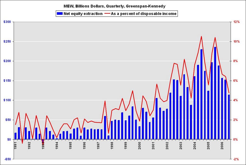 I will be using this graph in the future to show the relative size of MEW. This graph is of the Greenspan-Kennedy MEW results, both in billions of dollars quarterly (not annual rate), and as a percent of personal disposable income.
Sorry for any confusion.
CSBS State Mortgage Guidance Update
by Calculated Risk on 1/03/2007 06:25:00 PM
Twenty two states and the District of Columbia have now adopted the CSBS / AARMR Guidance on Nontraditional Mortgage Product Risks.
This may seem like a slow process, but the WaPo reports:
... states ... have moved quickly to warn state-regulated lenders about the hazards to consumers from nontraditional mortgages.The CSBS told me they expect all 50 states to adopt the guidance.
...
Mike Stevens, senior vice president for regulatory affairs at the Conference of State Bank Supervisors, ... said it was the fastest state-by-state regulatory rollout he had ever seen.
emphasis added
November Construction Spending
by Calculated Risk on 1/03/2007 02:21:00 PM
From the Census Bureau: November 2006 Construction at $1,184.1 Billion Annual Rate
There is some good news in this report - nonresidential construction increased in November.
Nonresidential construction was at a seasonally adjusted annual rate of $316.5 billion in November, 1.4 percent above the revised October estimate of $312.0 billion.Residential construction spending peaked in December 2005, and the typical pattern is for nonresidential construction to peak 3 to 5 quarters after residential construction. Last month I asked if nonresidential construction had peaked in August 2006 - the answer is: no.
The continued decline in residential construction spending was about as expected, and will continue at around this pace, at least through mid-2007, based on housing starts.
Residential construction was at a seasonally adjusted annual rate of $589.3 billion in November, 1.6 percent (±1.3%) below the revised October estimate of $599.0 billion.The Fed is watching nonresidential construction closely too. From the just released minutes of the Dec 12th FOMC meeting:
Business investment appeared to have decelerated recently, and surveys and orders data pointed to a relatively slow rise in equipment and software spending over the next few quarters. Incoming data on construction activity and employment also suggested that, following very rapid growth earlier in the year, increases in nonresidential construction spending could be moderating considerably.
MBA: Mortgage Applications Increase
by Calculated Risk on 1/03/2007 01:19:00 AM
The Mortgage Bankers Association (MBA) reports: Mortgage Applications Increase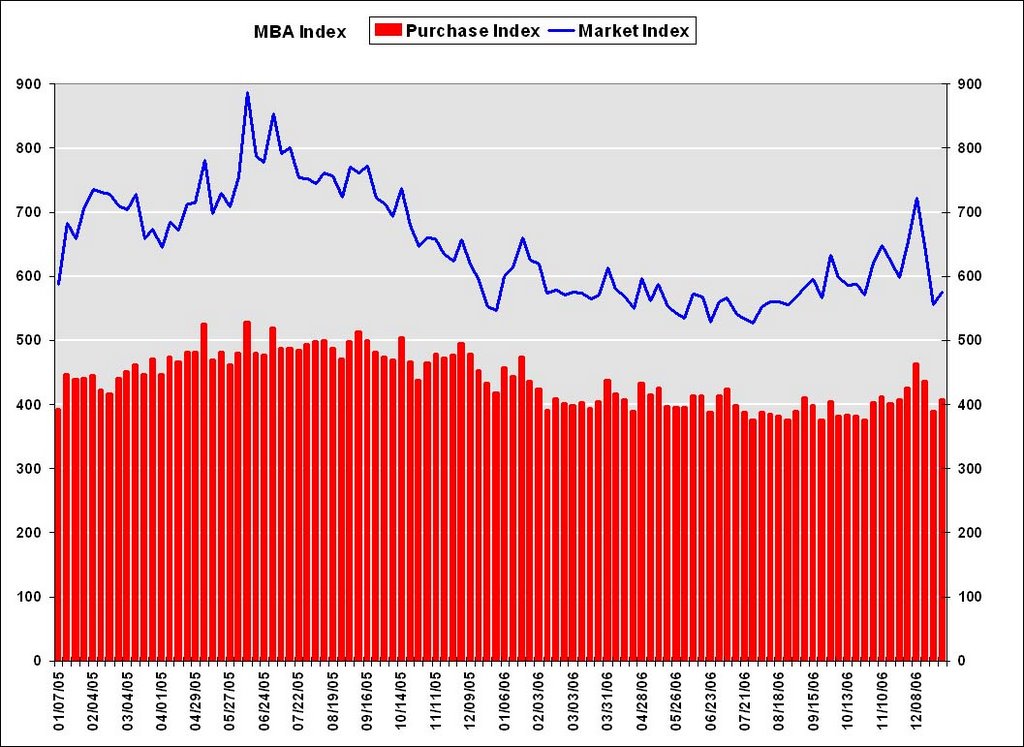 Click on graph for larger image.
The Market Composite Index, a measure of mortgage loan application volume, was 575.6, an increase of 3.6 percent on a seasonally adjusted basis from 555.8 one week earlier. On an unadjusted basis, the Index decreased 27.4 percent compared with the previous week and was up 6.9 percent compared with the same week one year earlier.Mortgage rates were mixed:
The Refinance Index increased by 2.2 percent to 1640.4 from 1604.6 the previous week and the seasonally adjusted Purchase Index increased by 4.3 percent to 406.9 from 390.2 one week earlier.
The average contract interest rate for 30-year fixed-rate mortgages increased to 6.22 from 6.12 percent ...
The average contract interest rate for one-year ARMs decreased to 5.84 percent from 5.87 ...
 The second graph shows the Purchase Index and the 4 and 12 week moving averages since January 2002. The four week moving average is down 1.1 percent to 424.4 from 429.3 for the Purchase Index.
The refinance share of mortgage activity decreased to 48.1 percent of total applications from 48.8 percent the previous week. The adjustable-rate mortgage (ARM) share of activity decreased to 20.4 from 23.1 percent of total applications from the previous week. The ARM share is at its lowest level since July 2003.
Tuesday, January 02, 2007
December Retail Sales "Anemic"
by Calculated Risk on 1/02/2007 09:48:00 PM
From Bloomberg: December Sales Look Anemic, According To Analysts
When the numbers are all tallied on Thursday most industry analysts and experts think this year's holiday-shopping period will be "anemic" -- the description most often used -- because shoppers held off on buying winter gear, procrastinated on holiday gift shopping and have yet to turn in gift cards.Just a note - the Census Bureau will release advanced monthly retail sales for December on January 12th.
...
The International Council of Shopping Centers is projecting that same-store sales, the industry's benchmark of growth measured by receipts rung up at stores open longer than a year, will rise at the low end of its 2.5% to 3.5% forecast.
Thomson Financial expects sales to rise 3% in December.
Wal-Mart Stores Inc. (WMT) , the world's largest retailer, said Saturday that its same-store sales are likely to be higher by 1.6%. That's above a flat to 1% rise the mass discounter forecast ahead of the month. However, it comes after Wal-Mart turned in its first sales decline in 10 years, down 0.1%, in November and may have come at the expense of profit margins.


