by Calculated Risk on 2/08/2011 09:41:00 PM
Tuesday, February 08, 2011
Fannie Freddie Report may be released by Friday
From Binyamin Appelbaum at the NY Times: Plans Near for Freddie and Fannie
[The] report will be released as early as Friday, [and] will present a range of options without stating a preference.At the least, having Fannie and Freddie as the "last line of defense" seems to make sense. When the next crisis happens - and it will happen - if there is only a "private market", then the government would have to scramble to provide mortgages (a free fall would never be allowed), so you might as well plan for it in advance.
...
One possibility ... would not create any federal replacement for Fannie and Freddie, leaving the private markets to provide mortgages for most Americans. The alternative approaches instead would continue some form of federal mortgage backstop.
...
One potential compromise described in current drafts of the administration’s proposal would reduce the government’s role to a last line of defense for the mortgage market. ... During normal times, the insurer would guarantee no more than 10 percent of mortgages, but in times of crisis, the government could raise that cap, offering guarantees to a broader range of investors so that money continues to flow into the mortgage market and credit remains available.
A Dab of Color: Transportation
by Calculated Risk on 2/08/2011 06:45:00 PM
After my "D-List Data" post, I've received several requests to try to create a list of economic data by priority. I'm working on it, in the meantime, here is some more data for D-List.
I follow three measures of transportation: rail traffic, trucking and a diesel fuel index (Ceridian-UCLA Pulse of Commerce Index). I also occasionally review press releases for UPS and FedEx for comments on the economy and forecasts.
This is not primary data, but it is sometimes helpful in confirming other data. As an example, last year I was looking for a mid-year / 2nd half slowdown, and the transportation data was useful in confirming the slowdown was happening.
These indicators mostly improved towards the end of the year, confirming the brighter outlook.
The January rail traffic report released today by the Association of American Railroads suggests the economy expanded further in January. The January Pulse of Commerce Index (PCI) will be released tomorrow morning at 9 AM ET.
The PCI is also somewhat correlated to Industrial Production (IP) from the Federal Reserve (although the relationship is a bit noisy). So the release tomorrow will give us a hint on January IP to be released on Wednesday Feb 16th.
Finally, rail traffic is an example of excess capacity in the economy. The railroad companies are always investing in maintenance and repairs, but investment in new equipment will probably not pick up significantly until traffic starts to approach the levels seen in 2006 – the peak year (still a long ways to go).
Here is the graph gallery for transportation.
AAR: Rail Traffic increases in January
by Calculated Risk on 2/08/2011 03:59:00 PM
From the Association of American Railroads: January Freight Rail Traffic Continues Steady Growth. The AAR reports carload traffic in January 2011 was up 8.0% compared to January 2010. Intermodal traffic (using intermodal or shipping containers) is up 7.4% over January 2010.
U.S. freight railroads originated an average of 285,573 carloads per week in January 2011, for a total of 1,142,293 carloads for the month. That’s up 8.0% over January 2010 and up 7.3% over January 2009. That sounds like a nice gain — and it is — but to keep it in perspective, other than 2009 and 2010 it’s still the lowest January average since 1994.
 Click on graph for larger image in new window.
This graph shows U.S. average weekly rail carloads (NSA).
From AAR:
• On an unadjusted basis, 15 of the 20 commodity categories saw carload gains on U.S. railroads in January 2011 compared with January 2010. The five commodity categories seeing declines — grain mill products, primary forest products, coke, nonmetallic minerals, and waste and non-ferrous scrap — together accounted for less than 8% of total carloads for the month. The highest-volume commodity categories were all up in January.As the first graph shows, rail carload traffic collapsed in November 2008, and now, over 18 months into the recovery, carload traffic has only recovered part way.
 The second graph is for intermodal traffic (using intermodal or shipping containers):
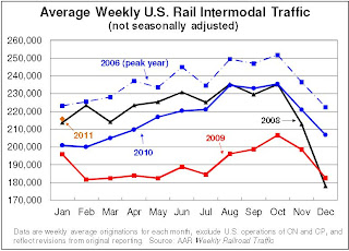
• In January 2011, U.S. railroads originated 863,099 intermodal trailers and containers, an average of 215,775 per week — up 7.4% over January 2010, up 10.1% over January 2009, and the third highest January average in history(behind January 2006 and January 2007).Traffic is increasing slowly, but combined traffic is still well below the 2008 levels.
• Growth in intermodal traffic is a function both of a growing economy
and growing international trade as well as conversion of freight from over-the-highway moves to rail intermodal moves.
excerpts with permission
Fed's Lockhart on Inflation
by Calculated Risk on 2/08/2011 02:16:00 PM
From Atlanta Fed President Dennis Lockhart: Rising Prices, the Cost of Living, and Inflation. A few excerpts:
So what about inflation? I'll start with what the data tell us. The retail price measures jumped at year end as the price of gasoline rose. But looking beyond the rise in gasoline prices, consumer price increases remained exceptionally modest.There is much more in the speech, but these excerpts touch on a few key points. There does appear to be a disconnect between what the Fed is looking at for monetary policy, and what the general public (and some politicians) are looking at. Monetary policy cannot control the price of oil or other commodities that are being driven up by supply and demand factors (as an example, monetary policy can't help with a drought in China and other food production problems).
...
Yet inflation anxiety is rising. There seems to be a disconnect between what the Fed is saying and what people are experiencing when they fill up their gas tanks or read about rising food prices around the world.
...
I do think in the swirl of official statements and public discourse we may be talking about different things. To my way of thinking, the term "inflation" is misused in describing rising prices in narrow expenditure categories (for example, food inflation). Nonetheless, recent price news has encroached on the public consciousness with the effect that any price rise of an important consumption item is often taken as signaling inflation.
...
Let's review what inflation is and is not. Inflation affects all prices. Inflation is not the rise of individual prices or the rise of categories of prices.
...
The Fed, like every other central bank, is powerless to prevent fluctuations in the cost of living and increases of individual prices. We do not produce oil. Nor do we grow food or provide health care. We cannot prevent the next oil shock, or drought, or a strike somewhere —events that cause prices of certain goods to rise and change your cost of living.
So monetary policy is not about preventing relative price adjustments dictated by market forces. It is about controlling the broad direction and pace of change of all prices across the economy.
...
Notwithstanding the energy-driven jump in prices in December, underlying inflation is currently below the level that I would define as price stability. My current projection shows underlying inflation gradually rising over the next few years, putting us back into a range consistent with the 2 percent target by 2013.
The bottom line is the core measures of inflation are still very low, and it is very unlikely that the Fed will raise the Fed funds rates this year.
CoreLogic: House Prices declined 1.8% in December
by Calculated Risk on 2/08/2011 11:07:00 AM
Notes: CoreLogic reports the year-over-year change. The headline for this post is for the change from November to December 2010. The CoreLogic HPI is a three month weighted average of October, November, and December and is not seasonally adjusted (NSA).
From CoreLogic: CoreLogic® Home Price Index Shows Decline for Fifth Straight Month
CoreLogic ... released its December Home Price Index (HPI) which shows that home prices in the U.S. declined for the fifth month in a row. According to the CoreLogic HPI, national home prices, including distressed sales, declined by 5.46 percent in December 2010 compared to December 2009 and declined by 4.39 percent in November 2010 compared to November 2009.
Excluding distressed sales, year-over-year prices declined by 2.31 percent in December 2010 compared to December 2009 and declined by 2.81 percent in November 2010 compared to November 2009.
...
According to Mark Fleming, chief economist with CoreLogic, 2010 was a year of ups and downs as a result of the improvements brought on by the tax credits followed by the declines that occurred when they expired. “It was a bumpy ride which ended with a net gain/loss of zero. Despite the continued monthly decline in home prices and year-over-year depreciation, we’re encouraged that on an annual basis we’re unchanged relative to a year ago. Excess supply continues to drive prices downward, but the silver lining is that the rate of decline is decelerating,” he said.
 Click on graph for larger image in graph gallery.
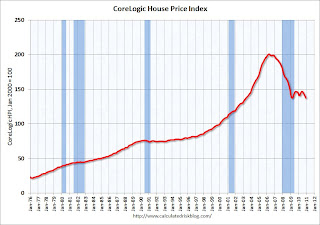
 This graph shows the national CoreLogic HPI data since 1976. January 2000 = 100.
The index is down 5.46% over the last year, and off 31.6% from the peak.
This is the fifth straight month of year-over-year declines, and the sixth straight month of month-to-month declines. The index is only 0.07% above the low set in March 2009 (essentially at the low), and I expect to see a new post-bubble low for this index with the January release.
BLS: Job Openings decline in December, Labor Turnover still Low
by Calculated Risk on 2/08/2011 10:00:00 AM
From the BLS: Job Openings and Labor Turnover Summary
The number of job openings in December was 3.1 million, which was little changed from 3.2 million in November. Since the most recent series trough in July 2009, the level of job openings has risen by 0.7 million, or 31 percent.The following graph shows job openings (yellow line), hires (purple), Layoff, Discharges and other (red column), and Quits (light blue column) from the JOLTS.
Unfortunately this is a new series and only started in December 2000.
Note: The difference between JOLTS hires and separations is similar to the CES (payroll survey) net jobs headline numbers. This report is for December, the most recent employment report was for January.
 Click on graph for larger image in graphics gallery.
Notice that hires (purple) and total separations (red and blue columns stacked) are pretty close each month. When the purple line is above the two stacked columns, the economy is adding net jobs - when it is below the columns, the economy is losing jobs.
Note: The temporary decennial Census hiring and layoffs distorted this series last summer.
In December, about 4.162 million people lost (or left) their jobs, and 4.184 million were hired (this is the labor turnover in the economy) adding 20 thousand total jobs.
Even with the decline in December, job openings (yellow) are up significantly over the last year.


