by Calculated Risk on 5/27/2015 11:55:00 AM
Wednesday, May 27, 2015
FDIC: Fewer Problem banks, Residential REO Declines in Q1
The FDIC released the Quarterly Banking Profile for Q1 today:
Commercial banks and savings institutions insured by the Federal Deposit Insurance Corporation (FDIC) reported aggregate net income of $39.8 billion in the first quarter of 2015, up $2.6 billion (6.9 percent) from a year earlier. The increase in earnings was mainly attributable to a $4.3 billion rise in net operating revenue (net interest income plus total noninterest income). Financial results for the first quarter of 2015 are included in the FDIC's latest Quarterly Banking Profile released today.
...
"Problem List" Continues to Shrink: The number of banks on the FDIC's Problem List fell from 291 to 253 during the first quarter. This is the smallest number of banks on the Problem List in six years. The number of problem banks was down 72 percent from the peak of 888 in the first quarter of 2011. Total assets of problem banks fell from $86.7 billion to $60.3 billion during the first quarter.
Deposit Insurance Fund (DIF) Rises $2.5 Billion to $65.3 Billion: The DIF increased from $62.8 billion to $65.3 billion in the first quarter, largely driven by $2.2 billion in assessment income. The DIF reserve ratio rose to 1.03 percent from 1.01 percent during the quarter.
 Click on graph for larger image.
The FDIC reported the number of problem banks declined (Note: graph shows problem banks for Q1 2015, and year end prior to 2015):
The number of insured commercial banks and savings institutions filing quarterly financial reports declined from 6,509 to 6,419 in the first quarter. Mergers absorbed 86 institutions, while four insured institutions failed. For a fifth consecutive quarter, no new charters were added. The number of full-time equivalent employees declined by 5,349 to 2,042,596. The number of institutions on the FDIC’s “Problem List” declined for the 16th consecutive quarter, falling from 291 to 253. Total assets of problem institutions fell from $86.7 billion to $60.3 billion.
 The dollar value of 1-4 family residential Real Estate Owned (REOs, foreclosure houses) declined from $5.98 billion in Q4 2014 to $5.72 billion in Q1. This is the lowest level of REOs since Q3 2007.
This graph shows the nominal dollar value of Residential REO for FDIC insured institutions. Note: The FDIC reports the dollar value and not the total number of REOs.
BLS: Twenty-Three States had Unemployment Rate Decreases in April
by Calculated Risk on 5/27/2015 10:10:00 AM
From the BLS: Regional and State Employment and Unemployment Summary
Regional and state unemployment rates were little changed in April. Twenty-three states and the District of Columbia had unemployment rate decreases from March, 11 states had increases, and 16 states had no change, the U.S. Bureau of Labor Statistics reported today.
...
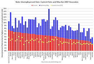
Nebraska had the lowest jobless rate in April, 2.5 percent. Nevada had the highest rate among the states, 7.1 percent. The District of Columbia had a rate of 7.5 percent.
 Click on graph for larger image.
This graph shows the current unemployment rate for each state (red), and the max during the recession (blue). All states are well below the maximum unemployment rate for the recession.
The size of the blue bar indicates the amount of improvement. The yellow squares are the lowest unemployment rate per state since 1976.
The states are ranked by the highest current unemployment rate. Nevada, at 7.1%, had the highest state unemployment rate although D.C was higher.
 The second graph shows the number of states (and D.C.) with unemployment rates at or above certain levels since January 2006. At the worst of the employment recession, there were 10 states with an unemployment rate at or above 11% (red).
Currently no state has an unemployment rate at or above 8% (light blue); Only two states (Nevada and West Virginia) and D.C. are still at or above 7% (dark blue).
MBA: Mortgage Refinance Applications Decrease in Latest Weekly Survey, Purchase Index up 14% YoY
by Calculated Risk on 5/27/2015 07:00:00 AM
From the MBA: Mortgage Applications Decrease in Latest MBA Weekly Survey
Mortgage applications decreased 1.6 percent from one week earlier, according to data from the Mortgage Bankers Association’s (MBA) Weekly Mortgage Applications Survey for the week ending May 22, 2015. ...
The Refinance Index decreased 4 percent from the previous week. The seasonally adjusted Purchase Index increased 1 percent from one week earlier. The unadjusted Purchase Index was essentially unchanged compared with the previous week and was 14 percent higher than the same week one year ago.
The average contract interest rate for 30-year fixed-rate mortgages with conforming loan balances ($417,000 or less) increased to 4.07 percent from 4.04 percent, with points increasing to 0.35 from 0.32 (including the origination fee) for 80 percent loan-to-value ratio (LTV) loans.
emphasis added
 Click on graph for larger image.
The first graph shows the refinance index.
2014 was the lowest year for refinance activity since year 2000.
It would take much lower rates - below 3.5% - to see a significant refinance boom this year.
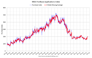
 The second graph shows the MBA mortgage purchase index.
 According to the MBA, the unadjusted purchase index is 14% higher than a year ago.
Tuesday, May 26, 2015
Regional Fed Manufacturing Surveys for May and the ISM Index
by Calculated Risk on 5/26/2015 04:32:00 PM
Earlier today the last two regional Fed surveys for May were released. As expected, the Dallas Fed was especially weak due primarily to weakness in the oil sector.
From the Dallas Fed: Texas Manufacturing Activity Contracts Further
Texas factory activity declined again in May, according to business executives responding to the Texas Manufacturing Outlook Survey. ... The general business activity index fell to -20.8 in May, its lowest reading since June 2009.And from the Richmond Fed: Manufacturing Sector Activity Remained Tepid; Employment Edged Up, Wage Growth Accelerated
Labor market indicators reflected employment declines and shorter workweeks. The May employment index declined 10 points to -8.2, after rebounding slightly above zero last month. Twelve percent of firms reported net hiring, compared with 21 percent reporting net layoffs. The hours worked index fell from -5 to -11.6.
emphasis added
Manufacturing activity remained soft this month, with several components flattening. The composite index for manufacturing moved to 1 following April's reading of −3, while the shipments index leveled off to −1 from −6. In addition, the index for new orders gained eight points, reaching a nearly flat reading of 2. ...Here is a graph comparing the regional Fed surveys and the ISM manufacturing index:
Manufacturing employment continued to grow at a modest pace in May. The index ended the survey period at 3 compared to last month's reading of 7. The average workweek increased; the index moved up two points to end at 6. Additionally, the index for average wages advanced 11 points to finish at a reading of 20.
 Click on graph for larger image.
The New York and Philly Fed surveys are averaged together (yellow, through May), and five Fed surveys are averaged (blue, through May) including New York, Philly, Richmond, Dallas and Kansas City. The Institute for Supply Management (ISM) PMI (red) is through April (right axis).
It seems likely the ISM index will be weak again in May, and will probably be around the same level as in April.
Real Prices and Price-to-Rent Ratio in March
by Calculated Risk on 5/26/2015 02:29:00 PM
The expected slowdown in year-over-year price increases has occurred. In October 2013, the National index was up 10.9% year-over-year (YoY). In March 2015, the index was up 4.1% YoY. However the YoY change has only declined slightly over the last six months.
As I've noted before, I think most of the slowdown on a YoY basis is now behind us (I don't expect price to go negative this year). This slowdown in price increases was expected by several key analysts, and I think it was good news for housing and the economy.
In the earlier post, I graphed nominal house prices, but it is also important to look at prices in real terms (inflation adjusted). Case-Shiller, CoreLogic and others report nominal house prices. As an example, if a house price was $200,000 in January 2000, the price would be close to $274,000 today adjusted for inflation (37%). That is why the second graph below is important - this shows "real" prices (adjusted for inflation).
It has been almost ten years since the bubble peak. In the Case-Shiller release this morning, the National Index was reported as being 7.6% below the bubble peak. However, in real terms, the National index is still about 21% below the bubble peak.
Nominal House Prices

In nominal terms, the Case-Shiller National index (SA) is back to June 2005 levels, and the Case-Shiller Composite 20 Index (SA) is back to February 2005 levels, and the CoreLogic index (NSA) is back to March 2005.
Real House Prices

In real terms, the National index is back to June 2003 levels, the Composite 20 index is back to May 2003, and the CoreLogic index back to July 2003.
In real terms, house prices are back to 2003 levels.
Note: CPI less Shelter is down 1.5% year-over-year, so this is pushing up real prices.
Price-to-Rent
In October 2004, Fed economist John Krainer and researcher Chishen Wei wrote a Fed letter on price to rent ratios: House Prices and Fundamental Value. Kainer and Wei presented a price-to-rent ratio using the OFHEO house price index and the Owners' Equivalent Rent (OER) from the BLS.

This graph shows the price to rent ratio (January 1998 = 1.0).
On a price-to-rent basis, the Case-Shiller National index is back to May 2003 levels, the Composite 20 index is back to March 2003 levels, and the CoreLogic index is back to June 2003.
In real terms, and as a price-to-rent ratio, prices are mostly back to 2003 levels - and the price-to-rent ratio maybe moving a little sideways now.


