 RSS Feed
 by Calculated Risk on 5/12/2015 09:06:00 AM
Tuesday, May 12, 2015
NFIB: Small Business Optimism Index increased in April
From the National Federation of Independent Business (NFIB): Small Business Optimism Rises, But Future Sales Cloud Outlook
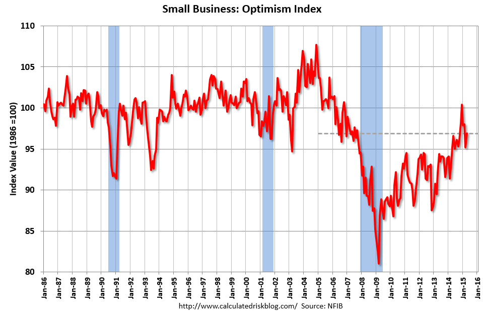
The Small Business Optimism Index increased 1.7 points from March to 96.9, this in spite of a quarter of virtually no economic growth. Unfortunately, the Index remained below the January reading. Nine of the 10 Index components gained, only real sales expectations were weaker. But this still leaves the Index below its historical average, oscillating between 95 and 98 but never breaking out except for December, when the Index just tipped past 100, only to fall again.More good news: Only 11 percent of companies reported "poor sales" as the most important problem, down from 16% a year ago, and a recession high of 34%.
...
Small businesses posted another decent month of job creation. Those that hired were more aggressive than those reducing employment, producing an average increase of 0.14 workers per firm, continuing a string of solid readings for 2015. ... Twenty-seven percent of all owners reported job openings they could not fill in the current period, up 3 points from March. A net 11 percent plan to create new jobs, up 1 point and a solid reading.
emphasis added
 Click on graph for larger image.
This graph shows the small business optimism index since 1986.
The index increased to 96.9 in April from 95.2 in March.
Monday, May 11, 2015
Tuesday: Job Openings, Q1 Household Debt and Credit Report
by Calculated Risk on 5/11/2015 09:27:00 PM
A couple of posts on consumers ...
From Professor Hamilton at Econbrowser: Energy prices and consumer spending
Whatever the explanation, the facts seem to be that, unlike what we usually observed historically, consumers have been using much of the gains from lower energy prices to bolster their saving rather than using it to increase spending on other goods and services.And from Dr. Altig at Macroblog: All Eyes on the Consumer
... the "fundamentals" suggest the four-month annualized growth of consumer spending should have been in excess of 4 percent, as opposed to the approximately 1.5 percent we actually saw. That is a story we don't expect to persist, and our current view of the year is that first-quarter consumer spending results are not indicative of future performance.My sense is the increase in consumer spending will be larger in Q2.
Consumers are, of course, a forward-looking bunch, and it is possible the recent weak spending reflects a looming reality not captured by the simple model described above. But our forecast for now is that consumers will move to the fundamentals, and not vice versa.
Tuesday:
• At 9:00 AM ET, NFIB Small Business Optimism Index for April.
• At 10:00 AM, the Job Openings and Labor Turnover Survey for March from the BLS. Jobs openings increased in February to 5.133 million from 4.965 million in January. This was the highest level for job openings since January 2001. The number of job openings (yellow) were up 23% year-over-year, and Quits were up 10% year-over-year.
• At 11:00 AM, the The New York Fed will release their Q1 2015 Household Debt and Credit Report
Research: Natural Rate of Unemployment under 5% and Falling
by Calculated Risk on 5/11/2015 05:32:00 PM
From the Chicago Fed: Changing labor force composition and the natural rate of unemployment Excerpts:
We estimate our baseline natural rate of unemployment as of 2014:Q4 to be 4.9% —0.5 percentage points lower than the CBO’s estimate of the short-run natural rate. We project this rate to fall by about 0.06 percentage points per year through the end of the decade, reaching 4.5% at the end of 2020—0.7 percentage points below the CBO’s estimate.
Two broad assumptions underlie these simple calculations. First, demographics and educational attainment are fundamental determinants of unemployment, and thus, changes in them over time should drive overall levels of aggregate unemployment. Second, the unemployment rate was at its natural rate in late 2005. Both of these assumptions seem plausible, but neither is completely unassailable. ...
...
While great progress has been made over the past few years, significant labor market slack remains. We estimate the natural rate at or below 5%, at least half of a percentage point below its actual level as of March 2015. This estimate of slack, in combination with labor market measures such as LFP and involuntary part-time workers, may help explain why wage inflation and price inflation remain so low. Moreover, we estimate that absent major new developments, demographic and educational changes will persist, potentially reducing the trend unemployment rate to around 4.4% to 4.8% by 2020.
Demographics, Unemployment Rate and Inflation
by Calculated Risk on 5/11/2015 03:19:00 PM
It wasn't long ago that several FOMC members were arguing inflation would pick up when the unemployment rate declined to 6%. They were wrong with the unemployment rate now at 5.4%. I think they were looking at the '70s and ignoring the demographic differences.
The first graph shows the year-over-year change in the prime working age population (25 to 54 years old) with projections for the next 25 years.
If there is a demographic component to inflation, then we would have expected inflation to increase in the '70s, and be very low now.
Note: Ignore the steps up and down - the data was affected by changes in population controls.
The dashed red line is based on Census Bureau projections through 2040.
 Click on graph for larger image.
A key is the prime working age population was declining in the early part of this decade and has only started increasing again recently.
This is very similar to what happened in the '60s. In the early '60s, there was a slow increase in the prime working age population until the baby boomers started pouring into the labor force.
Now the prime working age population is growing again, and we can expect growth to pick up over the next decade. However there will not be as large in increase in the prime working age labor force like in the '70s and '80s.
 The second graph shows the unemployment rate and year-over-year change in CPI measured inflation.
In the 1960s, inflation didn't pickup until the unemployment rate had fallen close to 4% - and when the early baby boomers started entering the labor force.
The current period is similar to the '60s (although there won't be as large a group entering the labor force). And the current period - from a demographics perspective - is very different from the '70s and '80s.
Ignoring for the moment monetary and fiscal policy differences between the '60s and now, demographics suggests that the unemployment rate will have to fall below 5% before inflation picks up.
More Employment Graphs: Duration of Unemployment, Unemployment by Education, Construction Employment and Diffusion Indexes
by Calculated Risk on 5/11/2015 11:58:00 AM
By request, a few more employment graphs ...
Here are the previous posts on the employment report:
• April Employment Report: 223,000 Jobs, 5.4% Unemployment Rate
• Employment Report Comments and Graphs
 This graph shows the duration of unemployment as a percent of the civilian labor force. The graph shows the number of unemployed in four categories: less than 5 week, 6 to 14 weeks, 15 to 26 weeks, and 27 weeks or more.
The general trend is down for all categories, and the "less than 5 weeks", "6 to 14 weeks" and "15 to 26 weeks" are all close to normal levels.
The long term unemployed is less than 1.6% of the labor force - the lowest since November 2008 - however the number (and percent) of long term unemployed remains elevated.
 This graph shows the unemployment rate by four levels of education (all groups are 25 years and older).
Unfortunately this data only goes back to 1992 and only includes one previous recession (the stock / tech bust in 2001). Clearly education matters with regards to the unemployment rate - and it appears all four groups are generally trending down.
Although education matters for the unemployment rate, it doesn't appear to matter as far as finding new employment.
Note: This says nothing about the quality of jobs - as an example, a college graduate working at minimum wage would be considered "employed".
 This graph shows total construction employment as reported by the BLS (not just residential).
Since construction employment bottomed in January 2011, construction payrolls have increased by 951 thousand.
Construction employment is still far below the bubble peak - and below the level in the late '90s.
 The BLS diffusion index for total private employment was at 57.0 in April, down from 59.5 in March.
 For manufacturing, the diffusion index was at 50.6, up from 45.6 in March.
Think of this as a measure of how widespread job gains are across industries. The further from 50 (above or below), the more widespread the job losses or gains reported by the BLS. Above 60 is very good. From the BLS:
Figures are the percent of industries with employment increasing plus one-half of the industries with unchanged employment, where 50 percent indicates an equal balance between industries with increasing and decreasing employment.Overall private job growth was less widespread in April.


