by Calculated Risk on 3/08/2015 11:49:00 AM
Sunday, March 08, 2015
Update: Prime Working-Age Population Growing Again
An update: Last year, I posted some demographic data for the U.S., see: Census Bureau: Largest 5-year Population Cohort is now the "20 to 24" Age Group, Decline in the Labor Force Participation Rate: Mostly Demographics and Long Term Trends, and The Future's so Bright ...
I pointed out that "even without the financial crisis we would have expected some slowdown in growth this decade (just based on demographics). The good news is that will change soon."
Changes in demographics are an important determinant of economic growth, and although most people focus on the aging of the "baby boomer" generation, the movement of younger cohorts into the prime working age is another key story in coming years. Here is a graph of the prime working age population (this is population, not the labor force) from 1948 through February 2015.

There was a huge surge in the prime working age population in the '70s, '80s and '90s - and the prime age population has been mostly flat recently (even declined a little).
The prime working age labor force grew even quicker than the population in the '70s and '80s due to the increase in participation of women. In fact, the prime working age labor force was increasing 3%+ per year in the '80s!
So when we compare economic growth to the '70s, '80, or 90's we have to remember this difference in demographics (the '60s saw solid economic growth as near-prime age groups increased sharply).
The prime working age population peaked in 2007, and appears to have bottomed at the end of 2012. The good news is the prime working age group has started to grow again, and should be growing solidly by 2020 - and this should boost economic activity in the years ahead.
Saturday, March 07, 2015
More Employment Graphs: Duration of Unemployment, Unemployment by Education, Construction Employment and Diffusion Indexes
by Calculated Risk on 3/07/2015 08:04:00 PM
By request, a few more employment graphs ...
Here are the previous posts on the employment report:
• February Employment Report: 295,000 Jobs, 5.5% Unemployment Rate
• Employment Report Comments and Graphs
 This graph shows the duration of unemployment as a percent of the civilian labor force. The graph shows the number of unemployed in four categories: less than 5 week, 6 to 14 weeks, 15 to 26 weeks, and 27 weeks or more.
The general trend is down for all categories, and both the "less than 5 weeks" and 6 to 14 weeks" are close to normal levels.
The long term unemployed is close to 1.7% of the labor force - the lowest since December 2008 - however the number (and percent) of long term unemployed remains a serious problem.
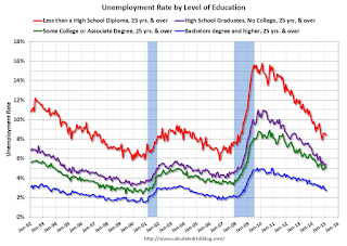
 This graph shows the unemployment rate by four levels of education (all groups are 25 years and older).
Unfortunately this data only goes back to 1992 and only includes one previous recession (the stock / tech bust in 2001). Clearly education matters with regards to the unemployment rate - and it appears all four groups are generally trending down.
Although education matters for the unemployment rate, it doesn't appear to matter as far as finding new employment.
Note: This says nothing about the quality of jobs - as an example, a college graduate working at minimum wage would be considered "employed".
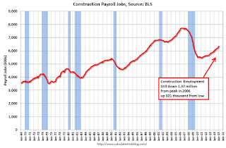
 This graph shows total construction employment as reported by the BLS (not just residential).
Since construction employment bottomed in January 2011, construction payrolls have increased by 921 thousand.
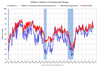
 The BLS diffusion index for total private employment was at 65.4 in February, up from 62.0 in January.
For manufacturing, the diffusion index was at 64.4, up from 61.3 in January.
Think of this as a measure of how widespread job gains are across industries. The further from 50 (above or below), the more widespread the job losses or gains reported by the BLS. Above 60 is very good. From the BLS:
Figures are the percent of industries with employment increasing plus one-half of the industries with unchanged employment, where 50 percent indicates an equal balance between industries with increasing and decreasing employment.Overall job growth was widespread in February - another good sign.
Schedule for Week of March 8, 2015
by Calculated Risk on 3/07/2015 10:00:00 AM
The key economic report this week is February retail sales on Thursday.
Also the Census Bureau will release the Q4 Quarterly Services Report on Wednesday, and the Fed will release the Q4 Flow of Funds report on Thursday.
At 10:00 AM ET: The Fed will release the monthly Labor Market Conditions Index (LMCI).
7:30 AM ET: NFIB Small Business Optimism Index for February.
 10:00 AM: Job Openings and Labor Turnover Survey for January from the BLS.
 This graph shows job openings (yellow line), hires (purple), Layoff, Discharges and other (red column), and Quits (light blue column) from the JOLTS.
Jobs openings increased in December to 5.028 million from 4.847 million in November.
The number of job openings (yellow) were up 28% year-over-year, and Quits were up 12% year-over-year.
10:00 AM: Monthly Wholesale Trade: Sales and Inventories for January. The consensus is for a 0.1% decrease in inventories.
7:00 AM: The Mortgage Bankers Association (MBA) will release the results for the mortgage purchase applications index.
10:00 AM: The Q4 Quarterly Services Report from the Census Bureau.
4:30 PM: The Federal Reserve will release the Comprehensive Capital Analysis and Review Results (Stress Test)
8:30 AM: The initial weekly unemployment claims report will be released. The consensus is for claims to decrease to 309 thousand from 320 thousand.
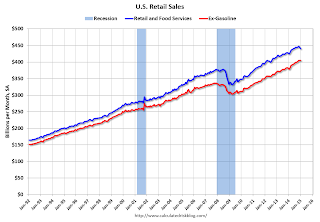
 8:30 AM ET: Retail sales for February will be released.
This graph shows retail sales since 1992 through January 2015. This is monthly retail sales and food service, seasonally adjusted (total and ex-gasoline). On a monthly basis, retail sales decreased 0.8% from December to January (seasonally adjusted), and sales were up 3.3% from January 2014.
The consensus is for retail sales to increase 0.3% in February, and to increase 0.5% ex-autos.
10:00 AM: Manufacturing and Trade: Inventories and Sales (business inventories) report for January. The consensus is for a 0.1% increase in inventories.
12:00 PM: Q4 Flow of Funds Accounts of the United States from the Federal Reserve.
2:00 PM ET: The Monthly Treasury Budget Statement for February.
8:30 AM: The Producer Price Index for February from the BLS. The consensus is for a 0.3% increase in prices, and a 0.1% increase in core PPI.
10:00 AM: University of Michigan's Consumer sentiment index (preliminary for March). The consensus is for a reading of 95.5, up from 95.4 in February.
Friday, March 06, 2015
Duy: "Patient" is History
by Calculated Risk on 3/06/2015 06:00:00 PM
From Tim Duy at Fed Watch: "Patient" is History
The February employment report almost certainly means the Fed will no longer describe its policy intentions as "patient" at the conclusion of the March FOMC meeting. And it also keep a June rate hike in play. But for June to move from "in play" to "it's going to happen," I still feel the Fed needs a more on the inflation side. ...CR Note: Based on Yellen's testimony last week, it seemed likely that "patient" would be dropped from the March FOMC statement. June might be in play, but like Duy, I think the FOMC will wait until it is clear inflation is moving towards 2% before raising rates.
Bottom Line: "Patient" is out. Tough to justify with unemployment at the top of the Fed's central estimates of NAIRU. Pressure to begin hiking rates will intensify as unemployment heads lower. The inflation bar will fall, and Fed officials will increasingly look for reasons to hike rates rather than reasons to delay. They may not want to admit it, but I suspect one of those reasons will be fear of financial instability in the absence of tighter policy. June is in play.
emphasis added
Update: Best Private Sector Job Creation "Ever"?
by Calculated Risk on 3/06/2015 03:33:00 PM
Last month, I mentioned that private job creation was on pace for the best ever during a presidential term. I received a few emails asking if that was correct. The answer is "yes".
Note: We frequently use Presidential terms as time markers - we could use Speaker of the House, or any other marker.
Here is a table of the top three presidential terms for private job creation (they also happen to be the three best terms for total non-farm job creation).
Note: Overall employment was smaller in the '80s, however the participation rate was increasing in the '80s. The prime working age labor force was growing more than 3% per year in the '80s with a surge in younger workers and women joining the labor force. Now, the overall population is larger, but the prime working age population has declined this decade and the participation rate is generally declining now.
Clinton's two terms were the best for both private and total non-farm job creation, followed by Reagan's 2nd term. Public sector job creation increased the most during Reagan's 2nd term.
Currently Obama's 2nd term is on pace to be the best ever for private job creation. However, with very few public sector jobs added, Obama's 2nd term is only on pace to be the third best for total job creation.
Note: Only 34 thousand public sector jobs have been added during the first twenty five months of Obama's 2nd term (following a record loss of 702 thousand public sector jobs during Obama's 1st term). This is just 2% of the public sector jobs added during Reagan's 2nd term!
| Top Employment Gains per Presidential Terms (000s) | ||||
|---|---|---|---|---|
| Rank | Term | Private | Public | Total Non-Farm |
| 1 | Clinton 1 | 10,885 | 692 | 11,577 |
| 2 | Clinton 2 | 10,070 | 1,242 | 11,312 |
| 3 | Reagan 2 | 9,357 | 1,438 | 10,795 |
| Obama 21 | 5,799 | 34 | 5,833 | |
| Pace2 | 11,134 | 65 | 11,199 | |
| 125 Months into 2nd Term 2Current Pace for Obama's 2nd Term | ||||
The second table shows the jobs need per month for Obama's 2nd term to be in the top three presidential terms.
| Jobs needed per month (average) for Obama's 2nd Term | ||||
|---|---|---|---|---|
| to Rank | Private | Total | ||
| #1 | 221 | 250 | ||
| #2 | 186 | 238 | ||
| #3 | 155 | 216 | ||


