by Calculated Risk on 2/10/2015 09:01:00 AM
Tuesday, February 10, 2015
NFIB: Small Business Optimism Index Decreased in January
From the National Federation of Independent Business (NFIB): SMALL BUSINESS OPTIMISM FALLS, BUT STILL IN NORMAL ZONE
The Small Business Optimism Index fell 2.5 points to 97.9, giving back the December gain that took the Index over 100. Still, the Index indicates that the small business sector is operating in a somewhat “normal” zone.
The percent of owners reporting job creation fell 4 percentage points to a net 5 percent of owners, still a solid number. ... Twenty-six percent of all owners reported job openings they could not fill in the current period, up 1 point and a very solid reading. ...
...
Labor costs continue to put pressure on the bottom line but energy prices are down a lot. Two percent reported reduced worker compensation and 25 percent reported raising compensation, yielding a seasonally adjusted net 25 percent reporting higher compensation, unchanged from December.
emphasis added
 Click on graph for larger image.
This graph shows the small business optimism index since 1986.
The index decreased to 97.9 in January from 100.4 in December.
Monday, February 09, 2015
Tuesday: Job Openings, Small Business Optimism
by Calculated Risk on 2/09/2015 07:21:00 PM
From the NY Times: Greece to Propose a Debt Compromise Plan to Creditors
Hoping to defuse a standoff that has set Europe and financial markets on edge, Greek officials intend to propose a detailed compromise plan at an emergency meeting with creditors on Wednesday in Brussels, a finance ministry official here said on Monday.Tuesday:
...
Greece still plans to reject some of the harshest austerity conditions attached to Greece’s bailout loans, but will propose retaining about 70 percent of the terms, according to the official.
Athens will propose replacing the remaining 30 percent of the austerity conditions with new reforms that the Greek government will devise together with the Organization for Economic Cooperation and Development.
• At 7:30 AM ET, NFIB Small Business Optimism Index for January.
• Early: Trulia Price Rent Monitors for January. This is the index from Trulia that uses asking house prices adjusted both for the mix of homes listed for sale and for seasonal factors.
• At 10:00 AM, Job Openings and Labor Turnover Survey for December from the BLS. Jobs openings increased in November to 4.972 million from 4.830 million in October. The number of job openings were up 21% year-over-year compared to November 2013, and Quits were up 7% year-over-year.
West Coast Port Slowdown Ongoing
by Calculated Risk on 2/09/2015 03:20:00 PM
At least this is getting more media attention ...
From the LA Times: Ship unloading resumes at West Coast ports as labor talks continue
Employers and the International Longshore and Warehouse Union have been locked in bitter talks for a new West Coast dockworkers contract for nearly nine months -- a period that has seen debilitating congestion up and down the West Coast.From CNBC: West Coast ports: Retail's $7 billion problem
...
The line of ships anchored off the Long Beach and Los Angeles coast waiting for berths grew over the weekend, from 28 Friday afternoon to 31 Sunday morning, according to the Marine Exchange of Southern California.
...
The two sides are expected to meet again this afternoon.
Retailers' anxiety levels are rising as gridlock grinds on with contract negotiations between West Coast dockworkers and port terminal operators.
It has been a long nine months for those dealing directly, or indirectly, with the lack of a West Coast port contract, and after a temporary shutdown over the weekend, retail lobby groups and consultants are assigning potential costs to the issue.
According to a Kurt Salmon analysis, congestion at West Coast ports could cost retailers as much as $7 billion this year. That congestion cost comes from a combination of the higher price of carrying goods and missed sales due to below optimal inventory levels.
Prime Working-Age Population Growing Again
by Calculated Risk on 2/09/2015 11:59:00 AM
Last year, I posted some demographic data for the U.S., see: Census Bureau: Largest 5-year Population Cohort is now the "20 to 24" Age Group, Decline in the Labor Force Participation Rate: Mostly Demographics and Long Term Trends, and The Future is still Bright!
I pointed out that "even without the financial crisis we would have expected some slowdown in growth this decade (just based on demographics). The good news is that will change soon."
Changes in demographics are an important determinant of economic growth, and although most people focus on the aging of the "baby boomer" generation, the movement of younger cohorts into the prime working age is another key story in coming years. Here is a graph of the prime working age population (this is population, not the labor force) from 1948 through January 2015.

There was a huge surge in the prime working age population in the '70s, '80s and '90s - and the prime age population has been mostly flat recently (even declined a little).
The prime working age labor force grew even quicker than the population in the '70s and '80s due to the increase in participation of women. In fact, the prime working age labor force was increasing 3%+ per year in the '80s!
So when we compare economic growth to the '70s, '80, or 90's we have to remember this difference in demographics (the '60s saw solid economic growth as near-prime age groups increased sharply).
The prime working age population peaked in 2007, and appears to have bottomed at the end of 2012. The good news is the prime working age group has started to grow again, and should be growing solidly by 2020 - and this should boost economic activity in the years ahead.
More Employment Graphs: Duration of Unemployment, Unemployment by Education, Construction Employment and Diffusion Indexes
by Calculated Risk on 2/09/2015 09:50:00 AM
By request, a few more employment graphs ...
Here are the previous posts on the employment report:
• January Employment Report: 257,000 Jobs, 5.7% Unemployment Rate
• Employment Report Comments and Graphs
 This graph shows the duration of unemployment as a percent of the civilian labor force. The graph shows the number of unemployed in four categories: less than 5 week, 6 to 14 weeks, 15 to 26 weeks, and 27 weeks or more.
The general trend is down for all categories, and both the "less than 5 weeks" and 6 to 14 weeks" are close to normal levels.
The long term unemployed is just below 1.8% of the labor force - the lowest since January 2009 - however the number (and percent) of long term unemployed remains a serious problem.
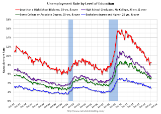
 This graph shows the unemployment rate by four levels of education (all groups are 25 years and older).
Unfortunately this data only goes back to 1992 and only includes one previous recession (the stock / tech bust in 2001). Clearly education matters with regards to the unemployment rate - and it appears all four groups are generally trending down.
Although education matters for the unemployment rate, it doesn't appear to matter as far as finding new employment.
Note: This says nothing about the quality of jobs - as an example, a college graduate working at minimum wage would be considered "employed".
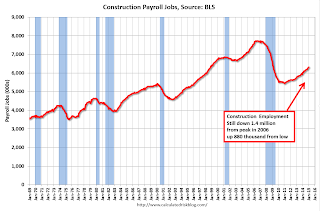
 This graph shows total construction employment as reported by the BLS (not just residential).
Since construction employment bottomed in January 2011, construction payrolls have increased by 882 thousand.
 The BLS diffusion index for total private employment was at 62.4 in January, down from 69.0 in December.
For manufacturing, the diffusion index was at 58.1, down from 64.4 in December.
Think of this as a measure of how widespread job gains are across industries. The further from 50 (above or below), the more widespread the job losses or gains reported by the BLS. Above 60 is very good. From the BLS:
Figures are the percent of industries with employment increasing plus one-half of the industries with unchanged employment, where 50 percent indicates an equal balance between industries with increasing and decreasing employment.Overall job growth was widespread in January - another good sign.


