by Calculated Risk on 2/09/2015 11:59:00 AM
Monday, February 09, 2015
Prime Working-Age Population Growing Again
Last year, I posted some demographic data for the U.S., see: Census Bureau: Largest 5-year Population Cohort is now the "20 to 24" Age Group, Decline in the Labor Force Participation Rate: Mostly Demographics and Long Term Trends, and The Future is still Bright!
I pointed out that "even without the financial crisis we would have expected some slowdown in growth this decade (just based on demographics). The good news is that will change soon."
Changes in demographics are an important determinant of economic growth, and although most people focus on the aging of the "baby boomer" generation, the movement of younger cohorts into the prime working age is another key story in coming years. Here is a graph of the prime working age population (this is population, not the labor force) from 1948 through January 2015.

There was a huge surge in the prime working age population in the '70s, '80s and '90s - and the prime age population has been mostly flat recently (even declined a little).
The prime working age labor force grew even quicker than the population in the '70s and '80s due to the increase in participation of women. In fact, the prime working age labor force was increasing 3%+ per year in the '80s!
So when we compare economic growth to the '70s, '80, or 90's we have to remember this difference in demographics (the '60s saw solid economic growth as near-prime age groups increased sharply).
The prime working age population peaked in 2007, and appears to have bottomed at the end of 2012. The good news is the prime working age group has started to grow again, and should be growing solidly by 2020 - and this should boost economic activity in the years ahead.
More Employment Graphs: Duration of Unemployment, Unemployment by Education, Construction Employment and Diffusion Indexes
by Calculated Risk on 2/09/2015 09:50:00 AM
By request, a few more employment graphs ...
Here are the previous posts on the employment report:
• January Employment Report: 257,000 Jobs, 5.7% Unemployment Rate
• Employment Report Comments and Graphs
 This graph shows the duration of unemployment as a percent of the civilian labor force. The graph shows the number of unemployed in four categories: less than 5 week, 6 to 14 weeks, 15 to 26 weeks, and 27 weeks or more.
The general trend is down for all categories, and both the "less than 5 weeks" and 6 to 14 weeks" are close to normal levels.
The long term unemployed is just below 1.8% of the labor force - the lowest since January 2009 - however the number (and percent) of long term unemployed remains a serious problem.
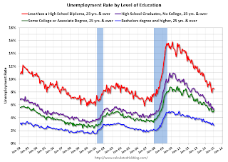
 This graph shows the unemployment rate by four levels of education (all groups are 25 years and older).
Unfortunately this data only goes back to 1992 and only includes one previous recession (the stock / tech bust in 2001). Clearly education matters with regards to the unemployment rate - and it appears all four groups are generally trending down.
Although education matters for the unemployment rate, it doesn't appear to matter as far as finding new employment.
Note: This says nothing about the quality of jobs - as an example, a college graduate working at minimum wage would be considered "employed".
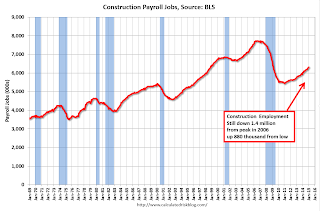
 This graph shows total construction employment as reported by the BLS (not just residential).
Since construction employment bottomed in January 2011, construction payrolls have increased by 882 thousand.
 The BLS diffusion index for total private employment was at 62.4 in January, down from 69.0 in December.
For manufacturing, the diffusion index was at 58.1, down from 64.4 in December.
Think of this as a measure of how widespread job gains are across industries. The further from 50 (above or below), the more widespread the job losses or gains reported by the BLS. Above 60 is very good. From the BLS:
Figures are the percent of industries with employment increasing plus one-half of the industries with unchanged employment, where 50 percent indicates an equal balance between industries with increasing and decreasing employment.Overall job growth was widespread in January - another good sign.
Sunday, February 08, 2015
Sunday Night Futures
by Calculated Risk on 2/08/2015 08:59:00 PM
From the WSJ: Air of Optimism Pervades Athens Even as Country Heads for Showdown in Brussels
The defiant, antiausterity position taken by the just-elected government toward Greece’s creditors has given new hope to many Athenians, even those who didn’t vote for the leftist Syriza party, which came out on top in last month’s election.Austerity has failed (obvious to almost everyone), and anything else is welcome. I wrote several years ago that austerity wouldn't survive for too many years in a democracy.
“People in Greece had to deal with so many difficulties during the last five years that they now feel they have nothing to lose,” says Chrysa Stratou, a 52-year-old psychologist. “The only thing left for Greeks is to battle.”
Elsewhere in Europe, the Greek government’s firm rejection of the terms governing its bailout has been met with a mix of consternation and outright hostility.
Monday:
• At 10:00 AM ET: the Fed will release the monthly Labor Market Conditions Index (LMCI).
Weekend:
• Schedule for Week of February 8, 2015
• Best Private Sector Job Creation "Ever"?
From CNBC: Pre-Market Data and Bloomberg futures: currently S&P futures are down 8 and DOW futures are down 60 (fair value).
Oil prices were up sharply over the last week with WTI futures at $52.34 per barrel and Brent at $58.20 per barrel. A year ago, WTI was at $97, and Brent was at $110 - so prices are a little less than 50% year-over-year.
Below is a graph from Gasbuddy.com for nationwide gasoline prices. Nationally prices are around $2.18 per gallon (down over $1.00 per gallon from a year ago). If you click on "show crude oil prices", the graph displays oil prices for WTI, not Brent; gasoline prices in most of the U.S. are impacted more by Brent prices.
| Orange County Historical Gas Price Charts Provided by GasBuddy.com |
Best Private Sector Job Creation "Ever"?
by Calculated Risk on 2/08/2015 11:41:00 AM
On Friday, I mentioned that private job creation was on pace for the best ever during a presidential term. I received a few emails asking if that was correct. The answer is "yes".
Here is a table of the top three presidential terms for private job creation (they also happen to be the three best terms for total non-farm job creation).
Note: Overall employment was smaller in the '80s, however the participation rate was increasing in the '80s. The prime working age labor force was growing more than 3% per year in the '80s with a surge in younger workers and women joining the labor force. Now, the overall population is larger, but the prime working age population has declined this decade and the participation rate is generally declining now.
Clinton's two terms were the best for both private and total non-farm job creation, followed by Reagan's 2nd term. Public sector job creation increased the most during Reagan's 2nd term.
Currently Obama's 2nd term is on pace to be the best ever for private job creation. However, with very few public sector jobs added, Obama's 2nd term is only on pace to be the third best for total job creation.
Note: Only 14 thousand public sector jobs have been added during the first two years of Obama's 2nd term (following a record loss of 702 thousand public sector jobs during Obama's 1st term).
This is 1% of the public sector jobs added during Reagan's 2nd term!
| Top Employment Gains per Presidential Terms (000s) | ||||
|---|---|---|---|---|
| Rank | Term | Private | Public | Total Non-Farm |
| 1 | Clinton 1 | 10,885 | 692 | 11,577 |
| 2 | Clinton 2 | 10,070 | 1,242 | 11,312 |
| 3 | Reagan 2 | 9,357 | 1,438 | 10,795 |
| Obama 21 | 5,542 | 14 | 5,556 | |
| Pace2 | 11,084 | 28 | 11,112 | |
| 124 Months into 2nd Term 2Current Pace for Obama's 2nd Term | ||||
The second table shows the jobs need per month for Obama's 2nd term to be in the top three presidential terms.
| Jobs needed per month (average) for Obama's 2nd Term | ||||
|---|---|---|---|---|
| to Rank | Private | Total | ||
| #1 | 223 | 251 | ||
| #2 | 189 | 240 | ||
| #3 | 159 | 218 | ||
Saturday, February 07, 2015
Schedule for Week of February 8, 2015
by Calculated Risk on 2/07/2015 01:09:00 PM
The key economic report this week is January retail sales on Thursday.
At 10:00 AM ET: The Fed will release the monthly Labor Market Conditions Index (LMCI).
7:30 AM ET: NFIB Small Business Optimism Index for January.
Early: Trulia Price Rent Monitors for January. This is the index from Trulia that uses asking house prices adjusted both for the mix of homes listed for sale and for seasonal factors.
 10:00 AM: Job Openings and Labor Turnover Survey for December from the BLS.
 This graph shows job openings (yellow line), hires (purple), Layoff, Discharges and other (red column), and Quits (light blue column) from the JOLTS.
Jobs openings increased in November to 4.972 million from 4.830 million in October.
The number of job openings (yellow) were up 21% year-over-year compared to November 2013, and Quits were up 7% year-over-year.
7:00 AM: The Mortgage Bankers Association (MBA) will release the results for the mortgage purchase applications index.
8:30 AM: The initial weekly unemployment claims report will be released. The consensus is for claims to increase to 285 thousand from 278 thousand.
 8:30 AM ET: Retail sales for January will be released.
This graph shows retail sales since 1992 through December 2014. This is monthly retail sales and food service, seasonally adjusted (total and ex-gasoline). On a monthly basis, retail sales decreased 0.9% from November to December (seasonally adjusted), and sales were up 3.2% from December 2013.
The consensus is for retail sales to decrease 0.5% in January, and to decrease 0.5% ex-autos.
10:00 AM: Manufacturing and Trade: Inventories and Sales (business inventories) report for December. The consensus is for a 0.2% increase in inventories.
10:00 AM: University of Michigan's Consumer sentiment index (preliminary for February). The consensus is for a reading of 98.5, up from 98.1 in January.


