by Calculated Risk on 7/07/2014 12:15:00 PM
Monday, July 07, 2014
Demographics and Behavior
Imagine if you were born in 1900. You'd have a 23% chance of dying before age 20 (a 13% change before age 1). You'd have a 38% chance of dying before age 45 (see first two graphs below).
Compare that to kids born recently. You'd have about a 1% chance of dying before age 20, and about a 4% chance of dying before age 45. A dramatic change over the last century.
How would this effect your behavior? If you were born in 1900, you'd want to get married early, and have plenty of children. If you were born recently, you'd probably take your time - get married later, have fewer children - and education would be more valuable (because you'd probably live longer).
So we'd expect to see more young people stay in school, and more older people stay in the work force - and that is exactly what is happening.
Some people look at these trends and worry about supporting all the old people. To me, this is all great news - the vast majority of people can look forward to a long life - with fewer people dying in childhood or during their prime working years.
Here is some data from the CDC United States Life Tables, 2009 by Elizabeth Arias released earlier this year (repeated from an earlier post):
The most frequently used life table statistic is life expectancy (ex), which is the average number of years of life remaining for persons who have attained a given age (x). ... Another way of assessing the longevity of the period life table cohort is by determining the proportion that survives to specified ages. ... To illustrate, 56,572 persons out of the original 2009 hypothetical life table cohort of 100,000 (or 56.6%) were alive at exact age 80. In other words, the probability that a person will survive from birth to age 80, given 2009 age-specific mortality, is 56.6%.Instead of look at life expectancy, here is a graph of survivors out of 100,000 born alive, by age for three groups: those born in 1900-1902, born in 1949-1951 (baby boomers), and born in 2009.
emphasis added
 Click on graph for larger image.
There was a dramatic change between those born in 1900 (blue) and those born mid-century (orange). The risk of infant and early childhood deaths dropped sharply, and the risk of death in the prime working years also declined significantly.
The CDC is projecting further improvement for childhood and prime working age for those born in 2009, but they are also projecting that people will live longer.
 The second graph uses the same data but looks at the number of people who die before a certain age, but after the previous age. As an example, for those born in 1900 (blue), 12,448 of the 100,000 born alive died before age 1, and another 5,748 died between age 1 and age 5.
The peak age for deaths didn't change much for those born in 1900 and 1950 (between 76 and 80, but many more people born in 1950 will make it).
Now the CDC is projection the peak age for deaths - for those born in 2009 - will increase to 86 to 90! Using these stats - for those born in 2014 - about half will make it to the next century.
Also the number of deaths for those younger than 20 will be very small (down to mostly accidents, guns, and drugs). Self-driving cars might reduce the accident component of young deaths.
And the next graph shows the impact of changing demographics on labor force participation. The 2022 projections are based on a recent article from BLS economist Mitra Toossi: Labor force projections to 2022: the labor force participation rate continues to fall
 Probably the main reason for the decline in the participation rate for the younger age groups is that more people are pursuing higher education (graphs in previous post show increase in enrollment).
I'll have more on this soon, but all of this is great news!
Dorms as "Parents' Home": The long term trends for higher enrollment
by Calculated Risk on 7/07/2014 09:44:00 AM
On Friday I noted an article by Derek Thompson in the Atlantic: The Misguided Freakout About Basement-Dwelling Millennials
More than 15.3 million twentysomethings—and half of young people under 25—live "in their parents’ home," according to official Census statistics.As Thompson noted, most of the recent increase in the percent living "in their parents' home" is related to living in dorms.
There's just one problem with those official statistics. They're criminally misleading. When you read the full Census reports, you often come upon this crucial sentence:
It is important to note that the Current Population Survey counts students living in dormitories as living in their parents' home.
This is an important point since there is a long term trend for higher school enrollment (so we shouldn't "freak out" about the reported increase in young people living at home).
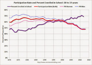
And higher school enrollment generally means lower labor force participation (as I've pointed out before, the decline in the overall labor force participation rate is due to several factors, but two of the most important are aging of the baby boomers and more younger people staying in school).
 Click on graph for larger image.
This graph uses data from the BLS on participation rate, and the National Center for Education Statistics (NCES) on enrollment rates (most recent data for 2012).
This graph shows the participation and enrollment rates for the 18 to 19 year old age group. These two lines are a "mirror image".
Note: I added the participation rate for men and women too. One of the key labor stories in the 2nd half of the 1900s was the surge in participation by women.
 The third graph shows the participation and enrollment rates for the 20 to 24 year old age group.
Once again the participation rate is declining as the enrollment rate is increasing. The participation rate (all) was rising in the '70s and early '80s because of the increase in women entering the labor force.
So don't worry about the kids living in their parents' basements - they are actually living in dorms. In the long run, more education is a positive for the economy.
Hey, the kids are alright!
Sunday, July 06, 2014
Sunday Night Futures
by Calculated Risk on 7/06/2014 07:51:00 PM
On inflation: I'm sympathetic to people like Joe Weisenthal at Business Insider who is looking for signs of inflation increasing; I'm starting to look for signs of real wage increases and inflation too. I just think inflation isn't a concern right now (Weisenthal was correct on inflation over the last several years in contrast to the people who were consistently wrong on inflation).
It is easy to understand the concern about inflation when we see articles like this from Ben Leubsdorf and Jon Hilsenrath at the WSJ: As Food Prices Rise, Fed Keeps a Watchful Eye
The consumer price of ground beef in May rose 10.4% from a year earlier while pork chop prices climbed 12.7%. The price of fresh fruit rose 7.3% and oranges 17.1% ... The U.S. Department of Agriculture predicts overall food prices will increase 2.5% to 3.5% this year after rising 1.4% in 2013, as measured by the Labor Department's consumer-price index.Meanwhile gasoline prices are up year-over-year too (see graph below). I suspect this is going to reignite the CPI (or PCE prices) vs. core prices again.
For food prices, the drought in California is having an impact. From an earlier WSJ article:
Because California boasts a bigger agricultural sector than any other state, the drought could have an outsize economic impact nationally, raising produce prices.And gasoline and oil prices have been impacted by the turmoil in Iraq. Monetary policy can't halt the violence in Iraq or make it rain in California - and this is why it is important to track various core measures of inflation.
On the Employment Report:
• June Employment Report: 288,000 Jobs, 6.1% Unemployment Rate
• Comment on Employment Report
• More Employment Graphs: Duration of Unemployment, Unemployment by Education, Construction Employment and Diffusion Indexes
Weekend:
• Mid-Year Review: Ten Economic Questions for 2014
• Schedule for Week of July 6th
From CNBC: Pre-Market Data and Bloomberg futures: the S&P futures are down slightly and DOW futures are down 11 (fair value).
Oil prices moved mostly sideways down the last week with WTI futures at $103.91 per barrel and Brent at $110.61 per barrel.
Below is a graph from Gasbuddy.com for nationwide gasoline prices. Nationally prices are around $3.65 per gallon (about 20 cents higher than a year ago). If you click on "show crude oil prices", the graph displays oil prices for WTI, not Brent; gasoline prices in most of the U.S. are impacted more by Brent prices.
| Orange County Historical Gas Price Charts Provided by GasBuddy.com |
Is Inflation Coming?
by Calculated Risk on 7/06/2014 02:42:00 PM
Joe Weisenthal at Business Insider writes: These Three Charts Show Inflation Is Finally Right Around The Corner
After this week's strong Jobs Report, it's becoming conventional wisdom that the economy is heating up for real this time. After numerous false starts and disappointments since the financial crisis, it appears we've kicked into a higher gear.I also think the economy is picking up, and I agree that as slack diminishes, we will probably see real wage growth and an uptick in inflation.
A stronger economy should mean higher inflation. That's because as the economy grows, slack diminishes in the economy (both industrial slack and labor market slash) and that puts pricing pressure on existing resources. It makes sense, as the unemployed become more scarce, employed workers have greater bargaining power for wages.
However, this is unconvincing:
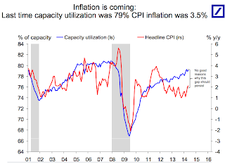
These three charts from Deutsche Bank economist Torsten Slok make for a good overview of the case that inflation is coming. ... Historically, when Capacity Utilization is as high as its now (suggesting not much industrial slack) the inflation rate has been much higher.
 Click on graph for larger image.
Here is the first chart. This shows capacity utilization and the year-over-year change in CPI.
Capacity Utilization has been increasing, and the author write "No good reasons why this gap should persist" (gap between Capacity utilization on the chart and CPI).
Whenever I see a correlation chart like this, I like to see what happened in earlier periods.
 The second graph shows the same data, but this time starting in 1990 (instead of 2001).
For most of the '90s there was a huge "gap" between capacity utilization and CPI.
There were periods when capacity utilization was higher than now - and inflation lower. As an example, capacity utilization was close to 83% in 1998, and YoY inflation averaged 1.5%.
So I don't think the first graph is convincing that inflation is "right around the corner". (the last two graphs are from a small survey and also not convincing).
My view is inflation is increasing a little (as was expected), but is not a concern this year.
More Employment Graphs: Duration of Unemployment, Unemployment by Education, Construction Employment and Diffusion Indexes
by Calculated Risk on 7/06/2014 11:39:00 AM
Thursday on the employment report:
• June Employment Report: 288,000 Jobs, 6.1% Unemployment Rate
• Comments on Employment Report
A few more employment graphs by request ...
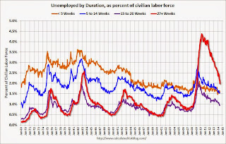
 This graph shows the duration of unemployment as a percent of the civilian labor force. The graph shows the number of unemployed in four categories: less than 5 week, 6 to 14 weeks, 15 to 26 weeks, and 27 weeks or more.
The general trend is down for all categories, and both the "less than 5 weeks" and 6 to 14 weeks" are close to normal levels.
The long term unemployed is just below 2.0% of the labor force - the lowest since February 2009 - however the number (and percent) of long term unemployed remains a serious problem.
 This graph shows the unemployment rate by four levels of education (all groups are 25 years and older).
Unfortunately this data only goes back to 1992 and only includes one previous recession (the stock / tech bust in 2001). Clearly education matters with regards to the unemployment rate - and it appears all four groups are generally trending down.
Although education matters for the unemployment rate, it doesn't appear to matter as far as finding new employment.
Note: This says nothing about the quality of jobs - as an example, a college graduate working at minimum wage would be considered "employed".
 This graph shows total construction employment as reported by the BLS (not just residential).
Since construction employment bottomed in January 2011, construction payrolls have increased by 583 thousand.
Historically there is a lag between an increase in activity and more hiring - and it appears hiring should pickup more this year.
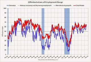
 The BLS diffusion index for total private employment was at 64.8 in June, up from 62.9 in May.
For manufacturing, the diffusion index decreased to 61.1, down from 63.6 in May.
Think of this as a measure of how widespread job gains are across industries. The further from 50 (above or below), the more widespread the job losses or gains reported by the BLS. From the BLS:
Figures are the percent of industries with employment increasing plus one-half of the industries with unchanged employment, where 50 percent indicates an equal balance between industries with increasing and decreasing employment.Job growth was widespread in June.


