by Calculated Risk on 7/06/2014 02:42:00 PM
Sunday, July 06, 2014
Is Inflation Coming?
Joe Weisenthal at Business Insider writes: These Three Charts Show Inflation Is Finally Right Around The Corner
After this week's strong Jobs Report, it's becoming conventional wisdom that the economy is heating up for real this time. After numerous false starts and disappointments since the financial crisis, it appears we've kicked into a higher gear.I also think the economy is picking up, and I agree that as slack diminishes, we will probably see real wage growth and an uptick in inflation.
A stronger economy should mean higher inflation. That's because as the economy grows, slack diminishes in the economy (both industrial slack and labor market slash) and that puts pricing pressure on existing resources. It makes sense, as the unemployed become more scarce, employed workers have greater bargaining power for wages.
However, this is unconvincing:
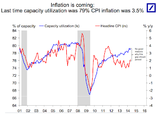
These three charts from Deutsche Bank economist Torsten Slok make for a good overview of the case that inflation is coming. ... Historically, when Capacity Utilization is as high as its now (suggesting not much industrial slack) the inflation rate has been much higher.
 Click on graph for larger image.
Here is the first chart. This shows capacity utilization and the year-over-year change in CPI.
Capacity Utilization has been increasing, and the author write "No good reasons why this gap should persist" (gap between Capacity utilization on the chart and CPI).
Whenever I see a correlation chart like this, I like to see what happened in earlier periods.
 The second graph shows the same data, but this time starting in 1990 (instead of 2001).
For most of the '90s there was a huge "gap" between capacity utilization and CPI.
There were periods when capacity utilization was higher than now - and inflation lower. As an example, capacity utilization was close to 83% in 1998, and YoY inflation averaged 1.5%.
So I don't think the first graph is convincing that inflation is "right around the corner". (the last two graphs are from a small survey and also not convincing).
My view is inflation is increasing a little (as was expected), but is not a concern this year.


