by Calculated Risk on 6/26/2014 12:56:00 PM
Thursday, June 26, 2014
The Future is still Bright!
Trulia chief economist Jed Kolko wrote this morning:
"Median age in US ~38. But modal age is 23. Five most common ages: 23, 24, 22, 54, 53."This is an important change in the modal age. As I've noted before, by 2020, eight of the top ten largest cohorts (five year age groups) will be under 40, and by 2030 the top 11 cohorts will be the youngest 11 cohorts.
Demographics is a key driver of economic growth, and although most people focus on the aging of the "baby boomer" generation, the movement of these younger cohorts into the prime working age is another key story in coming years. Here is a graph of the prime working age population (this is population, not the labor force) from 1948 through May 2014.
 Click on graph for larger image.
There was a huge surge in the prime working age population in the '70s, '80s and '90s - and the prime age population has been mostly flat recently (even declined a little).
The prime working age labor force grew even quicker than the population in the '70s and '80s due the increase in participation of women. In fact, the prime working age labor force was increasing 3%+ per year in the '80s!
So when we compare economic growth to the '70s, '80, or 90's we have to remember this difference in demographics (the '60s saw solid economic growth as near-prime age groups increased sharply).
The good news is the prime working age group will start growing again by 2020, and this should boost economic activity.
But that is medium term - in the near term, the reasons for a pickup in economic growth are still intact:1) the housing recovery should continue, 2) household balance sheets are in much better shape. This means less deleveraging, and probably a little more borrowing, 3) State and local government austerity is over (in the aggregate),4) there will be less Federal austerity this year, 5) commercial real estate (CRE) investment will probably make a small positive contribution this year.
For new readers: I was very bearish on the economy when I started this blog in 2005 - back then I wrote mostly about housing (see: LA Times article and more here for comments about the blog). I started looking for the sun in early 2009, and now I'm more optimistic.
Last year I wrote The Future's so Bright .... In that post I outlined why I was becoming more optimistic.
Here are some updates to the graphs I posted last year. Several of these graphs have changed direction (as predicted) since I wrote that post. For example, state and local government employment is now increasing, and household debt has started increasing.
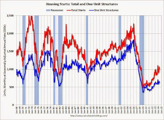
 This graph shows total and single family housing starts. Even after the 28.2% increase in 2012, and 18.5% increase in 2013 (to 925 thousand starts), starts are still way below the average level of 1.5 million per year from 1959 through 2000.
Demographics and household formation suggests starts will return to close to that level over the next few years. That means starts will probably increase another 50% or so over the next few years from the May 2014 level of 1 million starts (SAAR).
Residential investment and housing starts are usually the best leading indicator for the economy, so this suggests the economy will continue to grow over the next couple of years.
 This graph shows total state and government payroll employment since January 2007. State and local governments lost 129,000 jobs in 2009, 262,000 in 2010, 249,000 in 2011, and 33,000 in 2012.
 In 2013, state and local government employment increased by 44,000 jobs.
This year, through May 2014, state and local employment is up 46,000. So it appears that most of the state and local government layoffs are over - and the economic drag on the economy is over.
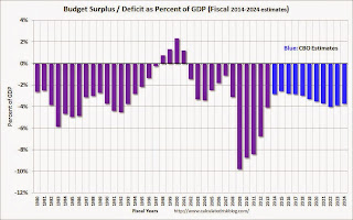
 And here is a key graph on the US deficit. This graph, based on the CBO's May projections, shows the actual (purple) budget deficit each year as a percent of GDP, and an estimate for the next ten years based on estimates from the CBO.
As we've been discussing, the US deficit as a percent of GDP has been declining, and will probably remain under 3% for several years.
Here are a couple of graph on household debt (and debt service):
 This graph from the the NY Fed shows aggregate household debt increased $129 billion in Q1 2014 from Q4 2013.
From the NY Fed: "In its Q1 2014 Household Debt and Credit Report, the Federal Reserve Bank of New York announced that outstanding household debt increased $129 billion from the previous quarter. The increase was led by rises in mortgage debt ($116 billion), student loan debt ($31 billion) and auto loan balances ($12 billion), slightly offset by a $27 billion declines in credit card and HELOC balances. Total household indebtedness stood at $11.65 trillion, 1.1 percent higher than the previous quarter. Overall household debt remains 8.1 percent below the peak of $12.68 trillion reached in Q3 2008. "
There will be some more deleveraging ahead for certain households (mostly from foreclosures and distressed sales), but it appears that in the aggregate, household deleveraging is over.
 This graph is from the Fed's Q1 Household Debt Service and Financial Obligations Ratios. These ratios show the percent of disposable personal income (DPI) dedicated to debt service (DSR) and financial obligations (FOR) for households.
The overall Debt Service Ratio decreased in Q1, and is at a record low. Note: The financial obligation ratio (FOR) is also near a record low (not shown)
Also the DSR for mortgages (blue) are near the low for the last 30 years. This ratio increased rapidly during the housing bubble, and continued to increase until 2007. With falling interest rates, and less mortgage debt (mostly due to foreclosures), the mortgage ratio has declined significantly.
This data suggests household cash flow is in much better shape than a few years ago.
 And for commercial real estate, here is the AIA Architecture Billings Index. This is usually a leading indicator for commercial real estate, and even though the index has been moving sideways near the expansion / contraction line recently, the readings over the last year suggest some increase in CRE investment in 2014.
Overall it appears the economy is poised for more growth over the next few years.
As I noted at the beginning of this post, in the longer term I remain very optimistic. The renewing of America was one of the key points I made when I posted the following animation of the U.S population by age, from 1900 through 2060. The population data and estimates are from the Census Bureau (actual through 2010 and projections through 2060).
Kansas City Fed: Regional Manufacturing "Activity Slowed Somewhat" in June
by Calculated Risk on 6/26/2014 11:00:00 AM
From the Kansas City Fed: Growth in Tenth District Manufacturing Activity Slowed Somewhat
The Federal Reserve Bank of Kansas City released the June Manufacturing Survey today. According to Chad Wilkerson, vice president and economist at the Federal Reserve Bank of Kansas City, the survey revealed that growth in Tenth District manufacturing activity slowed somewhat, while producers’ expectations for future factory activity showed little change and remained at solid levels.The last regional Fed manufacturing survey for June will be released on Monday, June 30th (Dallas Fed). In general the regional surveys have indicated growth in June at about the same pace as in May.
“We saw some moderation in factory growth in June and many contacts mentioned difficulties finding qualified workers,” said Wilkerson. “However, many respondents noted solid expectations for future months.”
The month-over-month composite index was 6 in June, down from 10 in May and 7 in April. The composite index is an average of the production, new orders, employment, supplier delivery time, and raw materials inventory indexes. ... The production index dropped from 14 to 2, and the new orders, employment, and new orders for exports indexes also declined.
emphasis added
Personal Income increased 0.4% in May, Spending increased 0.2%
by Calculated Risk on 6/26/2014 08:57:00 AM
The BEA released the Personal Income and Outlays report for May:
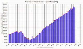
Personal income increased $58.8 billion, or 0.4 percent ... in May, according to the Bureau of Economic Analysis. Personal consumption expenditures (PCE) increased $18.3 billion, or 0.2 percent.The following graph shows real Personal Consumption Expenditures (PCE) through May 2014 (2009 dollars). Note that the y-axis doesn't start at zero to better show the change.
...
Real PCE -- PCE adjusted to remove price changes -- decreased 0.1 percent in May, compared with a decrease of 0.2 percent in April. ... The price index for PCE increased 0.2 percent in May, the same increase as in April. The PCE price index, excluding food and energy, increased 0.2 percent in May, the same increase as in April. ... The May price index for PCE increased 1.8 percent from May a year ago. The May PCE price index, excluding food and energy, increased 1.5 percent from May a year ago.
 Click on graph for larger image.
The dashed red lines are the quarterly levels for real PCE.
Note: Usually the two-month and mid-month methods can be used to estimate PCE growth for the quarter (using the first two months and mid-month of the quarter). However this isn't very effective if there was an "event", and in Q1 PCE was especially weak in January and February - and then surged in March.
Still, using the two-month method to estimate Q2 PCE growth, PCE was increasing at a 2.3% annual rate in Q2 2014 (using the mid-month method, PCE was increasing less than 1.5%). Since the comparison to March will be difficult, it appears PCE growth will be below 2% in Q2 (another weak quarter).
On inflation: The PCE price index increased 1.8 percent year-over-year, and at a 2.8% annualized rate in May. The core PCE price index (excluding food and energy) increased 1.5 percent year-over-year in May, and at a 2.0% annualized rate in May.
Weekly Initial Unemployment Claims decrease to 312,000
by Calculated Risk on 6/26/2014 08:34:00 AM
The DOL reports:
In the week ending June 21, the advance figure for seasonally adjusted initial claims was 312,000, a decrease of 2,000 from the previous week's revised level. The previous week's level was revised up by 2,000 from 312,000 to 314,000. The 4-week moving average was 314,250, an increase of 2,000 from the previous week's revised average. The previous week's average was revised up by 500 from 311,750 to 312,250.The previous week was revised up from 312,000.
There were no special factors impacting this week's initial claims.
The following graph shows the 4-week moving average of weekly claims since January 1971.
 Click on graph for larger image.
The dashed line on the graph is the current 4-week average. The four-week average of weekly unemployment claims increased to 314,250.
This was close to the consensus forecast of 313,000. The 4-week average is now at normal levels for an expansion.
Wednesday, June 25, 2014
Thursday: May Personal Income and Outlays, Weekly Unemployment Claims
by Calculated Risk on 6/25/2014 08:23:00 PM
First, according to Mortgage News Daily, 30 year mortgage rates have fallen to 4.13% today, down from 4.18% yesterday, and down from 4.59% a year ago.
Thursday:
• At 8:30 AM ET, the initial weekly unemployment claims report will be released. The consensus is for claims to increase to 313 thousand from 312 thousand last week.
• Also at 8:30 AM, Personal Income and Outlays for May. The consensus is for a 0.4% increase in personal income, and for a 0.4% increase in personal spending. And for the Core PCE price index to increase 0.2%.
• At 11:00 AM, the Kansas City Fed manufacturing survey for May.


