by Calculated Risk on 6/06/2014 01:58:00 PM
Friday, June 06, 2014
Employment Recovery: Great Recession, Great Depression, and other Financial Crises
As a follow-up to my earlier posts comparing employment recoveries from recent recessions, here is a graph comparing the recent recovery to other financial crises.
Even though it took 6+ years to exceed the previous employment peak, this is actually better than most recoveries from a financial crisis. (Note: this recovery was during a period of declining participation - partially due to demographics - and that makes this milestone even better).
From Josh Lehner today: U.S. Jobs Are Back … To Pre-Recession Levels
With the May jobs report, the U.S. economy is now back to pre-recession peak levels of employment. While this is the longest post WWII recovery the U.S. has experienced — by a good margin — it is important to keep in mind that financial crises are different. When comparing the Great Recession against other advanced economies’ financial crises in recent decades, the current U.S. cycle has outperformed in terms of employment, even as most other measures of financial crises were just as bad — home prices, stock prices, GDP per capita, government debt and the like.
 This graph from Lehner shows employment recoveries for several different financial crises.
 The U.S. Great Recession is in red.
The Great Depression is in dark blue.
Comment: U.S. Employment at All Time High
by Calculated Risk on 6/06/2014 10:10:00 AM
First, I promised the headline for this post last week!
Second, this means I'll be retiring the graph many called the "scariest jobs chart ever" (first graph in previous post).
Earlier: May Employment Report: 217,000 Jobs, 6.3% Unemployment Rate
Now some numbers: Through the first five months of 2014, the economy has added 1,068,000 payroll jobs - slightly better than during the same period in 2013 even with the severe weather early this year. (For comparison, there were 1,020,000 payroll jobs added during the first five months of 2013). My expectation at the beginning of the year was the economy would add between 2.4 and 2.7 million payroll jobs this year, and that still looks about right.
Here is a table of the annual change in total nonfarm and private sector payrolls jobs since 1999. The last three years have been near the best since 1999 (2005 was the best year for total nonfarm, and 2011 the best for private jobs).
It is possible that 2014 will be the best year since 1999 for both total nonfarm and private sector employment.
| Change in Payroll Jobs per Year (000s) | ||
|---|---|---|
| Total, Nonfarm | Private | |
| 1999 | 3,177 | 2,716 |
| 2000 | 1,946 | 1,682 |
| 2001 | -1,735 | -2,286 |
| 2002 | -508 | -741 |
| 2003 | 105 | 147 |
| 2004 | 2,033 | 1,886 |
| 2005 | 2,506 | 2,320 |
| 2006 | 2,085 | 1,876 |
| 2007 | 1,140 | 852 |
| 2008 | -3,576 | -3,756 |
| 2009 | -5,087 | -5,013 |
| 2010 | 1,058 | 1,277 |
| 2011 | 2,083 | 2,400 |
| 2012 | 2,236 | 2,294 |
| 2013 | 2,331 | 2,365 |
| 20141 | 2,563 | 2,527 |
| 1 2014 is current pace annualized (through May). | ||
Also employment has reached another milestone: total employment is now 98,000 above the previous peak, and and at a new all time high in May. Of course the labor force has continued to increase over the last 6+ years, and there are still millions of workers unemployed - so the economy still has a long way to go.
Note: Private payroll employment increased 216,000 in May and private employment is now 617,000 above the previous peak (the unprecedented large number of government layoffs has held back total employment).
Overall this was another solid employment report.
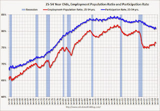
Employment-Population Ratio, 25 to 54 years old
 Since the overall participation rate declined recently due to cyclical (recession) and demographic (aging population, younger people staying in school) reasons, an important graph is the employment-population ratio for the key working age group: 25 to 54 years old.
In the earlier period the participation rate for this group was trending up as women joined the labor force. Since the early '90s, the participation rate has mostly moved sideways (with a downward drift started around '00) - and with ups and downs related to the business cycle.
The 25 to 54 participation rate was unchanged in May at 80.8%, and the 25 to 54 employment population ratio decreased to 76.4% from 76.5%. As the recovery continues, I expect the participation rate for this group to increase.
Percent Job Losses During Recessions

This graph shows the job losses from the start of the employment recession, in percentage terms - this time aligned at maximum job losses. Employment is now back above pre-recession levels and this graph will be retired until the next recession (Of course this doesn't include population growth).
In the earlier post, the graph showed the job losses aligned at the start of the employment recession.
Part Time for Economic Reasons
 From the BLS report:
The number of persons employed part time for economic reasons (sometimes referred to as involuntary part-time workers), at 7.3 million, changed little in May. These individuals were working part time because their hours had been cut back or because they were unable to find a full-time job.The number of persons working part time for economic reasons declined in May to 7.269 million from 7.465 million in April. This suggests significantly slack still in the labor market. These workers are included in the alternate measure of labor underutilization (U-6) that decreased to 12.2% in May from 12.3% in April. This is the lowest level for U-6 since October 2008.
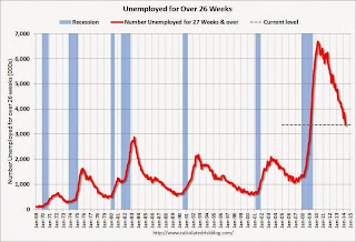
Unemployed over 26 Weeks
 This graph shows the number of workers unemployed for 27 weeks or more.
 According to the BLS, there are 3.374 million workers who have been unemployed for more than 26 weeks and still want a job. This was down from 3.452 in April. This is trending down, but is still very high. This is the lowest level for long term unemployed since March 2009.
Long term unemployment remains one of the key labor problems in the US.
State and Local Government
 This graph shows total state and government payroll employment since January 2007. State and local governments lost jobs for four straight years. (Note: Scale doesn't start at zero to better show the change.)
 In May 2014, state and local governments added 6,000 jobs. State and local government employment is now up 107,000 from the bottom, but still 637,000 below the peak.
It appears state and local employment employment is now increasing. Of course Federal government layoffs are ongoing (another 5,000 jobs lost in May).
May Employment Report: 217,000 Jobs, 6.3% Unemployment Rate
by Calculated Risk on 6/06/2014 08:30:00 AM
From the BLS:
Total nonfarm payroll employment rose by 217,000 in May, and the unemployment rate was unchanged at 6.3 percent, the U.S. Bureau of Labor Statistics reported today.
...
After revision, the change in total nonfarm employment for March remained +203,000, and the change for April was revised from +288,000 to +282,000. With these revisions, employment gains in March and April were 6,000 lower than previously reported.
 Click on graph for larger image.
The headline number was at expectations of 213,000 payroll jobs added.
The first graph shows the job losses from the start of the employment recession, in percentage terms, compared to previous post WWII recessions. The dotted line is ex-Census hiring.
This shows the depth of the recent employment recession - worse than any other post-war recession - and the relatively slow recovery due to the lingering effects of the housing bust and financial crisis.

Total employment is now 98 thousand above the pre-recession peak and at an all time high. It is probably time to retire this graph - until the next recession.
NOTE: The second graph is the change in payroll jobs ex-Census - meaning the impact of the decennial Census temporary hires and layoffs is removed to show the underlying payroll changes.
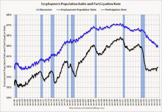
The third graph shows the employment population ratio and the participation rate.
 The Labor Force Participation Rate was unchanged in May at 62.8%. This is the percentage of the working age population in the labor force. A large portion of the recent decline in the participation rate is due to demographics.
The Employment-Population ratio was unchanged in May at 58.9% (black line).
I'll post the 25 to 54 age group employment-population ratio graph later.
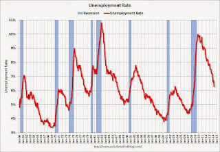
 The fourth graph shows the unemployment rate.
 The unemployment rate was unchanged in May at 6.3%.
This was a solid employment report, and total non-farm employment is now at a new all time high.
I'll have much more later ...
Thursday, June 05, 2014
Friday: Jobs, Jobs, Jobs
by Calculated Risk on 6/05/2014 09:47:00 PM
Some great graphs from Nick Timiraos at the WSJ: Mortgage Rates Are Falling, So Where Are the Home Buyers?
True, mortgage rates are low—as low as they’ve been in almost 12 months. But in the same way that shoppers may not be lured by “low prices” at a department store that is always advertising a sale, mortgage rates at 4.1% may not be seen as a steal by buyers who lived with rates that were even lower for all of 2012 and the first half of 2013—especially considering that prices have moved higher.Check out the graphs!
Friday:
• At 8:30 AM ET, the Employment Report for May. The consensus is for an increase of 213,000 non-farm payroll jobs in May, down from the 288,000 non-farm payroll jobs added in April. The consensus is for the unemployment rate to increase to 6.4% in May. There are 406 thousand more private sector jobs now than when the recession started in 2007, but total employment is still 113 thousand below the pre-recession peak.
• At 3:00 PM, Consumer Credit for April from the Federal Reserve. The consensus is for credit to increase $15.5 billion.
Mortgage Equity Withdrawal Still Negative in Q1 2014
by Calculated Risk on 6/05/2014 06:55:00 PM
Note: This is not Mortgage Equity Withdrawal (MEW) data from the Fed. The last MEW data from Fed economist Dr. Kennedy was for Q4 2008.
The following data is calculated from the Fed's Flow of Funds data (released this morning) and the BEA supplement data on single family structure investment. This is an aggregate number, and is a combination of homeowners extracting equity - hence the name "MEW", but there is little MEW right now - and normal principal payments and debt cancellation.
For Q1 2014, the Net Equity Extraction was minus $74 billion, or a negative 2.3% of Disposable Personal Income (DPI).
 Click on graph for larger image.
This graph shows the net equity extraction, or mortgage equity withdrawal (MEW), results, using the Flow of Funds (and BEA data) compared to the Kennedy-Greenspan method.
There are smaller seasonal swings right now, perhaps because there is a little actual MEW (this is heavily impacted by debt cancellation right now).
The Fed's Flow of Funds report showed that the amount of mortgage debt outstanding decreased by $37 billion in Q1. Compared to recent years, this was a small decrease in mortgage debt.
The Flow of Funds report also showed that Mortgage debt has declined by almost $1.3 trillion since the peak. This decline is mostly because of debt cancellation per foreclosures and short sales, and some from modifications. There has also been some reduction in mortgage debt as homeowners paid down their mortgages so they could refinance. With residential investment increasing, and a slower rate of debt cancellation, it is possible that MEW will turn positive again soon.
For reference:
Dr. James Kennedy also has a simple method for calculating equity extraction: "A Simple Method for Estimating Gross Equity Extracted from Housing Wealth". Here is a companion spread sheet (the above uses my simple method).
For those interested in the last Kennedy data included in the graph, the spreadsheet from the Fed is available here.


