by Calculated Risk on 5/26/2014 01:42:00 PM
Monday, May 26, 2014
Employment Graph Fail!
Reader MC sent me the following graph and asked "This chart looks highly questionable for a number of reasons. Any thoughts?"
Usually I ignore this nonsense, but I have a little extra time today - and this is an egregious example of "Graph Fail"

Click on graph for larger image.
Here is the apparent source of the graph.
The graph is constructed from the start of the 1982 and 2009 recoveries, and the graph subtracts the change in the Civilian noninstitutional population, 16 years and over, from the change in total non-farm payroll jobs.
This is just another way to ignore the change in demographics and the participation rate (that I've written about for years - and most research shows the decline in the participation rate is primarily due to changing demographics).
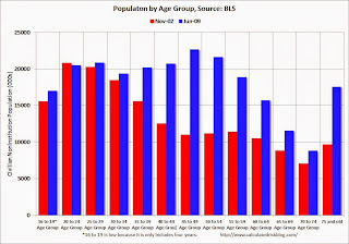
 Here is a quick look at demographics: This graph shows the population in each 5 year age group in November 1982 (red) and June 2009 (blue). This is the start of each recovery. Note: Not Seasonally Adjusted, Source: BLS.
In November 1982 (red), the two largest groups were in the "20 to 24" and "25 to 29" age groups. These people were just entering the prime working age! Is anyone surprised there was an increase in the overall participation rate during the '80s?
In June 2009 (blue), the two largest groups were in the "45 to 49" and "50 to 54" age groups . The older group was moving into a lower participation age group. And look at all those people in the 75+ group in 2009! That is good news - people are living longer - but most of these people are not participating in the labor force (the 75+ participation rate was 8.3% in April 2014).
And there are other long term demographic trends. As an example, in November 1982, 54.7% of the "16 to 19" age group participated in the labor force, and in 2009, only 38.5% participated (this is a long term trend and is mostly because more young people are staying in school - more good news).
So just ignore this graph. It is a Graph Fail!.
Note: The 1981 recession was primarily caused by then Fed Chairman Paul Volcker tightening monetary policy to fight inflation, and the recovery was directly related to the Fed easing policy. The 2007 recession was a direct result of the housing bubble and bust, and resulting financial crisis (all research shows recoveries from financial crisis are very difficult).
Sunday, May 25, 2014
Vehicle Sales Forecasts: Over 16 Million SAAR in May
by Calculated Risk on 5/25/2014 03:13:00 PM
The automakers will report May vehicle sales on Tuesday, June 3rd. Sales in April were close to 16.0 million on a seasonally adjusted annual rate basis (SAAR), and it appears sales in May will be above 16 million (SAAR).
Here are a few forecasts:
From WardsAuto: May Sales to Continue Upward Trend
A new WardsAuto forecast calls for U.S. light-vehicle deliveries to best April’s strong showing, with modest increases to incentives and a full post-holiday sales week on the calendar boosting the retail outlook. ... The projected 16.1 million-unit seasonally adjusted annual rate would be slightly higher than [in April].From J.D. Power: J.D. Power and LMC Automotive Report: May New-Vehicle Retail Sales Continue Growth Trend; Strong Memorial Day Weekend Expected
The strong retail performance is expected to lift total light-vehicle sales to 1.5 million units in May 2014 ... [16.1 million SAAR]
From TrueCar: May SAAR to Hit 16.1 Million Vehicles, According to TrueCar; 2014 New Vehicle Sales Expected to be up 5.5 Percent Year-Over-Year
Seasonally Adjusted Annualized Rate ("SAAR") of 16.1 million new vehicle sales is up 6 percent from May 2013 and up 1.1 percent over April 2014.The sales growth rate will probably slow this year and auto sales will contribute less to GDP growth in 2014 than the previous four years. Here is a table showing annual sales and the growth rate since 2000.
| Light Vehicle Sales | ||
|---|---|---|
| Sales (millions) | Annual Change | |
| 2000 | 17.4 | 2.7% |
| 2001 | 17.1 | -1.3% |
| 2002 | 16.8 | -1.8% |
| 2003 | 16.6 | -1.1% |
| 2004 | 16.9 | 1.4% |
| 2005 | 16.9 | 0.5% |
| 2006 | 16.5 | -2.6% |
| 2007 | 16.1 | -2.5% |
| 2008 | 13.2 | -18.0% |
| 2009 | 10.4 | -21.2% |
| 2010 | 11.6 | 11.1% |
| 2011 | 12.7 | 10.2% |
| 2012 | 14.4 | 13.4% |
| 2013 | 15.5 | 7.6% |
| 20141 | 16.1 | 3% |
| 1LMC Automotive Forecast | ||
Unofficial Problem Bank list declines to 499 Institutions
by Calculated Risk on 5/25/2014 09:30:00 AM
This is an unofficial list of Problem Banks compiled only from public sources.
Here is the unofficial problem bank list for May 23, 2014.
Changes and comments from surferdude808:
Three removals this week lower the Unofficial Problem Bank List to 499 institutions with assets of $154.9 billion. A year ago the list held 767 institutions with assets of $283.7 billion.CR Note: The first unofficial problem bank list was published in August 2009 with 389 institutions. The list peaked at 1,002 institutions on June 10, 2011, and is now down to 499 (just under half the peak).
Actions were terminated against First Bank, Creve Coeur, MO ($5.8 billion) and Parke Bank, Sewell, NJ ($794 million Ticker: PKBK). Somewhat surprisingly in front of the Memorial Day holiday, the FDIC closed Columbia Savings Bank, Cincinnati, OH ($38 million), which had been operating under a formal enforcement action since 2007. The failure is the eight this year compared to 13 failures at the 20th week last year.
Next week the FDIC is expected to release its enforcement action activity through April and release industry results and an updated Official Problem Bank List as of the first quarter.
Saturday, May 24, 2014
DOT: Vehicle Miles Driven increased 0.2% year-over-year in March
by Calculated Risk on 5/24/2014 03:04:00 PM
The Department of Transportation (DOT) reported:
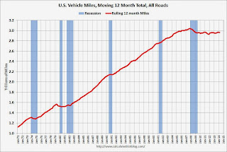
Travel on all roads and streets changed by 0.2% (0.5 billion vehicle miles) for March 2014 as compared with March 2013.The following graph shows the rolling 12 month total vehicle miles driven.
Travel for the month is estimated to be 249.1 billion vehicle miles.
Cumulative Travel for 2014 changed by -0.6% (-4.2 billion vehicle miles).
The rolling 12 month total is still mostly moving sideways ...
 Click on graph for larger image.
In the early '80s, miles driven (rolling 12 months) stayed below the previous peak for 39 months.
Currently miles driven has been below the previous peak for 76 months - 6+ years - and still counting. Currently miles driven (rolling 12 months) are about 2.5% below the previous peak.
The second graph shows the year-over-year change from the same month in the previous year.
 In March 2014, gasoline averaged of $3.61 per gallon according to the EIA. That was down from March 2013 when prices averaged $3.78 per gallon. Note: In April, gasoline prices were higher in 2014 than in 2013 - and miles driven might be down again for April.
Of course gasoline prices are just part of the story. The lack of growth in miles driven over the last 6+ years is probably also due to the lingering effects of the great recession (high unemployment rate and lack of wage growth), the aging of the overall population (over 55 drivers drive fewer miles) and changing driving habits of young drivers.
With all these factors, it might take a few more years before we see a new peak in miles driven.
Schedule for Week of May 25th
by Calculated Risk on 5/24/2014 08:30:00 AM
The key reports this week are the 2nd estimate of Q1 GDP on Thursday, April Personal Income and Outlays on Friday, and March Case-Shiller house prices on Tuesday.
For manufacturing, the May Richmond and Kansas City Fed surveys will be released.
The FDIC Q1 Quarterly Banking Report is expected to be released during the week.
All US markets will be closed in observance of Memorial Day.
8:30 AM: Durable Goods Orders for April from the Census Bureau. The consensus is for a 0.8% decrease in durable goods orders.
9:00 AM: FHFA House Price Index for March. This was original a GSE only repeat sales, however there is also an expanded index. The consensus is for a 0.5% increase.
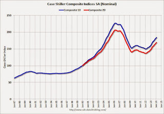
 9:00 AM: S&P/Case-Shiller House Price Index for March. Although this is the March report, it is really a 3 month average of January, February and March.
 This graph shows the nominal seasonally adjusted Composite 10 and Composite 20 indexes through February 2014 (the Composite 20 was started in January 2000).
The consensus is for a 11.9% year-over-year increase in the Composite 20 index (NSA) for March. The Zillow forecast is for the Composite 20 to increase 11.9% year-over-year, and for prices to increase 0.8% month-to-month seasonally adjusted.
10:00 AM: Conference Board's consumer confidence index for May. The consensus is for the index to increase to 83.0 from 82.3.
10:00 AM: Richmond Fed Survey of Manufacturing Activity for May. The consensus is for a reading of 9, up from 7 in April.
10:30 AM: Dallas Fed Manufacturing Survey for May. This is the last of the regional Fed manufacturing surveys for May.
7:00 AM: The Mortgage Bankers Association (MBA) will release the results for the mortgage purchase applications index.
8:30 AM: The initial weekly unemployment claims report will be released. The consensus is for claims to decrease to 317 thousand from 326 thousand.
8:30 AM: Q1 GDP (second estimate). This is the second estimate of Q1 GDP from the BEA. The consensus is that real GDP decreased 0.6% annualized in Q1, revised down from the advance estimate of a 0.1% increase.
10:00 AM ET: Pending Home Sales Index for April. The consensus is for a 1% increase in the index.
8:30 AM: Personal Income and Outlays for April. The consensus is for a 0.3% increase in personal income, and for a 0.2% increase in personal spending. And for the Core PCE price index to increase 0.2%.
9:45 AM: Chicago Purchasing Managers Index for May. The consensus is for a decrease to 61.0, down from 63.0 in April.
9:55 AM: Reuter's/University of Michigan's Consumer sentiment index (final for May). The consensus is for a reading of 82.5, up from the preliminary reading of 81.8, but down from the April reading of 84.1.


