by Calculated Risk on 8/02/2013 01:39:00 PM
Friday, August 02, 2013
Personal Income increased 0.3% in June, Spending increased 0.5%
The BEA released the Personal Income and Outlays report for June:
Personal income increased $45.4 billion, or 0.3 percent ... in June, according to the Bureau of Economic Analysis. Personal consumption expenditures (PCE) increased $59.4 billion, or 0.5 percent.Core PCE increased at a 2.6% annual rate in June, but only a 1.2% annual rate in Q2.
...
Real PCE -- PCE adjusted to remove price changes -- increased 0.1 percent in June, the same increase as in May. ... The price index for PCE increased 0.4 percent in June, compared with an increase of 0.1 percent in May. The PCE price index, excluding food and energy, increased 0.2 percent, compared with an increase of 0.1 percent.
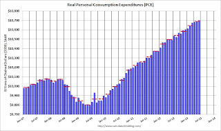
The following graph shows real Personal Consumption Expenditures (PCE) through June (2009 dollars). Note that the y-axis doesn't start at zero to better show the change.
 Click on graph for larger image.
The dashed red lines are the quarterly levels for real PCE.
Real PCE increased at a 1.8% annual rate in Q2.
Note: This includes the comprehensive revisions and the change to 2009 dollars.
This is interesting! With the comprehensive revisions, personal income less transfer payments had returned to the pre-recession level. Note: The following graph constructed as a percent of the peak. This shows when the real personal income less transfer payments bottomed - and when the indicator returned to the level of the previous peak. If the indicator is at a new peak, the value is 100%.
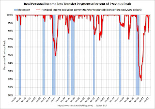 This graph shows real personal income less transfer payments as a percent of the previous peak through the June report.
Before the revisions, this measure was off 11.2% at the trough in October 2009. With the revisions, this indicator was "only" off 8.2% at the worst point (the recession wasn't as bad as originally reported).
Real personal income less transfer payments surged in December due to a one time surge in income as some high income earners accelerated earnings to avoid higher taxes in 2013 (I've left December out going forward). Real personal income less transfer payments declined sharply in January (as expected), and are now close to the pre-recession peak..
Employment Report: Steady, but Slow Improvement
by Calculated Risk on 8/02/2013 11:21:00 AM
If we look at the year-over-year change in employment - to minimize the monthly volatility - total nonfarm employment is up 2.276 million from July 2012, and private employment is up 2.315 million. That is essentially the same year-over-year gain as in June (2.267 million total, 2.331 million private year-over-year in June). Steady, but not strong, job growth.
Hourly wages declined slightly in July, but are up 1.9% year-over-year. Hourly wages were up 2.1% year-over-year in June.
In July, average hourly earnings for all employees on private nonfarm payrolls edged down by 2 cents to $23.98, following a 10-cent increase in June. Over the year, average hourly earnings have risen by 44 cents, or 1.9 percent.The decline in the unemployment rate to 7.4% from 7.6% in June was due to a larger increase in employment in the household survey (227,000 increase in jobs) combined with a decline in the participation rate (not good news). If the participation rate had held steady, the unemployment rate would have declined to 7.5% instead of 7.4%.
In general this report was more of the same - steady but slow improvement.
A few more graphs ...
Employment-Population Ratio, 25 to 54 years old
 Click on graph for larger image.
Since the participation rate declined recently due to cyclical (recession) and demographic (aging population) reasons, an important graph is the employment-population ratio for the key working age group: 25 to 54 years old.
In the earlier period the employment-population ratio for this group was trending up as women joined the labor force. The ratio has been mostly moving sideways since the early '90s, with ups and downs related to the business cycle.
The ratio was unchanged at 75.9% in July. This ratio should probably move close to 80% as the economy recovers.
The participation rate for this group was also unchanged at 81.1% in July. The decline in the participation rate for this age group is probably mostly due to economic weakness (as opposed to demographics) and this suggests the labor market is still very weak.
Percent Job Losses During Recessions

This graph shows the job losses from the start of the employment recession, in percentage terms - this time aligned at maximum job losses. At the recent pace of improvement, it appears employment will be back to pre-recession levels next year (Of course this doesn't include population growth).
In the earlier post, the graph showed the job losses aligned at the start of the employment recession.
This financial crisis recession was much deeper than other post WWII recessions, and the recovery has been slower (the recovery from the 2001 recession was slow too). However, if we compare to other financial crisis recoveries, this recovery has actually been better than most.
Part Time for Economic Reasons
 From the BLS report:
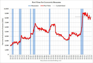
The number of persons employed part time for economic reasons (sometimes referred to as involuntary part-time workers) was essentially unchanged at 8.2 million in July. These individuals were working part time because their hours had been cut back or because they were unable to find a full-time job.The number of part time workers increased in July to 8.245 million.
These workers are included in the alternate measure of labor underutilization (U-6) that decreased to 14.0% in July from 14.3% in June.
Unemployed over 26 Weeks
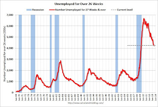 This graph shows the number of workers unemployed for 27 weeks or more.
 According to the BLS, there are 4.246 million workers who have been unemployed for more than 26 weeks and still want a job. This was down from 4.328 million in June and is at the lowest level since May 2009. This is trending down, but is still very high. Long term unemployment remains one of the key labor problems in the US.
State and Local Government
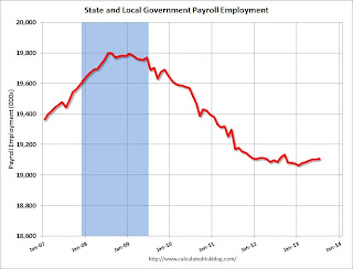 This graph shows total state and government payroll employment since January 2007. State and local governments lost jobs for four straight years. (Note: Scale doesn't start at zero to better show the change.)
 In July 2013, state and local governments added 3,000 jobs, and state and local employment is up 31 thousand so far in 2013.
I think most of the state and local government layoffs are over. Of course Federal government layoffs are ongoing - and with many more layoffs expected.
Overall this was a tepid report - especially with the downward revisions to May and June employment and the slight decline in hourly wages. The labor market is still weak and millions of people are unemployed or underemployed.
July Employment Report: 162,000 Jobs, 7.4% Unemployment Rate
by Calculated Risk on 8/02/2013 08:30:00 AM
From the BLS:
Total nonfarm payroll employment increased by 162,000 in July, and the unemployment rate edged down to 7.4 percent, the U.S. Bureau of Labor Statistics reported today. ...The headline number was below expectations of 175,000 payroll jobs added. Employment for May and June were also revised lower.
...
The change in total nonfarm payroll employment for May was revised from +195,000 to +176,000, and the change for June was revised from +195,000 to +188,000. With these revisions, employment gains in May and June combined were 26,000 less than previously reported.
 Click on graph for larger image.
NOTE: This graph is ex-Census meaning the impact of the decennial Census temporary hires and layoffs is removed to show the underlying payroll changes.
The second graph shows the unemployment rate.
The unemployment rate declined in July to 7.4% from 7.6% in June.
 This is the lowest level for the unemployment rate since November 2008.
The unemployment rate is from the household report and the household report showed a larger increase in employment than the establishment report, and that combined with a decline in the participation rate meant a lower unemployment rate.
The third graph shows the employment population ratio and the participation rate.
The Labor Force Participation Rate decreased to 63.4% in July (blue line) from 63.5% in June. This is the percentage of the working age population in the labor force.
 The participation rate is well below the 66% to 67% rate that was normal over the last 20 years, although a significant portion of the recent decline is due to demographics.
The Employment-Population ratio was unchanged in July at 58.7% (black line). I'll post the 25 to 54 age group employment-population ratio graph later.
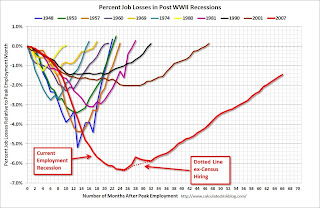 The fourth graph shows the job losses from the start of the employment recession, in percentage terms, compared to previous post WWII recessions. The dotted line is ex-Census hiring.
This shows the depth of the recent employment recession - worse than any other post-war recession - and the relatively slow recovery due to the lingering effects of the housing bust and financial crisis.
This was below expectations. I'll have much more later ...
Thursday, August 01, 2013
Friday: Jobs, Jobs, Jobs
by Calculated Risk on 8/01/2013 09:16:00 PM
From economist Sven Jari Stehn at Goldman Sachs on the employment report:
We expect a 200,000 gain in nonfarm payrolls in July (a bit above consensus), as well as a decline in the unemployment rate to 7.5% (in line with consensus). As far as payrolls are concerned, our forecast would be in line with the 3-, 6- and 12-month moving average.Thursday:
The reason for expecting another strong report is that a number of labor market indicators released for July so far have been encouraging, including manufacturing survey employment indices, consumers' assessment of job availability and the ADP report. Other indicators are sending no clear directional signal relative to June, including jobless claims, online advertising and the effects of the sequester on payrolls.
We expect another small effect of the sequester on employment. Our best guess is a sequester impact of around 5,000-10,000 in the federal government, which might bring the overall reduction in federal payrolls to 10,000-15,000.
• At 8:30 AM ET, the Employment Report for July. The consensus is for an increase of 175,000 non-farm payroll jobs in July; the economy added 195,000 non-farm payroll jobs in June. The consensus is for the unemployment rate to decrease to 7.5% in July from 7.6% in June.
• Also at 8:30 AM, Personal Income and Outlays for June. The consensus is for a 0.4% increase in personal income in June, and for a 0.4% increase in personal spending.
• At 10:00 AM, the Manufacturers' Shipments, Inventories and Orders (Factory Orders) for June. The consensus is for a 2.3% increase in orders.
Employment Situation Preview
by Calculated Risk on 8/01/2013 05:49:00 PM
Tomorrow at 8:30 AM ET, the BLS will release the employment report for July. The consensus is for an increase of 175,000 non-farm payroll jobs in July, and for the unemployment rate to decline to 7.5% from 7.6% in June.
Here is a summary of recent data:
• The ADP employment report showed an increase of 200,000 private sector payroll jobs in July. This was above expectations of 179,000 private sector payroll jobs added. The ADP report hasn't been very useful in predicting the BLS report for any one month, but in general, this suggests employment growth somewhat above expectations.
• The ISM manufacturing employment index increased in July to 54.4% from 48.7% in June. A historical correlation between the ISM manufacturing employment index and the BLS employment report for manufacturing, suggests that private sector BLS reported payroll jobs for manufacturing increased by close to 5,000 in July. However the ADP report indicated a loss of 5,000 manufacturing jobs in July.
The ISM non-manufacturing (service) employment index will be released next Monday.
• Initial weekly unemployment claims averaged about 341,000 in July. This was down slightly from 345,000 in June, and near the low for the year.
For the BLS reference week (includes the 12th of the month), initial claims were at 336,000; down from 355,000 in June.
• The final July Reuters / University of Michigan consumer sentiment index increased to 85.1, up from the June reading of 84.1. This is frequently coincident with changes in the labor market, but also strongly related to gasoline prices and other factors.
• And on the unemployment rate from Gallup: More Americans working part-time vs. a year ago, but no growth in full-time jobs
Gallup's unadjusted unemployment rate for the U.S. workforce is 7.8% in July, unchanged from June (7.8%), but down from 8.2% in July 2012.Note: So far the Gallup numbers haven't been very useful in predicting the BLS unemployment rate.
Gallup's seasonally adjusted U.S. unemployment rate for July is 7.4%, a slight decline from 7.6% in June.
• Conclusion: The employment related data was slightly better in July than in June when the BLS reported 195,000 jobs added. Both the ADP employment and ISM manufacturing reports suggest an increase in hiring. Also weekly claims for the reference week were lower in July than in June, and consumer sentiment increased slightly.
There is always some randomness to the employment report, but my guess is the BLS will report above the consensus of 175,000 jobs added in July. A key will be the unemployment rate (and participation rate) to see if unemployment is tracking the Fed's forecast for QE3 tapering.


