by Calculated Risk on 7/02/2013 11:14:00 AM
Tuesday, July 02, 2013
Existing Home Inventory is up 16.7% year-to-date on July 1st
Weekly Update: One of key questions for 2013 is Will Housing inventory bottom this year?. Since this is a very important question, I'm tracking inventory weekly in 2013.
There is a clear seasonal pattern for inventory, with the low point for inventory in late December or early January, and then peaking in mid-to-late summer.
The Realtor (NAR) data is monthly and released with a lag (the most recent data was for May). However Ben at Housing Tracker (Department of Numbers) has provided me some weekly inventory data for the last several years. This is displayed on the graph below as a percentage change from the first week of the year (to normalize the data).
In 2010 (blue), inventory increased more than the normal seasonal pattern, and finished the year up 7%. However in 2011 and 2012, there was only a small increase in inventory early in the year, followed by a sharp decline for the rest of the year.
 Click on graph for larger image.
Note: the data is a little weird for early 2011 (spikes down briefly).
So far in 2013, inventory is up 16.7%, and I expect further increases over the next few months.
Inventory is well above the peak percentage increases for 2011 and 2012 and this suggests to me that inventory is near the bottom. It now seems likely - at least by this measure - that inventory bottomed early this year.
It is important to remember that inventory is still very low, and is down 11.9% from the same week last year according to Housing Tracker. Once inventory starts to increase (more than seasonal), I expect price increases to slow.
CoreLogic: House Prices up 12.2% Year-over-year in May
by Calculated Risk on 7/02/2013 08:55:00 AM
Notes: This CoreLogic House Price Index report is for May. The recent Case-Shiller index release was for April. The CoreLogic HPI is a three month weighted average and is not seasonally adjusted (NSA).
From CoreLogic: CoreLogic Report Shows Home Prices Rise by 12.2 Percent Year Over Year in May
Home prices nationwide, including distressed sales, increased 12.2 percent on a year-over-year basis in May 2013 compared to May 2012. This change represents the biggest year-over-year increase since February 2006 and the 15th consecutive monthly increase in home prices nationally. On a month-over-month basis, including distressed sales, home prices increased by 2.6 percent in May 2013 compared to April 2013.
Excluding distressed sales, home prices increased on a year-over-year basis by 11.6 percent in May 2013 compared to May 2012. On a month-over-month basis, excluding distressed sales, home prices increased 2.3 percent in May 2013 compared to April 2013. Distressed sales include short sales and real estate owned (REO) transactions.
The CoreLogic Pending HPI indicates that June 2013 home prices, including distressed sales, are expected to rise by 13.2 percent on a year-over-year basis from June 2012 and rise by 2.9 percent on a month-over-month basis from May 2013. Excluding distressed sales, June 2013 home prices are poised to rise 12 percent year over year from June 2012 and by 2 percent month over month from May 2013.
...
“It’s been more than seven years since the housing market last experienced the increases that we saw in May, with indications that the summer months will continue to see significant gains,” said Dr. Mark Fleming, chief economist for CoreLogic. “As we approach the half-way point of 2013, home prices continue to respond positively to the reductions in home inventory thus far.”
 Click on graph for larger image.
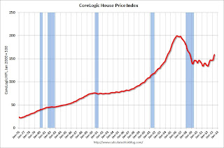
 This graph shows the national CoreLogic HPI data since 1976. January 2000 = 100.
The index was up 2.6% in May, and is up 12.2% over the last year. This index is not seasonally adjusted, and this is usually the strongest time of the year for price increases.
The index is off 21% from the peak - and is up 18.7% from the post-bubble low set in February 2012.
 The second graph is from CoreLogic. The year-over-year comparison has been positive for fifteen consecutive months suggesting house prices bottomed early in 2012 on a national basis (the bump in 2010 was related to the tax credit).
This is the largest year-over-year increase since 2006.
This was another very strong month-to-month increase. Note: CoreLogic notes that prices are up year-over-year in all 50 states excluding distressed sales, and up in 97 of the 100 largest metro areas: "Of the top 100 Core Based Statistical Areas (CBSAs) measured by population, 97 were showing year-over-year increases in May, up from 94 in April 2013."
Monday, July 01, 2013
Tuesday: June Auto Sales
by Calculated Risk on 7/01/2013 09:00:00 PM
More grim news from Europe: Joblessness Edges Higher To Hit a Euro Zone Record
Unemployment in the euro zone continued its steady rise in May ... The jobless rate in the 17 countries that belong to the euro zone was 12.1 percent in May, adjusting for seasonal effects, according to a report from Eurostat, the European Union statistics agency. That figure compared with 12 percent in April ...That is the "good news"? Oh my ... epic failure. Here is the Eurostat unemployment data.
Joblessness in the euro zone has been rising almost without interruption since early 2008, when the financial crisis began, declining only briefly at the beginning of 2011. And analysts see little prospect for a sustained decline anytime soon ... Unemployment rates in Spain and Greece were about 27 percent in May, with youth unemployment remaining well above 50 percent. ... If there was any good news, economists said, it was that unemployment may not go up much more.
Tuesday:
• All day: Light vehicle sales for June. The consensus is for light vehicle sales to increase to 15.5 million SAAR in June (Seasonally Adjusted Annual Rate) from 15.3 million SAAR in May.
• At 10:00 AM, the Manufacturers' Shipments, Inventories and Orders (Factory Orders) for May. The consensus is for a 2.0% increase in orders.
Deutsche Bank: Pace of Construction Hiring to increase in 2nd Half of 2013
by Calculated Risk on 7/01/2013 04:21:00 PM
From the Financial Times: US construction hiring poised to explode (says Deutsche)
[A]ccording to economists at Deutsche Bank ... if the volume of housing starts accelerate as they expect, construction industry will need about 300,000 new workers in the second half of the year.Earlier articles on construction employment:
excerpt with permission
• From Michelle Meyer at Merrill Lynch: Construction Coming Back
• From Kris Dawsey and Hui Shan at Goldman Sachs: Housing Sector Jobs Poised for a Comeback
• From Jed Kolko at Trulia: Here are the “Missing” Construction Jobs
• From Professor Tim Duy at EconomistsView: Employment Report Nothing If Not Consistent
 This graph shows total construction employment as reported by the BLS (not just residential).
Since construction employment bottomed in January 2011, construction payrolls have increased by 369 thousand. Historically there is a lag between an increase in activity and more hiring - and it appears hiring should pickup significant in the 2nd half of 2013 (Merrill estimates 20 thousand construction jobs per month will be added this year, Goldman estimates 25 to 30 thousand jobs per month, Deutsche Bank around 50 thousand jobs per month in the 2nd half).
Update: Recovery Measures
by Calculated Risk on 7/01/2013 01:31:00 PM
By request, here is an update to four key indicators used by the NBER for business cycle dating: GDP, Employment, Industrial production and real personal income less transfer payments.
Note: The following graphs are all constructed as a percent of the peak in each indicator. This shows when the indicator has bottomed - and when the indicator has returned to the level of the previous peak. If the indicator is at a new peak, the value is 100%.
These graphs show that most major indicators are still below the pre-recession peaks.
 Click on graph for larger image.
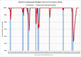
This graph is for real GDP through Q1 2013.
Real GDP returned to the pre-recession peak in Q4 2011, and has hit new post-recession highs for six consecutive quarters.
At the worst point - in Q2 2009 - real GDP was off 4.7% from the 2007 peak.
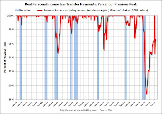
 This graph shows real personal income less transfer payments as a percent of the previous peak through the May report.
This measure was off 11.2% at the trough in October 2009.
Real personal income less transfer payments returned to the pre-recession peak in December, but that was due to a one time surge in income as some high income earners accelerated earnings to avoid higher taxes in 2013. Real personal income less transfer payments declined sharply in January (as expected), and were still 3.3% below the previous peak in May.
Real personal income less transfer payments will probably be the last major indicator to return to pre-recession levels (excluding the spike last December).
 The third graph is for industrial production through May 2013 - although production growth has slowed recently.
Industrial production was off over 17% at the trough in June 2009, and has been one of the stronger performing sectors during the recovery.
However industrial production is still 2.1% below the pre-recession peak. This indicator might return to the pre-recession peak in late 2013 or in 2014.
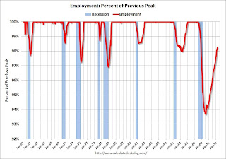
 The final graph is for employment and is through May 2013. This is similar to the graph I post every month comparing percent payroll jobs lost in several recessions.
Payroll employment is still 1.8% below the pre-recession peak and will probably be back to pre-recession levels in 2014.
All of these indicators collapsed in 2008 and early 2009, and only real GDP is back to the pre-recession peak (personal income returned to the previous peak in December due to a one time increase in income).


