by Calculated Risk on 9/20/2012 05:49:00 PM
Thursday, September 20, 2012
Lawler: ACS 2011: Big Shift to Rental Market
CR Note: This is a fairly long technical piece. These are just excerpts. The complete article is here.
From housing economist Tom Lawler: ACS 2011: Big Shift to Rental Market; Gross Vacancy Rate Virtually Unchanged Despite Drop in Vacant Homes for Rent and For Sale; Household “Estimate” Shockingly Low
The Census Bureau released it ACS 2011 one-year estimates, and for housing folks the data were in some cases interesting and in other cases quite puzzling. ...
A few things jump out: first, the ACS estimate for occupied housing units increased by just 424,306 in 2011, and at 114.992 million was 1.724 million lower than the “official” Census household count on April 1, 2010. Second, the ACS’ estimate of the gross vacancy rate in 2011 was virtually unchanged from 2010, despite a decline in the number of homes for rent or for sale. The reason was an increase in both housing units for seasonal/recreational/occasional use (up 181,000) and an increase in “other” – homes vacant and held of the market for unknown reasons (in the above I included “usual residence elsewhere” and migrant workers” in “other” to be consistent with the other measures.)
Third, the ACS homeownership rate fell from 65.4% in 2010 to 64.6% in 2011, which is a full 1.5 percentage points lower than the HVS.
In terms of the jump in the ACS’ estimate of the number of renters in 2011 vs. 2010, almost half of the 1.033 million increase reflected a jump in the number of householders renting SF detached homes. The ACS estimate of the percent of the occupied SF detached home market that was occupied by renters for 2011 was 15.7%, up from 15.1% in 2010 and 13.1% in 2006. The renter-share of the occupied SF detached housing market increased by over three percentage points from 2006 to 2011 in eleven states plus DC, with the biggest increases coming in Nevada, Arizona, Oregon, and California. (The full list is Arizona, California, Colorado, DC, Florida, Georgia, Michigan, Nevada, Ohio, Oregon, Utah, and Washington.)
...
what is a reasonable assumption to make about the increase in US households in 2011, much less so far in 2012? HVS and ACS data suggest very slow growth in 2011, but neither has been consistent with decennial Census results, and HVS data suggest only a modest pickup in 2012. CPS/ASEC data, in contrast, suggest much faster growth in households since early 2010, but CPS/ASEC data are not consistent with decennial Census data either!
Gosh, it’s no wonder there’s so much confusion on the US housing outlook!
CR Note: This was an excerpt from an article by Tom Lawler.
The Trillion Dollar Bear
by Calculated Risk on 9/20/2012 03:10:00 PM
Memories ... some new readers might not realize that once upon a time I was one of the most bearish analysts around.
The Flow of Funds report today showed that household mortgage debt has declined by more than $1 trillion following the housing bust (see previous post). Most of that decline is due to defaults (as opposed to homeowners paying down debt). And that reminds me of a post I wrote almost 5 years ago.
From the WSJ in December 2007: How High Will Subprime Losses Go?
The global race is on to find the best phrase to describe the housing and credit mess. The U.K.’s Telegraph quotes an economist who says it “could make 1929 look like a walk in the park” if central banks don’t solve the crisis in a matter of weeks.Many people thought I was crazy.
The report cites the recent prediction from Barclays Capital that losses from the subprime-mortgage meltdown could hit $700 billion. That would top Merrill Lynch’s recent estimate of $500 billion. The Australian newspaper notes that a $700 billion “bloodbath” — potentially leading the U.S. economy into “the blackest year since the Great Depression” — would top the GDPs of all but 15 nations.
Back in the U.S., the Calculated Risk blog sidestepped the colorful language and went straight for the big number: “The losses for the lenders and investors might well be over $1 trillion.”
And if you look at the post the WSJ referenced, the first paragraph starts: "Within the next couple of years, probably somewhere between 10 million and 20 million U.S. homeowners will owe more on their homes, than their homes are worth."
I was a grizzly bear!
Fed's Q2 Flow of Funds: Household Mortgage Debt down $1 Trillion from Peak
by Calculated Risk on 9/20/2012 12:00:00 PM
The Federal Reserve released the Q2 2012 Flow of Funds report today: Flow of Funds.
According to the Fed, household net worth declined slightly in Q2 compared to Q1 2011. Net worth peaked at $67.4 trillion in Q3 2007, and then net worth fell to $51.2 trillion in Q1 2009 (a loss of $16.2 trillion). Household net worth was at $62.7 trillion in Q2 2012 (up $11.5 trillion from the trough, but still down $4.7 trillion from the peak).
The Fed estimated that the value of household real estate increased $353 billion to $16.9 trillion in Q2 2012. The value of household real estate is still $5.9 trillion below the peak.
 Click on graph for larger image.
This is the Households and Nonprofit net worth as a percent of GDP.
This includes real estate and financial assets (stocks, bonds, pension reserves, deposits, etc) net of liabilities (mostly mortgages). Note that this does NOT include public debt obligations.
This ratio was relatively stable for almost 50 years, and then we saw the stock market and housing bubbles. The ratio decreased a little in Q2.
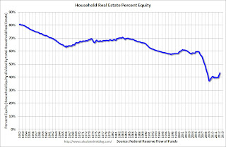
 This graph shows homeowner percent equity since 1952.
Household percent equity (as measured by the Fed) collapsed when house prices fell sharply in 2007 and 2008.
In Q2 2012, household percent equity (of household real estate) was at 43.1% - up from Q1, and the highest since Q2 2008. This was because of a small increase in house prices in Q2 (the Fed uses CoreLogic) and a reduction in mortgage debt.
Note: about 30.3% of owner occupied households had no mortgage debt as of April 2010. So the approximately 52+ million households with mortgages have far less than 43.1% equity - and over 10 million have negative equity.
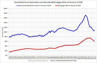
 The third graph shows household real estate assets and mortgage debt as a percent of GDP.
Mortgage debt declined by $51 billion in Q2. Mortgage debt has now declined by $1.05 trillion from the peak. Studies suggest most of the decline in debt has been because of foreclosures (or short sales), but some of the decline is from homeowners paying down debt (sometimes so they can refinance at better rates).
The value of real estate, as a percent of GDP, was up slightly in Q2 (as house prices increased), but is still near the lows of the last 30 years. However household mortgage debt, as a percent of GDP, is still historically very high, suggesting more deleveraging ahead for households.
Philly Fed "Region’s manufacturing sector has steadied"
by Calculated Risk on 9/20/2012 10:00:00 AM
The Philly Fed manufacturing index showed slight contraction in September. From the Philly Fed: September Manufacturing Survey
Firms responding to the September Business Outlook Survey reported nearly flat business activity this month. The survey’s indicators for general activity and new orders both improved from last month but recorded levels near zero. Firms reported continuing declines in shipments, employment, and hours worked. Indicators for the firms’ expectations over the next six months, however, improved notably this month, although the same firms forecast continued deceleration in production growth in the fourth quarter.
The survey’s broadest measure of manufacturing conditions, the diffusion index of current activity, increased 5 points, to a reading of ‐1.9. Although this marks the fifth consecutive negative reading for the index, the index has been edging nearer to zero over the last three months.
Labor market conditions at the reporting firms remained weak this month. The current employment index, at ‐7.3, was little changed from its reading in July and August.
 Click on graph for larger image.
Here is a graph comparing the regional Fed surveys and the ISM manufacturing index. The dashed green line is an average of the NY Fed (Empire State) and Philly Fed surveys through September. The ISM and total Fed surveys are through August.
The average of the Empire State and Philly Fed surveys increased slightly in September, and has remained negative for four consecutive months. This suggests another weak reading for the ISM manufacturing index.
Weekly Initial Unemployment Claims at 382,000
by Calculated Risk on 9/20/2012 08:30:00 AM
The DOL reports:
In the week ending September 15, the advance figure for seasonally adjusted initial claims was 382,000, a decrease of 3,000 from the previous week's revised figure of 385,000. The 4-week moving average was 377,750, an increase of 2,000 from the previous week's revised average of 375,750.The previous week was revised up from 382,000.
The following graph shows the 4-week moving average of weekly claims since January 2000.

Click on graph for larger image.
The dashed line on the graph is the current 4-week average. The four-week average of weekly unemployment claims increased to 377,750.
This was above the consensus forecast of 373,000.

And here is a long term graph of weekly claims:
Mostly moving sideways this year, but moving up recently.


