 RSS Feed
 by Calculated Risk on 10/09/2010 07:27:00 AM
Saturday, October 09, 2010
Unofficial Problem Bank List 877 Institutions
Note: this is an unofficial list of Problem Banks compiled only from public sources.
Here is the unofficial problem bank list for Oct 8, 2010.
Changes and comments from surferdude808:
The number of institutions on the Unofficial Problem Bank List remained unchanged this week at 877 but assets rose slightly from $416.1 billion to $417.3 billon.
Three institutions were removed with one because of action termination -- First National Bank and Trust Company ($296 million), and two others -- First National Bank & Trust Company in Larned ($34 million) and Clear Creek National Bank ($24 million) because they merged into other banks that are on the Unofficial Problem Bank List.
Additions this week include Valley Bank, Roanoke, VA ($763 million Ticker: VYFC); Fullerton Community Bank, FSB, Fullerton, CA ($705 million); and Fort Lee Federal Savings Bank, FSB, Fort Lee, NJ ($75 million), which received about $1.3 million of TARP capital in May 2009.
We anticipate for the OCC to release its actions from mid-August through mid-September next Friday.
Friday, October 08, 2010
Late night Foreclosure-Gate
by Calculated Risk on 10/08/2010 11:36:00 PM
From Dina ElBoghdady at the WaPo: Buyers anxiously await foreclosure deals to go through
From David Streitfeld and Nelson Schwartz at the NY Times: Largest U.S. Bank Halts Foreclosures in All States
Note: the media is in a frenzy about this, but I've hardly mentioned it other than linking to a few articles and posting Tom Lawler's piece about Who will, and who should "pay"?.
Best to all.
Employment posts today (with many graphs):
Daily Show on Foreclosure-Gate
by Calculated Risk on 10/08/2010 07:26:00 PM
While we wait for the FDIC ...
From the Daily Show (link if embed doesn't work) Foreclosure Crisis
| The Daily Show With Jon Stewart | Mon - Thurs 11p / 10c | |||
| Foreclosure Crisis | ||||
| ||||
Impact of estimated Benchmark Revision on Job Losses
by Calculated Risk on 10/08/2010 03:05:00 PM
This morning I mentioned the annual benchmark revision for the employment report - here are some more details, and a graph showing the impact on job losses.
As part of the employment report, the BLS released the preliminary annual benchmark revision of minus 366,000 payroll jobs. This will be finalized next February when the January 2011 employment report is released. Usually the preliminary estimate is pretty close to the final benchmark estimate.
 Click on graph for larger image.
This graph shows the impact of the preliminary benchmark revision on job losses in percentage terms from the start of the employment recession.
The red line on the graph is the current estimate, and the dotted line shows the impact of estimated coming benchmark revision. This puts the current payroll employment about 8.1 million jobs below the pre-recession peak in December 2007.
Using the preliminary benchmark estimate, this means that payroll employment in March 2010 was 366,000 lower than originally estimated. This is slightly larger than a normal adjustment (see table below). So in February 2011, the payroll numbers will be revised down to reflect this estimate. The number is then "wedged back" to the previous revision (March 2009).
For details on the benchmark revision process, see from the BLS: Methodology
"The benchmark adjustment, a standard part of the payroll survey estimation process, is a once-a-year re-anchoring of the sample-based employment estimates to full population counts available principally through unemployment insurance (UI) tax records filed by employers with State Employment Security Agencies."The following table shows the benchmark revisions since 1979.
| Year | Percent difference | Difference in thousands |
|---|---|---|
| 1979 | 0.5 | 447 |
| 1980 | -0.1 | -63 |
| 1981 | -0.4 | -349 |
| 1982 | -0.1 | -113 |
| 1983 | * | 36 |
| 1984 | 0.4 | 353 |
| 1985 | * | -3 |
| 1986 | -0.5 | -467 |
| 1987 | * | -35 |
| 1988 | -0.3 | -326 |
| 1989 | * | 47 |
| 1990 | -0.2 | -229 |
| 1991 | -0.6 | -640 |
| 1992 | -0.1 | -59 |
| 1993 | 0.2 | 263 |
| 1994 | 0.7 | 747 |
| 1995 | 0.5 | 542 |
| 1996 | * | 57 |
| 1997 | 0.4 | 431 |
| 1998 | * | 44 |
| 1999 | 0.2 | 258 |
| 2000 | 0.4 | 468 |
| 2001 | -0.1 | -123 |
| 2002 | -0.2 | -313 |
| 2003 | -0.2 | -122 |
| 2004 | 0.2 | 203 |
| 2005 | -0.1 | -158 |
| 2006 | 0.6 | 752 |
| 2007 | -0.2 | -293 |
| 2008 | -0.1 | -89 |
| 2009 | -0.7 | -902 |
| 2010 | -0.3 | -366 estimate |
Earlier employment posts today (with many graphs):
Unemployment by Level of Education and Employment Diffusion Indexes
by Calculated Risk on 10/08/2010 12:34:00 PM
By request ...
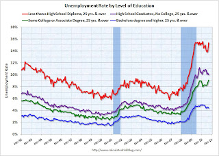 Click on graph for larger image in new window.
This graph shows the unemployment rate by four levels of education (all groups are 25 years and older).
Note that the unemployment rate increased sharply for all four categories in 2008 and into 2009.
Unfortunately this data only goes back to 1992 and only includes one previous recession (the stock / tech bust in 2001). Clearly education matters with regards to the unemployment rate - but education didn't seem to matter as far as the recovery rate in unemployment following the 2001 recession. All four groups recovered slowly.
Earlier this year, the group with "less than a high school diploma" recovered a little better than the more educated groups - possibly because of the tax credit related increase in construction - but that changed in September as the unemployment rate increased sharply.
For the group with some college or an associate degree, the unemployment rate is at a new high for this employment recession.
Diffusion Indexes
This is a little more technical ...
 The BLS diffusion index for total private employment declined to 49.8 from 54.1 in August. For manufacturing, the diffusion index declined to 46.3 from 48.2 in August.
Both indexes are down sharply from earlier this year.
Think of this as a measure of how widespread job gains are across industries. The further from 50 (above or below), the more widespread the job losses or gains reported by the BLS. From the BLS:
Figures are the percent of industries with employment increasing plus one-half of the industries with unchanged employment, where 50 percent indicates an equal balance between industries with increasing and decreasing employment.The increases in the diffusion indexes in 2009 and earlier this year, was a clear positive in the monthly employment reports. However the decrease in the diffusion indexes over the last few months (falling below 50% for both in September), is disappointing.
Earlier employment posts today (with many graphs):


