 RSS Feed
 by Calculated Risk on 5/24/2010 11:25:00 AM
Monday, May 24, 2010
Existing Home Sales: Inventory increases Year-over-Year
Earlier the NAR released the existing home sales data for April; here are a couple more graphs ...
The first graph shows the year-over-year (YoY) change in reported existing home inventory and months-of-supply. Inventory is not seasonally adjusted, so it really helps to look at the YoY change.  Click on graph for larger image in new window.
Inventory increased 2.7% YoY in April, the first YoY increase since 2008.
This increase in the inventory is especially concerning because the reported inventory is already historically very high, and the 8.4 months of supply in April is well above normal. The months of supply will probably decline over the next two months because of the increase in sales due to the tax credit (reported at closing), but this will be something to watch this summer and later this year.
Perhaps this was an especially large surge in inventory as sellers tried to take advantage of the tax credit, but it is also possible that we will see close to double digit months of supply later this year.  The second graph shows NSA monthly existing home sales for 2005 through 2010 (see Red columns for 2010).
Sales (NSA) in April 2010 were 26% higher than in April 2009, and also higher than in April of 2007 and 2008.
We will probably see an increase in sales in May and June - perhaps to the levels of 2006 or 2007 - because of the tax credit, however I expect to see existing home sales below last year in the 2nd half of this year.
I think this was a weak report. Sales were up because of the tax credit (pulling sales forward), but that does very little for the economy. The key is the increase in the inventory and months-of-supply, and if these two measures increase later this year (after the distortions in May and June), then there will be additional downward pressure on house prices.
Existing Home Sales increase in April
by Calculated Risk on 5/24/2010 10:00:00 AM
The NAR reports: Existing-Home Sales Rise
Existing-home sales, which are completed transactions that include single-family, townhomes, condominiums and co-ops, increased 7.6 percent to a seasonally adjusted annual rate of 5.77 million units in April from an upwardly revised 5.36 million in March, and are 22.8 percent higher than the 4.70 million-unit pace in April 2009.
...
Total housing inventory at the end of April rose 11.5 percent to 4.04 million existing homes available for sale, which represents an 8.4-month supply at the current sales pace, up from an 8.1-month supply in March.
 Click on graph for larger image in new window.
This graph shows existing home sales, on a Seasonally Adjusted Annual Rate (SAAR) basis since 1993.
Sales in April 2010 (5.77 million SAAR) were 7% higher than last month, and were 22.8% higher than April 2009 (4.61 million SAAR).
Sales surged last November when many first-time homebuyers rushed to beat the initial expiration of the tax credit. There will probably be a further increase in May and June this year. Note: existing home sales are counted at closing, so even though contracts must be signed in April to qualify for the tax credit, buyers have until June 30th to close.
 The second graph shows nationwide inventory for existing homes.
According to the NAR, inventory increased to 4.04 million in April from 3.63 million in March. The all time record high was 4.57 million homes for sale in July 2008.
Inventory is not seasonally adjusted and there is a clear seasonal pattern - inventory should increase further in the spring. This is an increase from April 2009, and this breaks a streak of 20 consecutive months of year-over-year declines in inventory (I'll have more on inventory).
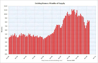 The last graph shows the 'months of supply' metric.
Months of supply increased to 8.4 months in April. A normal market has under 6 months of supply, so this is high - and probably excludes some substantial shadow inventory. And the months of supply will probably increase sharply this summer.
I'll have more later ... the increase in inventory is the big story.
Chicago Fed: Economic Activity increased in April
by Calculated Risk on 5/24/2010 08:30:00 AM
Note: This is a composite index based on a number of economic releases. This shows that growth in April was still slightly below trend (weak for a recovery).
From the Chicago Fed: Index shows economic activity continued to improve in April
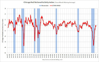
Led by continued improvements in production- and employment-related indicators, the Chicago Fed National Activity Index increased to +0.29 in April, up from +0.13 in March. April marked the highest level of the index since December 2006 and the third time in the past four months that the index indicated above-average economic activity. Three of the four broad categories of indicators that make up the index made positive contributions in April, while the consumption and housing category made the lone negative contribution.
The index’s three-month moving average, CFNAI-MA3, increased to –0.03 in April from –0.09 in March, reaching its highest level since February 2007. April’s CFNAI-MA3 suggests that growth in national economic activity was very near its historical trend. With the index still slightly below trend, there remains some economic slack, suggesting subdued inflationary pressure from economic activity over the coming year.
 Click on table for larger image in new window.
This graph shows the Chicago Fed National Activity Index (three month moving average) since 1967. According to the Chicago Fed:
A zero value for the index indicates that the national economy is expanding at its historical trend rate of growth; negative values indicate below-average growth; and positive values indicate above-average growth.We are now about 10+ months into the recovery, and growth by most indicators is still slightly below trend.
Sunday, May 23, 2010
Sunday Night Futures
by Calculated Risk on 5/23/2010 11:59:00 PM
Note: Here is the weekly summary and a look ahead (with plenty of interesting graphs!). The U.S. futures are off slightly tonight:
From CNBC: Pre-Market Data shows the S&P 500 off about 7 or less than 1%. Dow futures are off about 45 points.
CBOT mini-sized Dow
And the Asian markets are mostly up ... and a graph of the Asian markets.
The Euro is at 1.25 dollars (off slightly). Some other sources for exchange rates and NetDania.
Best to all.
States: U-6 Unemployment Rate vs. Mortgage Delinquency Rate
by Calculated Risk on 5/23/2010 07:01:00 PM
Note: Earlier post is weekly summary and a look ahead (with plenty of interesting graphs!)
By request here is a scatter graph comparing the Q1 2010 delinquency rate for mortgage loans (including all loans in foreclosure) vs. the U-6 unemployment rate for all states. U-6 is available on a rolling four quarters basis from the BLS - and this is the 'Second Quarter of 2009 through First Quarter of 2010 Averages' data. (ht Keith for the data).
Note: The U-6 unemployment rate includes "total unemployed, plus all marginally attached workers, plus total employed part time for economic reasons, as a percent of the civilian labor force plus all marginally attached workers." Click on graph for larger image in new window.
Ht Jeff to the labels!
The graph is pretty similar to the U-3 vs delinquency rate graph. R2 is higher using U-3 (0.52) than using U-6 (0.46), but that might be because of the lag of using a four quarter average.
Once again Florida and Nevada stand out. As I mentioned before, Florida has a high number of delinquencies because of state specific foreclosure laws - it takes forever to foreclose. The delinquency rate in Nevada is also very high, probably because of the large percentage of homeowners with negative equity. Both states might also have higher than expected delinquency rates because of significant investor activity during the housing bubble.
Another stand out is Oregon with a much higher U-6 than U-3.


