by Calculated Risk on 3/17/2010 11:59:00 PM
Wednesday, March 17, 2010
Previous Business Cycle: "Bad by any measure"
We've seen all the statistics from the aughts - declining employment, declining stock prices, and weak income.
Andrew Flowers, economic research analyst at the Atlanta Fed, points out that decades are arbitrary, and that the previous decade started with a recession and ended with the great recession. He suggests looking at periods as trough-to-trough: Bad by any measure
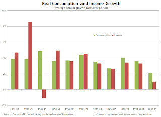
Flowers provides graphs of GDP, personal income and consumption, and payrolls for each trough-to-trough period. As an example, on income and consumption: Click on graph for larger image in new window.
Flowers writes:
[F]or real consumption and income growth, the 2002–09 period is also bleak. Average annual consumption and income growth had averaged 3.81 percent and 3.79 percent, respectively, going into 2002. But during this recent trough-to-trough period, income growth was very weak at 1 percent, with only the 1946–49 period doing worse (–1.09 percent). But consumption growth in 2002–09 was the lowest on record, averaging only 2.12 percent growth annually.The 1946-49 period isn't surprising since there was a flood of workers from the military (keeping income down), but people had significant savings from WWII when income far outpaced consumption. Of course, in the recent period, consumption was higher than income primarily because of mortgage equity extraction (The Home ATM).
Another interesting observation is the spread between average annual consumption and income growth. The 1946–49 and 2002–09 periods are where it's the largest, at 5.9 percent and 1.1 percent, respectively. These large imbalances could possibly reflect growth in household debt and/or lower saving rates, as consumption growth far outstrips income growth. Indeed, debt grew and savings declined notably during 2002–09.
The previous business cycle was "bad by any measure".
Comparing New Home Sales and Housing Starts
by Calculated Risk on 3/17/2010 09:29:00 PM
 Click on graph for larger image in new window.
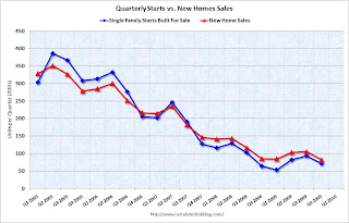
A frequently asked question is how do new home sales compare to single family housing starts (both series from the Census Bureau). This graph shows the two series - although they track each other, the two series cannot be directly compared.
For starts of single family structures, the Census Bureau includes owner built units and units built for rent that are not included in the new home sales report. From the Census Bureau: Comparing New Home Sales and New Residential Construction
We are often asked why the numbers of new single-family housing units started and completed each month are larger than the number of new homes sold. This is because all new single-family houses are measured as part of the New Residential Construction series (starts and completions), but only those that are built for sale are included in the New Residential Sales series. We categorize new residential construction into four intents, or purposes:However it is possible to compare "Single Family Starts, Built for Sale" to New Home sales on a quarterly basis. The Q4 quarterly report showed that there were 71,000 single family starts, built for sale, in Q4 2009, and that is less than the 82,000 new homes sold for the same period. This data is Not Seasonally Adjusted (NSA).
Built for sale (or speculatively built): the builder is offering the house and the developed lot for sale as one transaction this includes houses where ownership of the entire property including the land is acquired ("fee simple") as well as houses sold for cooperative or condominium ownership. These are the units measured in the New Residential Sales series.
Contractor-built (or custom-built): the house is built for the landowner by a general contractor, or the land and the house are purchased in separate transactions.
Owner-built: the house is built entirely by the landowner or by the landowner acting as his/her own general contractor.
Built for rent: the house is built with the intent that it be placed on the rental market when it is completed.
Q4 was the 9th consecutive quarter with homebuilders selling more homes than they start.
Note: new home sales are reported when contracts are signed, so it is appropriate to compare sales to starts (as opposed to completions). This is not perfect because homebuilders do build spec homes and many builders were stuck with some “unintentional spec homes” because of cancellations during the bust.
 This graph provides a quarterly comparison of housing starts and new home sales. In 2005, and most of 2006, starts (blue) were higher than sales (red), and inventories of new homes increased. For the last 9 quarters, starts have been below sales – and new home inventories have been falling.
It is possible that the streak will be broken in Q1, and that the builders started more single family homes, built for sale, than they sold. This is because a number of builders started some extra spec homes in anticipation of a "buying rush" in April before the tax credit expires. To qualify for the tax credit, the homes have to be finished before June 30th - and it takes close to 6 months to build a home - so some builders started a few extra homes in January that they hope will sold in Q2.
REO: Agencies vs. Private Label
by Calculated Risk on 3/17/2010 06:15:00 PM
CR Note: the following is from housing economist Tom Lawler (posted with permission):
Last month I showed data on trends in the REO inventories of Fannie, Freddie, and FHA, highlighting how while total REO inventory estimates appear to have fallen, REO at “the F’s” has increased notably over the last year. A few folks questioned how there could be reports of sharply lower REO inventories in many parts of the country if the F’s REO’s were up so much.
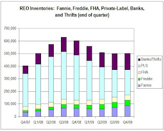
Well, the answer mainly in REO inventories in the “non-agency” space, and especially REO inventories held by trusts for private-label mortgage-backed securities. Here is a chart (courtesy of Amherst) showing REO inventories for private-label securities tracked by LoanPerformance, which folks estimate accounts for about 85-90% of the private-label market.
As the above chart indicates, REO inventory from private-label MBS (where mortgage credit performance started to deteriorate sharply well before the ‘prime” market began to deteriorate in a big way) increased at a rapid clip from end of 2007 through the fall of 2008, peaking in October. It then began to decline as servicers accelerated the pace of REO sales last winter and early Spring, often by slashing prices – thus resulting in the “de-stickification” of home prices observed this cycle relative to past cycles. 
Most areas where one hears that REO inventories have plunged over the last year are in areas that had a high share of “risky” mortgages and a disproportionately high share of loans that were packaged into private-label securities.
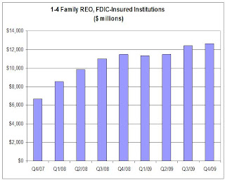
On the depository institution front, data on the book value of FDIC-insured institutions’ holdings of 1-4 family REO – in $’s, but not units – is shown below.
Second, over the last few years the % of mortgages held by banks and thrifts that are FDIC insured has increased. E.g., according to Fed data vs. FDIC data, the ratio of 1-4 family mortgages held by FDIC-insured institutions to 1-4 family mortgages held by all bank and savings institutions went from 89.3% at the end of 2007 to 92.9% at the end of 2009 – implying that the above chart for REO trends overstates a tad the increase in all banks and thrifts.
Having said that, it’s pretty clear that REO inventories at depositories grew at a decent clip (though much slower than REO at PLS) from the end of 2007 to the end of 2008, went down a “scooch” in the first half of 2009 (mainly, I believe, reflecting certain foreclosure moratoria), and then increased a bit in the second half of last year – though less rapidly than at the GSEs.
Note that this is still a “work in progress, and some of the assumptions I’ve made on depositories could be wrong. However, for those who wondered “how could REO have fallen so much if REO at ‘the F’s’ had gone up so much,” here is your answer. Once you factor in the private label market, it is not so “F’ing” hard to understand.
CR Note: The post was from economist Tom Lawler.
Bernanke on Bank Supervision
by Calculated Risk on 3/17/2010 02:52:00 PM
Fed Chairman Ben Bernanke: The Federal Reserve's role in bank supervision
Professor Hamilton supports Bernanke's view: Bank supervision and the Federal Reserve
The Fed employs hundreds of extremely bright and very well-informed economists. On my visits to the Federal Reserve, I've been amazed at how well the staff work together to assimilate information and perspectives. In my experience, you can ask any one of them a question about pretty much anything, and although the person you're talking with may not know the answer, he or she will know the name of the person within the Fed who does know. I've interacted with lots of different institutions over the years, and have never seen another one that functions so effectively as a single, cohesive neural processor. Certainly the objective record of Federal Reserve forecasts is pretty impressive; see for example the assessments by Christina and David Romer and Faust and Wright.From CR: The Fed has a number of roles and they are all somewhat related: monetary policy, lender of last resort, bank supervision and consumer financial protection.
Doubtless others will be skeptical, trotting out the Fed's spectacular underestimation of financial problems during 2005-2007. That criticism is of course well taken, and both the Fed and the economics profession as a whole have much more work to do in terms of recognizing exactly what should have been done differently. But let's be practical. What other institution did a better job? Where in Washington today do you see an agency with the intellectual resources to get this right?
Clearly something went wrong with bank supervision during the recent bubble and bust. And here are the improvements Bernanke outlined today:
To improve both our consolidated supervision and our ability to identify potential risks to the financial system, we have made substantial changes to our supervisory framework. So that we can better understand linkages among firms and markets that have the potential to undermine the stability of the financial system, we have adopted a more explicitly multidisciplinary approach, making use of the Federal Reserve's broad expertise in economics, financial markets, payment systems, and bank supervision to which I alluded earlier. We are also augmenting our traditional supervisory approach that focuses on firm-by-firm examinations with greater use of horizontal reviews that look across a group of firms to identify common sources of risks and best practices for managing those risks. To supplement information from examiners in the field, we are developing an off-site, enhanced quantitative surveillance program for large bank holding companies that will use data analysis and formal modeling to help identify vulnerabilities at both the firm level and for the financial sector as a whole. This analysis will be supported by the collection of more timely, detailed, and consistent data from regulated firms.I think the key question is: How much sooner would these changes have caught the lending problems? I think the answer might be 2007 - and that was already too late.
Many of these changes draw on the successful experience of the Supervisory Capital Assessment Program (SCAP), also known as the banking stress test, which the Federal Reserve led last year. As in the SCAP, representatives of primary and functional supervisors will be fully integrated in the process, participating in the planning and execution of horizontal exams and consolidated supervisory activities.
Improvements in the supervisory framework will lead to better outcomes only if day-to-day supervision is well executed, with risks identified early and promptly remediated. Our internal reviews have identified a number of directions for improvement. In the future, to facilitate swifter, more-effective supervisory responses, the oversight and control of our supervisory function will be more centralized, with shared accountability by senior Board and Reserve Bank supervisory staff and active oversight by the Board of Governors. Supervisory concerns will be communicated to firms promptly and at a high level, with more-frequent involvement of senior bank managers and boards of directors and senior Federal Reserve officials. Greater involvement of senior Federal Reserve officials and strong, systematic follow-through will facilitate more vigorous remediation by firms. Where necessary, we will increase the use of formal and informal enforcement actions to ensure prompt and effective remediation of serious issues.
Hamilton asks who did a better job? Unfortunately all the regulators missed the problems.
Squatter Stimulus: No Mortgage Payment for Three Years and Counting
by Calculated Risk on 3/17/2010 12:33:00 PM
Note: I didn't mean "Squatter Stimulus" as a put down. Many of these people are in limbo and facing serious uncertainty. This is a term that is being bandied about ... and I didn't mean to make fun of the plight of some homeowners.
The Irvine Housing Blog has an example of the squatter stimulus (homeowners living in their homes and not paying the mortgage): One Defaulting Owner’s Free Ride: Three Years and Counting (ht ghostfaceinvestah)
Freeloaders enjoying the entitled life are not confined to subprime areas. Today's featured property may be the worst case of housing entitlement in the country, and it is right here in Irvine.I've heard a number of stories of people living in their homes for a year or more without paying their mortgage - and without the bank foreclosing. It is difficult to get a handle on the actual number of long term delinquencies (say longer than 6 months without the bank foreclosing). Is this widespread or are these isolated incidents?
...
The owner of today's featured property paid $465,000 on 10/23/2003. She used a $372,000 first mortgage, a $93,000 second mortgage, and a $0 down payment.Consider what this woman accomplished:On 12/30/2004 she refinanced into an Option ARM for $486,500. Two months later on 2/3/2005 she opened a HELOC for $67,000. Total property debt is $553,500 plus 3 years of missed payments, negative amortization, and fees. Total mortgage equity withdrawal is $88,500. ...She put no money into the transaction. None. She extracted $88,500 in just over one year. That is nearly the median income in Irvine, and that money came to her without tax withholding. She has lived in the property since 2003, and in the full term of ownership, she has not made payments totaling what she pulled from the property.
The owner of this property stopped making payments sometime in late 2006. It has been over [three years] since this owner stopped paying, and she is still listed as the property owner, so one can assume she still occupies the property.


