 RSS Feed
 by Calculated Risk on 12/05/2005 12:26:00 AM
Monday, December 05, 2005
Demographics and Policy
My Angry Bear post builds on my previous demographic posts: The Best of Times. The post includes an enhanced animation of the demographic changes from 1900 to 2050 (based on Census Bureau projections).
Recommended:
Dr. Duy's Fed Watch: Looking for a Reason to Worry ...
And excerpts from Paul Krugman's: Joyless Economy
"It should have been a good year for American families: the economy grew 4.2 percent ... Yet most families actually lost economic ground. Real median household income ... fell for the fifth year in a row. And one key source of economic insecurity got worse, as the number of Americans without health insurance continued to rise. ..."I believe this story of a bifurcating US economy is important. In the roaring 20's many families were struggling because of increased productivity on farms (due to the farm tractor). This shows up in the demographic numbers - the start of the Baby Bust was before the start of the Depression.
The improved farm productivity (a good thing) contributed to a period of depressed wages for a large segment of America (a bad thing) and was a factor in the Great Depression. It really is important that a rising tide floats a vast majority of boats. That didn't happen in the 20's and its not happening now.
Best to all.
Sunday, December 04, 2005
Barrons on Housing
by Calculated Risk on 12/04/2005 09:27:00 PM
Barrons opines on housing (pay):
... the accompanying chart ...[with] that single line rising toward the heavens depicts the share of household real-estate assets as a percentage of gross domestic product. It's a graphic (in every sense of the word) description of the fantastic rise of the housing bubble. ... As David warns, "Caveat emptor whenever anything approaches 150% of GDP."
There are ... any number of reasons to be wary. Among them: Affordability is at a 14-year low; the sales of new and existing homes are leveling off or worse, even as prices continue to rise; inventories of unsold homes are more than ample; mortgage applications are running some 20% below the summer's high; and even a few -- make that a very few -- home builders insist that business is as good as it gets, but could get better.
Moreover, the regulators are growing restless, as they inevitably do when denial can no longer serve as adequate policy to cope with a speculative frenzy that's reaching fever pitch. ... the Comptroller of the Currency, the Fed, the FDIC and their kin who oversee the thrifts and the credit unions are busily drawing up drafts of rules they plan to issue before year-end to seriously tighten standards on risky loans.
Not surprisingly, those risky loans ... are those that cheerfully don't require the consumer to pay down principal; for their part, the originators of such loans ... haven't the foggiest real notion as to whether said consumer can afford the house he's buying. Since these exceedingly risky loans are ... "ubiquitous" a crackdown on them could ... "have a significant impact on the housing market, bank-lending activity and the broader economy, beginning in the first half of next year."
What has made the regulators more than a little antsy is that many of the folks taking interest-only or so-called option adjustable-rate mortgages (ARMs in the popular parlance) are due for brutal "payment shock" when the loans reset, as a heap of them are slated to do over the next several years. Resetting, in this instance, means that the suddenly-not-so-happy home owner, besides higher interest rates, will have to start paying down the principal, a double whammy that could raise his monthly mortgage payments by 50%, even 100%.
Since the bulk of option ARMs and interest-only loans are also "stated income" loans, in which the bank cheerfully accepts as income whatever the borrower says it is and no documentation is required, the shock -- and the consequences -- are sure to be that much greater for the borrower. In the circumstances, lenders might begin to feel a bit queasy as well.
Such risky (to put it mildly) loans, ISI reports, may account for nearly half of all the loans made in the past 18 months...
Saturday, December 03, 2005
Demographics GIF: 1920 - 2005
by Calculated Risk on 12/03/2005 01:20:00 AM
US Population distribution by age, every decade 1920 - 2000, plus 2005.
NOTE: Thanks to InsultComicDog for hosting this animation. Please see previous post for individual graphs.

Friday, December 02, 2005
Demographics: Baby Bust and Boom
by Calculated Risk on 12/02/2005 08:33:00 PM
The following graphs shows the US population distribution by age since 1920.
All data from the Census Bureau.
This is nothing new, but its interesting when considering the debates on Social Security, medical care, budget deficits or when considering investments that are related to demographics (like 2nd homes).
Click on graphs for larger image.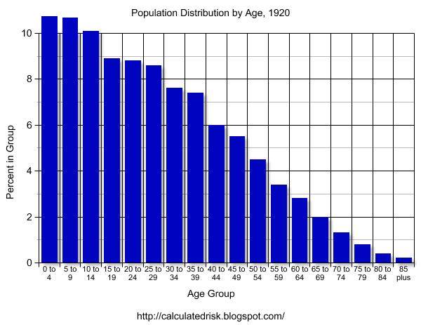
1920 The graphs for 1900 and 1910 have a similar shape as 1920. With the medical advances of the 20th Century, we would expect the shape of the distribution to become flatter as fewer people die of illnesses in the prime of their lives. Otherwise this represents the expected population distribution.
1930 Although 1930 has the general shape of the previous decades, the first evidence of the Baby Bust is apparent. Although 1929 is usually considered the start of the Depression, there was a large segment of America that was struggling economically several years earlier. This shows up in the drop in births.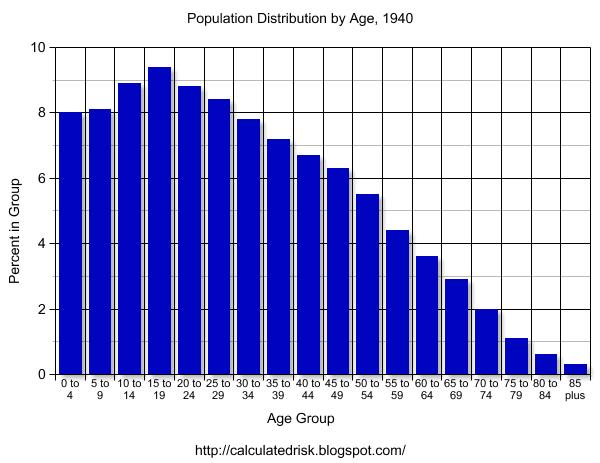
1940 The Depression era Baby Bust is evident in the 1940 census data. With tough economic times, it is no surprise that many families postponed having children.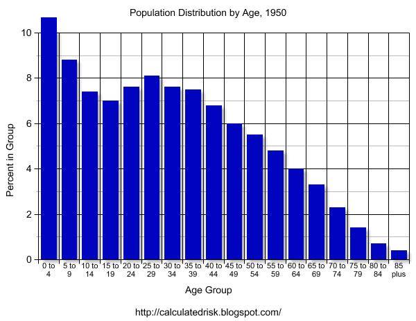
1950 Here comes the Baby Boom. The Boom actually started during World War II and really picked up after the war.
The Baby Bust is very clear on the graph.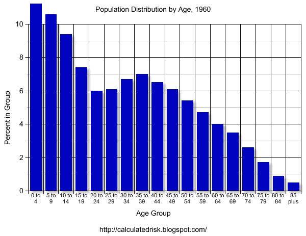
1960 The Baby Boom probably peaked in the mid-1950s.
The 1960 graph clearly shows both the Baby Bust of the '30s and the Baby Boom that followed.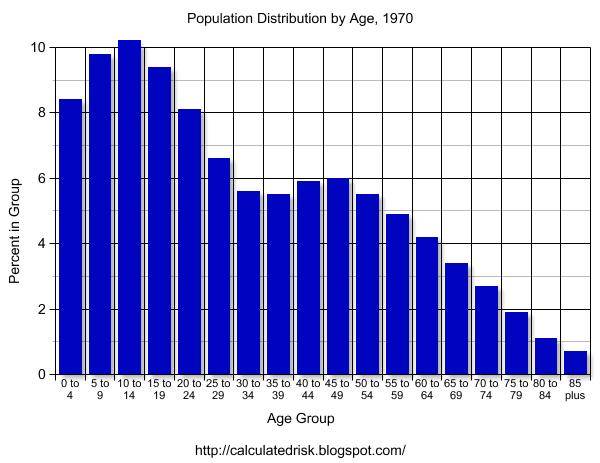
1970 The Baby Boom is over and a mini-bust has started. 
1980 By 1980, the Boomers are mostly in the workforce. Social Security is close to running a deficit and Alan Greenspan heads a commission to fix the program. The Greenspan commission recommends several changes, including having the Baby Boomers prepay their Social Security.
1990 By 1990, the Baby Bust is close to retirement. The Boomers are entering their peak earning years.
This combination of fewer retirees in the '90s (Baby Bust) and Boomers entering their peak earnings years is a positive for running huge Social Security surpluses and working towards balancing the Federal Budget. 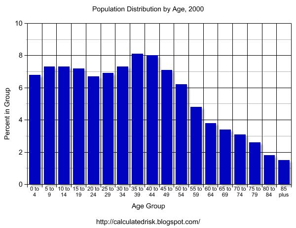
2000 By 2000 it is hard to distinguish the Baby Bust, but the Baby Boom is very clear. New entries into the population have been relatively steady for years. Even with the lower impact from the Baby Bust, medical costs are still straining the budget - and with the Boomers nearing retirement age, this is clearly a major issue for the US.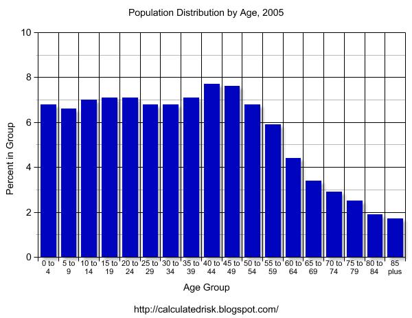
2005 And here is an interim population estimate from the Census Bureau. The distribution is starting to flatten out due to advances in medical care. The largest increases in the distribution have been in the older age groups (compare 2005 to 1920).
I will refer to these graphs in future posts. All comments are welcome.
Fiscal 2006: Record YTD Increase in National Debt
by Calculated Risk on 12/02/2005 01:24:00 PM
Fiscal 2006 is off to a poor start as the increase in the National Debt set a record for the first two months of the fiscal year. The National Debt increased $159.6 Billion to $8.092 Trillion as of Nov 30, 2005. 
Click on graph for larger image.
The previous record through November was in 2004 (fiscal 2005) with an increase in the National Debt of $146.2 Billion.
Each month I will plot the YTD increase in the National Debt and compare it to the proceeding years. I expect fiscal 2006 to set a new record for the annual increase in the National Debt.


