 RSS Feed
 by Calculated Risk on 12/02/2005 08:33:00 PM
Friday, December 02, 2005
Demographics: Baby Bust and Boom
The following graphs shows the US population distribution by age since 1920.
All data from the Census Bureau.
This is nothing new, but its interesting when considering the debates on Social Security, medical care, budget deficits or when considering investments that are related to demographics (like 2nd homes).
Click on graphs for larger image.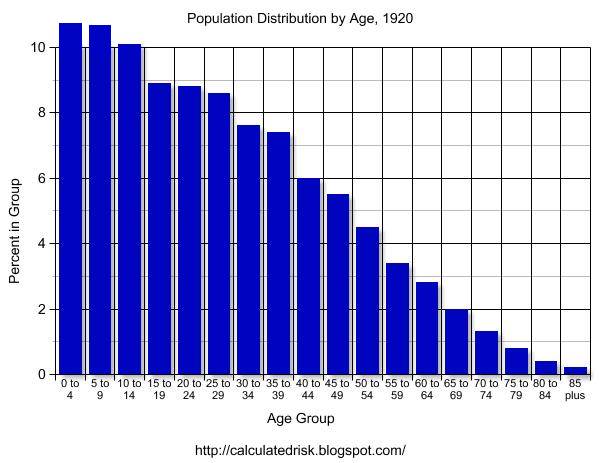
1920 The graphs for 1900 and 1910 have a similar shape as 1920. With the medical advances of the 20th Century, we would expect the shape of the distribution to become flatter as fewer people die of illnesses in the prime of their lives. Otherwise this represents the expected population distribution.
1930 Although 1930 has the general shape of the previous decades, the first evidence of the Baby Bust is apparent. Although 1929 is usually considered the start of the Depression, there was a large segment of America that was struggling economically several years earlier. This shows up in the drop in births.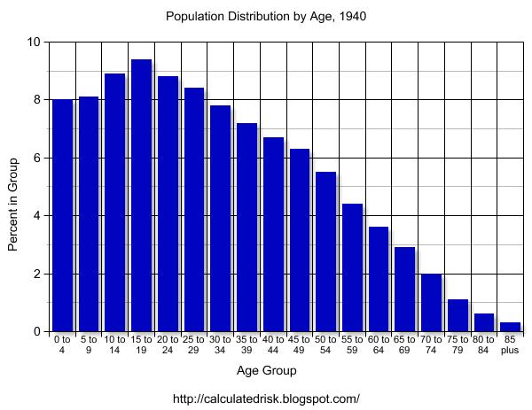
1940 The Depression era Baby Bust is evident in the 1940 census data. With tough economic times, it is no surprise that many families postponed having children.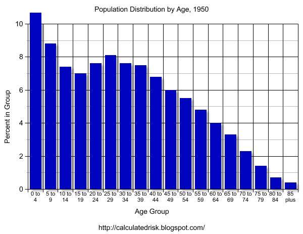
1950 Here comes the Baby Boom. The Boom actually started during World War II and really picked up after the war.
The Baby Bust is very clear on the graph.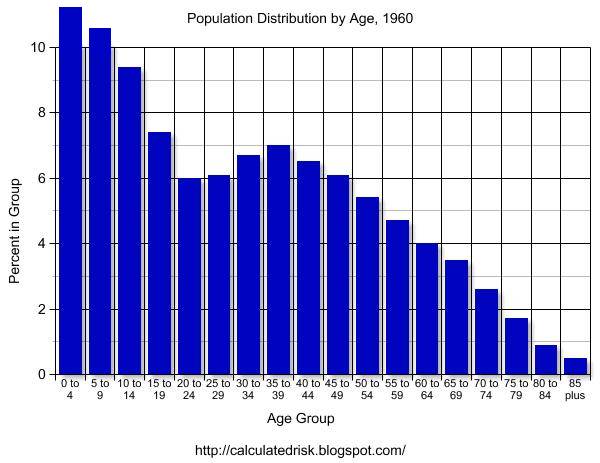
1960 The Baby Boom probably peaked in the mid-1950s.
The 1960 graph clearly shows both the Baby Bust of the '30s and the Baby Boom that followed.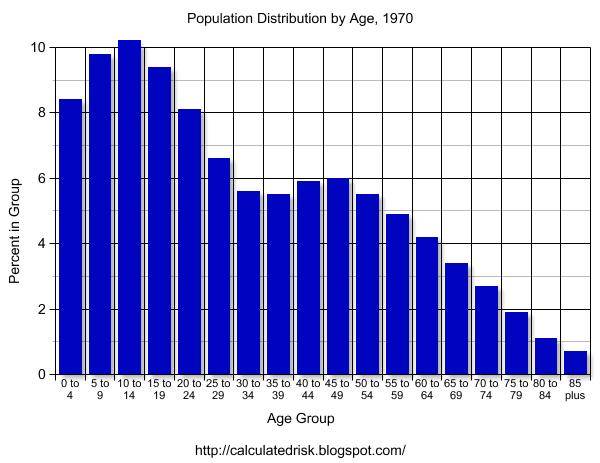
1970 The Baby Boom is over and a mini-bust has started. 
1980 By 1980, the Boomers are mostly in the workforce. Social Security is close to running a deficit and Alan Greenspan heads a commission to fix the program. The Greenspan commission recommends several changes, including having the Baby Boomers prepay their Social Security.
1990 By 1990, the Baby Bust is close to retirement. The Boomers are entering their peak earning years.
This combination of fewer retirees in the '90s (Baby Bust) and Boomers entering their peak earnings years is a positive for running huge Social Security surpluses and working towards balancing the Federal Budget. 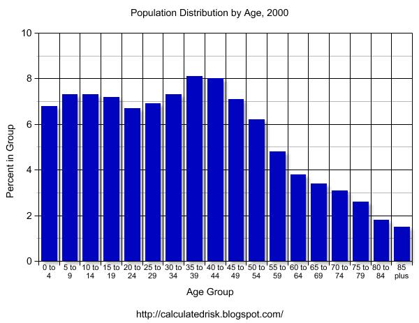
2000 By 2000 it is hard to distinguish the Baby Bust, but the Baby Boom is very clear. New entries into the population have been relatively steady for years. Even with the lower impact from the Baby Bust, medical costs are still straining the budget - and with the Boomers nearing retirement age, this is clearly a major issue for the US.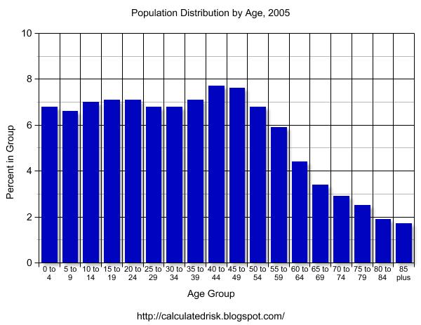
2005 And here is an interim population estimate from the Census Bureau. The distribution is starting to flatten out due to advances in medical care. The largest increases in the distribution have been in the older age groups (compare 2005 to 1920).
I will refer to these graphs in future posts. All comments are welcome.


