 RSS Feed
 by Calculated Risk on 9/18/2010 09:44:00 PM
Saturday, September 18, 2010
FOMC Statement Preview
I thought there were three things to look for in the August 10th FOMC statement:
1) How the statement would discuss the economic slowdown.
The FOMC statement was more pessimistic in August than in June.
Information received since the Federal Open Market Committee met in June indicates that the pace of recovery in output and employment has slowed in recent months. Household spending is increasing gradually, but remains constrained by high unemployment, modest income growth, lower housing wealth, and tight credit. Business spending on equipment and software is rising; however, investment in nonresidential structures continues to be weak and employers remain reluctant to add to payrolls. Housing starts remain at a depressed level. Bank lending has continued to contract. Nonetheless, the Committee anticipates a gradual return to higher levels of resource utilization in a context of price stability, although the pace of economic recovery is likely to be more modest in the near term than had been anticipated.In the period since the August FOMC meeting, the economic data has remained weak, but the data hasn't indicated a further slowdown (at least not yet). So I expect the tone of the first paragraph to be about the same.
2) How the FOMC would express more concern about deflation. The FOMC didn't make a significant change:
Measures of underlying inflation have trended lower in recent quarters and, with substantial resource slack continuing to restrain cost pressures and longer-term inflation expectations stable, inflation is likely to be subdued for some time.Actually inflation expectations have been trending down, and the FOMC might remove the "stable" expectations phrase this week (although this seems to be a key point of contention on the FOMC).
3) And the BIG one for the August meeting was how the FOMC would change their reinvestment strategy. They decided to keep the Federal Reserve's holdings of securities stable by investing the principal payments from maturing MBS in longer-term Treasury securities.
So what will change in the September FOMC statement? Probably very little. The first paragraph will be reworked a little, but the tone will probably remain the same. And the key sentence "exceptionally low levels of the federal funds rate for an extended period" will mostl likely stay the same.
And it seems too soon for further easing based on Fed Chairman Ben Bernanke comments in his speech at Jackson Hole. Bernanke suggested that additional easing would probably require “significant weakening of the outlook” or a meaningful decline in inflation expectations (or further disinflation). The first hasn't happened yet ... although they might express more concern about disinflation this week.
Q2 Flow of Funds: Household Net Worth off $12.3 Trillion from Peak
by Calculated Risk on 9/18/2010 05:10:00 PM
The Federal Reserve released the Q2 2010 Flow of Funds report yesterday: Flow of Funds.
According to the Fed, household net worth is now off $12.3 Trillion from the peak in 2007, but up $4.7 trillion from the trough in Q1 2009.  Click on graph for larger image in new window.
This is the Households and Nonprofit net worth as a percent of GDP.
This includes real estate and financial assets (stocks, bonds, pension reserves, deposits, etc) net of liabilities (mostly mortgages). Note that this does NOT include public debt obligations.
Note that this ratio was relatively stable for almost 50 years, and then we saw the stock market and housing bubbles. This graph shows homeowner percent equity since 1952.
Household percent equity (as measured by the Fed) collapsed when house prices collapsed in 2007 and 2008.
In Q2 2010, household percent equity (of household real estate) was up to 40.7% from the all time low of 36.1% in Q1 2009. The increase was due to both an increase in the value of household real estate and a $49 billion decline in mortgage debt.
Note: something less than one-third of households have no mortgage debt. So the approximately 50+ million households with mortgages have far less than 40.7% equity.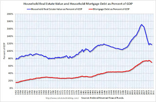 The third graph shows household real estate assets and mortgage debt as a percent of GDP.
Mortgage debt declined by $49 billion in Q2. Mortgage debt has now declined by $463 billion from the peak. According to an analysis by the WSJ, most of the decline in debt has been because of defaults, see: Defaults Account for Most of Pared Down Debt
As house prices decline further, I expect the percent equity to decline and household net worth to fall.
Unofficial Problem Bank List increases to 854 institutions
by Calculated Risk on 9/18/2010 11:20:00 AM
Note: this is an unofficial list of Problem Banks compiled only from public sources.
Here is the unofficial problem bank list for September 17, 2010.
Changes and comments from surferdude808:
The FDIC got back to work closing banks in earnest this Friday after taking about a month hiatus. Also, as anticipated the OCC released its actions for July/August. Activities by the FDIC and OCC contributed to many changes in the Unofficial Problem Bank List this week as the six failures were removed and there were 11 additions.Once again - a special thanks to surferdude808 for all his hard work maintaining this list.
After these changes, the Unofficial Problem Bank List stands at 854 institutions with assets of $416 billion, up from 849 institutions with assets of $415.3 billion last week.
The failures include The Peoples Bank ($447 million), Maritime Savings Bank ($350 million), First Commerce Community Bank ($248 million Ticker: FCGA), Bank of Ellijay ($169 million), ISN Bank ($82 million), and Bramble Savings Bank ($48 million).
Most notable among the 11 additions are Nextier Bank, National Association, Evans City, PA ($558 million); American National Bank of Minnesota, Baxter, MN ($322 million); State Bank Financial, La Crosse, WI ($308 million); and National Bank of New York City, New York City, NY ($253 million).
Lawler: US Households: Why Researchers / Analysts are “Confused”
by Calculated Risk on 9/18/2010 08:00:00 AM
CR Note: This from economist Tom Lawler.
[On Thursday, the Census Department released a report] entitled “Income, Poverty, and Health Insurance Coverage in the United State: 2009,” which was widely covered in the press, included a table showing an “estimate” of the number of US households in the US as of March 2010 --- 117,538,000, up just 357,000 from March 2009. The report also shows historical data on this estimated number of households, which is derived from a special Current Population Survey. The table with that data has tons of footnotes, which note that there have been multiple revisions in this so-called “time series.”
This ‘household estimate,” which is not subject to rigorous population or housing unit “controls,” is one of at least five household series one can “pick up” from various Census sources. And, of course, they are all unbelievably inconsistent, both in terms of levels and changes.
Below are various household (“occupied housing units") estimates from different reports/sources. Note that the Housing Vacancy Survey has quarterly average “estimates,” but I am just showing its annual data. I am also only showing data back to 2000.
| US Households: What's the "Right" Number? (thousands of units) | ||||||
|---|---|---|---|---|---|---|
| AHS (avg) | ACS (avg) | HVS, 2008 vintage (avg) | HVS, unadj (avg) | CPS (Mar) | Decennial Census (April 1) | |
| 2000 | 104,819 | 102,555 | 105,720 | 106,434 | 105,480 | |
| 2001 | 105,435 | 106,429 | 103,772 | 107,010 | 108,239 | |
| 2002 | 107,367 | 104,994 | 104,965 | 109,297 | ||
| 2003 | 105,842 | 108,420 | 105,636 | 105,560 | 111,278 | |
| 2004 | 109,902 | 106,971 | 106,588 | 112,000 | ||
| 2005 | 108,871 | 111,091 | 108,667 | 108,231 | 113,343 | |
| 2006 | 111,617 | 109,736 | 109,575 | 114,384 | ||
| 2007 | 110,692 | 112,378 | 110,173 | 110,306 | 116,011 | |
| 2008 | 113,101 | 110,475 | 111,409 | 116,783 | ||
| 2009 | 111,861 | 111,344 | 111,344 | 117,181 | ||
| 2010 | 117,538 | |||||
| AHS (avg)* | ACS (avg) | HVS, 2008 vintage (avg) | HVS, unadj (avg) | CPS (Mar) | Decennial Census (April 1) | |
| 2001 | 1,610 | 1,217 | 1,290 | 1,805 | ||
| 2002 | 204 | 938 | 1,222 | -2,045 | 1,058 | |
| 2003 | 204 | 1,053 | 642 | 595 | 1,981 | |
| 2004 | 1,515 | 1,483 | 1,335 | 1,028 | 722 | |
| 2005 | 1,515 | 1,189 | 1,696 | 1,643 | 1,343 | |
| 2006 | 911 | 527 | 1,069 | 1,344 | 1,041 | |
| 2007 | 911 | 761 | 437 | 731 | 1,627 | |
| 2008 | 585 | 723 | 302 | 1,103 | 772 | |
| 2009 | 585 | 869 | -65 | 398 | ||
| 357 | ||||||
| *AHS: annual average for 2-year period | ||||||
The “HVS” is the Housing Vacancy Survey, which is the quarterly Census report that includes the homeownership rates and vacancy rates. This report is not actually designed to measure the size of the housing stock (or the number of households), but rather vacancy rates. The “2008 vintage” data are attempts to create a household estimate consistent with historical housing stock estimates from other Census reports. The “unadjusted” HVS data use periodic updates of the housing stock estimates (and updated forecasts), but do not correct for past over- or under-estimates of the housing stock – thus creating multiple discrete shifts in this time series.
I include this one because recently someone sent me a report asking me to comment on a piece by a firm which including showing a decline in the number of households in 2009, citing a Census report. This confused me, but I figured out that the hapless “analyst” had used this “unadjusted” series, which is absolutely useless as a time series. The 2009 and 2010 HVS household (and housing stock) data, are going to be revised downward materially in the upcoming Q3/10 report, reflecting the updated July 1, 2009 housing stock estimates released this June, and then revised in September, which show a MUCH lower housing stock than that assumed by the HVS.
All of these data are available on various Census sources or in vendor economic databases, but the caveats/concerns/issues associated with using them as a time series are often either barely mentioned in footnotes, or not mentioned at all.
Even a casual glance at the [above table] indicates that [these] various measures – some of which cover slightly different time spans, and some (such as the ACS) is a different “concept,” at times show vastly different trends, for reasons that are not at first glance clear. As many housing analysts have noted, how fast the current “excess” supply of housing (which in and of itself is extremely difficult to gauge, given the apparent unreliability of the data!) can be absorbed is heavily dependent both on the level of new construction and the growth in households. Sadly, there not only does not exist a reliable time series of household growth that enables one to look at the behavior during business downturns/recoveries, but there is no reliable time series to gauge how fast/slow RECENT growth has been – though the combined data suggest extremely slow growth over the last few years.
On the housing stock, Census – which released updated housing stock estimates through July 1, 2009 in June (based on a pretty simplistic methodology) -- updated those estimates this month to reflect the fact that the June estimates did not incorporate state/local inputs. [The next table] are the revised housing stock estimates back to July 1, 2000. Census does not have a reliable annual time series for earlier periods.
| Census Housing Stock Estimates, July 1 | |
|---|---|
| Revised 2009 Vintage | |
| 7/1/2000 | 116,300,799 |
| 7/1/2001 | 117,905,005 |
| 7/1/2002 | 119,456,206 |
| 7/1/2003 | 121,076,837 |
| 7/1/2004 | 122,824,501 |
| 7/1/2005 | 124,711,041 |
| 7/1/2006 | 126,500,212 |
| 7/1/2007 | 128,132,164 |
| 7/1/2008 | 129,313,137 |
| 7/1/2009 | 129,969,653 |
| 7/1/2001 | 1,604,206 |
| 7/1/2002 | 1,551,201 |
| 7/1/2003 | 1,620,631 |
| 7/1/2004 | 1,747,664 |
| 7/1/2005 | 1,886,540 |
| 7/1/2006 | 1,789,171 |
| 7/1/2007 | 1,631,952 |
| 7/1/2008 | 1,180,973 |
| 7/1/2009 | 656,516 |
In the “Vintage 2008” HVS data, it was assumed that the housing stock from mid 2008 to mid 2009 increased by about 1,140,000, and that from the spring of 2009 to the spring of 2010 the housing stock increased by a similar amount. In fact, of course, it did not, and as a result there will be sizable downward revisions in the HVS’ estimated household growth in 2009 and so far in 2010.
CR Note: The above was from Tom Lawler. I've tried to figure out when the excess supply will be absorbed, but as Tom points out, it is difficult since there is no reliable time series of household growth.
Friday, September 17, 2010
WSJ: Pension Gaps Loom Larger
by Calculated Risk on 9/17/2010 09:41:00 PM
From David Reilly at the WSJ: Pension Gaps Loom Larger
The median expected investment return for more than 100 U.S. public pension plans surveyed by the National Association of State Retirement Administrators remains 8%, the same level as in 2001, the association says.I keep expecting the plans to lower their expected returns, but that increases the funding requirements ...
...
Return assumptions can affect the size of so-called funding gaps—the amounts by which future liabilities to retirees exceed current pension assets. ... The concern is that the reluctance to plan for smaller gains will understate the scale of the potential time bomb facing America's government and corporate pension plans
Bank Failure #125: Maritime Savings Bank, West Allis, Wisconsin
by Calculated Risk on 9/17/2010 07:05:00 PM
Bankers wailing sea chanties
While the sea consumes
by Soylent Green is People
From the FDIC: North Shore Bank, FSB, Brookfield, Wisconsin, Assumes All of the Deposits of Maritime Savings Bank, West Allis, Wisconsin
As of June 30, 2010, Maritime Savings Bank had approximately $350.5 million in total assets and $248.1 million in total deposits. ... The FDIC estimates that the cost to the Deposit Insurance Fund (DIF) will be $83.6 million. ... Maritime Savings Bank is the 125th FDIC-insured institution to fail in the nation this year, and the first in Wisconsin.
Bank Failures #121 to 124: Georgia and Ohio
by Calculated Risk on 9/17/2010 06:19:00 PM
Autumn leaves fall to the ground
As do many banks.
by Soylent Green is People
From the FDIC: Community & Southern Bank, Carrollton, Georgia, Assumes All of the Deposits of Three Georgia Institutions
As of June 30, 2010, Bank of Ellijay had total assets of $168.8 million and total deposits of $160.7 million; First Commerce Community Bank had total assets of $248.2 million and total deposits of $242.8 million; and The Peoples Bank had total assets of $447.2 million and total deposits of $398.2 million.From the FDIC: Foundation Bank, Cincinnati, Ohio, Assumes All of the Deposits of Bramble Savings Bank, Milford, Ohio
...
The FDIC estimates that the cost to the Deposit Insurance Fund (DIF) for Bank of Ellijay will be $55.2 million; for First Commerce Community Bank, $71.4 million; and for The Peoples Bank, $98.9 million. ... These failures bring the total number of failures to 123 for the nation and to 14 for Georgia. Prior to these failures, the last bank closed in the state was Northwest Bank & Trust, Acworth, on July 31, 2010.
As of June 30, 2010, Bramble Savings Bank had approximately $47.5 million in total assets and $41.6 million in total deposits. ... The FDIC estimates that the cost to the Deposit Insurance Fund (DIF) will be $14.6 million. ... Bramble Savings Bank is the 124th FDIC-insured institution to fail in the nation this year, and the second in Ohio.Five down today. The FDIC is back to work ...
Bank Failure #120: ISN Bank, Cherry Hill, New Jersey
by Calculated Risk on 9/17/2010 04:18:00 PM
Wild times had with Cherry Hill
Never meant to be.
by Soylent Green is People
From the FDIC: New Century Bank, Phoenixville, Pennsylvania, Assumes All of the Deposits of ISN Bank, Cherry Hill, New Jersey
As of June 30, 2010, ISN Bank had approximately $81.6 million in total assets and $79.7 million in total deposits. ... The FDIC estimates that the cost to the Deposit Insurance Fund (DIF) will be approximately $23.9 million. Compared ... ISN Bank is the 120th FDIC-insured institution to fail in the nation this year, and the first in New Jersey. The last FDIC-insured institution closed in the state was First BankAmericano, Elizabeth, on July 31, 2009.Off to a quick start ...
Inflation: Core CPI, Median CPI, 16% trimmed-mean CPI
by Calculated Risk on 9/17/2010 02:25:00 PM
The Cleveland Fed has released the median CPI:
According to the Federal Reserve Bank of Cleveland, the median Consumer Price Index rose 0.1% (0.6% annualized rate) in August. The 16% trimmed-mean Consumer Price Index increased 0.1% (1.2% annualized rate) during the month.
...
Over the last 12 months, the median CPI rose 0.5%, the trimmed-mean CPI rose 0.9%, the CPI rose 1.1%, and the CPI less food and energy rose 0.9%.
 Click on graph for larger image in new window.
This graph shows three measure of inflation, Core CPI, Median CPI (from the Cleveland Fed), and 16% trimmed CPI (also from Cleveland Fed).
They all show that inflation has been falling, and that measured inflation is up less than 1% year-over-year. Core CPI was flat, and median CPI and the 16% trimmed mean CPI were up 0.1% in August.
Note: The Cleveland Fed has a discussion of a number of measures of inflation: Measuring Inflation
No increase to Social Security Benefits for 2011 (unofficial)
by Calculated Risk on 9/17/2010 11:28:00 AM
It won't be official until the BLS releases the September CPI-W report, but we can already say there will be no increase in Social Security benefits or the Maximum Contribution Base in 2011 (assuming no new legislation).
The BLS reported this morning that the Consumer Price Index for Urban Wage Earners and Clerical Workers (CPI-W) was at 214.205 in August (CPI-W was at 213.898 in July).
Here is an explanation of why there will be no change (some repeated from a post last month):
The calculation dates have changed over time (see Cost-of-Living Adjustments), but the current calculation uses the average CPI-W for the three months in Q3 (July, August, September) and compares to the average for the highest previous average of Q3 months. Note: this is not the headline CPI-U.
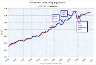 Click on graph for larger image in new window.
This graph shows CPI-W over the last ten years. The red lines are the Q3 average of CPI-W for each year.
The COLA adjustment is based on the increase from Q3 of one year from the highest previous Q3 average. So a 2.3% increase was announced in 2007 for 2008, and a 5.8% increase was announced in 2008 for 2009.
In Q3 2009, CPI-W was lower than in Q3 2008, so there was no change in benefits for 2010.
For 2011, the calculation is not based on Q3 2010 over Q3 2009, but based on the average CPI-W for Q3 2010 over the highest preceding Q3 average - the 215.495 in Q3 2008. This means CPI-W in Q3 2010 has to average above 215.495 for there to be an increase in Social Security benefits in 2011.
In July 2010, CPI-W was at 213.898, and in August CPI-W was at 214.205 - so CPI-W would have to increase by almost 2% in September for the Q3 average to be at or above the Q3 2008 average. There is no evidence of a huge surge in inflation this month, so there will be no increase in Social Security benefits in 2011.
Even though there was no increase last year, and there will be no increase this year, those receiving benefits are still ahead because of the huge increase in Q3 2008.
Note: See post last month for a discussion of CPI-W and the Contribution Base.
Now the question is: Will Social Security benefits be flat in 2012 too? That is possible.
Consumer Sentiment declines in September, lowest level in a year
by Calculated Risk on 9/17/2010 09:55:00 AM
From MarketWatch: U.S. Sept. consumer sentiment falls to 66.6
The UMich index declined to 66.6 in September - the lowest level since August 2009 -- from 68.9 in August.
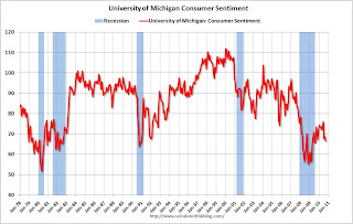 Click on graph for larger image in new window.
Consumer sentiment is a coincident indicator - and this is further evidence of a sluggish economy.
This was a big story in July when consumer sentiment collapsed to the lowest level since late 2009. Now it is even lower ...
Consumer Price Index increases 0.3%, core rate unchanged in August
by Calculated Risk on 9/17/2010 08:30:00 AM
From the BLS report on the Consumer Price Index this morning:
The Consumer Price Index for All Urban Consumers (CPI-U) increased 0.3 percent in August on a seasonally adjusted basis, the U.S. Bureau of Labor Statistics reported today. ... Over the last 12 months, the all items index increased 1.1 percent before seasonal adjustment.The general disinflationary trend continues - core CPI is up less than 1% over the last year - and with all the slack in the system (especially the 9.6% unemployment rate), the various measures of inflation will probably stay low or even fall further.
...
The index for all items less food and energy was unchanged in August ... Over the last 12 months, the index for all items less food and energy rose 0.9 percent ...
The index for owners' equivalent rent was unchanged and the lodging away from home index fell 1.3 percent....
Note: I'll post a graph later after the Cleveland Fed releases the 16% trimmed CPI (another measure of inflation).
Thursday, September 16, 2010
Weekly Update on European Bond Spreads
by Calculated Risk on 9/16/2010 08:38:00 PM
Here are the European bond spreads from the Atlanta Fed weekly Financial Highlights released today (graph as of Sept 15th): Click on graph for larger image in new window.
From the Atlanta Fed:
European bond spreads have risen and remain elevated since the August FOMC meeting.A quiet week, but definitely still worth watching ... especially with all the currency manipulation going on.
Update: Regional Fed Surveys and ISM
by Calculated Risk on 9/16/2010 04:35:00 PM
Note: Usually I don't watch this very closely, but right now I'm looking for signs of a slowdown in manufacturing. Eventually a watched pot does boil ...
By request - now that the Empire State and Philly Fed manufacturing surveys for September have been released - here is an update to the graph I posted last month: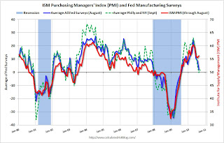 Click on graph for larger image in new window.
For this graph I averaged the New York and Philly Fed surveys (dashed green, through September), and averaged five surveys including New York, Philly, Richmond, Dallas and Kansas City (blue, through August).
The Institute for Supply Management (ISM) PMI (red) is through August (right axis).
Last month, when the ISM survey came in slightly better than expected, I wrote: "Based on this graph, I'd expect either the Fed surveys to bounce back in September - or the ISM to decline."
So far there has been little "bounce back" in the Fed surveys.
Hotel Occupancy Rate: "Bumpy Week"
by Calculated Risk on 9/16/2010 01:57:00 PM
Hotel occupancy is one of several industry specific indicators I follow ...
From HotelNewsNow.com: STR: US hotel industry has bumpy week
The U.S. hotel industry reported a decrease in average daily rate ADR for the first time in 13 consecutive weeks for the week of 5-11 September 2010, according to data from STR.The following graph shows the four week moving average for the occupancy rate by week for 2008, 2009 and 2010 (and a median for 2000 through 2007).
ADR fell 2.0% to US$92.84, occupancy increased 2.7% to 54.2%, and revenue per available room ended the week virtually flat with a 0.7% increase to US$50.32.
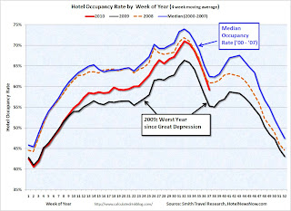 Click on graph for larger image in new window.
Notes: the scale doesn't start at zero to better show the change. The graph shows the 4-week average, not the weekly occupancy rate.
On a 4-week basis, occupancy is up 7.2% compared to last year (the worst year since the Great Depression) and 5.1% below the median for 2000 through 2007.
The occupancy rate has fallen below the levels of 2008 again - and 2008 was a tough year for the hotel industry!
Important: Even with the occupancy rate close to 2008 levels, 2010 is a much more difficult year. The average daily rate (ADR) is off 14% from 2008 levels - so even with the similar occupancy rates, hotel room revenue is off sharply.
Data Source: Smith Travel Research, Courtesy of HotelNewsNow.com
Misc: China's Exchange Rate, Foreclosures, Poverty and Walking Away
by Calculated Risk on 9/16/2010 11:57:00 AM
A few articles:
It is the judgment of the IMF that, in view of the very limited movement in the Chinese currency, the rapid pace of productivity and income growth in China relative to its trading partners, the size of its current account surplus, and the substantial level of ongoing intervention in exchange markets to limit the appreciation of the Chinese currency, the renminbi is significantly undervalued.
We share that assessment. We are concerned, as are many of China’s trading partners, that the pace of appreciation has been too slow and the extent of appreciation too limited.
We will take China’s actions into account as we prepare the next Foreign Exchange Report, and we are examining the important question of what mix of tools, those available to the United States as well as multilateral approaches, might help encourage the Chinese authorities to move more quickly.
Bank repossessions ... increased about 3 percent from the month before to 95,364, a record high. At the same time the number of properties that received default notices—the first step in the foreclosure process—decreased 1 percent from a month ago and fell 30 percent from a year ago ...
Forty-four million people in the United States, or one in seven residents, lived in poverty in 2009, an increase of 4 million from the year before, the Census Bureau reported on Thursday.Here is the Census Bureau report.
The poverty rate climbed to 14.3 percent — the highest since 1994 — from 13.2 percent in 2008.
[T]he majority of Americans still believe [walking away] is unacceptable, according to a report from Pew Research Center.Here is the Pew Research report.
On the other hand, more than a third (36 percent) say the practice is at least sometimes acceptable.
Philly Fed Index shows contraction in September
by Calculated Risk on 9/16/2010 10:00:00 AM
Here is the Philadelphia Fed Index: Business Outlook Survey
The survey’s broadest measure of manufacturing conditions, the diffusion index of current activity, increased from a reading of -7.7 in August to -0.7 in September. The index, which has been negative for two consecutive months, suggests that growth has stalled over the last two months (see Chart). Indexes for new orders and shipments continued to indicate weakness this month: The new orders index fell 1 point, remaining negative for the third consecutive month, and the shipments index decreased 3 points, remaining negative for the second consecutive month.
Firms reported near steady employment this month but lower average work hours for existing employees. The percentage of firms reporting increases in employment (18 percent) narrowly edged out the percentage reporting decreases (16 percent). The index for employment was slightly positive this month, increasing 5 points from its negative reading in August. Indicative of weaker activity, more firms reported declines in average work hours for existing employees (30 percent) than reported increases (8 percent).emphasis added
 Click on graph for larger image in new window.
This graph shows the Philly index for the last 40 years.
This index turned down sharply in June and July and was negative in August and September (indicating contraction).
These surveys are timely, but noisy. However this is further evidence of a slowdown in manufacturing. This was slightly worse than the consensus view of a reading of 3.8 (slight expansion).
Weekly initial unemployment claims decline slightly
by Calculated Risk on 9/16/2010 08:32:00 AM
The DOL reports on weekly unemployment insurance claims:
In the week ending Sept. 11, the advance figure for seasonally adjusted initial claims was 450,000, a decrease of 3,000 from the previous week's revised figure of 453,000 [revised up from 451,000]. The 4-week moving average was 464,750, a decrease of 13,500 from the previous week's revised average of 478,250.
 Click on graph for larger image in new window.
This graph shows the 4-week moving average of weekly claims since January 2000.
The dashed line on the graph is the current 4-week average. The four-week average of weekly unemployment claims decreased this week by 13,500 to 464,750.
This is the lowest level for weekly claims since early July, but it is still very high - the 4-week moving average has been moving sideways at an elevated level for about 10 months - and that suggests a weak job market.
Wednesday, September 15, 2010
Elizabeth Warren to lead Consumer Financial Protection Bureau, unofficially
by Calculated Risk on 9/15/2010 09:22:00 PM
From the NY Times: Warren to Unofficially Lead Consumer Agency
Elizabeth Warren, who conceived of the Consumer Financial Protection Bureau, will oversee its establishment as an assistant to President Obama, an official briefed on the decision said Wednesday evening.I think Ms. Warren is an excellent choice.
The decision, which Mr. Obama is to announce this week, would allow Ms. Warren, a Harvard law professor, to effectively run the new agency without having to go through a potentially contentious confirmation battle in the Senate.
The two key housing problems
by Calculated Risk on 9/15/2010 07:00:00 PM
I think there are two key problems for the housing market: 1) the excess supply of existing housing units, and 2) negative equity.
The excess supply is keeping pressure on residential investment, and therefore on employment and economic growth. As new households are formed, the excess supply will be absorbed - but this is happening very slowly.
Hence the quote of the day:
Time Warner Cable ... CFO Robert Marcus said "subscriber environment very, very weak," thanks to high unemployment, high ... vacancies and "really anemic new home formation."It takes jobs to create households, and usually housing is the key driver for employment growth in the early stages of a recovery. So this is a trap: the excess supply means weak employment growth, leading to few new households, so the excess supply is absorbed slowly - putting off more robust employment growth.
The excess supply is also pushing down house prices (prices are just starting to fall again). Lower prices will eventually help clear the market, however lower prices will push more homeowners into negative equity.
And negative equity is the other key problem for housing. It is difficult for homeowners with negative equity to sell, it is difficult to move for employment or other reasons, it is hard to refinance, and it is demoralizing for many homeowners (especially those with substantial negative equity).
Negative equity frequently leads to distressed sales (short sales or foreclosures), and losses for lenders.
At the end of Q2, CoreLogic reported that "11 million, or 23 percent, of all residential properties with mortgages were in negative equity". And an "additional 2.4 million borrowers had less than five percent equity". With house prices falling, several million more properties will be in a negative equity position later this year and in 2011.
"Negative equity continues to both drive foreclosures and impede the housing market recovery. With nearly 5 million borrowers currently in severe negative equity, defaults will remain at a high level for an extended period of time," said Mark Fleming, chief economist with CoreLogic.The negative equity problem is intractable. The administration has pushed modifications (HAMP), short sales (HAFA), the Fannie 125% LTV refinance program (HARP), the FHA short refinance option (for lenders willing to write down principal) and a number of other programs. These have had limited success so far (the FHA short refinance option just started).
It is important to note that falling house prices helps clear the excess supply, although more jobs and more households is the preferred solution. However falling prices makes the negative equity problem worse.
The "good" news is the banks were stress tested for much lower house prices. The following graph shows the two bank stress test scenarios compared to the Case-Shiller Composite 10 Index.
 Click on graph for larger image in new window.
The heavy government support for house prices has kept prices well above the baseline scenario. With prices higher than projected, fewer homeowners are in negative equity, and banks have taken fewer write downs than originally expected. Meanwhile many homeowners have been able to refinance into Fannie and Freddie (or FHA insured) loans putting the future risk on the taxpayer.
Based on the stress test results, the large banks should be able to handle further price declines - and falling prices will help clear the excess supply.
Both of these problems are very frustrating and will take time to resolve, but this suggests that policy should not be targeted at trying to support house prices.


