 RSS Feed
 by Calculated Risk on 7/22/2010 09:47:00 PM
Thursday, July 22, 2010
DataQuick: California Notice of Default Filings Decline in Q2

Click on graph for larger image in new window.
This graph shows the Notices of Default (NOD) by year through 2009, and for the first half of 2010, in California from DataQuick.
Although the pace of filings has slowed, it is still very high by historical standards.
From DataQuick: California Mortgage Defaults Hit Three-Year Low; Foreclosures Rise
The number of California homes pushed into the formal foreclosure process between April and June dropped for the fifth consecutive quarter to the lowest level in three years. The declines were greatest in the most affordable areas, where foreclosure activity continues to fall from extremely high levels over the past two years, a real estate information service reported.As I've noted before, in terms of new NOD filings the peak was probably in 2009. A few key points:
A total of 70,051 Notices of Default ("NODs") were filed at county recorder offices during the April-to-June period. That was down 13.6 percent from 81,054 for the prior quarter, and down 43.8 percent from 124,562 in second-quarter 2009, according to San Diego-based MDA DataQuick.
Last quarter's total was the lowest since second-quarter 2007, when 53,943 NODs were recorded. The peak was in first-quarter 2009 when 135,431 homeowners received foreclosure notices.
"Obviously, motivated sellers and accommodating lenders have played a part in bringing the default filings down, especially when it comes to short sales. Public policy has also been a factor. We also need to remember that prices have come up off bottom over the past year. If they continue to rise, fewer homeowners will find themselves under water, which is a significant factor in letting a home go," said John Walsh, DataQuick president.
...
The number of Trustees Deeds (TDs) recorded, which reflect the number of houses or condo units lost at the end of the foreclosure process, totaled 47,669 during the second quarter. That was up 11.2 percent from 42,857 for the prior quarter, and up 4.4 percent from 45,667 for second-quarter 2009. The all-time peak was 79,511 in third- quarter 2008.
European Stress Tests and Bond Spreads
by Calculated Risk on 7/22/2010 06:04:00 PM
Tomorrow the Committee of European Banking Supervisors (CEBS) will release the stress test results for 91 European Banks.
The results will be released at 6:00 PM CEST (Central European Summer Time). That would be noon ET, although a few reports have suggested earlier release times (perhaps time conversion problems - something I'm familiar with).
Here is the press release on timing:
The results of the stress test will be released, both on an aggregated and on a bank-by-bank basis, on 23 July 2010, starting at 18.00 hrs CEST.In advance, here is a look at European bond spreads from the Atlanta Fed weekly Financial Highlights released today (graph as of July 21st):
At 18.00 hrs CEST, CEBS will publish on its website the results of the exercise on an aggregated basis, in the form of a summary report, accompanied by a press release presenting the main conclusions as regards the resilience of the EU banking sector.
From 18.00 hrs CEST, the banks' individual results of the exercise will be published by banks and/or their national supervisory authorities, on their respective websites.
A summary of the 91 bank-by-bank results, sorted by country, will be republished on CEBS’s website with links to the websites of the participating national authorities, foreseen around 18.30 hrs CET.
A restricted press conference will be held at CEBS’s premises in London at 19:00 hrs CEST. Invitations will be sent separately. A broadcast of the press conference will be available via CEBS’s website.
 Click on graph for larger image in new window.
From the Atlanta Fed:
Peripheral European bond spreads (over German bonds) have declined from recent highs but remain extremely elevated.Note: The Atlanta Fed data is a couple days old. Nemo has links to the current data on the sidebar of his site.
Since the June FOMC meeting, the 10-year Greece-to-German bond spread has narrowed by nearly 40 basis points (bps) (from 8.01% to 7.62%) through July 20. Other European peripherals’ spreads have also narrowed, with Portugal lower by 25 bps over the period and Spain 24 bps lower.
Here are the spreads for the 10-year relative to the German bonds:
| Country | Spreads July 22nd | Spreads July 7th | Spreads June 16th | Spreads June 2nd |
|---|---|---|---|---|
| Greece | 7.75% | 7.64% | 6.40% | 5.03% |
| Portugal | 2.88% | 2.75% | 2.74% | 1.95% |
| Ireland | 2.77% | 2.62% | 2.83% | 2.19% |
| Spain | 1.7% | 2.06% | 2.09% | 1.62% |
DOT: Miles Driven increase slightly in May
by Calculated Risk on 7/22/2010 03:27:00 PM
Note: on Existing Home sales, please see:Existing Home Sales decline in June and Existing Home Inventory increases 4.7% Year-over-Year
The Department of Transportation (DOT) reported that vehicle miles driven in May were up just 0.1% compared to May 2009:
Travel on all roads and streets changed by +0.1% (0.3 billion vehicle miles) for May 2010 as compared with May 2009.
...
Cumulative Travel for 2010 changed by -0.1% (-1.6 billion vehicle miles).
 Click on graph for larger image in new window.
This graph shows the rolling 12 month total vehicle miles driven.
On a rolling 12 month basis, vehicle miles driven are mostly moving sideways. Miles driven are still 2.0% below the peak - and only 0.6% above the recent low.
Back in 2008, vehicle miles turned strongly negative on a "month over the same month of the prior year" basis, and that was one of the pieces of data that helped me correctly predict oil prices would decline sharply in the 2nd half of 2008. So far we haven't seen a sharp decline in vehicle miles - and also not a strong increase.
Hotel Occupancy Rate above 70% last week
by Calculated Risk on 7/22/2010 01:35:00 PM
Hotel occupancy is one of several industry specific indicators I follow ...
From HotelNewsNow.com: STR: US hotel results for week ending 17 July
In year-over-year measurements, the industry’s occupancy increased 7.3 percent to 71.0 percent. Average daily rate rose 1.6 percent to US$99.07 Revenue per available room went up 9.0 percent to US$70.30.The following graph shows the four week moving average for the occupancy rate by week for 2008, 2009 and 2010 (and a median for 2000 through 2007).
 Click on graph for larger image in new window.
Notes: the scale doesn't start at zero to better show the change. The graph shows the 4-week average, not the weekly occupancy rate.
On a 4-week basis, occupancy is up 6.8% compared to last year (the worst year since the Great Depression) and 4.7% below the median for 2000 through 2007.
On a weekly basis this is the first week since summer 2008 with the occupancy rate above 70%. In 2009, the occupancy rate peaked at 67% in mid-July.
Data Source: Smith Travel Research, Courtesy of HotelNewsNow.com
Existing Home Inventory increases 4.7% Year-over-Year
by Calculated Risk on 7/22/2010 11:19:00 AM
Earlier the NAR released the existing home sales data for June; here are a couple more graphs ...
The first graph shows the year-over-year (YoY) change in reported existing home inventory and months-of-supply. Inventory is not seasonally adjusted, so it really helps to look at the YoY change.  Click on graph for larger image in new window.
Inventory increased 4.7% YoY in June. This is the third consecutive month of a year-over-year increases in inventory, and this is the largest YoY increase since early 2008.
This increase in inventory is especially bad news because the reported inventory is already historically very high, and the 8.9 months of supply in June is well above normal.
The months-of-supply will jump in July as sales collapse - probably to double digits - and a double digit months-of-supply would be a really bad sign for house prices ... The second graph shows NSA monthly existing home sales for 2005 through 2010 (see Red columns for 2010).
Sales (NSA) in June 2010 were 8.3% higher than in June 2009, and also higher than in June 2008.
With the expiration of the tax credit, I expect to see existing home sales below last year starting in July. In fact I expect sales in July to be well below last year, and probably the lowest since 1997 (or so).
This was another a weak report. Sales were slightly above expectations (5.37 million at a seasonally adjusted annual rate vs. expectations of 5.3 million), but the YoY increase in inventory and the increase in months-of-supply are the real stories.
If months-of-supply increases sharply as I expect, then there will be additional downward pressure on house prices.
Existing Home Sales decline in June
by Calculated Risk on 7/22/2010 10:00:00 AM
The NAR reports: Existing-Home Sales Slow in June but Remain Above Year-Ago Levels
Existing-home sales, which are completed transactions that include single-family, townhomes, condominiums and co-ops, fell 5.1 percent to a seasonally adjusted annual rate of 5.37 million units in June from 5.66 million in May, but are 9.8 percent higher than the 4.89 million-unit pace in June 2009.
...
Total housing inventory at the end of June rose 2.5 percent to 3.99 million existing homes available for sale, which represents an 8.9-month supply at the current sales pace, up from an 8.3-month supply in May.
 Click on graph for larger image in new window.
This graph shows existing home sales, on a Seasonally Adjusted Annual Rate (SAAR) basis since 1993.
Sales in June 2010 (5.37 million SAAR) were 5.1% lower than last month, and were 9.8% higher than June 2009 (4.89 million SAAR).
 The second graph shows nationwide inventory for existing homes.
According to the NAR, inventory increased to 3.99 million in June from 3.89 million in May. The all time record high was 4.58 million homes for sale in July 2008.
Inventory is not seasonally adjusted and there is a clear seasonal pattern with inventory increasing in the spring and into the summer. I'll have more on inventory later ...
 The last graph shows the 'months of supply' metric.
Months of supply increased to 8.9 months in June from 8.3 months in May. A normal market has under 6 months of supply, so this is already high - and probably excludes some substantial shadow inventory. And the months of supply will increase sharply next month when sales collapse.
I'll have more ...
Weekly Initial Unemployment Claims increase to 464,000
by Calculated Risk on 7/22/2010 08:30:00 AM
The DOL reports on weekly unemployment insurance claims:
In the week ending July 17, the advance figure for seasonally adjusted initial claims was 464,000, an increase of 37,000 from the previous week's revised figure of 427,000. The 4-week moving average was 456,000, an increase of 1,250 from the previous week's revised average of 454,750.
...
The advance number for seasonally adjusted insured unemployment during the week ending July 10 was 4,487,000, a decrease of 223,000 from the preceding week's revised level of 4,710,000.
 Click on graph for larger image in new window.
This graph shows the 4-week moving average of weekly claims since January 2000.
The four-week average of weekly unemployment claims increased this week by 1,250 to 456,000.
The dashed line on the graph is the current 4-week average.
The 4-week average of initial weekly claims has been at about the same level since December 2009 (eight months) and the 4-week average of 456,000 is high historically, and suggests a weak labor market.
Wednesday, July 21, 2010
Office Vacancy, Lease Rates and New Investment
by Calculated Risk on 7/21/2010 10:29:00 PM
Voit Real Estate released their Q2 quarterly reports today for CRE in Las Vegas, Phoenix, San Diego, Orange County and several other southwest cities.
These two graphs from the O.C. office report really tell a story ... Click on graph for larger image in new window.
The first graph shows the vacancy rate and amount of new construction. Notice that new construction has fallen to almost zero this year, and the vacancy rate in Q2 was 18.34%, slightly above the Q1 rate of 18.21%.
Look back at the early '90s when the vacancy rate was at about the same level (in '93 and '94), there was very little building for the next three years even with the vacancy rate falling.
These is so much excess capacity that there is no need for new investment for some time. The second graph shows the average full-service monthly lease rate per sq ft.
This is just asking rates, but it looks like rents are off about 25% to 30%, and are back to 1999 levels.
Party like it's 1999!
This is just one area, but something similar is happening in most cities around the country. This also shows up in the Architecture Billings Index that showed contraction again in June. Historically the billings index will turn up 6 to 9 months before an increase in non-residential structure investment - there is a long way to go!
Excess Capacity and Housing
by Calculated Risk on 7/21/2010 07:39:00 PM
Fed Chairman Ben Bernanke was asked today why he thought companies with significant cash weren't investing. His answer was that most companies currently have excess capacity.
Bernanke was also asked about small companies having trouble getting financing, and he pointed out that small companies reported their number one problem is "lack of customers", not difficulties in obtaining financing.
This excess capacity or lack of demand - and therefore lack of new investment - is a key reason why the recovery is sluggish.
One of the few sectors seeing new investment is the semiconductor equipment manufacturers - Intel, Taiwan Semiconductor and others are making new investments in equipment to meet increased demand - and Applied Material, LAM Research, KLA-Tencor, Cymer and others are all seeing a boom in business. I've spoken with companies in the semiconductor equipment sector, and they are hiring like crazy (probably all of these companies are). But this is a small part of the economy ...
Most other sectors, from autos to commercial real estate, and especially residential real estate have too much capacity. Away from equipment and software, investment is still very weak.
As we've discussed many times, usually residential investment is the key investment sector for the economy in the early stages of a recovery. But not this time because of the oversupply of existing housing units.
There is some good news:
However the bad news is:
Eventually this excess supply will be absorbed, and new residential investment will increase - but that will not happen until the excess inventory is reduced significantly.
1Analysis: Housing Units added to stock in 2010
Yesterday the Census Bureau reported housing starts fell in June to a 549 thousand seasonally adjusted annual rate. As I noted yesterday, this is good news for the housing market longer term (because of the excess housing units), but bad news for the economy and employment short term.
The table below is based on the data through June, and shows an estimate of the number of housing units that will be added to the stock in 2010 (based on completions from the Census Bureau).
Housing units include single family homes (included as 1 to 4 units), apartments (5+ units), and mobile homes. Demolitions are subtracted from the stock (note: demolitions are the hardest to estimate).
| (in thousands) | 2009 | First Half 2010 | 2010 Estimate |
|---|---|---|---|
| 1 to 4 units | 534.6 | 243.8 | 500 |
| 5+ units | 259.8 | 86.8 | 150 |
| Mobile Homes1 | 53 | 26 | 55 |
| Sub-Total | 848.4 | 356.6 | 705 |
| Demolitions2 | 200 | 100 | 200 |
| Added to Stock | 648.4 | 256.6 | 505 |
1 Actual through May 2010, June estimated.
2 estimated.
Notice that the number of "5+ units" completed in 2010 is about to collapse. This is already in the works as shown in the following diagram:
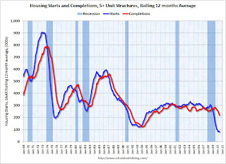 Click on graph for larger image in new window.
The blue line is for multifamily starts and the red line is for multifamily completions. All the multifamily units that will be delivered in 2010 have already been started since, according to the Census Bureau, it takes on average over 1 year to complete these projects.
Since multifamily starts collapsed in 2009, completions will collapse in 2010.
In June 2010, builders started 8,200 apartment units (NSA), and completed 18,200 units. This level of starts has been steady all year, and completions should drop sharply in the next few months. As an aside, this suggests that construction employment will decline further over the next few months.
Similar logic applies to single family units, although these only take around 7 months to complete. Most of the housing units that will be completed this year have already been started. Builders completed 243,800 units (1 to 4 units) in the first half of 2010. Based on starts, builders will probably complete about the same number of units in the 2nd half of the year.
The manufactured homes data is from the Census Bureau through May (and demolitions are estimated).
AIA: Architecture Billings Index shows contraction in June
by Calculated Risk on 7/21/2010 03:59:00 PM
Note: This index is a leading indicator for new Commercial Real Estate (CRE) investment.
Birmingham Business Journal reports that the American Institute of Architects’ Architecture Billings Index increased to 46 in June from 45.8 in May. Any reading below 50 indicates contraction.
The ABI press release is not online yet. Click on graph for larger image in new window.
This graph shows the Architecture Billings Index since 1996. The index has remained below 50, indicating falling demand, since January 2008.
Note: Nonresidential construction includes commercial and industrial facilities like hotels and office buildings, as well as schools, hospitals and other institutions.
This suggests the slump for commercial real estate design is ongoing. According to the AIA, there is an "approximate nine to twelve month lag time between architecture billings and construction spending" on non-residential construction. So there will probably be further declines in CRE investment into 2011.
Live Feeds: Bernanke Testimony at 2 PM ET
by Calculated Risk on 7/21/2010 01:50:00 PM
Here are two live feeds for Fed Chairman Ben Bernanke's testimony to the Senate Banking Committee: The Semiannual Monetary Policy Report to the Congress
Here is the CNBC feed.
Here is the C-Span3 Link
Prepared testimony: Semiannual Monetary Policy Report to the Congress
Existing Homes: Months of Supply and House Prices
by Calculated Risk on 7/21/2010 12:08:00 PM
Earlier I mentioned that a normal housing market usually has under 6 months of supply. The NAR reported that months of supply was at 8.3 months in May, and the months of supply was probably be higher in June (to be reported tomorrow).
A quick estimate: If sales are 5.3 million (SAAR) in June, and inventory stays the same at 3.9 million units, the months of supply will rise to 8.8 months in June.
This is calculated as: 3.9 divided by 5.3 * 12 (months) = 8.8 months of supply.
For July, if sales fall to 4.5 million (it could be lower) and inventory is still at 3.9 million units, months of supply will rise to 10.4 months.
I think these estimates are conservative (actual will probably be higher). For reference, the all time record high was 11.2 months of supply in 2008.
This level of supply will put additional downward pressure on house prices. Click on graph for larger image in new window.
This graph show months of supply and the annualized change in the Case-Shiller Composite 20 house price index.
Below 6 months of supply (blue line) house prices are typically rising (black line).
Above 6 or 7 months of supply house prices are usually falling (although there were many programs to support house prices over the last year).
The dashed red line is the estimate for months of supply in June and July.
This is a key reason why I expect house prices to fall further later this year as measured by the Case-Shiller and CoreLogic repeat sales house price indexes.
WSJ: Housing Market Stumbles
by Calculated Risk on 7/21/2010 08:55:00 AM
Nick Timiraos and Robbie Whelan write at the WSJ Housing Market Stumbles. A few excerpts:
The Wall Street Journal's quarterly survey of housing-market conditions in 28 major metropolitan areas shows that inventory levels have grown in many markets.A few comments:
... newly signed contracts in May and June have plunged. ...
More broadly, the housing market faces two big problems: too many homes and falling demand.
MBA: Mortgage Purchase Applications increase slightly last week
by Calculated Risk on 7/21/2010 07:43:00 AM
The MBA reports: Interest Rate Drops Spur Refinance Applications in Latest MBA Weekly Survey
The Refinance Index increased 8.6 percent from the previous week and was the highest Refinance Index observed in the survey since the week ending May 15, 2009.
...
The seasonally adjusted Purchase Index increased 3.4 percent from one week earlier, driven by an 8.0 percent increase in government purchase applications.
...
"As rates on 30- and 15-year fixed-rate mortgages declined to the lowest levels recorded in the survey, refinance activity increased last week. The refinance index is up almost 30 percent over the past 4 weeks, but is still well below the peak seen last spring,” said Michael Fratantoni, MBA’s Vice President of Research and Economics.
...
The average contract interest rate for 30-year fixed-rate mortgages decreased to 4.59 percent from 4.69 percent, with points increasing to 1.04 from 0.96 (including the origination fee) for 80 percent loan-to-value (LTV) ratio loans. This was the lowest 30-year contract rate ever recorded in the survey.
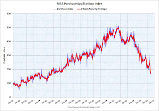 Click on graph for larger image in new window.
This graph shows the MBA Purchase Index and four week moving average since 1990.
Although the weekly applications index increased slightly, the four-week moving average is at a 15 year low (lowest since August 1995). The four week average is off 36% since the mini-peak in April (the weekly index is off 42% since the end of April).
This collapse in the mortgage application index has already shown up as a decline in new home sales, and will show up in the July and August existing home sales reports (counted at close of escrow).
Tuesday, July 20, 2010
Quick Update: Bernanke rescheduled to 2 PM ET
by Calculated Risk on 7/20/2010 10:08:00 PM
The Semiannual Monetary Policy Report to the Congress 02:00 PM - 05:00 PM ET
Bernanke Testimony Preview
by Calculated Risk on 7/20/2010 07:45:00 PM
Tomrrow, starting at 10 AM ET, Fed Chairman Ben Bernanke will report to the Senate Banking Committee: The Semiannual Monetary Policy Report to the Congress
David Wessel at the WSJ has a preview: The View From Bernanke's Perch at the Fed
Neil Irwin at the WaPo has some comments: Why Wall Street doesn't understand the Fed
Bernanke will very likely tell the Senate Banking Committee on Wednesday that cutting [interest on excess reserves] is one of a handful of options that the Fed is evaluating should the economic recovery continue to stumble. The others ... are strengthening its promise to keep interest rates low for an extended period and buying enough mortgage securities to replace those that mature. He will indicate openness to buying more long-term assets, but only if the economy appears to be heading back toward recession.I doubt Bernanke will mention options for further easing in his prepared statement, however he will probably be asked about what options are available in the Q&A. As Andrew Tilton at Goldman Sachs noted yesterday: "Any commentary on easing options seems more likely to come in the question-and-answer session rather than prepared remarks. One way for Chairman Bernanke to keep specific ideas at arm’s length might be to couch them in terms of a discussion of what other central banks have done."
I think Bernanke will mention the recent weak economic data in his prepared testimony, and it will interesting to see how he phrases it. As far as policy options, I think the options Irwin mentions are possible - and also possible is setting target ceiling rates for 3 to 5 year Treasury securities (he discussed this in his 2002 speech: Deflation: Making Sure "It" Doesn't Happen Here).
Obama Housing Scorecard
by Calculated Risk on 7/20/2010 04:31:00 PM
The Obama Administration released the June Housing Scorecard today. The graphs are a little hard to read, but they do provide a list of sources.
On modifications they provide a graph showing 2.95 million total modifications for Hope Now, HAMP, and FHA loss mitigation (page 3). There are also private modifications too (not mentioned) - so quite a few borrowers have had some sort of loan modification.
For housing supply (page 2 last graph), they show existing home inventory and "vacant housing units, held off market, year round, other" from the Census Bureau. I suppose they are using this number (about 3.6 million now - usually around 2.7 million) as a measure of shadow inventory. I think a better measure of the excess supply is to use the vacancy rates from the Census Bureau. The Q2 vacancy rates will be released next week on July 27th.
HAMP data: Only 15,000 trial modifications started in June
by Calculated Risk on 7/20/2010 01:07:00 PM
From Treasury: HAMP Servicer Performance Report Through June 2010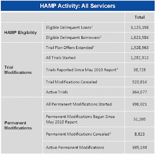 Click on table for larger image in new window.
About 389 thousand modifications are now "permanent" - up from 347 thousand last month - and 521 thousand trial modifications have been cancelled - up sharply from 430 thousand last month.
According to HAMP, there are 364,077 "active trials", down from 467,672 last month. There is still a large number of borrowers in limbo since only 235 thousand trials were started over the last 5 months. I expect another large number of cancellations in July. The second graph shows the cumulative HAMP trial programs started.
Notice that the pace of new trial modifications has slowed sharply from over 150,000 in September to just over 15,000 in June (down from 30,000 in April 2010). This is the slowest pace since the program started, probably because of two factors: 1) servicers are now pre-qualifying borrowers, and 2) servicers are running out of eligible borrowers. The program is winding down ...
Debt-to-income ratios
If we look at the HAMP program stats (see page 3), the median front end DTI (debt to income) before modification was 44.8% - the same as last month. And the back end DTI was an astounding 79.9 (up slightly from last month).
Think about that for a second: for the median borrower, about 80% of the borrower's income went to servicing debt. And the median is 63.7% after the modification.
And that is the median - and just imagine the characteristics of the borrowers who can't be converted!
Summary:
Note: On page 3, HAMP added the delinquency rates for "permanent" modifications. As an example, 5.9% of borrowers are 60+ days delinquent six months after their modifications became "permanent". Over 8,800 "permanent" modifications have been cancelled, and only 195 have been paid off (probably sold property). The others probably are in foreclosure (or other distress sale).
State Unemployment Rates: Generally lower in June
by Calculated Risk on 7/20/2010 10:03:00 AM
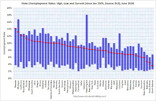 Click on graph for larger image in new window.
This graph shows the high and low unemployment rates for each state (and D.C.) since 1976. The red bar is the current unemployment rate (sorted by the current unemployment rate).
Sixteen states and D.C. now have double digit unemployment rates. Arizona and New Jersey are close.
Nevada set a new series high at 14.2% and now has the highest state unemployment rate. Michigan held the top spot for over 4 years until May.
From the BLS: Regional and State Employment and Unemployment Summary
Regional and state unemployment rates were generally lower in June. Thirty-nine states and the District of Columbia recorded unemployment rate decreases, five states had increases and six states had no change, the U.S. Bureau of Labor Statistics reported today.
...
Nevada again reported the highest unemployment rate among the states, 14.2 percent in June. The rate in Nevada also set a new series high. (All region, division, and state series begin in 1976.) The states with the next highest rates were Michigan, 13.2 percent; California, 12.3 percent; and Rhode Island, 12.0 percent.
emphasis added
Housing Starts decline in June
by Calculated Risk on 7/20/2010 08:30:00 AM
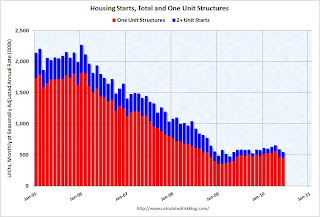 Click on graph for larger image in new window.
Total housing starts were at 549 thousand (SAAR) in June, down 5% from the revised May rate of 578,000 (revised down from 593 thousand), and up 15% from the all time record low in April 2009 of 477 thousand (the lowest level since the Census Bureau began tracking housing starts in 1959).
Single-family starts declined 0.7% to 454,000 in June. This is 26% above the record low in January 2009 (360 thousand). 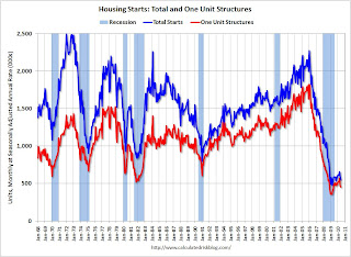 The second graph shows total and single unit starts since 1968. This shows the huge collapse following the housing bubble, and that housing starts have mostly been moving sideways for over a year.
Here is the Census Bureau report on housing Permits, Starts and Completions.
Housing Starts:This is way below expectations of 580 thousand (I took the under!), and is good news for the housing market longer term (there are too many housing units already), but bad news for the economy and employment short term.
Privately-owned housing starts in June were at a seasonally adjusted annual rate of 549,000. This is 5.0 percent (±13.2%)* below the 13.2%) revised May estimate of 578,000 and is 5.8 percent (±10.5%)* below the June 2009 rate of 583,000.
Single-family housing starts in June were at a rate of 454,000; this is 0.7 percent (±10.7%)* below the revised May figure of 457,000.
Building Permits:
Privately-owned housing units authorized by building permits in June were at a seasonally adjusted annual rate of 586,000. This is 2.1 percent (±2.1%)* above the revised May rate of 574,000, but is 2.3 percent (±2.0%) below the June 2009 estimate of 600,000.
Single-family authorizations in June were at a rate of 421,000; this is 3.4 percent (±1.8%) below the revised May figure of 436,000.


