by Calculated Risk on 6/29/2021 03:36:00 PM
Tuesday, June 29, 2021
June 29th COVID-19 New Cases, Vaccinations, Hospitalizations
This data is from the CDC.
According to the CDC, on Vaccinations.
Total doses administered: 325,152,847, as of a week ago 319,223,844. Average doses last week: 0.85 million per day.
| COVID Metrics | ||||
|---|---|---|---|---|
| Today | Yesterday | Week Ago | Goal | |
| Percent over 18, One Dose | 66.2% | 66.1% | 65.5% | ≥70.0%1,2 |
| Fully Vaccinated (millions) | 154.2 | 153.8 | 150.4 | ≥1601 |
| New Cases per Day3,4🚩 | 11,707 | 11,817 | 11,344 | ≤5,0002 |
| Hospitalized3 | 11,837 | 11,287 | 12,633 | ≤3,0002 |
| Deaths per Day3,4🚩 | 286 | 312 | 284 | ≤502 |
| 1 America's Goal by July 4th, 2my goals to stop daily posts, 37 day average for Cases, Hospitalized, and Deaths 4Cases and Deaths updated Mon - Fri 🚩 Increasing week-over-week | ||||
KUDOS to the residents of the 16 states and D.C. that have already achieved the 70% goal: Vermont, Hawaii and Massachusetts are at 80%+, and Connecticut, Maine, New Jersey, Rhode Island, Pennsylvania, New Mexico, Maryland, California, Washington, New Hampshire, New York, Illinois, Virginia and D.C. are all over 70%.
Next up are Delaware at 69.8%, Minnesota at 69.7%, Colorado at 69.6%, Oregon at 69.4%, Wisconsin at 65.2%, Nebraska at 65.1%, and Florida at 64.3%.
 Click on graph for larger image.
This graph shows the daily (columns) and 7 day average (line) of positive tests reported.
This data is from the CDC.
House Prices and Inventory
by Calculated Risk on 6/29/2021 12:42:00 PM
Watching existing home "for sale" inventory is very helpful. As an example, the increase in inventory in late 2005 helped me call the top for housing.
And the decrease in inventory eventually helped me correctly call the bottom for house prices in early 2012, see: The Housing Bottom is Here.
And in 2015, it appeared the inventory build in several markets was ending, and that boosted price increases.
I don't have a crystal ball, but watching inventory helps understand the housing market.
 Click on graph for larger image.
This graph below shows existing home months-of-supply (inverted, from the NAR) vs. the seasonally adjusted month-to-month price change in the Case-Shiller National Index (both since January 1999 through March 2021).
In the May existing home sales report released last week, the NAR reported months-of-supply increased to 2.5 month in May. There is a seasonal pattern to inventory, but this is still very low - and prices are increasing sharply.
Real House Prices and Price-to-Rent Ratio in April
by Calculated Risk on 6/29/2021 10:48:00 AM
Here is the post earlier on Case-Shiller: Case-Shiller: National House Price Index increased 14.6% year-over-year in April
It has been fifteen years since the bubble peak. In the Case-Shiller release today, the seasonally adjusted National Index (SA), was reported as being 35% above the previous bubble peak. However, in real terms, the National index (SA) is about 5% above the bubble peak (and historically there has been an upward slope to real house prices). The composite 20, in real terms, is still 3% below the bubble peak.
The year-over-year growth in prices increased to 14.6% nationally.
Usually people graph nominal house prices, but it is also important to look at prices in real terms (inflation adjusted). Case-Shiller and others report nominal house prices. As an example, if a house price was $200,000 in January 2000, the price would be over $301,000 today adjusted for inflation (50%). That is why the second graph below is important - this shows "real" prices (adjusted for inflation).
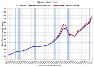
Nominal House Prices

In nominal terms, the Case-Shiller National index (SA) and the Case-Shiller Composite 20 Index (SA) are both at new all times highs (above the bubble peak).
Real House Prices

In real terms, the National index is 5% above the bubble peak, and the Composite 20 index is back to late-2005.
In real terms, house prices are close to previous peak levels.
Note that inflation was negative for a few months last year, and that also boosted real prices.
Price-to-Rent
In October 2004, Fed economist John Krainer and researcher Chishen Wei wrote a Fed letter on price to rent ratios: House Prices and Fundamental Value. Kainer and Wei presented a price-to-rent ratio using the OFHEO house price index and the Owners' Equivalent Rent (OER) from the BLS.

This graph shows the price to rent ratio (January 2000 = 1.0). The price-to-rent ratio had been moving more sideways, but picked up significantly recently.
On a price-to-rent basis, the Case-Shiller National index is back to April 2005 levels, and the Composite 20 index is back to October 2004 levels.
In real terms, prices are close to 2005 peak levels, and the price-to-rent ratio is back to late 2004, early 2005.
Case-Shiller: National House Price Index increased 14.6% year-over-year in April
by Calculated Risk on 6/29/2021 09:10:00 AM
S&P/Case-Shiller released the monthly Home Price Indices for April ("April" is a 3 month average of February, March and April prices).
This release includes prices for 20 individual cities, two composite indices (for 10 cities and 20 cities) and the monthly National index.
From S&P: S&P Corelogic Case-Shiller Index Shows Annual Home Price Gains Surged to 14.6% In April
The S&P CoreLogic Case-Shiller U.S. National Home Price NSA Index, covering all nine U.S. census divisions, reported a 14.6% annual gain in April, up from 13.3% in the previous month. The 10-City Composite annual increase came in at 14.4%, up from 12.9% in the previous month. The 20-City Composite posted a 14.9% year-over-year gain, up from 13.4% in the previous month.
Phoenix, San Diego, and Seattle reported the highest year-over-year gains among the 20 cities in April. Phoenix led the way with a 22.3% year-over-year price increase, followed by San Diego with a 21.6% increase and Seattle with a 20.2% increase. All 20 cities reported higher price increases in the year ending April 2021 versus the year ending March 2021.
...
Before seasonal adjustment, the U.S. National Index posted a 2.1% month-over-month increase, while the 10-City and 20-City Composites both posted increases of 1.9% and 2.1% respectively in April.
After seasonal adjustment, the U.S. National Index posted a month-over-month increase of 1.6%, and the 10-City and 20-City Composites both posted increases of 1.4% and 1.6% respectively. In April, all 20 cities reported increases before and after seasonal adjustments.
“Housing prices accelerated their surge in April 2021,” says Craig J. Lazzara, Managing Director and Global Head of Index Investment Strategy at S&P DJI. “The National Composite Index marked its eleventh consecutive month of accelerating prices with a 14.6% gain from year-ago levels, up from 13.3% in March. This acceleration is also reflected in the 10- and 20-City Composites (up 14.4% and 14.9%, respectively). The market’s strength is broadly-based: all 20 cities rose, and all 20 gained more in the 12 months ended in April than they had gained in the 12 months ended in March.
“April’s performance was truly extraordinary. The 14.6% gain in the National Composite is literally the highest reading in more than 30 years of S&P CoreLogic Case-Shiller data. Housing prices in all 20 cities rose; price gains in all 20 cities accelerated; price gains in all 20 cities were in the top quartile of historical performance. In 15 cities, price gains were in top decile. Five cities – Charlotte, Cleveland, Dallas, Denver, and Seattle – joined the National Composite in recording their all-time highest 12- month gains.
“We have previously suggested that the strength in the U.S. housing market is being driven in part by reaction to the COVID pandemic, as potential buyers move from urban apartments to suburban homes. April’s data continue to be consistent with this hypothesis. This demand surge may simply represent an acceleration of purchases that would have occurred anyway over the next several years. Alternatively, there may have been a secular change in locational preferences, leading to a permanent shift in the demand curve for housing. More time and data will be required to analyze this question
emphasis added
 Click on graph for larger image.
 The first graph shows the nominal seasonally adjusted Composite 10, Composite 20 and National indices (the Composite 20 was started in January 2000).
The Composite 10 index is up 1.4% in April (SA) from March.
The Composite 20 index is up 1.6% (SA) in April.
The National index is 35% above the bubble peak (SA), and up 1.6% (SA) in April. The National index is up 80% from the post-bubble low set in February 2012 (SA).
 The second graph shows the year-over-year change in all three indices.
The Composite 10 SA is up 14.4% compared to April 2020. The Composite 20 SA is up 14.9% year-over-year.
The National index SA is up 14.6% year-over-year.
Price increases were above expectations. I'll have more later.
Monday, June 28, 2021
Tuesday: Case-Shiller House Prices
by Calculated Risk on 6/28/2021 08:22:00 PM
From Matthew Graham at Mortgage News Daily: MBS RECAP: Monday Giveth
Summertime weekend trading dynamics are sadly a source of motivation for bond markets--especially amid a lack of actionable data on a week that ends with the most actionable data. In that sense, whereas we found ourselves saying "Friday taketh away" at the end of last week, we can now say "Monday giveth." ... MBS kept pace with the Treasury gains quite nicely and 2.0 coupons are now at their best levels in 2 weeks. [30 year fixed 3.20%]Tuesday:
emphasis added
• At 9:00 AM ET, S&P/Case-Shiller House Price Index for April. The consensus is for a 12.3% year-over-year increase in the Comp 20 index for April. (CR Note: Consensus seems low!)
• Also at 9:00 AM, FHFA House Price Index for April 2021. This was originally a GSE only repeat sales, however there is also an expanded index.
MBA Survey: "Share of Mortgage Loans in Forbearance Slightly Decreases to 3.91%"
by Calculated Risk on 6/28/2021 04:00:00 PM
Note: This is as of June 20th.
From the MBA: Share of Mortgage Loans in Forbearance Slightly Decreases to 3.91%
The Mortgage Bankers Association’s (MBA) latest Forbearance and Call Volume Survey revealed that the total number of loans now in forbearance decreased by 2 basis points from 3.93% of servicers’ portfolio volume in the prior week to 3.91% as of June 20, 2021. According to MBA’s estimate, 2 million homeowners are in forbearance plans.
The share of Fannie Mae and Freddie Mac loans in forbearance decreased 3 basis points to 2.02%. Ginnie Mae loans in forbearance decreased 2 basis points to 5.13%, while the forbearance share for portfolio loans and private-label securities (PLS) decreased 1 basis point to 7.97%. The percentage of loans in forbearance for independent mortgage bank (IMB) servicers decreased 2 basis points to 4.03%, and the percentage of loans in forbearance for depository servicers declined 2 basis points to 4.14%.
“The share of loans in forbearance declined for the 17th straight week, with small declines across almost every loan category,” said Mike Fratantoni, MBA’s Senior Vice President and Chief Economist. “The rate of forbearance exits slowed – as has been typical in mid-month reports – but the pace of new forbearance requests remained at a very low level of 4 basis points.”
Added Fratantoni, “The steady improvement in the aggregate forbearance numbers is heartening, as it is evidence that improving economic conditions are allowing more homeowners to get back on their feet. However, we continue to closely monitor the number of forbearance re-entries, reflecting borrowers who exited forbearance but had to re-enter due to hardships. These re-entries accounted for 6.2 percent of loans in forbearance this week.”
emphasis added
 Click on graph for larger image.
This graph shows the percent of portfolio in forbearance by investor type over time. Most of the increase was in late March and early April 2020, and has trended down since then.
The MBA notes: "Total weekly forbearance requests as a percent of servicing portfolio volume (#) remained the same relative to the prior week at 0.04%".
Note: These deferral plans are very popular. Basically when the homeowner exits forbearance, they just go back to making their regular monthly payments, they are not charged interest on the missed payments, and the unpaid balanced is deferred until the end of the mortgage.
June 28th COVID-19 New Cases, Vaccinations, Hospitalizations
by Calculated Risk on 6/28/2021 03:38:00 PM
This data is from the CDC.
According to the CDC, on Vaccinations.
Total doses administered: 324,414,371, as of a week ago 318,576,441. Average daily doses last week: 0.83 million.
| COVID Metrics | ||||
|---|---|---|---|---|
| Today | Yesterday | Week Ago | Goal | |
| Percent over 18, One Dose | 66.1% | 66.0% | 65.4% | ≥70.0%1,2 |
| Fully Vaccinated (millions) | 153.8 | 153.0 | 150.0 | ≥1601 |
| New Cases per Day3,4 | 10,332 | 11,025 | 11,111 | ≤5,0002 |
| Hospitalized3 | 11,287 | 11,839 | 12,179 | ≤3,0002 |
| Deaths per Day3,4🚩 | 295 | 305 | 270 | ≤502 |
| 1 America's Goal by July 4th, 2my goals to stop daily posts, 37 day average for Cases, Hospitalized, and Deaths 4Cases and Deaths updated Mon - Fri 🚩 Increasing week-over-week | ||||
KUDOS to the residents of the 16 states and D.C. that have already achieved the 70% goal: Vermont, Hawaii and Massachusetts are at 80%+, and Connecticut, Maine, New Jersey, Rhode Island, Pennsylvania, New Mexico, Maryland, California, Washington, New Hampshire, New York, Illinois, Virginia and D.C. are all over 70%.
Next up are Delaware at 69.8%, Minnesota at 69.7%, Colorado at 69.5%, Oregon at 69.4%, Wisconsin at 65.2%, Nebraska at 65.0%, and Florida at 64.3%.
 Click on graph for larger image.
This graph shows the daily (columns) and 7 day average (line) of positive tests reported.
This data is from the CDC.
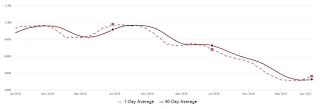
Housing Inventory June 28th Update: Inventory Increased Week-over-week
by Calculated Risk on 6/28/2021 10:40:00 AM
Tracking existing home inventory will be very important this year.

This inventory graph is courtesy of Altos Research.
Mike Simonsen discusses this data regularly on Youtube. Altos Research has also seen a significant pickup in price decreases, although still well below a normal rate for June.
Seven High Frequency Indicators for the Economy
by Calculated Risk on 6/28/2021 08:15:00 AM
These indicators are mostly for travel and entertainment. It will interesting to watch these sectors recover as the pandemic subsides.
The TSA is providing daily travel numbers.
 Click on graph for larger image.
This data shows the seven day average of daily total traveler throughput from the TSA for 2019 (Light Blue), 2020 (Blue) and 2021 (Red).
The dashed line is the percent of 2019 for the seven day average.
This data is as of June 27th.
The seven day average is down 23.7% from the same day in 2019 (76.3% of 2019). (Dashed line)
There was a slow increase from the bottom - and TSA data has picked up in 2021.
The second graph shows the 7 day average of the year-over-year change in diners as tabulated by OpenTable for the US and several selected cities.
 Thanks to OpenTable for providing this restaurant data:
This data is updated through June 26, 2021.
This data is "a sample of restaurants on the OpenTable network across all channels: online reservations, phone reservations, and walk-ins. For year-over-year comparisons by day, we compare to the same day of the week from the same week in the previous year."
Note that this data is for "only the restaurants that have chosen to reopen in a given market". Since some restaurants have not reopened, the actual year-over-year decline is worse than shown.
Dining picked up during the holidays, then slumped with the huge winter surge in cases. Dining is picking up again, and was up slightly in US (7-day average compared to 2019). Florida and Texas are above 2019 levels.
 This data shows domestic box office for each week and the median for the years 2016 through 2019 (dashed light blue).
 Note that the data is usually noisy week-to-week and depends on when blockbusters are released.
Movie ticket sales were at $70 million last week, down about 79% from the median for the week.
 This graph shows the seasonal pattern for the hotel occupancy rate using the four week average.
 The red line is for 2021, black is 2020, blue is the median, dashed purple is 2019, and dashed light blue is for 2009 (the worst year on record for hotels prior to 2020).
Occupancy is now above the horrible 2009 levels and weekend occupancy (leisure) has been solid.
This data is through June 19th. Hotel occupancy is currently down 10% compared to same week in 2019). Note: Occupancy was up year-over-year, since occupancy declined sharply at the onset of the pandemic. However, the 4-week average occupancy is still down from normal levels.
Notes: Y-axis doesn't start at zero to better show the seasonal change.
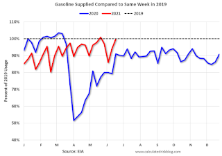
 This graph, based on weekly data from the U.S. Energy Information Administration (EIA), shows gasoline supplied compared to the same week of 2019.
Blue is for 2020. Red is for 2021.
As of June 18th, gasoline supplied was down slightly compared to the same week in 2019 (about 99.7% of the same week in 2019).
Four weeks ago was the only week this year when gasoline supplied was up compared to the same week in 2019.
This graph is from Apple mobility. From Apple: "This data is generated by counting the number of requests made to Apple Maps for directions in select countries/regions, sub-regions, and cities." This is just a general guide - people that regularly commute probably don't ask for directions.
There is also some great data on mobility from the Dallas Fed Mobility and Engagement Index. However the index is set "relative to its weekday-specific average over January–February", and is not seasonally adjusted, so we can't tell if an increase in mobility is due to recovery or just the normal increase in the Spring and Summer.
 This data is through June 26th for the United States and several selected cities.
The graph is the running 7 day average to remove the impact of weekends.
IMPORTANT: All data is relative to January 13, 2020. This data is NOT Seasonally Adjusted. People walk and drive more when the weather is nice, so I'm just using the transit data.
According to the Apple data directions requests, public transit in the 7 day average for the US is at 96% of the January 2020 level and moving up.
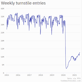
Here is some interesting data on New York subway usage (HT BR).
 This graph is from Todd W Schneider. This is weekly data since 2015.
 This data is through Friday, June 25th.
Schneider has graphs for each borough, and links to all the data sources.
He notes: "Data updates weekly from the MTA’s public turnstile data, usually on Saturday mornings".
Sunday, June 27, 2021
Sunday Night Futures
by Calculated Risk on 6/27/2021 07:30:00 PM
Weekend:
• Schedule for Week of June 27, 2021
Monday:
• At 10:30 AM ET, Dallas Fed Survey of Manufacturing Activity for June. This is the last of the regional surveys for June.
From CNBC: Pre-Market Data and Bloomberg futures S&P 500 are up 8 and DOW futures are up 88 (fair value).
Oil prices were up over the last week with WTI futures at $74.11 per barrel and Brent at $76.24 per barrel. A year ago, WTI was at $40, and Brent was at $41 - so WTI oil prices are UP over 75% year-over-year (oil prices collapsed at the beginning of the pandemic).
Here is a graph from Gasbuddy.com for nationwide gasoline prices. Nationally prices are at $3.09 per gallon. A year ago prices were at $2.18 per gallon, so gasoline prices are up $0.91 per gallon year-over-year.


