 RSS Feed
 by Calculated Risk on 6/22/2021 01:00:00 PM
Tuesday, June 22, 2021
DOT: Vehicle Miles Driven Increased Sharply year-over-year in April
This will be something to watch as the economy recovers.
The Department of Transportation (DOT) reported:
Travel on all roads and streets changed by 54.6% (90.6 billion vehicle miles) for April 2021 as compared with April 2020. Travel for the month is estimated to be 256.5 billion vehicle miles.
The seasonally adjusted vehicle miles traveled for April 2021 is 248.6 billion miles, a 56.5% (89.7 billion vehicle miles) increase over April 2020. It also represents -4.7% decline (-12.3 billion vehicle miles) compared with March 2021.
Cumulative Travel for 2021 changed by ( billion vehicle miles). The cumulative estimate for the year is 947.5 billion vehicle miles of travel.
emphasis added
 Click on graph for larger image.
This graph shows the monthly total vehicle miles driven, seasonally adjusted.
Miles driven declined sharply in March 2020, and really collapsed in April 2020. After partially recovering fairly quickly, miles driven was mostly flat for 6+ months - but picked up in March, but fell back in April.
Comments on May Existing Home Sales
by Calculated Risk on 6/22/2021 10:34:00 AM
Earlier: NAR: Existing-Home Sales Decreased to 5.80 million in May
A few key points:
1) Existing home sales are getting close to pre-pandemic levels. Although seasonally adjusted (SA) sales for May were the highest since 2006, sales Not Seasonally Adjusted (NSA) in May 2021 were below the sales for May in 2017, 2018 and 2019.
Some of the increase over the previous ten months was probably related to record low mortgage rates, a move away from multi-family rentals, strong second home buying (to escape the high-density cities), a strong stock market and favorable demographics.
2) Inventory is very low, and was down 20.6% year-over-year (YoY) in May. Also, as housing economist Tom Lawler has noted, the local MLS data shows even a larger decline in active inventory (the NAR appears to include some pending sales in inventory). Lawler noted:
Months-of-supply at 2.5 months is still very low, but above the record low of 1.9 months set in December 2020 and January 2021. Inventory will be important to watch in 2021, see: Some thoughts on Housing Inventory
Also, the delay in the 2020 buying season pushed the seasonally adjusted number to very high levels over the winter. This means there are going to be some difficult comparisons in the second half of 2021!
2) Inventory is very low, and was down 20.6% year-over-year (YoY) in May. Also, as housing economist Tom Lawler has noted, the local MLS data shows even a larger decline in active inventory (the NAR appears to include some pending sales in inventory). Lawler noted:
"As I’ve noted before, the inventory measure in most publicly-released local realtor/MLS reports excludes listings with pending contracts, but that is not the case for many of the reports sent to the NAR (referred to as the “NAR Report!”), Since the middle of last Spring inventory measures excluding pending listings have fallen much more sharply than inventory measures including such listings, and this latter inventory measure understates the decline in the effective inventory of homes for sale over the last several months."
It seems likely that active inventory is down close to 50% year-over-year.
3) As usual, housing economist Tom Lawler's forecast was closer to the NAR report than the Consensus. The NAR reported 5.80 million SAAR, Lawler estimated the NAR would report 5.78 million SAAR, and the consensus was 5.72 million SAAR.
 Click on graph for larger image.
This graph shows existing home sales by month for 2020 and 2021.
The year-over-year comparison will be easy in June, and then difficult in the second half of the year.
The second graph shows existing home sales for each month, Not Seasonally Adjusted (NSA), since 2005.
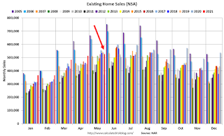 Sales NSA in May (528,000) were 41.9% above sales in May 2020 (372,000).
Although sales were up sharply from May 2020, this was below the sales NSA for May in 2017, 2018 and 2019.
NAR: Existing-Home Sales Decreased to 5.80 million in May
by Calculated Risk on 6/22/2021 10:12:00 AM
From the NAR: Existing-Home Sales Experience Slight Skid of 0.9% in May
Existing-home sales decreased for a fourth straight month in May, according to the National Association of Realtors®. Only one major U.S. region recorded a month-over-month increase, while the other three regions saw sales decline. However, each of the four areas again registered double-digit year-over-year gains.
Total existing-home sales, completed transactions that include single-family homes, townhomes, condominiums and co-ops, dropped 0.9% from April to a seasonally-adjusted annual rate of 5.80 million in May. Sales in total climbed year-over-year, up 44.6% from a year ago (4.01 million in May 2020).
...
Total housing inventory at the end of May amounted to 1.23 million units, up 7.0% from April's inventory and down 20.6% from one year ago (1.55 million). Unsold inventory sits at a 2.5-month supply at the present sales pace, marginally up from April's 2.4-month supply but down from 4.6-months in May 2020.
emphasis added
 Click on graph for larger image.
This graph shows existing home sales, on a Seasonally Adjusted Annual Rate (SAAR) basis since 1993.
Sales in May (5.80 million SAAR) were down 0.9% from last month, and were 44.6% above the May 2020 sales rate.
The second graph shows nationwide inventory for existing homes.
 According to the NAR, inventory increased to 1.23 million in May from 1.15 million in April. Headline inventory is not seasonally adjusted, and inventory usually decreases to the seasonal lows in December and January, and peaks in mid-to-late summer.
The last graph shows the year-over-year (YoY) change in reported existing home inventory and months-of-supply. Since inventory is not seasonally adjusted, it really helps to look at the YoY change. Note: Months-of-supply is based on the seasonally adjusted sales and not seasonally adjusted inventory.
 Inventory was down 20.6% year-over-year in May compared to May 2020.
 Months of supply increased to 2.5 months in May from 2.4 months in April.
This was slightly above the consensus forecast. I'll have more later.
Monday, June 21, 2021
Tuesday: Existing Home Sales, Richmond Fed Mfg, Fed Chair Powell
by Calculated Risk on 6/21/2021 09:00:00 PM
From Matthew Graham at Mortgage News Daily: No Easy Victories For Mortgage Rates
10yr yields may have hit their lowest levels in months in the wee hours of the morning and people may always perceive a bit too much correlation between 10yr yields and mortgage rates, but the latter didn't have quite the same success. To be fair, Treasuries ended up losing ground as the day progressed, but even so, they are nearer to their recent lows than mortgage rates. [30 year fixed 3.25%]Tuesday:
emphasis added
• At 10:00 AM ET, Existing Home Sales for May from the National Association of Realtors (NAR). The consensus is for 5.72 million SAAR, down from 5.85 million.
Housing economist Tom Lawler expects the NAR to report sales of 5.78 million SAAR for May.
• Also at 10:00 AM, Richmond Fed Survey of Manufacturing Activity for June.
• At 2:00 PM, Testimony, Fed Chair Jerome Powell, The Federal Reserve's Response to the Coronavirus Pandemic, Before the Select Subcommittee on Coronavirus Crisis, U.S. House of Representatives
June 21st COVID-19 New Cases, Vaccinations, Hospitalizations
by Calculated Risk on 6/21/2021 07:24:00 PM
This data is from the CDC.
According to the CDC, on Vaccinations.
Total doses administered: 318,576,441, as of yesterday 317,966,408. Daily change: 0.61 million.
| COVID Metrics | ||||
|---|---|---|---|---|
| Today | Yesterday | Week Ago | Goal | |
| Percent over 18, One Dose | 65.4% | 65.4% | 64.5% | ≥70.0%1,2 |
| Fully Vaccinated (millions) | 150.0 | 149.7 | 144.9 | ≥1601 |
| New Cases per Day3,4 | 10,351 | 10,067 | 12,581 | ≤5,0002 |
| Hospitalized3 | 12,179 | 12,879 | 13,944 | ≤3,0002 |
| Deaths per Day3,4 | 273 | 222 | 310 | ≤502 |
| 1 America's Goal by July 4th, 2my goals to stop daily posts, 37 day average for Cases, Hospitalized, and Deaths 4Cases and Deaths updated Mon - Fri | ||||
KUDOS to the residents of the 16 states and D.C. that have already achieved the 70% goal: Vermont, Hawaii and Massachusetts are at 80%+, and Connecticut, New Jersey, Maine, Rhode Island, Pennsylvania, New Mexico, California, New Hampshire, Maryland, Washington, New York, Illinois, Virginia and D.C. are all over 70%.
Next up are Minnesota at 69.2%, Delaware at 69.1%, Colorado at 68.8%, Oregon at 68.7%, Wisconsin at 64.7%, Nebraska at 63.4%, and South Dakota at 63.4%.
 Click on graph for larger image.
This graph shows the daily (columns) and 7 day average (line) of positive tests reported.
This data is from the CDC.
Housing: A Somewhat Similar Period
by Calculated Risk on 6/21/2021 12:48:00 PM
A period that is somewhat similar to the current housing market was in the late 1970s.
House prices increased 14.7% in 1977, 15.7% in 1978 and 13.9% in 1979 (Case-Shiller National Index).
Over the last 12 months, house prices have increased 13.2%.
And currently demographics are favorable for home buying with a large cohort moving into their 30s, just like in the late 70s, with the leading-edge boomers turning 31 in 1977.
But there are stark differences too.
First, inflation was very high in the late '70s, averaging close to 9% over those 3 years. Inflation over the last year was up 5.0%, but that was mostly over the last few months - and is likely transitory (inflation was embedded in the late '70s).
Another major difference is housing inventories are much lower today (a key reason why house prices have jumped). There are a number of reasons for the low levels of inventory, including investor buying houses and condos following the GFC (mostly in the 2010 to 2015 period), and houses taken off the market due to the pandemic. Both the pandemic and strong investor buying following the financial crisis are unique to the current housing market.
The '70s house price boom stopped in the early '80s, as the economy went into recession twice with the unemployment rate peaking at 10.8% in 1982 (higher than the peak following the financial crisis). This was directly related to the Volcker Fed raising rates to fight inflation.
House prices declined regionally in the early '80s, but just flattened out nationally. In real terms, national house prices fell about 10% over a three-year period in the early '80s - and didn't regain the earlier peak for almost 7 years.
Currently there is no recession on the horizon to slow house price gains, and it is unlikely the Fed will tighten aggressively any time soon.
Although there are some similarities to the late '70s, there are also obvious differences.
My guess is the key will be inventory. As long as inventory stays low, house prices will continue to increase rapidly. If inventories increase, house price gains will slow.
Housing Inventory June 21st Update: Inventory Increased Week-over-week
by Calculated Risk on 6/21/2021 10:57:00 AM
One of the key questions for 2021 is: Will inventory increase as the pandemic subsides, or will inventory decrease further in 2021?
Tracking inventory will be very important this year.
 Click on graph for larger image in graph gallery.
This inventory graph is courtesy of Altos Research.
As of June 18th, inventory was at 353 thousand (7 day average), compared to 690 thousand the same week a year ago. That is a decline of 48.8%.
A week ago, inventory was at 342 thousand, and was down 51.0% YoY.
Seasonally, inventory has bottomed. Inventory was about 15.3% above the low in early April.
Mike Simonsen discusses this data regularly on Youtube.
Seven High Frequency Indicators for the Economy
by Calculated Risk on 6/21/2021 08:09:00 AM
These indicators are mostly for travel and entertainment. It will interesting to watch these sectors recover as the pandemic subsides.
The TSA is providing daily travel numbers.
 Click on graph for larger image.
This data shows the seven day average of daily total traveler throughput from the TSA for 2019 (Light Blue), 2020 (Blue) and 2021 (Red).
The dashed line is the percent of 2019 for the seven day average.
This data is as of June 20th.
The seven day average is down 27.0% from the same day in 2019 (73.0% of 2019). (Dashed line)
There was a slow increase from the bottom - and TSA data has picked up in 2021.
The second graph shows the 7 day average of the year-over-year change in diners as tabulated by OpenTable for the US and several selected cities.
IMPORTANT: OpenTable notes: "we’ve updated the data including downloadable dataset from January 1, 2021 onward to compare seated diners from 2021 to 2019, as opposed to year over year." Thanks!
 Thanks to OpenTable for providing this restaurant data:
This data is updated through June 19, 2021.
This data is "a sample of restaurants on the OpenTable network across all channels: online reservations, phone reservations, and walk-ins. For year-over-year comparisons by day, we compare to the same day of the week from the same week in the previous year."
Note that this data is for "only the restaurants that have chosen to reopen in a given market". Since some restaurants have not reopened, the actual year-over-year decline is worse than shown.
Dining picked up during the holidays, then slumped with the huge winter surge in cases. Dining is picking up again, and was only down 11% in US (7-day average compared to 2019). Florida and Texas are above 2019 levels.
----- Movie Tickets: Box Office Mojo -----
 This data shows domestic box office for each week and the median for the years 2016 through 2019 (dashed light blue).
 Thanks to OpenTable for providing this restaurant data:
This data is updated through June 19, 2021.
This data is "a sample of restaurants on the OpenTable network across all channels: online reservations, phone reservations, and walk-ins. For year-over-year comparisons by day, we compare to the same day of the week from the same week in the previous year."
Note that this data is for "only the restaurants that have chosen to reopen in a given market". Since some restaurants have not reopened, the actual year-over-year decline is worse than shown.
Dining picked up during the holidays, then slumped with the huge winter surge in cases. Dining is picking up again, and was only down 11% in US (7-day average compared to 2019). Florida and Texas are above 2019 levels.
 This data shows domestic box office for each week and the median for the years 2016 through 2019 (dashed light blue).
 Blue is 2020 and Red is 2021.
The data is from BoxOfficeMojo through June 17th.
Note that the data is usually noisy week-to-week and depends on when blockbusters are released.
Movie ticket sales were at $88 million last week, down about 66 from the median for the week.
Note that the data is usually noisy week-to-week and depends on when blockbusters are released.
Movie ticket sales were at $88 million last week, down about 66 from the median for the week.
 This graph shows the seasonal pattern for the hotel occupancy rate using the four week average.
 The red line is for 2021, black is 2020, blue is the median, dashed purple is 2019, and dashed light blue is for 2009 (the worst year on record for hotels prior to 2020).
Occupancy is now above the horrible 2009 levels and weekend occupancy (leisure) has been solid.
This data is through June 12th. Hotel occupancy is currently down 10% compared to same week in 2019). Note: Occupancy was up year-over-year, since occupancy declined sharply at the onset of the pandemic. However, the 4-week average occupancy is still down from normal levels.
Notes: Y-axis doesn't start at zero to better show the seasonal change.
 This graph, based on weekly data from the U.S. Energy Information Administration (EIA), shows gasoline supplied compared to the same week of 2019.
Blue is for 2020. Red is for 2021.
As of June 11th, gasoline supplied was down about 5.7% (about 94.3% of the same week in 2019).
Three weeks ago was the first week this year with gasoline supplied up compared to the same week in 2019.
This graph is from Apple mobility. From Apple: "This data is generated by counting the number of requests made to Apple Maps for directions in select countries/regions, sub-regions, and cities." This is just a general guide - people that regularly commute probably don't ask for directions.
There is also some great data on mobility from the Dallas Fed Mobility and Engagement Index. However the index is set "relative to its weekday-specific average over January–February", and is not seasonally adjusted, so we can't tell if an increase in mobility is due to recovery or just the normal increase in the Spring and Summer.
 This data is through June 19th for the United States and several selected cities.
The graph is the running 7 day average to remove the impact of weekends.
IMPORTANT: All data is relative to January 13, 2020. This data is NOT Seasonally Adjusted. People walk and drive more when the weather is nice, so I'm just using the transit data.
According to the Apple data directions requests, public transit in the 7 day average for the US is at 95% of the January 2020 level and moving up.
Here is some interesting data on New York subway usage (HT BR).
 This graph is from Todd W Schneider. This is weekly data since 2015.
 Most weeks are between 30 and 35 million entries, and currently there are close to 13 million subway turnstile entries per week - and generally increasing.
This data is through Friday, June 18th.
Schneider has graphs for each borough, and links to all the data sources.
He notes: "Data updates weekly from the MTA’s public turnstile data, usually on Saturday mornings".
This data is through Friday, June 18th.
Schneider has graphs for each borough, and links to all the data sources.
He notes: "Data updates weekly from the MTA’s public turnstile data, usually on Saturday mornings".
Sunday, June 20, 2021
Sunday Night Futures
by Calculated Risk on 6/20/2021 08:45:00 PM
Weekend:
• Schedule for Week of June 20, 2021
• Homebuilder Comments in Mid-June: "Interest lists are shrinking slightly, Traffic down"
Monday:
• At 8:30 AM ET, Chicago Fed National Activity Index for May. This is a composite index of other data.
From CNBC: Pre-Market Data and Bloomberg futures S&P 500 are down 8 and DOW futures are down 63 (fair value).
Oil prices were up over the last week with WTI futures at $71.87 per barrel and Brent at $73.70 per barrel. A year ago, WTI was at $40, and Brent was at $42 - so WTI oil prices are UP about 75% year-over-year (oil prices collapsed at the beginning of the pandemic).
Here is a graph from Gasbuddy.com for nationwide gasoline prices. Nationally prices are at $3.05 per gallon. A year ago prices were at $2.14 per gallon, so gasoline prices are up $0.91 per gallon year-over-year.
June 20th COVID-19 New Cases, Vaccinations, Hospitalizations
by Calculated Risk on 6/20/2021 04:36:00 PM
Congratulations to the residents of Virginia on joining the 70% club! Go for 80%!!!
This data is from the CDC.
According to the CDC, on Vaccinations.
Total doses administered: 317,966,408, as of yesterday 317,117,797. Daily change: 0.85 million.
| COVID Metrics | ||||
|---|---|---|---|---|
| Today | Yesterday | Week Ago | Goal | |
| Percent over 18, One Dose | 65.4% | 65.3% | 64.4% | ≥70.0%1,2 |
| Fully Vaccinated (millions) | 149.7 | 149.1 | 143.9 | ≥1601 |
| New Cases per Day3,4 | 11,432 | 11,976 | 14,274 | ≤5,0002 |
| Hospitalized3 | 12,879 | 13,344 | 14,683 | ≤3,0002 |
| Deaths per Day3,4 | 284 | 284 | 350 | ≤502 |
| 1 America's Goal by July 4th, 2my goals to stop daily posts, 37 day average for Cases, Hospitalized, and Deaths 4Cases and Deaths updated Mon - Fri | ||||
KUDOS to the residents of the 15 states and D.C. that have already achieved the 70% goal: Vermont, Hawaii and Massachusetts are at 80%+, and Connecticut, New Jersey, Maine, Rhode Island, Pennsylvania, New Mexico, California, New Hampshire, Maryland, Washington, New York, Illinois, Virginia and D.C. are all over 70%.
Next up are Minnesota at 69.2%, Delaware at 68.9%, Oregon at 68.7%, Colorado at 68.7%, Wisconsin at 64.6%, Nebraska at 63.4%, and South Dakota at 63.4%.
 Click on graph for larger image.
This graph shows the daily (columns) and 7 day average (line) of positive tests reported.
This data is from the CDC.


