 RSS Feed
 by Calculated Risk on 5/25/2021 01:25:00 PM
Tuesday, May 25, 2021
Real House Prices and Price-to-Rent Ratio in March
Here is the post earlier on Case-Shiller: Case-Shiller: National House Price Index increased 13.2% year-over-year in March
It has been fifteen years since the bubble peak. In the Case-Shiller release today, the seasonally adjusted National Index (SA), was reported as being 33% above the previous bubble peak. However, in real terms, the National index (SA) is about 4% above the bubble peak (and historically there has been an upward slope to real house prices). The composite 20, in real terms, is still 4% below the bubble peak.
The year-over-year growth in prices increased to 13.2% nationally.
Usually people graph nominal house prices, but it is also important to look at prices in real terms (inflation adjusted). Case-Shiller and others report nominal house prices. As an example, if a house price was $200,000 in January 2000, the price would be over $298,000 today adjusted for inflation (49%). That is why the second graph below is important - this shows "real" prices (adjusted for inflation).
Nominal House Prices
 The first graph shows the monthly Case-Shiller National Index SA, and the monthly Case-Shiller Composite 20 SA (through March) in nominal terms as reported.
In nominal terms, the Case-Shiller National index (SA) and the Case-Shiller Composite 20 Index (SA) are both at new all times highs (above the bubble peak).
Real House Prices
 The second graph shows the same two indexes in real terms (adjusted for inflation using CPI less Shelter). Note: some people use other inflation measures to adjust for real prices.
In real terms, the National index is 4% above the bubble peak, and the Composite 20 index is back to mid-2005.
In real terms, house prices are at 2005 levels.
Note that inflation was negative for a few months last year, and that also boosted real prices.
Price-to-Rent
In October 2004, Fed economist John Krainer and researcher Chishen Wei wrote a Fed letter on price to rent ratios: House Prices and Fundamental Value. Kainer and Wei presented a price-to-rent ratio using the OFHEO house price index and the Owners' Equivalent Rent (OER) from the BLS.
 Here is a similar graph using the Case-Shiller National and Composite 20 House Price Indexes.
This graph shows the price to rent ratio (January 2000 = 1.0). The price-to-rent ratio had been moving mostly sideways, but picked up recently.
On a price-to-rent basis, the Case-Shiller National index is back to March 2005 levels, and the Composite 20 index is back to August 2004 levels.
In real terms, prices are back to 2005 levels, and the price-to-rent ratio is back to late 2004, early 2005.
A few Comments on April New Home Sales
by Calculated Risk on 5/25/2021 12:16:00 PM
New home sales for April were reported at 863,000 on a seasonally adjusted annual rate basis (SAAR). Sales for the previous three months were revised down significantly, combined.
This was well below consensus expectations for April, but still the highest sales rate for April since 2007.
However, sales were in line with home builder comments about "limiting sales" in April and May mostly due to high material costs.
Still, sales have been strong for the last 11 months. Clearly low mortgages rates, low existing home supply, and favorable demographics have boosted sales. A surging stock market has probably helped new home sales too.
Earlier: New Home Sales Decrease to 863,000 Annual Rate in April.
 Click on graph for larger image.
This graph shows new home sales for 2020 and 2021 by month (Seasonally Adjusted Annual Rate).
The year-over-year comparisons are easy in the first half of 2021 - especially in March and April.
However, sales will likely be down year-over-year in August through October - since the selling season was delayed in 2020.
And on inventory: note that completed inventory (3rd graph in previous post) is near record lows, but inventory under construction is closer to normal.
 This graph shows the months of supply by stage of construction.
The inventory of completed homes for sale was at 36 thousand in April, just above the record low of 34 thousand in March 2021. That is about 0.5 months of completed supply (just above record low).
The inventory of new homes under construction, and not started, is at 3.9 months - close to normal.
New Home Sales Decrease to 863,000 Annual Rate in April
by Calculated Risk on 5/25/2021 10:16:00 AM
The Census Bureau reports New Home Sales in April were at a seasonally adjusted annual rate (SAAR) of 863 thousand.
The previous three months were revised down sharply, combined.
Sales of new single‐family houses in April 2021 were at a seasonally adjusted annual rate of 863,000, according to estimates released jointly today by the U.S. Census Bureau and the Department of Housing and Urban Development. This is 5.9 percent below the revised March rate of 917,000, but is 48.3 percent above the April 2020 estimate of 582,000.
emphasis added
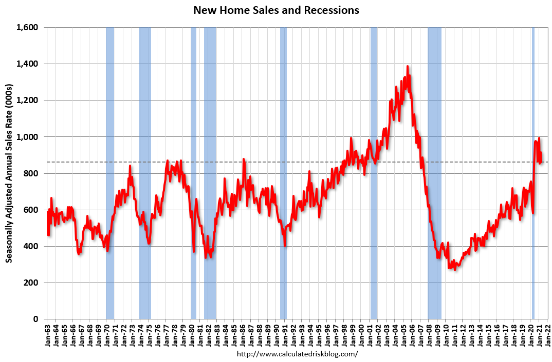 Click on graph for larger image.
The first graph shows New Home Sales vs. recessions since 1963. The dashed line is the current sales rate.
This was the highest sales rate for April since 2007.
The second graph shows New Home Months of Supply.
 The months of supply increased in April to 4.4 months from 4.0 months in March.
 The all time record high was 12.1 months of supply in January 2009. The all time record low was 3.5 months, most recently in October 2020.
This is close to the low end of the normal range (about 4 to 6 months supply is normal).
"The seasonally‐adjusted estimate of new houses for sale at the end of April was 316,000. This represents a supply of 4.4 months at the current sales rate."
 On inventory, according to the Census Bureau:
 "A house is considered for sale when a permit to build has been issued in permit-issuing places or work has begun on the footings or foundation in nonpermit areas and a sales contract has not been signed nor a deposit accepted."Starting in 1973 the Census Bureau broke this down into three categories: Not Started, Under Construction, and Completed.
The third graph shows the three categories of inventory starting in 1973.
The inventory of completed homes for sale is just above the record low, and the combined total of completed and under construction is a little lower than normal.
 The last graph shows sales NSA (monthly sales, not seasonally adjusted annual rate).
In April 2021 (red column), 78 thousand new homes were sold (NSA). Last year, 52 thousand homes were sold in April.
The all time high for April was 116 thousand in 2005, and the all time low for April was 30 thousand in 2011.
This was well below expectations, and sales in the three previous months were revised down sharply, combined. I'll have more later today.
Case-Shiller: National House Price Index increased 13.2% year-over-year in March
by Calculated Risk on 5/25/2021 09:11:00 AM
S&P/Case-Shiller released the monthly Home Price Indices for March ("March" is a 3 month average of January, February and March prices).
This release includes prices for 20 individual cities, two composite indices (for 10 cities and 20 cities) and the monthly National index.
From S&P: S&P Corelogic Case-Shiller Index Shows Annual Home Price Gains Climbed to 13.2% in March
The S&P CoreLogic Case-Shiller U.S. National Home Price NSA Index, covering all nine U.S. census divisions, reported a 13.2% annual gain in March, up from 12.0% in the previous month. The 10-City Composite annual increase came in at 12.8%, up from 11.7% in the previous month. The 20-City Composite posted a 13.3% year-over-year gain, up from 12.0% in the previous month.
Phoenix, San Diego, and Seattle reported the highest year-over-year gains among the 20 cities in March. Phoenix led the way with a 20.0% year-over-year price increase, followed by San Diego with a 19.1% increase and Seattle with a 18.3% increase. All 20 cities reported higher price increases in the year ending March 2021 versus the year ending February 2021.
...
Before seasonal adjustment, the U.S. National Index posted a 2.0% month-over-month increase, while the 10-City and 20-City Composites both posted increases of 2.0% and 2.2% respectively in March.
After seasonal adjustment, the U.S. National Index posted a month-over-month increase of 1.5%, and the 10-City and 20-City Composites both posted increases of 1.4% and 1.6% respectively. In March, all 20 cities reported increases before and after seasonal adjustments.
“Housing prices continued to rise robustly in March 2021,” says Craig J. Lazzara, Managing Director and Global Head of Index Investment Strategy at S&P DJI. “The National Composite Index marked its tenth consecutive month of accelerating prices with a 13.2% gain from year-ago levels, up from 12.0% in February. This acceleration is also reflected in the 10- and 20-City Composites (up 12.8% and 13.3%, respectively). The market’s strength is broadly-based: all 20 cities rose, and all 20 gained more in the 12 months ended in March than they had gained in the 12 months ended in February.
“More than 30 years of S&P CoreLogic Case-Shiller data put these results into historical context. The National Composite’s 13.2% gain was last exceeded more than 15 years ago in December 2005, and lies very comfortably in the top decile of historical performance. The unusual strength is reflected across all 20 cities; March’s price gains in every city are above that city’s median level, and rank in the top quartile of all reports in 19 cities.
“These data are consistent with the hypothesis that COVID has encouraged potential buyers to move from urban apartments to suburban homes. This demand may represent buyers who accelerated purchases that would have happened anyway over the next several years. Alternatively, there may have been a secular change in preferences, leading to a permanent shift in the demand curve for housing. More time and data will be required to analyze this question
emphasis added
 Click on graph for larger image.
 The first graph shows the nominal seasonally adjusted Composite 10, Composite 20 and National indices (the Composite 20 was started in January 2000).
The Composite 10 index is up 1.4% in March (SA) from February.
The Composite 20 index is up 1.6% (SA) in March.
The National index is 33% above the bubble peak (SA), and up 1.5% (SA) in March. The National index is up 80% from the post-bubble low set in December 2011 (SA).
 The second graph shows the year-over-year change in all three indices.
The Composite 10 SA is up 12.8% compared to March 2020. The Composite 20 SA is up 13.3% year-over-year.
The National index SA is up 13.2% year-over-year.
Price increases were above expectations. I'll have more later.
Monday, May 24, 2021
Tuesday: Case-Shiller House Prices, New Home Sales
by Calculated Risk on 5/24/2021 09:00:00 PM
From Matthew Graham at Mortgage News Daily: MBS RECAP: Uneventful But Slightly Stronger Start
10yr yields hit the lowest levels in almost 2 weeks this morning ... The low yields were less than 2bps away from Friday's lows and we only traded about a 2bp range on the day. MBS prices picked up almost an eighth of a point early in the day and were perfectly flat from there on out. [30 year fixed 3.14%]Tuesday:
emphasis added
• At 9:00 AM ET, S&P/Case-Shiller House Price Index for March. The consensus is for a 12.3% year-over-year increase in the Comp 20 index for March.
• Also at 9:00 AM, FHFA House Price Index for March 2021. This was originally a GSE only repeat sales, however there is also an expanded index.
• At 10:00 AM, New Home Sales for April from the Census Bureau. The consensus is for 975 thousand SAAR, down from 1.021 million SAAR in March.
• Also at 10:00 AM, Richmond Fed Survey of Manufacturing Activity for May.
MBA Survey: "Share of Mortgage Loans in Forbearance Decreases to 4.19%"
by Calculated Risk on 5/24/2021 04:00:00 PM
Note: This is as of May 16th.
From the MBA: Share of Mortgage Loans in Forbearance Decreases to 4.19%
The Mortgage Bankers Association’s (MBA) latest Forbearance and Call Volume Survey revealed that the total number of loans now in forbearance decreased by 3 basis points from 4.22% of servicers’ portfolio volume in the prior week to 4.19% as of May 16, 2021. According to MBA’s estimate, 2.1 million homeowners are in forbearance plans.
The share of Fannie Mae and Freddie Mac loans in forbearance decreased 3 basis points to 2.21%. Ginnie Mae loans in forbearance decreased 2 basis points to 5.59%, while the forbearance share for portfolio loans and private-label securities (PLS) remained the same relative to the prior week at 8.26%. The percentage of loans in forbearance for independent mortgage bank (IMB) servicers decreased 4 basis points to 4.38%, and the percentage of loans in forbearance for depository servicers remained the same at 4.35%.
“The share of loans in forbearance declined for the 12 th straight week, dropping by 3 basis points. The decline was smaller than the prior week due to a slower pace of forbearance exits,” said Mike Fratantoni, MBA’s Senior Vice President and Chief Economist. “Although the overall share is declining, there was another increase in forbearance re-entries. Currently, 5.3 percent of loans in forbearance are homeowners who had cancelled forbearance but needed assistance again.”
Added Fratantoni, “The job market is recovering, but the pace of recovery thus far is slower than we had forecasted. Continued job growth is needed to help more struggling homeowners get back on their feet.”
emphasis added
 Click on graph for larger image.
This graph shows the percent of portfolio in forbearance by investor type over time. Most of the increase was in late March and early April, and has trended down since then.
The MBA notes: "Total weekly forbearance requests as a percent of servicing portfolio volume (#) increased relative to the prior week: from 0.04% to 0.05%. "
May 24th COVID-19 New Cases, Vaccinations; Hospitalizations Finally Below Post-Summer Surge Low
by Calculated Risk on 5/24/2021 03:53:00 PM
The economy will pick up speed as more and more people get vaccinated!
According to the CDC, on Vaccinations. Total administered: 286,890,900, as of yesterday 285,720,586. Day: 1.17 million. (U.S. Capacity is around 4 million per day)
1) 61.5% of the population over 18 has had at least one dose (70% is the goal by July 4th).
2) 130.6 million Americans are fully vaccinated (160 million goal by July 4th)
Note: I'll stop posting this daily once all four of these criteria are met:
1) 70% of the population over 18 has had at least one dose of vaccine, and
2) new cases are under 5,000 per day, and
3) hospitalizations are below 3,000, and
4) average daily deaths under 50 (currently 500 per day).
And check out COVID Act Now to see how each state is doing.
Over 12,000 US deaths were reported so far in May due to COVID.
 Click on graph for larger image.
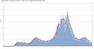
This graph shows the daily (columns) 7 day average (line) of positive tests reported.
This data is from the CDC.
 Click on graph for larger image.
This graph shows the daily (columns) 7 day average (line) of positive tests reported.
This data is from the CDC.
The 7-day average is 22,877, down from 23,834 yesterday, and down sharply from the recent peak of 69,881 on April 13, 2021. This is the lowest since June 14, 2020.
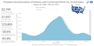
The second graph shows the number of people hospitalized.
 This data is also from the CDC.
The CDC cautions that due to reporting delays, the area in grey will probably increase.
The current 7-day average is 22,744, down from 23,917 reported yesterday, and finally below the post-summer surge low of 23,000.
Housing Inventory May 24th Update: Inventory Increased Week-over-week
by Calculated Risk on 5/24/2021 01:10:00 PM
One of the key questions for 2021 is: Will inventory increase as the pandemic subsides, or will inventory decrease further in 2021?
Tracking inventory will be very important this year.
 Click on graph for larger image in graph gallery.
This inventory graph is courtesy of Altos Research.
As of May 21st, inventory was at 324 thousand (7 day average), compared to 725 thousand the same week a year ago. That is a decline of 55.3%.
A week ago, inventory was at 314 thousand, and was down 57.0% YoY. Seasonally, inventory has probably bottomed. Inventory was about 5.5% above the low in early April.
Mike Simonsen discusses this data regularly on Youtube.
Lawler: Single-Family Rent Trends
by Calculated Risk on 5/24/2021 11:33:00 AM
CR Note: Last week, I posted a brief note from housing economist Tom Lawler: Lawler: Is the “Owners’ Equivalent Rent” Index Set to Accelerate Sharply?.
Here is some more information from Lawler:
Two of the largest institutional holders of single-family rental properties recently reported that demand for single-family rentals has rebounded strongly over the past several quarters, and both reported an acceleration in rental increases.
Invitation Homes owns about 80,330 single-family homes, while American Homes 4 Rent owns about 51,984 single-family homes.
While apartment rents in many large cities fell sharply following the pandemic (though rents have rebounded somewhat recently), the single-family rental market held up much better, as did the apartment rental markets in less-densely-populated (and less expensive) cities.
A recent report from CoreLogic also shows this to be the case. CoreLogic’s Single-Family Rent Index (SFRI), based on repeat-rent analysis of the same rental properties, increased by 4.3% YOY in March, compared to a recent YOY low of 1.4% in June. The SFRI for the “high-price” tier showed a 5.0% YOY gain in March, while the “low-price” tier showed just a 3.2% YOY increase. In terms of property type, the SFRI for SF detached properties increased by 6.9% YOY gain in March (a record high), while the SFRI for SF attached properties showed just a 1.3% YOY rise.
Here is a chart from the report, which is available here: U.S. Single-Family Rents Up 4.3% Year Over Year in March.
 Click on graph for larger image.
From CoreLogic:
Two of the largest institutional holders of single-family rental properties recently reported that demand for single-family rentals has rebounded strongly over the past several quarters, and both reported an acceleration in rental increases.
| Rent Increase, "Same-Store" Homes | |||
|---|---|---|---|
| Invitation Homes | |||
| Renewals | New Leases | Blended | |
| Q1/2020 | 4.2% | 1.8% | 3.4% |
| Q2/2020 | 3.5% | 2.7% | 3.3% |
| Q3/2020 | 3.3% | 5.5% | 4.0% |
| Q4/2020 | 3.8% | 6.9% | 4.9% |
| Q1/2021 | 4.4% | 7.9% | 5.4% |
| Apr-21 | 5.5% | 10.8% | 7.0% |
| American Homes 4 Rent | |||
| Renewals | New Leases | Blended | |
| Q1/2020 | 4.6% | 3.4% | 4.2% |
| Q2/2020 | 1.3% | 4.4% | 2.4% |
| Q3/2020 | 1.1% | 6.0% | 2.8% |
| Q4/2020 | 4.3% | 7.6% | 5.5% |
| Q1/2021 | 5.1% | 10.0% | 6.9% |
| Apr-21 | 11.0% | ||
Invitation Homes owns about 80,330 single-family homes, while American Homes 4 Rent owns about 51,984 single-family homes.
While apartment rents in many large cities fell sharply following the pandemic (though rents have rebounded somewhat recently), the single-family rental market held up much better, as did the apartment rental markets in less-densely-populated (and less expensive) cities.
A recent report from CoreLogic also shows this to be the case. CoreLogic’s Single-Family Rent Index (SFRI), based on repeat-rent analysis of the same rental properties, increased by 4.3% YOY in March, compared to a recent YOY low of 1.4% in June. The SFRI for the “high-price” tier showed a 5.0% YOY gain in March, while the “low-price” tier showed just a 3.2% YOY increase. In terms of property type, the SFRI for SF detached properties increased by 6.9% YOY gain in March (a record high), while the SFRI for SF attached properties showed just a 1.3% YOY rise.
Here is a chart from the report, which is available here: U.S. Single-Family Rents Up 4.3% Year Over Year in March.
 Click on graph for larger image.
From CoreLogic:
Rent prices for the low-end tier, increased 3.2% year over year in March 2021, down from 3.8% in March 2020. Meanwhile, higher-priced rentals increased 5% in March 2021, up from a gain of 2.8% in March 2020. This was the fastest increase in higher-price rents since August 2006.
Seven High Frequency Indicators for the Economy
by Calculated Risk on 5/24/2021 08:49:00 AM
These indicators are mostly for travel and entertainment. It will interesting to watch these sectors recover as the vaccine is distributed.
IMPORTANT: Be safe now - if all goes well, everyone could be vaccinated by June.
----- Airlines: Transportation Security Administration -----
The TSA is providing daily travel numbers.
 Click on graph for larger image.
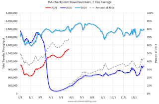
This data shows the seven day average of daily total traveler throughput from the TSA for 2019 (Light Blue), 2020 (Blue) and 2021 (Red).
The dashed line is the percent of 2019 for the seven day average.
This data is as of May 23rd.
The seven day average is down 32.0% from the same day in 2019 (68.0% of 2019). (Dashed line)
There was a slow increase from the bottom - and TSA data has picked up in 2021.
----- Restaurants: OpenTable -----
The second graph shows the 7 day average of the year-over-year change in diners as tabulated by OpenTable for the US and several selected cities.
----- Hotel Occupancy: STR -----
 This graph shows the seasonal pattern for the hotel occupancy rate using the four week average.
The red line is for 2021, black is 2020, blue is the median, and dashed light blue is for 2009 (the worst year since the Great Depression for hotels - before 2020).
Occupancy is now slightly above the horrible 2009 levels.
This data is through May 15th. Hotel occupancy is currently down 16% compared to same week in 2019). Note: Occupancy was up year-over-year, since occupancy declined sharply at the onset of the pandemic. However, occupancy is still down significantly from normal levels.
Notes: Y-axis doesn't start at zero to better show the seasonal change.
----- Gasoline Supplied: Energy Information Administration -----
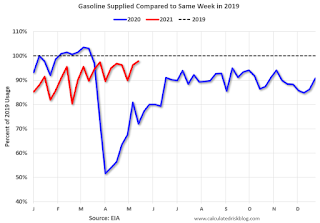 This graph, based on weekly data from the U.S. Energy Information Administration (EIA), shows gasoline supplied compared to the same week of 2019.
Blue is for 2020. Red is for 2021.
As of May 14th, gasoline supplied was off about 2.2% (about 97.8% of the same week in 2019).
Gasoline supplied was up year-over-year, since at one point, gasoline supplied was off almost 50% YoY in 2020.
----- Transit: Apple Mobility -----
This graph is from Apple mobility. From Apple: "This data is generated by counting the number of requests made to Apple Maps for directions in select countries/regions, sub-regions, and cities." This is just a general guide - people that regularly commute probably don't ask for directions.
There is also some great data on mobility from the Dallas Fed Mobility and Engagement Index. However the index is set "relative to its weekday-specific average over January–February", and is not seasonally adjusted, so we can't tell if an increase in mobility is due to recovery or just the normal increase in the Spring and Summer.
 This data is through May 22nd for the United States and several selected cities.
The graph is the running 7 day average to remove the impact of weekends.
IMPORTANT: All data is relative to January 13, 2020. This data is NOT Seasonally Adjusted. People walk and drive more when the weather is nice, so I'm just using the transit data.
According to the Apple data directions requests, public transit in the 7 day average for the US is at 78% of the January 2020 level and moving up.
----- New York City Subway Usage -----
Here is some interesting data on New York subway usage (HT BR).
 This graph is from Todd W Schneider. This is weekly data since 2015.
The TSA is providing daily travel numbers.
 Click on graph for larger image.
This data shows the seven day average of daily total traveler throughput from the TSA for 2019 (Light Blue), 2020 (Blue) and 2021 (Red).
The dashed line is the percent of 2019 for the seven day average.
This data is as of May 23rd.
The seven day average is down 32.0% from the same day in 2019 (68.0% of 2019). (Dashed line)
There was a slow increase from the bottom - and TSA data has picked up in 2021.
The second graph shows the 7 day average of the year-over-year change in diners as tabulated by OpenTable for the US and several selected cities.
IMPORTANT: OpenTable notes: "we’ve updated the data including downloadable dataset from January 1, 2021 onward to compare seated diners from 2021 to 2019, as opposed to year over year." Thanks!
 Thanks to OpenTable for providing this restaurant data:
This data is updated through May 22, 2021.
This data is "a sample of restaurants on the OpenTable network across all channels: online reservations, phone reservations, and walk-ins. For year-over-year comparisons by day, we compare to the same day of the week from the same week in the previous year."
Note that this data is for "only the restaurants that have chosen to reopen in a given market". Since some restaurants have not reopened, the actual year-over-year decline is worse than shown.
Dining picked up during the holidays, then slumped with the huge winter surge in cases. Dining was picking up again. Florida and Texas are above 2019 levels.
----- Movie Tickets: Box Office Mojo -----
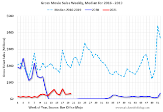 This data shows domestic box office for each week and the median for the years 2016 through 2019 (dashed light blue).
 Thanks to OpenTable for providing this restaurant data:
This data is updated through May 22, 2021.
This data is "a sample of restaurants on the OpenTable network across all channels: online reservations, phone reservations, and walk-ins. For year-over-year comparisons by day, we compare to the same day of the week from the same week in the previous year."
Note that this data is for "only the restaurants that have chosen to reopen in a given market". Since some restaurants have not reopened, the actual year-over-year decline is worse than shown.
Dining picked up during the holidays, then slumped with the huge winter surge in cases. Dining was picking up again. Florida and Texas are above 2019 levels.
 This data shows domestic box office for each week and the median for the years 2016 through 2019 (dashed light blue).
 Blue is 2020 and Red is 2021.
The data is from BoxOfficeMojo through May 20th.
Note that the data is usually noisy week-to-week and depends on when blockbusters are released.
Movie ticket sales were at $32 million last week, down about 83% from the median for the week.
Note that the data is usually noisy week-to-week and depends on when blockbusters are released.
Movie ticket sales were at $32 million last week, down about 83% from the median for the week.
 This graph shows the seasonal pattern for the hotel occupancy rate using the four week average.
 The red line is for 2021, black is 2020, blue is the median, and dashed light blue is for 2009 (the worst year since the Great Depression for hotels - before 2020).
Occupancy is now slightly above the horrible 2009 levels.
This data is through May 15th. Hotel occupancy is currently down 16% compared to same week in 2019). Note: Occupancy was up year-over-year, since occupancy declined sharply at the onset of the pandemic. However, occupancy is still down significantly from normal levels.
Notes: Y-axis doesn't start at zero to better show the seasonal change.
 This graph, based on weekly data from the U.S. Energy Information Administration (EIA), shows gasoline supplied compared to the same week of 2019.
Blue is for 2020. Red is for 2021.
As of May 14th, gasoline supplied was off about 2.2% (about 97.8% of the same week in 2019).
Gasoline supplied was up year-over-year, since at one point, gasoline supplied was off almost 50% YoY in 2020.
This graph is from Apple mobility. From Apple: "This data is generated by counting the number of requests made to Apple Maps for directions in select countries/regions, sub-regions, and cities." This is just a general guide - people that regularly commute probably don't ask for directions.
There is also some great data on mobility from the Dallas Fed Mobility and Engagement Index. However the index is set "relative to its weekday-specific average over January–February", and is not seasonally adjusted, so we can't tell if an increase in mobility is due to recovery or just the normal increase in the Spring and Summer.
 This data is through May 22nd for the United States and several selected cities.
The graph is the running 7 day average to remove the impact of weekends.
IMPORTANT: All data is relative to January 13, 2020. This data is NOT Seasonally Adjusted. People walk and drive more when the weather is nice, so I'm just using the transit data.
According to the Apple data directions requests, public transit in the 7 day average for the US is at 78% of the January 2020 level and moving up.
Here is some interesting data on New York subway usage (HT BR).
 This graph is from Todd W Schneider. This is weekly data since 2015.
 Most weeks are between 30 and 35 million entries, and currently there more than 11 million subway turnstile entries per week - and increasing.
This data is through Friday, May 21st.
Schneider has graphs for each borough, and links to all the data sources.
He notes: "Data updates weekly from the MTA’s public turnstile data, usually on Saturday mornings".
This data is through Friday, May 21st.
Schneider has graphs for each borough, and links to all the data sources.
He notes: "Data updates weekly from the MTA’s public turnstile data, usually on Saturday mornings".


