 RSS Feed
 by Calculated Risk on 3/08/2021 08:33:00 AM
Monday, March 08, 2021
Seven High Frequency Indicators for the Economy
These indicators are mostly for travel and entertainment. It will interesting to watch these sectors recover as the vaccine is distributed.
IMPORTANT: Be safe now - if all goes well, we could all be vaccinated by Q2 2021.
----- Airlines: Transportation Security Administration -----
The TSA is providing daily travel numbers.
 Click on graph for larger image.
This data shows the seven day average of daily total traveler throughput from the TSA for 2019 (Light Blue), 2020 (Blue) and 2021 (Red).
The dashed line is the percent of 2019 for the seven day average.
This data is as of March 7th.
The seven day average is down 55.9% from the same week in 2019 (45.1% of last year). (Dashed line)
There was a slow increase from the bottom, with ups and downs due to the holidays - but TSA data has mostly moved sideways or slightly up in 2021.
----- Restaurants: OpenTable -----
The second graph shows the 7 day average of the year-over-year change in diners as tabulated by OpenTable for the US and several selected cities.
----- Hotel Occupancy: STR -----
 This graph shows the seasonal pattern for the hotel occupancy rate using the four week average.
The red line is for 2021, black is 2020, blue is the median, and dashed light blue is for 2009 (the worst year since the Great Depression for hotels - before 2020).
Even when occupancy increases to 2009 levels, hotels will still be hurting.
This data is through February 27th. Hotel occupancy is currently down 25.8% year-over-year. In a few weeks, the year-over-year comparisons will be easy - since occupancy declined sharply at the onset of the pandemic - but occupancy will still be down significantly from normal levels.
Notes: Y-axis doesn't start at zero to better show the seasonal change.
----- Gasoline Supplied: Energy Information Administration -----
 This graph, based on weekly data from the U.S. Energy Information Administration (EIA), shows gasoline supplied compared to the same week of 2019.
Blue is for 2020. At one point, gasoline supplied was off almost 50% YoY. Red is for 2021.
As of February 26th, gasoline supplied was off about 10.0% (about 90.0% of the same week in 2019).
Note: Gasoline supplied was impacted by the snowstorm in Texas and other states the previous week.
----- Transit: Apple Mobility -----
This graph is from Apple mobility. From Apple: "This data is generated by counting the number of requests made to Apple Maps for directions in select countries/regions, sub-regions, and cities." This is just a general guide - people that regularly commute probably don't ask for directions.
There is also some great data on mobility from the Dallas Fed Mobility and Engagement Index. However the index is set "relative to its weekday-specific average over January–February", and is not seasonally adjusted, so we can't tell if an increase in mobility is due to recovery or just the normal increase in the Spring and Summer.
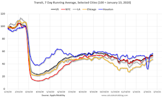 This data is through March 6th for the United States and several selected cities.
The graph is the running 7 day average to remove the impact of weekends.
IMPORTANT: All data is relative to January 13, 2020. This data is NOT Seasonally Adjusted. People walk and drive more when the weather is nice, so I'm just using the transit data.
According to the Apple data directions requests, public transit in the 7 day average for the US is at 54% of the January 2020 level. It is at 47% in Chicago, and 57% in Houston (the dip was a weather related decline) - and moving up recently.
----- New York City Subway Usage -----
Here is some interesting data on New York subway usage (HT BR).
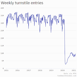 This graph is from Todd W Schneider. This is weekly data since 2015. Most weeks are between 30 and 35 million entries, and currently there are under 10 million subway turnstile entries per week.
This data is through Friday, March 5th.
Schneider has graphs for each borough, and links to all the data sources.
He notes: "Data updates weekly from the MTA’s public turnstile data, usually on Saturday mornings".
The TSA is providing daily travel numbers.
 Click on graph for larger image.
This data shows the seven day average of daily total traveler throughput from the TSA for 2019 (Light Blue), 2020 (Blue) and 2021 (Red).
The dashed line is the percent of 2019 for the seven day average.
This data is as of March 7th.
The seven day average is down 55.9% from the same week in 2019 (45.1% of last year). (Dashed line)
There was a slow increase from the bottom, with ups and downs due to the holidays - but TSA data has mostly moved sideways or slightly up in 2021.
The second graph shows the 7 day average of the year-over-year change in diners as tabulated by OpenTable for the US and several selected cities.
IMPORTANT: OpenTable is reporting the year-over-year change. Since dining started to collapse in early March 2020, this will start showing a pickup relative to that collapse. I'll adjust this to compare to the same week in 2019.
 Thanks to OpenTable for providing this restaurant data:
This data is updated through March 6, 2021.
This data is "a sample of restaurants on the OpenTable network across all channels: online reservations, phone reservations, and walk-ins. For year-over-year comparisons by day, we compare to the same day of the week from the same week in the previous year."
Note that this data is for "only the restaurants that have chosen to reopen in a given market". Since some restaurants have not reopened, the actual year-over-year decline is worse than shown.
Dining picked up during the holidays, the slumped with the huge winter surge in cases. Dining is picking up again.
----- Movie Tickets: Box Office Mojo -----
 This data shows domestic box office for each week and the median for the years 2016 through 2019 (dashed light blue).
 Thanks to OpenTable for providing this restaurant data:
This data is updated through March 6, 2021.
This data is "a sample of restaurants on the OpenTable network across all channels: online reservations, phone reservations, and walk-ins. For year-over-year comparisons by day, we compare to the same day of the week from the same week in the previous year."
Note that this data is for "only the restaurants that have chosen to reopen in a given market". Since some restaurants have not reopened, the actual year-over-year decline is worse than shown.
Dining picked up during the holidays, the slumped with the huge winter surge in cases. Dining is picking up again.
 This data shows domestic box office for each week and the median for the years 2016 through 2019 (dashed light blue).
 Blue is 2020 and Red is 2021.
The data is from BoxOfficeMojo through Mar 4th.
Note that the data is usually noisy week-to-week and depends on when blockbusters are released.
Movie ticket sales were at $5 million last week, down about 96% from the median for the week.
Note that the data is usually noisy week-to-week and depends on when blockbusters are released.
Movie ticket sales were at $5 million last week, down about 96% from the median for the week.
 This graph shows the seasonal pattern for the hotel occupancy rate using the four week average.
 The red line is for 2021, black is 2020, blue is the median, and dashed light blue is for 2009 (the worst year since the Great Depression for hotels - before 2020).
Even when occupancy increases to 2009 levels, hotels will still be hurting.
This data is through February 27th. Hotel occupancy is currently down 25.8% year-over-year. In a few weeks, the year-over-year comparisons will be easy - since occupancy declined sharply at the onset of the pandemic - but occupancy will still be down significantly from normal levels.
Notes: Y-axis doesn't start at zero to better show the seasonal change.
 This graph, based on weekly data from the U.S. Energy Information Administration (EIA), shows gasoline supplied compared to the same week of 2019.
Blue is for 2020. At one point, gasoline supplied was off almost 50% YoY. Red is for 2021.
As of February 26th, gasoline supplied was off about 10.0% (about 90.0% of the same week in 2019).
Note: Gasoline supplied was impacted by the snowstorm in Texas and other states the previous week.
This graph is from Apple mobility. From Apple: "This data is generated by counting the number of requests made to Apple Maps for directions in select countries/regions, sub-regions, and cities." This is just a general guide - people that regularly commute probably don't ask for directions.
There is also some great data on mobility from the Dallas Fed Mobility and Engagement Index. However the index is set "relative to its weekday-specific average over January–February", and is not seasonally adjusted, so we can't tell if an increase in mobility is due to recovery or just the normal increase in the Spring and Summer.
 This data is through March 6th for the United States and several selected cities.
The graph is the running 7 day average to remove the impact of weekends.
IMPORTANT: All data is relative to January 13, 2020. This data is NOT Seasonally Adjusted. People walk and drive more when the weather is nice, so I'm just using the transit data.
According to the Apple data directions requests, public transit in the 7 day average for the US is at 54% of the January 2020 level. It is at 47% in Chicago, and 57% in Houston (the dip was a weather related decline) - and moving up recently.
Here is some interesting data on New York subway usage (HT BR).
 This graph is from Todd W Schneider. This is weekly data since 2015. Most weeks are between 30 and 35 million entries, and currently there are under 10 million subway turnstile entries per week.
This data is through Friday, March 5th.
Schneider has graphs for each borough, and links to all the data sources.
He notes: "Data updates weekly from the MTA’s public turnstile data, usually on Saturday mornings".
Sunday, March 07, 2021
Sunday Night Futures
by Calculated Risk on 3/07/2021 09:37:00 PM
Weekend:
• Schedule for Week of March 7, 2021
• The Employment Situation is Far Worse than the Unemployment Rate Indicates
Monday:
• No major economic releases scheduled.
From CNBC: Pre-Market Data and Bloomberg futures S&P 500 futures are up 22 and DOW futures are up 216 (fair value).
Oil prices were up over the last week with WTI futures at $67.31 per barrel and Brent at $70.53 per barrel. A year ago, WTI was at $31, and Brent was at $35 - so WTI oil prices are UP more than double year-over-year (oil prices collapsed at the beginning of the pandemic).
Here is a graph from Gasbuddy.com for nationwide gasoline prices. Nationally prices are at $2.77 per gallon. A year ago prices were at $2.36 per gallon, so gasoline prices are up $0.41 per gallon year-over-year.
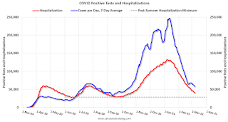
March 7 COVID-19 Test Results and Vaccinations; Over 90 Million Doses Administered
by Calculated Risk on 3/07/2021 07:42:00 PM
SPECIAL NOTE: The Covid Tracking Project ends today (March 7th). Awesome job. Starting tomorrow, I will post from different sources.
From Bloomberg on vaccinations as of Mar 7th:
"In the U.S., more Americans have now received at least one dose than have tested positive for the virus since the pandemic began. So far, 90.4 million doses have been given. In the last week, an average of 2.16 million doses per day were administered."Here is the CDC COVID Data Tracker. This site has data on vaccinations, cases and more.
The US has averaged 1.4 million tests per day over the last week. The percent positive over the last 7 days was 4.1%.
Based on the experience of other countries, for adequate test-and-trace (and isolation) to reduce infections, the percent positive needs to below 1%, so the US has far too many daily cases - and percent positive - to do effective test-and-trace.
There were 1,156,241 test results reported over the last 24 hours.
There were 41,265 positive tests.
Almost 12,000 US deaths have been reported in March. See the graph on US Daily Deaths here.
This data is from the COVID Tracking Project.
And check out COVID Act Now to see how each state is doing. (updated link to new site)
 Click on graph for larger image.
This graph shows the 7 day average of positive tests reported and daily hospitalizations.
The dashed line is the post-summer surge low for hospitalizations.
The Employment Situation is Far Worse than the Unemployment Rate Indicates
by Calculated Risk on 3/07/2021 09:13:00 AM
The headline unemployment rate of 6.2% significantly understates the current situation.
Here is a table that shows the current number of unemployed and the unemployment rate (as of February 2021).
Then I calculated the unemployment rate by including the number of people that have left the labor force since early 2020, and the expected growth in the labor force.
As the economy recovers, many of the people that left the labor force will probably return, and there will likely be more entrants into the labor force (although recent demographic data has been dismal).
Fed Chair Powell made a similar argument last month: Getting Back to a Strong Labor Market Excerpt: Then I calculated the unemployment rate by including the number of people that have left the labor force since early 2020, and the expected growth in the labor force.
| Unemployment Rate | Unemployed (000s) | Left Labor Force (000s) | Expected Labor Force Growth (000s) | Adjusted Unemployment Rate | |
|---|---|---|---|---|---|
| Jul-20 | 10.2% | 16,308 | 4,370 | 600 | 12.9% |
| Aug-20 | 8.4% | 13,542 | 3,637 | 700 | 10.8% |
| Sep-20 | 7.8% | 12,535 | 4,377 | 800 | 10.7% |
| Oct-20 | 6.9% | 11,049 | 3,737 | 900 | 9.5% |
| Nov-20 | 6.7% | 10,728 | 3,919 | 1,000 | 9.5% |
| Dec-20 | 6.7% | 10,736 | 3,888 | 1,100 | 9.5% |
| Jan-21 | 6.3% | 10,130 | 4,294 | 1,200 | 9.4% |
| Feb-21 | 6.2% | 9,972 | 4,244 | 1,300 | 9.4% |
As the economy recovers, many of the people that left the labor force will probably return, and there will likely be more entrants into the labor force (although recent demographic data has been dismal).
Employment in January of this year was nearly 10 million below its February 2020 level, a greater shortfall than the worst of the Great Recession's aftermath.
After rising to 14.8 percent in April of last year, the published unemployment rate has fallen relatively swiftly, reaching 6.3 percent in January. But published unemployment rates during COVID have dramatically understated the deterioration in the labor market. Most importantly, the pandemic has led to the largest 12-month decline in labor force participation since at least 1948. Fear of the virus and the disappearance of employment opportunities in the sectors most affected by it, such as restaurants, hotels, and entertainment venues, have led many to withdraw from the workforce. At the same time, virtual schooling has forced many parents to leave the work force to provide all-day care for their children. All told, nearly 5 million people say the pandemic prevented them from looking for work in January. In addition, the Bureau of Labor Statistics reports that many unemployed individuals have been misclassified as employed. Correcting this misclassification and counting those who have left the labor force since last February as unemployed would boost the unemployment rate to close to 10 percent in January.
emphasis added
 Click on graph for larger image.
 This graph from the Fed shows the actually unemployment rate and some alternative estimates (mostly due to people leaving the labor force).
It would be a mistake to just look at the headline unemployment rate to assess the current situation.
The following graph - that I post each month - show the percent decline in employment since the start of each recession since WWII.
 The second graph shows the job losses from the start of the employment recession, in percentage terms.
The current employment recession was by far the worst recession since WWII in percentage terms.
At the worst of the Great Recession, employment was down Down 6.29% from the previous peak.
Currently employment is down 6.21% - the current unemployment situation is about the same as the worst of the Great Recession (and there was no pandemic to contend with in 2009).
Saturday, March 06, 2021
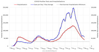
March 6 COVID-19 Test Results and Vaccinations
by Calculated Risk on 3/06/2021 07:05:00 PM
SPECIAL NOTE: The Covid Tracking Project will end daily updates on March 7th.
From Bloomberg on vaccinations as of Mar 6th.
"In the U.S., more Americans have now received at least one dose than have tested positive for the virus since the pandemic began. So far, 87.9 million doses have been given. In the last week, an average of 2.16 million doses per day were administered."Here is the CDC COVID Data Tracker. This site has data on vaccinations, cases and more.
The US has averaged 1.4 million tests per day over the last week. The percent positive over the last 7 days was 4.2%.
Based on the experience of other countries, for adequate test-and-trace (and isolation) to reduce infections, the percent positive needs to below 1%, so the US has far too many daily cases - and percent positive - to do effective test-and-trace.
There were 1,409,138 test results reported over the last 24 hours.
There were 59,620 positive tests.
Over 11,000 US deaths have been reported in March. See the graph on US Daily Deaths here.
This data is from the COVID Tracking Project.
And check out COVID Act Now to see how each state is doing. (updated link to new site)
 Click on graph for larger image.
This graph shows the 7 day average of positive tests reported and daily hospitalizations.
The dashed line is the post-summer surge low for hospitalizations.
Schedule for Week of March 7, 2021
by Calculated Risk on 3/06/2021 08:11:00 AM
This will be a light week for economic data.
The key report scheduled for this week is February CPI.
No major economic releases scheduled.
6:00 AM ET: NFIB Small Business Optimism Index for February.
7:00 AM ET: The Mortgage Bankers Association (MBA) will release the results for the mortgage purchase applications index.
8:30 AM: The Consumer Price Index for February from the BLS. The consensus is for a 0.4% increase in CPI, and a 0.2% increase in core CPI.
8:30 AM: The initial weekly unemployment claims report will be released. The consensus is for a increase to 760 thousand from 745 thousand last week.
 10:00 AM ET: Job Openings and Labor Turnover Survey for January from the BLS.
 This graph shows job openings (yellow line), hires (purple), Layoff, Discharges and other (red column), and Quits (light blue column) from the JOLTS.
Jobs openings increased in December to 6.646 million from 6.572 million in November.
12:00 PM: Q4 Flow of Funds Accounts of the United States from the Federal Reserve.
8:30 AM: The Producer Price Index for February from the BLS. The consensus is for a 0.4% decrease in PPI, and a 0.2% increase in core PPI.
10:00 AM: University of Michigan's Consumer sentiment index (Preliminary for March).
Friday, March 05, 2021
March 5 COVID-19 Test Results and Vaccinations: 85 Million Doses Given So Far
by Calculated Risk on 3/05/2021 07:21:00 PM
SPECIAL NOTE: The Covid Tracking Project will end daily updates on March 7th.
From Bloomberg on vaccinations as of Mar 5th.
"In the U.S., more Americans have now received at least one dose than have tested positive for the virus since the pandemic began. So far, 85 million doses have been given. In the last week, an average of 2.08 million doses per day were administered."Here is the CDC COVID Data Tracker. This site has data on vaccinations, cases and more.
The US has averaged 1.5 million tests per day over the last week. The percent positive over the last 7 days was 4.2%.
Based on the experience of other countries, for adequate test-and-trace (and isolation) to reduce infections, the percent positive needs to below 1%, so the US has far too many daily cases - and percent positive - to do effective test-and-trace.
There were 1,744,446 test results reported over the last 24 hours.
There were 68,787 positive tests.
Over 9,000 US deaths have been reported in March. See the graph on US Daily Deaths here.
This data is from the COVID Tracking Project.
And check out COVID Act Now to see how each state is doing. (updated link to new site)
 Click on graph for larger image.
This graph shows the 7 day average of positive tests reported and daily hospitalizations.
The dashed line is the post-summer surge low for hospitalizations.
Q1 GDP Forecasts: Around 5.5% SAAR
by Calculated Risk on 3/05/2021 02:32:00 PM
From Merrrill Lynch:
We continue to track 5.5% for 1Q GDP tracking. [Mar 5 estimate]From Goldman Sachs:
emphasis added
We left our Q1 GDP tracking estimate unchanged at +5.5% (qoq ar). [Mar 5 estimate]From the NY Fed Nowcasting Report
The New York Fed Staff Nowcast stands at 8.6% for 2021:Q1 and 4.0% for 2021:Q2. [Mar 5 estimate]And from the Altanta Fed: GDPNow
The GDPNow model estimate for real GDP growth (seasonally adjusted annual rate) in the first quarter of 2021 is 8.3 percent on March 5, down from 10.0 percent on March 1. [Mar 5 estimate]
AAR: February Rail Carloads down 11.1% YoY, Intermodal Up 1.8% YoY
by Calculated Risk on 3/05/2021 12:50:00 PM
From the Association of American Railroads (AAR) Rail Time Indicators. Graphs and excerpts reprinted with permission.
The U.S. freight rail network is subject to, and sometimes at the mercy of, hurricanes, tornadoes, floods, and other whims of nature. In February, the whims included exceptionally cold and icy conditions in most of the country, including in many areas that aren’t used to it. For rail, it meant reduced operations and, in some areas, complete temporary shutdowns. It was so bad, in fact, that total U.S. rail carloads in the third week of February were the lowest of any week in our records that go back to 1988. Volumes recovered the next week, but the net impact was materially lower rail volumes in February.
In February 2021, U.S total carloads were down 11.1% from February 2020, the biggest percentage decline in six months ... However, U.S. intermodal originations were 1.8% higher in February 2021 than in February 2020, continuing what’s now a streak of seven straight months of year-over-year gains.
emphasis added
 Click on graph for larger image.
This graph from the Rail Time Indicators report shows the six week average of U.S. Carloads in 2019, 2020 and 2021:
In February, U.S. railroads originated 824,636 total carloads, down 11.1% (102,972 carloads) from February 2020. That’s the biggest year-over-year percentage decline in six months, much worse than the 2.1% decline in January 2021 and 3.7% decline in December 2020. In the third week of February, when the worst of the bad weather struck, the year-over-year decline was 26.3%.
 The second graph shows the six week average of U.S. intermodal in 2019, 2020 and 2021: (using intermodal or shipping containers):
U.S. railroads originated 1.02 million intermodal containers and trailers in February 2021, an average of 253,999 per week. That’s 1.8% higher than the weekly average in February 2020, continuing what’s now a streak of seven straight months of year-over-year intermodal gains. U.S. intermodal originations averaged 293,305 per week in January 2021, an all-time record.Note that rail traffic was weak prior to the pandemic, however intermodal has come back strong.
Trade Deficit Increased to $68.2 Billion in January
by Calculated Risk on 3/05/2021 10:38:00 AM
From the Department of Commerce reported:
The U.S. Census Bureau and the U.S. Bureau of Economic Analysis announced today that the goods and services deficit was $68.2 billion in January, up $1.2 billion from $67.0 billion in December, revised.
January exports were $191.9 billion, $1.8 billion more than December exports. January imports were $260.2 billion, $3.1 billion more than December imports.
emphasis added
 Click on graph for larger image.
Both exports and imports increased in January.
Exports are down 7.6% compared to January 2020; imports are up 3.2% compared to January 2020.
Both imports and exports decreased sharply due to COVID-19, and have now bounced back (imports much more than exports),
The second graph shows the U.S. trade deficit, with and without petroleum.
 The blue line is the total deficit, and the black line is the petroleum deficit, and the red line is the trade deficit ex-petroleum products.
Note that the U.S. exported a slight net positive petroleum products in recent months.
Oil imports averaged $42.50 per barrel in January, up from $38.30 per barrel in December, and down from $52.24 in January 2020.
The trade deficit with China increased to $26.3 billion in January, from $26.1 billion in January 2020.


