by Calculated Risk on 10/12/2020 06:29:00 PM
Monday, October 12, 2020
October 12 COVID-19 Test Results
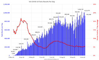
The US is now mostly reporting 700 thousand to 1 million tests per day. Based on the experience of other countries, the percent positive needs to be well under 5% to really push down new infections (probably close to 1%), so the US still needs to increase the number of tests per day significantly (or take actions to push down the number of new infections).
There were 931,308 test results reported over the last 24 hours.
There were 43,043 positive tests.
Almost 8,000 Americans deaths from COVID have been reported in October. See the graph on US Daily Deaths here.
This data is from the COVID Tracking Project.
The percent positive over the last 24 hours was 4.6% (red line is 7 day average).
For the status of contact tracing by state, check out testandtrace.com.
And check out COVID Exit Strategy to see how each state is doing.
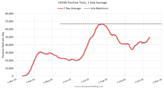
The dashed line is the July high.
Note that there were very few tests available in March and April, and many cases were missed (the percent positive was very high - see first graph). By June, the percent positive had dropped below 5%.
Everyone needs to be vigilant or we might see record high cases this Fall and Winter.
MBA Survey: "Share of Mortgage Loans in Forbearance Declines to 6.32%"
by Calculated Risk on 10/12/2020 04:15:00 PM
Note: This is as of October 4th.
From the MBA: Share of Mortgage Loans in Forbearance Declines to 6.32%
The Mortgage Bankers Association’s (MBA) latest Forbearance and Call Volume Survey revealed that the total number of loans now in forbearance decreased by 49 basis points from 6.81% of servicers’ portfolio volume in the prior week to 6.32% as of October 4, 2020. According to MBA’s estimate, 3.2 million homeowners are in forbearance plans.
...
“The share of loans in forbearance declined across all loan types. With the forbearance program for federally backed loans under the CARES Act reaching the six-month mark, many borrowers saw their forbearance plans expire because they did not contact their servicer. Another reason for expirations was that borrower information needed to determine an appropriate loss mitigation option was not yet in place,” said Mike Fratantoni, MBA’s Senior Vice President and Chief Economist. “Borrowers with federally backed mortgages need to contact their servicer to obtain another six months of reprieve if they are still impacted by the pandemic. As of now, some borrowers are exiting forbearance without making contact or without a plan in place. Servicers are making outreach efforts to attempt to work with these borrowers to determine the best options for them, including an extension.”
Added Fratantoni, “On a more positive note, nearly two-thirds of borrowers who exited forbearance remained current on their payments, repaid their forborne payments, or moved into a payment deferral plan. All of these borrowers have been able to resume – or continue – their pre-pandemic monthly payments.”
...
By stage, 25.50% of total loans in forbearance are in the initial forbearance plan stage, while 72.97% are in a forbearance extension. The remaining 1.53% are forbearance re-entries.
emphasis added
 Click on graph for larger image.
This graph shows the percent of portfolio in forbearance by investor type over time. Most of the increase was in late March and early April, and has been trending down for the last few months.
The MBA notes: "Total weekly forbearance requests as a percent of servicing portfolio volume (#) increased relative to the prior week: from 0.08% to 0.11%."
There hasn't been a pickup in forbearance activity related to the end of the extra unemployment benefits.
Update: Real Estate Agent Boom and Bust
by Calculated Risk on 10/12/2020 01:53:00 PM
Way back in 2005, I posted a graph of the Real Estate Agent Boom. Here is another update to the graph.
The graph shows the number of real estate licensees in California.
The number of agents peaked at the end of 2007 (housing activity peaked in 2005, and prices in 2006).
The number of salesperson's licenses is off 27% from the peak, and is increasing again (up 11% from low). The number of salesperson's licenses has increased to November 2004 levels.
Brokers' licenses are off 15% from the peak and have fallen to November 2005 levels, and are still slowly declining.

We are seeing a pickup in Real Estate licensees in California (although down a little recently), and the number of Brokers is still slowly declining.
Demographics: Renting vs. Owning
by Calculated Risk on 10/12/2020 11:01:00 AM
Yesterday I posted some recent demographic data U.S. Demographics: Largest 5-year cohorts, and Ten most Common Ages in 2019
A decade ago, a large cohort was moving into the 20 to 29 year old age group (a key age group for renters) and I was very positive on apartments. In 2010, we started discussing the turnaround for apartments. Then, in January 2011, I attended the NMHC Apartment Strategies Conference in Palm Springs, and the atmosphere was very positive.
Now a large cohort is moving into the 30 to 39 age group (a key for ownership).
Note: Household formation would be a better measure than population, but reliable data for households is released with a long lag.
NOTE: This graph is updated using the Vintage 2019 estimates. IMPORTANT NOTE: Housing economist Tom Lawler has pointed out some issues with earlier Census estimates, see: Lawler: "New Long-Term Population Projections Show Slower Growth than Previous Projections but Are Still Too High"

This graph shows the longer term trend for three key age groups: 20 to 29, 25 to 34, and 30 to 39 (the groups overlap).
This graph is from 1990 to 2060 (all data from BLS: current to 2060 is projected).
We can see the surge in the 20 to 29 age group (red). Once this group exceeded the peak in earlier periods, there was an increase in apartment construction. This age group peaked in 2018 / 2019 (until the 2030s), and the 25 to 34 age group (orange, dashed) will peak around 2023. This suggests demand for apartments will soften somewhat.
For buying, the 30 to 39 age group (blue) is important (note: see Demographics and Behavior for some reasons for changing behavior). The population in this age group is increasing, and will increase significantly over the next decade.
This demographics is now positive for home buying, and this is a key reason I expect single family housing starts to continue to increase.
Note: Based on Lawler's work, I expect some downward revisions to the prime population following the 2020 Census (lower immigration, more prime age deaths). But the general story will remain the same.
Seven High Frequency Indicators for the Economy
by Calculated Risk on 10/12/2020 08:27:00 AM
These indicators are mostly for travel and entertainment - some of the sectors that will recover very slowly.
The TSA is providing daily travel numbers.
 Click on graph for larger image.
This data shows the seven day average of daily total traveler throughput from the TSA for 2019 (Blue) and 2020 (Red).
The dashed line is the percent of last year for the seven day average.
This data is as of Oct 11th.
The seven day average is down 65% from last year (35% of last year).
There has been a slow increase from the bottom.
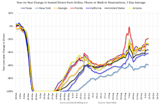
The second graph shows the 7 day average of the year-over-year change in diners as tabulated by OpenTable for the US and several selected cities.
 Thanks to OpenTable for providing this restaurant data:
This data is updated through October 10, 2020.
This data is "a sample of restaurants on the OpenTable network across all channels: online reservations, phone reservations, and walk-ins. For year-over-year comparisons by day, we compare to the same day of the week from the same week in the previous year."
Note that this data is for "only the restaurants that have chosen to reopen in a given market". Since some restaurants have not reopened, the actual year-over-year decline is worse than shown.
The 7 day average for New York is still off 59% YoY, and down 18% in Florida. There was a surge in restaurant dining around Labor Day - hopefully mostly outdoor dining.
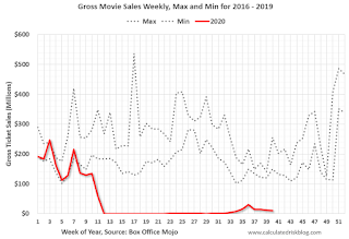 This data shows domestic box office for each week (red) and the maximum and minimum for the previous four years. Data is from BoxOfficeMojo through October 8th.
Note that the data is usually noisy week-to-week and depends on when blockbusters are released.
Movie ticket sales have picked up over the last few weeks, and were at $11 million last week (compared to usually around $200 million per week in the early Fall).
Some movie theaters are reopening (probably with limited seating at first).
 This graph shows the seasonal pattern for the hotel occupancy rate using the four week average.
 The red line is for 2020, dash light blue is 2019, blue is the median, and black is for 2009 (the worst year since the Great Depression for hotels - prior to 2020).
This data is through October 3rd.
Hotel occupancy is currently down 29.6% year-over-year.
Notes: Y-axis doesn't start at zero to better show the seasonal change.
There was some recent boost from natural disasters - perhaps 1 or 2 percentage points total based on previous disasters - but so far there has been little business travel pickup that usually happens in the Fall.
 This graph, based on weekly data from the U.S. Energy Information Administration (EIA), shows gasoline supplied compared to the same week last year of .
At one point, gasoline supplied was off almost 50% YoY.
As of October 2nd, gasoline supplied was only off about 6.0% YoY (about 94.0% of normal).
Note: I know several people that have driven to vacation spots - or to visit family - and they usually would have flown. So this might have boosted gasoline consumption and the expense of air travel.
This graph is from Apple mobility. From Apple: "This data is generated by counting the number of requests made to Apple Maps for directions in select countries/regions, sub-regions, and cities." This is just a general guide - people that regularly commute probably don't ask for directions.
There is also some great data on mobility from the Dallas Fed Mobility and Engagement Index. However the index is set "relative to its weekday-specific average over January–February", and is not seasonally adjusted, so we can't tell if an increase in mobility is due to recovery or just the normal increase in the Spring and Summer.
 This data is through October 10th for the United States and several selected cities.
The graph is the running 7 day average to remove the impact of weekends.
IMPORTANT: All data is relative to January 13, 2020. This data is NOT Seasonally Adjusted. People walk and drive more when the weather is nice, so I'm just using the transit data.
According to the Apple data directions requests, public transit in the 7 day average for the US is still only about 57% of the January level. It is at 50% in Los Angeles, and 59% in Houston.
Here is some interesting data on New York subway usage (HT BR).
 This graph is from Todd W Schneider.
This data is through Friday, October 9th.
Schneider has graphs for each borough, and links to all the data sources.
He notes: "Data updates weekly from the MTA’s public turnstile data, usually on Saturday mornings".
Sunday, October 11, 2020
Sunday Night Futures
by Calculated Risk on 10/11/2020 09:09:00 PM
Weekend:
• Schedule for Week of October 11, 2020
Monday:
• Columbus Day Holiday: Banks will be closed in observance of Columbus Day. The stock market will be open. No economic releases are scheduled.
From CNBC: Pre-Market Data and Bloomberg futures S&P 500 and DOW futures are up slightly (fair value).
Oil prices were up over the last week with WTI futures at $40.21 per barrel and Brent at $42.44 barrel. A year ago, WTI was at $55, and Brent was at $61 - so WTI oil prices are down about 30% year-over-year.
Here is a graph from Gasbuddy.com for nationwide gasoline prices. Nationally prices are at $2.17 per gallon. A year ago prices were at $2.64 per gallon, so gasoline prices are down $0.47 per gallon year-over-year.
October 11 COVID-19 Test Results
by Calculated Risk on 10/11/2020 07:23:00 PM
The US is now mostly reporting 700 thousand to 1 million tests per day. Based on the experience of other countries, the percent positive needs to be well under 5% to really push down new infections (probably close to 1%), so the US still needs to increase the number of tests per day significantly (or take actions to push down the number of new infections).
There were 846,805 test results reported over the last 24 hours.
There were 46,776 positive tests.
Almost 7,700 Americans deaths from COVID have been reported in October. See the graph on US Daily Deaths here.
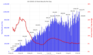
This data is from the COVID Tracking Project.
The percent positive over the last 24 hours was 5.5% (red line is 7 day average).
For the status of contact tracing by state, check out testandtrace.com.
And check out COVID Exit Strategy to see how each state is doing.

The dashed line is the July high.
Note that there were very few tests available in March and April, and many cases were missed (the percent positive was very high - see first graph). By June, the percent positive had dropped below 5%.
Everyone needs to be vigilant or we might see record high cases this Fall and Winter.
U.S. Demographics: Largest 5-year cohorts, and Ten most Common Ages in 2019
by Calculated Risk on 10/11/2020 11:31:00 AM
IMPORTANT NOTE: The data below is based on the Census 2019 estimates. Housing economist Tom Lawler has pointed out some questions about earlier Census estimates, see: Lawler: "New Long-Term Population Projections Show Slower Growth than Previous Projections but Are Still Too High"
Six years ago, I wrote: Census Bureau: Largest 5-year Population Cohort is now the "20 to 24" Age Group.
Earlier the Census Bureau released the population estimates for 2019 by age, and I've updated the table from the previous post.
The table below shows the top 11 cohorts by size for 2010, 2019 (released this year), and Census Bureau projections for 2030.
In 2019, 8 of the top 10 cohorts were under 40 (the Boomers will be fading away), and by 2030 the top 11 cohorts will be the youngest 11 cohorts (the reason I included 11 cohorts).
There will be plenty of "gray hairs" walking around in 2030, but the key for the economy is the population in the prime working age group is now increasing.
This is positive for housing and the economy.
| Population: Largest 5-Year Cohorts by Year | ||||
|---|---|---|---|---|
| Largest Cohorts | 2010 | 2019 | 2030 | |
| 1 | 45 to 49 years | 25 to 29 years | 35 to 39 years | |
| 2 | 50 to 54 years | 30 to 34 years | 40 to 44 years | |
| 3 | 15 to 19 years | 55 to 59 years | 30 to 34 years | |
| 4 | 20 to 24 years | 35 to 39 years | 25 to 29 years | |
| 5 | 25 to 29 years | 20 to 24 years | 5 to 9 years | |
| 6 | 40 to 44 years | 15 to 19 years | 10 to 14 years | |
| 7 | 10 to 14 years | 10 to 14 years | Under 5 years | |
| 8 | 5 to 9 years | 60 to 64 years | 15 to 19 years | |
| 9 | Under 5 years | 50 to 54 years | 20 to 24 years | |
| 10 | 35 to 39 years | 45 to 49 years | 45 to 49 years | |
| 11 | 30 to 34 years | 5 to 9 years | 50 to 54 years | |

Click on graph for larger image.
This graph, based on the 2019 population estimate, shows the U.S. population by age in July 2019 according to the Census Bureau.
Note that the largest age groups are all in their mid-20s.
And below is a table showing the ten most common ages in 2010, 2019, and 2030 (projections are from the Census Bureau).
Note the younger baby boom generation dominated in 2010. By 2019 the millennials have taken over and the boomers are off the list.
My view is this is positive for both housing and the economy, especially in the 2020s.
| Population: Most Common Ages by Year | ||||
|---|---|---|---|---|
| 2010 | 2019 | 2030 | ||
| 1 | 50 | 28 | 39 | |
| 2 | 49 | 29 | 40 | |
| 3 | 19 | 27 | 38 | |
| 4 | 48 | 30 | 37 | |
| 5 | 47 | 26 | 36 | |
| 6 | 46 | 25 | 35 | |
| 7 | 20 | 31 | 41 | |
| 8 | 45 | 34 | 30 | |
| 9 | 18 | 24 | 34 | |
| 10 | 52 | 33 | 33 | |
Saturday, October 10, 2020
October 10 COVID-19 Test Results
by Calculated Risk on 10/10/2020 06:30:00 PM
The US is now mostly reporting 700 thousand to 1 million tests per day. Based on the experience of other countries, the percent positive needs to be well under 5% to really push down new infections (probably close to 1%), so the US still needs to increase the number of tests per day significantly (or take actions to push down the number of new infections).
There were 1,011,075 test results reported over the last 24 hours.
There were 57,206 positive tests.
Over 7,200 Americans deaths from COVID have been reported in October. See the graph on US Daily Deaths here.

This data is from the COVID Tracking Project.
The percent positive over the last 24 hours was 5.7% (red line is 7 day average).
For the status of contact tracing by state, check out testandtrace.com.
And check out COVID Exit Strategy to see how each state is doing.

The dashed line is the July high.
Note that there were very few tests available in March and April, and many cases were missed (the percent positive was very high - see first graph). By June, the percent positive had dropped below 5%.
Everyone needs to be vigilant or we might see record high cases this Fall and Winter.
Schedule for Week of October 11, 2020
by Calculated Risk on 10/10/2020 08:11:00 AM
The key economic reports this week are September CPI and Retail Sales.
For manufacturing, September Industrial Production, and the October New York and Philly Fed surveys, will be released this week.
Columbus Day Holiday: Banks will be closed in observance of Columbus Day. The stock market will be open. No economic releases are scheduled.
8:30 AM: The Consumer Price Index for September from the BLS. The consensus is for a 0.2% increase in CPI, and a 0.2% increase in core CPI.
7:00 AM ET: The Mortgage Bankers Association (MBA) will release the results for the mortgage purchase applications index.
8:30 AM: The Producer Price Index for September from the BLS. The consensus is for a 0.2% increase in PPI, and a 0.2% increase in core PPI.
8:30 AM: The initial weekly unemployment claims report will be released. Initial claims were 840 thousand the previous week.
8:30 AM ET: The New York Fed Empire State manufacturing survey for October. The consensus is for a reading of 15.0, down from 17.0.
8:30 AM: the Philly Fed manufacturing survey for October. The consensus is for a reading of 14.5, down from 15.0.
 8:30 AM ET: Retail sales for September will be released. The consensus is for a 0.7% increase in retail sales.
This graph shows the year-over-year change in retail sales and food service (ex-gasoline) since 1993. Retail and Food service sales, ex-gasoline, increased by 4.0% on a YoY basis in August.
 9:15 AM: The Fed will release Industrial Production and Capacity Utilization for September.
This graph shows industrial production since 1967.
The consensus is for a 0.6% increase in Industrial Production, and for Capacity Utilization to increase to 71.9%.
10:00 AM: University of Michigan's Consumer sentiment index (Preliminary for October).


