by Calculated Risk on 8/04/2020 10:59:00 AM
Tuesday, August 04, 2020
Update: Framing Lumber Prices Up 81% Year-over-year
Here is another monthly update on framing lumber prices. Lumber prices are up 81% year-over-year.
This graph shows two measures of lumber prices: 1) Framing Lumber from Random Lengths through July 31, 2020 (via NAHB), and 2) CME framing futures.

Right now Random Lengths prices are up 81% from a year ago, and CME futures are up 60% year-over-year.
There is a seasonal pattern for lumber prices, and usually prices will increase in the Spring, and peak around May, and then bottom around October or November - although there is quite a bit of seasonal variability.
Prices fell sharply due to COVID-19, however prices have roared back (Note: Construction was considered an essential activity in many areas, so construction didn't decline as much as some other sectors).
This is the highest price for Random Lengths lumber, and futures are just below the previous record set in 2018.
BEA: July Vehicles Sales increased to 14.5 Million SAAR
by Calculated Risk on 8/04/2020 09:57:00 AM
The BEA released their estimate of July vehicle sales this morning. The BEA estimated light vehicle sales of 14.52 million SAAR in July 2020 (Seasonally Adjusted Annual Rate), up 11.1% from the June sales rate, and down 14.4% from July 2019.
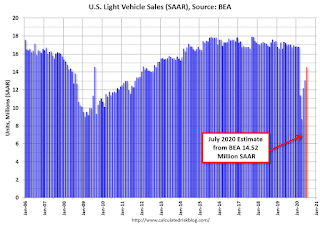
This graph shows light vehicle sales since 2006 from the BEA (blue) and an estimate for July 2020 (red).
The impact of COVID-19 is significant, and it appears April was the worst month.
Since April, sales have increased, but are still down 14.4% from last year.
The second graph shows light vehicle sales since the BEA started keeping data in 1967.

Light vehicle sales in 2020, to date, total 7.66 million (NSA), down 21.9% from the same period in 2019 with sales of 9.80 million through July (NSA).
CoreLogic: House Prices up 4.9% Year-over-year in June
by Calculated Risk on 8/04/2020 08:00:00 AM
Notes: This CoreLogic House Price Index report is for June. The recent Case-Shiller index release was for May. The CoreLogic HPI is a three month weighted average and is not seasonally adjusted (NSA).
From CoreLogic: Continued Strength and Resiliency: CoreLogic Reports Home Price Growth Accelerated in June
Nationally, home prices increased by 4.9% in June 2020, compared with June 2019. Month over month, home prices increased 1%, compared with May of this year, the fastest monthly gain for the month of June since 2013.CR Note: The overall impact on house prices will depend on the duration of the crisis.
CoreLogic’s HPI forecast predicts a modest decline in home prices over the twelve months ending June 2021. A sign of a solid foundation and resiliency in the housing market in the face of the pandemic, stronger home prices this summer reflect improved affordability, demographic demands, supply constraints and continued strong interest in purchasing a home. These factors combined to keep home prices steady despite the continued pressure of the pandemic and related economic fall-out.
“Mortgage rates hit record lows this spring, which enhanced affordability for home buyers,” said Dr. Frank Nothaft, chief economist at CoreLogic. “First-time buyers, and millennials in particular, have jumped at the opportunity to achieve homeownership.”
“Home price appreciation continues at a solid pace reflecting fundamental strength in demand drivers and limited for-sale inventory,” said Frank Martell, president and CEO of CoreLogic. “As we move forward, we expect these price increases to moderate over the next twelve months. Given the economic outlook, housing remains a bright spot for the foreseeable future.”
emphasis added
Monday, August 03, 2020
Tuesday: BEA Light Vehicle Sales
by Calculated Risk on 8/03/2020 09:17:00 PM
Tuesday:
• 8:00 AM ET, Corelogic House Price index for June
• Early, Light vehicle sales for July from the BEA. The consensus is for light vehicle sales to be 13.1 million SAAR in July, up from 13.0 million in June (Seasonally Adjusted Annual Rate).
August 3 COVID-19 Test Results
by Calculated Risk on 8/03/2020 06:00:00 PM
The US is now reporting over 700,000 tests per day. Based on the experience of other countries, the percent positive needs to be well under 5% to really push down new infections, so the US still needs to increase the number of tests per day significantly (or take actions to push down the number of new infections).
There were 731,690 test results reported over the last 24 hours.
There were 49,561 positive tests.
See the graph on US Daily Deaths here.

This data is from the COVID Tracking Project.
The percent positive over the last 24 hours was 6.8% (red line).
For the status of contact tracing by state, check out testandtrace.com.
And check out COVID Exit Strategy to see how each state is doing.
MBA Survey: "Share of Mortgage Loans in Forbearance Decreases to 7.67%" of Portfolio Volume
by Calculated Risk on 8/03/2020 04:00:00 PM
Note: This is as of July 26th. The report next week (through Aug 2nd) might show some impact from the delay of the disaster relief package.
From the MBA: Share of Mortgage Loans in Forbearance Decreases for Seventh Straight Week to 7.67%
The Mortgage Bankers Association’s (MBA) latest Forbearance and Call Volume Survey revealed that the total number of loans now in forbearance decreased by 7 basis points from 7.74% of servicers’ portfolio volume in the prior week to 7.67% as of July 26, 2020. According to MBA’s estimate, 3.8 million homeowners are in forbearance plans.
...
“The share of loans in forbearance declined, but we are now seeing a notable pattern developing over the past two weeks. The forbearance share is decreasing for GSE loans but has slightly increased for Ginnie Mae loans,” said Mike Fratantoni, MBA’s Senior Vice President and Chief Economist. “The job market has cooled somewhat over the past few weeks, with layoffs increasing and other indications that the economic rebound may be losing some steam because of the rising COVID-19 cases throughout the country. It is therefore not surprising to see this situation first impact the Ginnie Mae segment of the market.”
Added Fratantoni, “The higher level of Ginnie Mae loans in forbearance will increase the amount of payments that servicers must advance. We continue to monitor servicer liquidity during these challenging times.”
emphasis added
 Click on graph for larger image.
This graph shows the percent of portfolio in forbearance by investor type over time. Most of the increase was in late March and early April, and has been trending down for the last seven weeks.
The MBA notes: "Total weekly forbearance requests as a percent of servicing portfolio volume (#) decreased relative to the prior week from 0.13% to 0.10% – the lowest level reported since early March."
Three Months Until the Election
by Calculated Risk on 8/03/2020 12:00:00 PM
In the midst of a crisis, it is easy to lose sight of the medium term. Currently, as the FOMC noted, “The path of the economy will depend significantly on the course of the virus.”
But at some point, the virus will be under control, and we will need to address the significant long-term economic damage caused by the pandemic (and compounded by the ineffectual Federal response).
Three months from today there will be an election, and the outcome of that election will determine how quickly the US recovers from this crisis. First, we need to disabuse people of the idea that Mr. Trump has been good for the economy. That is not true.
Back in 2016, my outlook was very optimistic, and I wrote that the “cupboard is full”. I argued that from a short-term economic perspective, it didn’t matter who was President, the economy was poised for further steady growth.
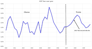
This graph shows the year-over-year change in GDP from 2010 through 2019 (leaving out the Great Recession, and the Pandemic). GDP growth has been fairly consistent, and didn’t pickup much with the 2017 Tax and Jobs Act (this act failed to deliver the promised pickup in growth and investment).
And the second graph shows the unemployment rate for the same period.

The unemployment rate is a function of the length of an economic expansion - and just the continuation of a trend.
The economy was mostly on cruise control until there was a crisis. The incompetent Federal response to the crisis has exacerbated both the health crisis, and the economic damage.
With advisors like Kudlow and Moore, there is no question Mr. Trump will bungle the recovery just like he mishandled the response to the pandemic.
Mr. Biden will receive much better economic advice, and he will also listen to a variety of opinions. But electing Mr. Biden in November – although critical – is not enough.
To achieve faster economic progress after the health crisis, Mr. Biden will need the support of both the House and the Senate. You can make a difference: Pick a race – for the Senate or the House - and support the Democratic candidate. This is the best for the economy – and for America.
Construction Spending Decreased in June
by Calculated Risk on 8/03/2020 10:19:00 AM
From the Census Bureau reported that overall construction spending decreased in June:
Construction spending during June 2020 was estimated at a seasonally adjusted annual rate of $1,355.2 billion, 0.7 percent below the revised May estimate of $1,364.7 billion. The June figure is 0.1 percent above the June 2019 estimate of $1,354.1 billion. During the first six months of this year, construction spending amounted to $667.9 billion, 5.0 percent above the $636.0 billion for the same period in 2019.Private spending decreased and public spending increased:
emphasis added
Spending on private construction was at a seasonally adjusted annual rate of $1,001.9 billion, 0.7 percent below the revised May estimate of $1,009.0 billion. ...
In June, the estimated seasonally adjusted annual rate of public construction spending was $353.3 billion, 0.7 percent below the revised May estimate of $355.8 billion.
 Click on graph for larger image.
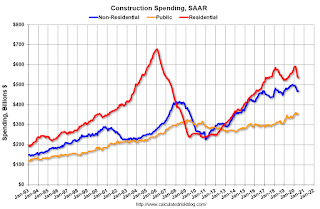
This graph shows private residential and nonresidential construction spending, and public spending, since 1993. Note: nominal dollars, not inflation adjusted.
Residential spending is 21% below the previous peak.
Non-residential spending is 13% above the previous peak in January 2008 (nominal dollars).
Public construction spending is 9% above the previous peak in March 2009, and 35% above the austerity low in February 2014.
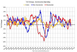 The second graph shows the year-over-year change in construction spending.
On a year-over-year basis, private residential construction spending is down 0.8%. Non-residential spending is down 3.2% year-over-year. Public spending is up 6.2% year-over-year.
This was below consensus expectations of a 1.3% increase in spending, however construction spending for the previous months was revised up slightly.
Construction was considered an essential service in most areas and did not decline sharply like many other sectors.
ISM Manufacturing index Increased to 54.2 in July
by Calculated Risk on 8/03/2020 10:07:00 AM
The ISM manufacturing index indicated expansion in July. The PMI was at 54.2% in July, up from 52.6% in June. The employment index was at 44.3%, up from 42.1% last month, and the new orders index was at 61.5%, up from 56.4%.
This was close to expectations of 54.0%, but the employment index indicated further contraction.
This suggests manufacturing expanded in July - for the third consecutive month - after the steep collapse in the previous months.
High Frequency Indicators for the Economy
by Calculated Risk on 8/03/2020 09:05:00 AM
Note: I've added a New York specific indicator - subway usage - at the bottom.
These indicators are mostly for travel and entertainment - some of the sectors that will recover very slowly.
The TSA is providing daily travel numbers.
 Click on graph for larger image.
This data shows the daily total traveler throughput from the TSA for 2019 (Blue) and 2020 (Red).
On Aug 2nd, the seven day average was 686,360 compared to the seven average of 2,589,300 a year ago.
The seven day average is down 73% from last year. There had been a slow steady increase from the bottom, but air travel has mostly moved sideways over the last several weeks.
The second graph shows the 7 day average of the year-over-year change in diners as tabulated by OpenTable for the US and several selected cities.
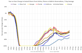 Thanks to OpenTable for providing this restaurant data:
This data is updated through Aug 1, 2020.
This data is "a sample of restaurants on the OpenTable network across all channels: online reservations, phone reservations, and walk-ins. For year-over-year comparisons by day, we compare to the same day of the week from the same week in the previous year."
Note that this data is for "only the restaurants that have chosen to reopen in a given market".
The 7 day average for New York is still off 75%.
Georgia is down 53% YoY. Note that dining declined in many areas as the number of COVID cases surged. It appears dining is increasing again (probably mostly outdoor dining).
 This data shows domestic box office for each week (red) and the maximum and minimum for the previous four years. Data is from BoxOfficeMojo through July 30th.
Note that the data is usually noisy week-to-week and depends on when blockbusters are released.
Movie ticket sales have picked up a slightly from the bottom, but are still under $1 million per week (compared to usually around $300 million per week), and ticket sales have essentially been at zero for nineteen weeks.
Most movie theaters are closed all across the country, and will probably reopen slowly (probably with limited seating at first).
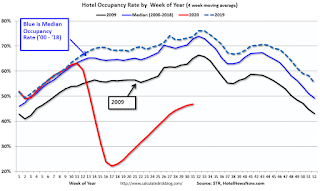 This graph shows the seasonal pattern for the hotel occupancy rate using the four week average.
 The red line is for 2020, dash light blue is 2019, blue is the median, and black is for 2009 (the worst year probably since the Great Depression for hotels).
COVID-19 crushed hotel occupancy.
Notes: Y-axis doesn't start at zero to better show the seasonal change.
Usually hotel occupancy starts to pick up seasonally in early June and decline towards the end of summer. So some of the recent pickup might be seasonal (summer travel). Note that summer occupancy usually peaks at the end of July or in early August.
 This graph, based on weekly data from the U.S. Energy Information Administration (EIA), shows the year-over-year change in gasoline consumption.
At one point, gasoline consumption was off almost 50% YoY.
As of July 24th, gasoline consumption was only off about 8% YoY (about 92% of normal).
Note: I know several people that have driven to vacation spots - or to visit family - and they usually would have flown. So this might be boosting gasoline consumption over the summer.
The final graph is from Apple mobility. From Apple: "This data is generated by counting the number of requests made to Apple Maps for directions in select countries/regions, sub-regions, and cities." This is just a general guide - people that regularly commute probably don't ask for directions.
There is also some great data on mobility from the Dallas Fed Mobility and Engagement Index. However the index is set "relative to its weekday-specific average over January–February", and is not seasonally adjusted, so we can't tell if an increase in mobility is due to recovery or just the normal increase in the Spring and Summer.
 This data is through August 1st for the United States and several selected cities.
The graph is the running 7 day average to remove the impact of weekends.
IMPORTANT: All data is relative to January 13, 2020. This data is NOT Seasonally Adjusted. People walk and drive more when the weather is nice, so I'm just using the transit data.
According to the Apple data directions requests, public transit in the 7 day average for the US is still only about 52% of the January level. It is at 48% in New York, and 52% in Houston (down over the last several of weeks).
Here is some interesting data on New York subway usage (HT BR).
 This graph is from Todd W Schneider.
This data is through Friday, July 31st.
Schneider has graphs for each borough, and links to all the data sources.
He notes: "Data updates weekly from the MTA’s public turnstile data, usually on Saturday mornings"


