by Calculated Risk on 5/11/2020 05:14:00 PM
Monday, May 11, 2020
May 11 Update: US COVID-19 Test Results: Progress!
The US might be able to test 400,000 to 600,000 people per day sometime in May according to Dr. Fauci - and that might be enough for test and trace.
However, the US might need more than 900,000 tests per day according to Dr. Jha of Harvard's Global Health Institute.
There were 394,711 test results reported over the last 24 hours.

This data is from the COVID Tracking Project.
The percent positive over the last 24 hours was 4.5% (red line). The US probably needs enough tests to keep the percentage positive well below 5%. (probably much lower based on testing in New Zealand).
This is the best day so far.
MBA Survey: "Share of Mortgage Loans in Forbearance Increases to 7.91%" of Portfolio Volume
by Calculated Risk on 5/11/2020 04:01:00 PM
Note: To put these numbers in perspective, the MBA notes "For the week of March 2, only 0.25% of all loans were in forbearance."
From the MBA: Share of Mortgage Loans in Forbearance Increases to 7.91%
The Mortgage Bankers Association’s (MBA) latest Forbearance and Call Volume Survey revealed that the total number of loans now in forbearance increased from 7.54% of servicers’ portfolio volume in the prior week to 7.91% as of May 3, 2020. According to MBA’s estimate, almost 4 million homeowners are now in forbearance plans.
...
“With the calendar turning to May, the share of loans in forbearance increased, but the pace of the increase and incoming forbearance requests continued to slow,” said Mike Fratantoni, MBA’s Senior Vice President and Chief Economist. “The dreadful April jobs report showed a decline of more than 20 million jobs, and a spike in the unemployment rate to the highest level since the Great Depression. It will not be surprising if the forbearance numbers continue to rise. As we anticipated, FHA and VA borrowers have been most impacted by the job losses thus far, with the share of Ginnie Mae loans in forbearance at almost 11 percent.”
Added Fratantoni, “Although the pace of forbearance requests slowed this week, call volume picked up – which could be a sign that more borrowers are calling in to check their options now that May due dates have arrived.”
emphasis added
 Click on graph for larger image.
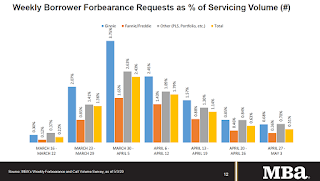
This graph shows the weekly forbearance requests as a percent of servicer's portfolio volume.
The requests peaked in the week of March 30th to April 5th, but might pick up again.
The MBA notes: "Forbearance requests as a percent of servicing portfolio volume (#) dropped across all investor types for the fourth consecutive week relative to the prior week: from 0.63% to 0.51%."
Education and Unemployment
by Calculated Risk on 5/11/2020 01:53:00 PM
This graph shows the unemployment rate by four levels of education (all groups are 25 years and older) through Feb 2020.
Unfortunately this data only goes back to 1992 and includes only two previous recessions (the stock / tech bust in 2001, and the 2007-2009 housing bust/financial crisis). Clearly education matters with regards to the unemployment rate.
Note: There was a data error in the original post in the Bachelors Degree series. This has been fixed.

Note: This says nothing about the quality of jobs - as an example, a college graduate working at minimum wage would be considered "employed".
The 'Less than a High School Diploma, 25 yrs. & over' unemployment rate increased from 5.7% in February to 6.8% in March to 21.2% in April.
The 'High School Graduates, No College, 25 yrs. & over' unemployment rate increased from 3.6% in February to 4.4% in March to 17.3% in April.
The 'Some College or Associate Degree, 25 yrs. & over' unemployment rate increased from 3.0% in February to 3.7% in March to 15.0% in April.
The 'Bachelors degree and higher, 25 yrs. & over' unemployment rate increased from 1.9% in February to 2.5% in March to 8.4% in April.
Last Week: NY Fed Q1 Report: "Pre-COVID-19 Data Shows Total Household Debt Increased in Q1 2020"
by Calculated Risk on 5/11/2020 11:05:00 AM
Note: This was released last week.
From the NY Fed: Pre-COVID-19 Data Shows Total Household Debt Increased in Q1 2020, Though Growth in Non-Housing Debt Slows
The Federal Reserve Bank of New York's Center for Microeconomic Data today issued its Quarterly Report on Household Debt and Credit, which shows that total household debt increased by $155 billion (1.1%) to $14.30 trillion in the first quarter of 2020. The total balance is now $1.6 trillion higher, in nominal terms, than the previous peak of $12.68 trillion in the third quarter of 2008. The Report is based on data from the New York Fed's Consumer Credit Panel, a nationally representative sample of individual- and household-level debt and credit records drawn from anonymized Equifax credit data.
The latest report captures consumer credit data as of March 31, 2020. However, given that individual credit accounts are typically updated monthly, the data do not fully reflect the potential effects of COVID-19 that materialized in the second half of March 2020.
…
"It is critical to note that the latest report reflects a time when many of the economic effects of the COVID-19 pandemic were only starting to be felt," said Andrew Haughwout, senior vice president at the New York Fed. "We do see a larger-than-expected decline in credit card balances based on past seasonal patterns, but it is too soon to confidently assess its connection to the pandemic. We will continue to monitor these developments and the broader state of household balance sheets closely as key data are updated and the economic situation evolves."
emphasis added
 Click on graph for larger image.
Here are two graphs from the report:
The first graph shows aggregate consumer debt increased in Q1. Household debt previously peaked in 2008, and bottomed in Q2 2013.
From the NY Fed:
Aggregate household debt balances increased by $155 billion in the first quarter of 2020, a 1.1% increase, and now stand at $14.30 trillion. Balances are $1.6 trillion higher, in nominal terms, than the previous peak (2008Q3) peak of $12.68 trillion and 28.2% above the 2013Q2 trough.
Mortgage balances shown on consumer credit reports on March 31 stood at $9.71 trillion, a $156 billion increase from 2019Q4.
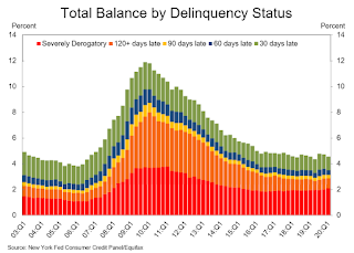 The second graph shows the percent of debt in delinquency.
The overall delinquency rate decreased slightly in Q1. From the NY Fed:
Aggregate delinquency rates were mostly unchanged in the first quarter of 2020. As of March 31, 4.6% of outstanding debt was in some stage of delinquency, a 0.1 percentage point decrease from the fourth quarter of 2019. Of the $652 billion of debt that is delinquent, $449 billion is seriously delinquent (at least 90 days late or “severely derogatory”, which includes some debts that have been removed from lenders books but upon which they continue to attempt collection).There is much more in the report. This is mostly prior to the impact of COVID-19.
About 189,000 consumers had a bankruptcy notation added to their credit reports in 2020Q1, a small decrease from the 192,000 seen in 2019Q1.
Four High Frequency Indicators for the Eventual Recovery
by Calculated Risk on 5/11/2020 08:21:00 AM
These indicators are for travel and entertainment - some of the sectors that will probably recover very slowly.
The TSA is providing daily travel numbers.

This data shows the daily total traveler throughput from the TSA for 2019 (Blue) and 2020 (Red).
On May 10th there were 200,815 travelers compared to 2,419,114 a year ago.
That is a decline of over 91.7%. There has been some increase off the bottom, but it is pretty small compared to the normal level of travel.
The second graph shows the year-over-year change in diners as tabulated by OpenTable for the US and several selected cities.
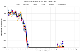
This data is updated through May 10, 2020.
The US was off 100% YoY as of March 21st.
California and New York are still off 100%.
Some states - like Texas and Georgia - have started to open up. In Texas, diner traffic was only down 83% YoY.

Note that the data is noisy and depends on when blockbusters are released.
Movie ticket sales have been essentially at zero for seven weeks.
Basically movie theaters are closed all across the country, and will probably reopen slowly (probably with limited seating at first).
The following graph shows the seasonal pattern for the hotel occupancy rate using the four week average.
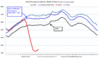
2020 was off to a solid start, however, COVID-19 has crushed hotel occupancy.
Note: Y-axis doesn't start at zero to better show the seasonal change.
STR reported hotel occupancy was off 58.5% year-over-year last week. Occupancy has increased slightly over the last few of weeks.
Sunday, May 10, 2020
Sunday Night Futures
by Calculated Risk on 5/10/2020 07:20:00 PM
Weekend:
• Schedule for Week of May 10, 2020
Monday:
• No major economic releases scheduled.
From CNBC: Pre-Market Data and Bloomberg futures S&P 500 are up 5 and DOW futures are up 50 (fair value).
Oil prices were up over the last week with WTI futures at $24.52 per barrel and Brent at $30.67 barrel. A year ago, WTI was at $62, and Brent was at $72 - so WTI oil prices are down about 60% year-over-year.
Here is a graph from Gasbuddy.com for nationwide gasoline prices. Nationally prices are at $1.84 per gallon. A year ago prices were at $2.86 per gallon, so gasoline prices are down $1.02 per gallon year-over-year.
May 10 Update: US COVID-19 Test Results
by Calculated Risk on 5/10/2020 05:32:00 PM
The US might be able to test 400,000 to 600,000 people per day sometime in May according to Dr. Fauci - and that might be enough for test and trace.
However, the US might need more than 900,000 tests per day according to Dr. Jha of Harvard's Global Health Institute.
There were 277,897 test results reported over the last 24 hours.
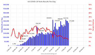
This data is from the COVID Tracking Project.
The percent positive over the last 24 hours was 7.8% (red line). The US probably needs enough tests to push the percentage positive below 5%. (probably much lower based on testing in New Zealand).
Employment: April Diffusion Indexes Decline to Record Lows
by Calculated Risk on 5/10/2020 11:34:00 AM
The BLS diffusion index for total private employment was at a record low 4.8 in April, down from 28.5 in March.
For manufacturing, the diffusion index was at a record low 2.6, down from 26.3 in March.
Think of this as a measure of how widespread job gains or losses are across industries. The further from 50 (above or below), the more widespread the job losses or gains reported by the BLS. From the BLS:
Figures are the percent of industries with employment increasing plus one-half of the industries with unchanged employment, where 50 percent indicates an equal balance between industries with increasing and decreasing employment.
 Click on graph for larger image.
Both indexes generally trended down in 2019 indicating job growth was becoming less widespread across industries (especially manufacturing).
Then both indexes declined sharply in March 2020, and collapsed to new record lows in April, due to the impact from COVID-19.
Saturday, May 09, 2020
May 9 Update: US COVID-19 Test Results: Third Consecutive Day Over 300K
by Calculated Risk on 5/09/2020 04:51:00 PM
The US might be able to test 400,000 to 600,000 people per day sometime in May according to Dr. Fauci - and that might be enough for test and trace.
However, the US might need more than 900,000 tests per day according to Dr. Jha of Harvard's Global Health Institute.
There were 300,842 test results reported over the last 24 hours.

This data is from the COVID Tracking Project.
The percent positive over the last 24 hours was 8.4% (red line). The US probably needs enough tests to push the percentage positive below 5%. (probably much lower based on testing in New Zealand).
Recession Measures and NBER
by Calculated Risk on 5/09/2020 12:58:00 PM
Calling the beginning or end of a recession takes time. The National Bureau of Economic Research (NBER) waits until the data is revised, and if the recovery is sluggish, this process can take from 18 months to two years or longer.
In addition, if the economy slides into recession again, the committee will only consider it a new recession if most major indicators were close to or above their previous highs. Otherwise it will just be considered a continuation of the previous recession.
A good example of the NBER calling two separate recessions was in the early '80s, from the NBER memo:
"The period following July 1980 will appear in the NBER chronology as an expansion. An important factor influencing that decision is that most major indicators, including real GNP, are already close to or above their previous highs."It will take some time for most major indicators to be above their previous high after the current recession because of the severe contraction as the graphs below show.
emphasis added
GDP is the key measure, as the NBER committee notes in their business cycle dating procedure:
The committee views real GDP as the single best measure of aggregate economic activity.
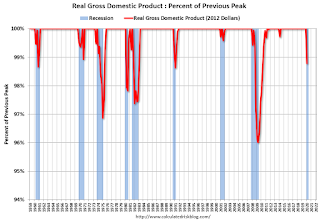 Click on graph for larger image.
This graph is for real GDP through Q1 2020. Real GDP returned to the pre-recession peak in Q3 2011, and has been at new post recession highs for almost a decade.
This is the key measure, and the NBER will probably use GDP and GDI to determine the trough of the recession.
Real GDP is only 1.2% below the pre-recession peak - however real GDP is expected to decline another 7% to 8% in Q2 (A much larger decline than the Great Recession).
 The second graph is for monthly industrial production based on data from the Federal Reserve through Mar 2020.
Industrial production declined much further in April (to be released this coming week).
Industrial production usually takes a long time to recover after a significant decline.
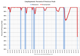 The third graph is for employment through April 2020.
Employment will decline much further in May.
Historically employment was a coincident indicator for the end of recessions, but that hasn't been true for the previous three recessions (1990-1991, 2001, 2007-2009).
It is likely that employment will not recover to pre-recession levels for a long time.
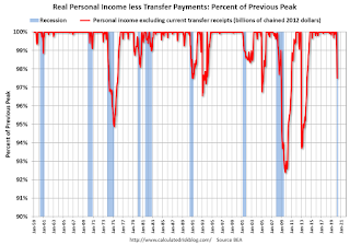 And the last graph is for real personal income excluding transfer payments through Mar 2020.
Once again it will take a long time to return to pre-recession levels.
These graphs are useful in trying to identify peaks and troughs in economic activity.
My guess is that economic activity will bottom in Q2 (maybe already in April), but the pace of the recovery will depend on the course of the virus.


