by Calculated Risk on 6/05/2018 08:00:00 AM
Tuesday, June 05, 2018
CoreLogic: House Prices up 6.9% Year-over-year in April
Notes: This CoreLogic House Price Index report is for April. The recent Case-Shiller index release was for March. The CoreLogic HPI is a three month weighted average and is not seasonally adjusted (NSA).
From CoreLogic: CoreLogic Reports April Home Prices Up, Washington State Increased 12.8 Percent
CoreLogic® ... today released the CoreLogic Home Price Index (HPI™) and HPI Forecast™ for April 2018, which shows home prices rose both year over year and month over month. Home prices increased nationally by 6.9 percent year over year from April 2017 to April 2018. On a month-over-month basis, prices increased by 1.2 percent in April 2018 – compared with March 2018 – according to the CoreLogic HPI.CR Note: The CoreLogic YoY increase has been in the 5% to 7% range for the last couple of years. This is towards the top end of that range. The year-over-year comparison has been positive for over six consecutive years since turning positive year-over-year in February 2012.
Looking ahead, the CoreLogic HPI Forecast indicates that the national home-price index is projected to continue to increase by 5.3 percent on a year-over-year basis from April 2018 to April 2019. On a month-over-month basis, home prices are expected to rise 0.2 percent in May 2018. The CoreLogic HPI Forecast is a projection of home prices that is calculated using the CoreLogic HPI and other economic variables. Values are derived from state-level forecasts by weighting indices according to the number of owner-occupied households for each state.
“The best antidote for rising home prices is additional supply,” said Dr. Frank Nothaft, chief economist for CoreLogic. “New construction has failed to keep up with and meet new housing growth or replace existing inventory. More construction of for-sale and rental housing will alleviate housing cost pressures.”
emphasis added
Monday, June 04, 2018
Tuesday: Job Openings, ISM non-Mfg Survey
by Calculated Risk on 6/04/2018 08:05:00 PM
From Matthew Graham at Mortgage News Daily: Mortgage Rates Continue Higher
Mortgage rates continued higher, adding onto a trend that began last Wednesday. A day earlier, rates hit their best levels in more than a month due to political risks in Europe. The trend back toward higher rates has coincided with the defusing of those risks. [30YR FIXED - 4.625%-4.75%]Tuesday:
emphasis added
• At 8:00 AM ET, Corelogic House Price index for April.
• At 10:00 AM, Job Openings and Labor Turnover Survey for April from the BLS.
• Also at 10:00 AM, the ISM non-Manufacturing Index for May. The consensus is for index to increase to 58.0 from 56.8 in April.
Annual Vehicle Sales: On Pace to decline slightly in 2018
by Calculated Risk on 6/04/2018 04:09:00 PM
The BEA released their estimate of May vehicle sales this morning. The BEA estimated sales of 16.81 million SAAR in May 2018 (Seasonally Adjusted Annual Rate), down 1.8% from the April sales rate, and up slightly from May 2017.
Through May, light vehicle sales are on pace to be down slightly in 2018 compared to 2017.
This would make 2018 the sixth best year on record after 2016, 2015, 2000, 2017 and 2001.
My guess is vehicle sales will finish the year with sales lower than in 2017. A small decline in sales this year isn't a concern - I think sales will move mostly sideways at near record levels.
As I noted last year, this means the economic boost from increasing auto sales is over (from the bottom in 2009, auto sales boosted growth every year through 2016).
Click on graph for larger image.
This graph shows annual light vehicle sales since 1976. Source: BEA.
Sales for 2018 are estimated based on the pace of sales during the first five months.
Update: Framing Lumber Prices Up Sharply Year-over-year, At Record Prices
by Calculated Risk on 6/04/2018 02:04:00 PM
Here is another monthly update on framing lumber prices. Early in 2013 lumber prices came close to the housing bubble highs - and now prices are well above the bubble highs.
This graph shows two measures of lumber prices: 1) Framing Lumber from Random Lengths through May 2018 (via NAHB), and 2) CME framing futures.

Right now Random Lengths prices are up 42% from a year ago, and CME futures are up about 70% year-over-year.
There is a seasonal pattern for lumber prices. Prices frequently peak around May, and bottom around October or November - although there is quite a bit of seasonal variability.
Rising costs - both material and labor - will be headwinds for the building industry this year.
U.S. Births decreased in 2017
by Calculated Risk on 6/04/2018 11:04:00 AM
From the National Center for Health Statistics: Births: Provisional Data for 2017. The NCHS reports:
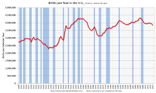
The provisional number of births for the United States in 2017 was 3,853,472, down 2% from 2016 and the lowest number in 30 years. The general fertility rate was 60.2 births per 1,000 women aged 15–44, down 3% from 2016 and another record low for the United States. ...Here is a long term graph of annual U.S. births through 2017.
 Click on graph for larger image.
Births have declined for three consecutive years following increases in 2013 and 2014.
With fewer births, and less net migration, demographics will not be as favorable as I was expecting a few years ago.
Black Knight Mortgage Monitor for April
by Calculated Risk on 6/04/2018 09:03:00 AM
Black Knight released their Mortgage Monitor report for April today. According to Black Knight, 3.67% of mortgages were delinquent in April, down from 4.08% in April 2017. Black Knight also reported that 0.61% of mortgages were in the foreclosure process, down from 0.85% a year ago.
This gives a total of 4.28% delinquent or in foreclosure.
Press Release: Black Knight’s April 2018 Mortgage Monitor
Today, the Data & Analytics division of Black Knight, Inc. released its latest Mortgage Monitor Report, based on data as of the end of April 2018. This month, leveraging both the Black Knight Home Price Index and Census Bureau income data, the company reports on how rising home prices and mortgage interest rates have affected housing affordability. While homes in much of the country are still more affordable than long-term norms, 19 states are either close to or past their long-term average affordability levels. As Ben Graboske, executive vice president of Black Knight’s Data & Analytics division explained, even the better-than-average income growth the U.S. has seen over the last few years has not been enough to keep up with rising home prices and interest rates.
“Last month, we reported that January and February 2018 saw faster rates of monthly home price appreciation (HPA) than the start of any year since 2005,” said Graboske. “While the pace of annual home price growth slowed a bit in March, HPA is still around 6.5 percent. We’ve also seen interest rates climb by nearly three-quarters of a percent so far this year. Together, those two factors have resulted in a $150 increase in the monthly payment on a 30-year mortgage used to purchase the median-priced U.S. home, about a 14 percent rise since the start of 2018. Stronger-than-average income growth in recent years still hasn’t been enough to keep up with rising HPA and interest rates. Seven states are now less affordable than their long-term norms and another 12 are close to hitting that point. Though much of the country remains more affordable than long-term norms, the current trajectory would change that sooner rather than later. We’ve modeled out multiple economic scenarios, some more conservative than others, and even with historically strong income growth, the current combination of home price and interest rate increases isn’t sustainable.
emphasis added
 Click on graph for larger image.
This graph from Black Knight shows the National Delinquency Rate since 2014, and the impact of the 2017 hurricanes.
From Black Knight:
• Of the 27K total reduction in national delinquencies, over 80% was attributed to hurricane recovery
• Hurricane-related delinquencies fell 19% (-22K) in April, with serious delinquencies attributed to the storms dropping by 15% (-16K)
• Storm-related delinquencies continue to have a strong upward pull on the national delinquency rate
• Without the hurricane effect, Black Knight estimates the national delinquency rate would be 3.48% (as opposed to the current 3.67%), 15% below April 2017 levels
• The upward pull is less than half the 45BPS seen last October, but it still remains strong

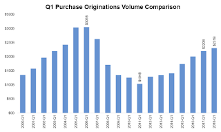
The second graph shows a comparison of Q1 mortgage purchase originations.
• We’ve now seen annual purchase origination growth in 26 of the past 27 quartersThere is much more in the mortgage monitor.
• The growth rate of purchase lending has moderated, from over 25% Y/Y in late 2015, to less than 10% in each of the past three quarters
• In fact, the 5% Y/Y increase in purchase lending was the lowest annual growth rate since early 2014, likely due to both normalization of growth as well as headwinds from tight housing inventory
• Average credit scores increased slightly in Q1 to 748 from 747 in the prior quarter, but have been hovering in the 747-748 range for the past four quarters
• Average loan-to-value ratios (LTVs) rose slightly in Q1 2018 from 81.7% to 82.2%
Sunday, June 03, 2018
Sunday Night Futures
by Calculated Risk on 6/03/2018 08:22:00 PM
Weekend:
• Schedule for Week of June 3, 2018
Monday:
• No major economic releases scheduled.
From CNBC: Pre-Market Data and Bloomberg futures: S&P 500 are unchanged, and DOW futures are up slightly (fair value).
Oil prices were down over the last week with WTI futures at $65.83 per barrel and Brent at $76.54 per barrel. A year ago, WTI was at $48, and Brent was at $48 - so oil prices are up about 50% year-over-year.
Here is a graph from Gasbuddy.com for nationwide gasoline prices. Nationally prices are at $2.95 per gallon. A year ago prices were at $2.37 per gallon - so gasoline prices are up 58 cents per gallon year-over-year.
Public and Private Sector Payroll Jobs During Presidential Terms
by Calculated Risk on 6/03/2018 08:14:00 AM
By request, here is another update of tracking employment during Presidential terms. We frequently use Presidential terms as time markers - we could use Speaker of the House, Fed Chair, or any other marker.
NOTE: Several readers have asked if I could add a lag to these graphs (obviously a new President has zero impact on employment for the month they are elected). But that would open a debate on the proper length of the lag, so I'll just stick to the beginning of each term.
Important: There are many differences between these periods. Overall employment was smaller in the '80s, however the participation rate was increasing in the '80s (younger population and women joining the labor force), and the participation rate is generally declining now. But these graphs give an overview of employment changes.
The first graph shows the change in private sector payroll jobs from when each president took office until the end of their term(s). Presidents Carter and George H.W. Bush only served one term.
Mr. G.W. Bush (red) took office following the bursting of the stock market bubble, and left during the bursting of the housing bubble. Mr. Obama (dark blue) took office during the financial crisis and great recession. There was also a significant recession in the early '80s right after Mr. Reagan (dark red) took office.
There was a recession towards the end of President G.H.W. Bush (light purple) term, and Mr Clinton (light blue) served for eight years without a recession.

The first graph is for private employment only.
Mr. Trump is in Orange (just 16 months).
The employment recovery during Mr. G.W. Bush's (red) first term was sluggish, and private employment was down 804,000 jobs at the end of his first term. At the end of Mr. Bush's second term, private employment was collapsing, and there were net 391,000 private sector jobs lost during Mr. Bush's two terms.
Private sector employment increased by 20,964,000 under President Clinton (light blue), by 14,717,000 under President Reagan (dark red), 9,041,000 under President Carter (dashed green), 1,509,000 under President G.H.W. Bush (light purple), and 11,907,000 under President Obama (dark blue).
During the first 16 months of Mr. Trump's term, the economy has added 2,953,000 private sector jobs.

The public sector grew during Mr. Carter's term (up 1,304,000), during Mr. Reagan's terms (up 1,414,000), during Mr. G.H.W. Bush's term (up 1,127,000), during Mr. Clinton's terms (up 1,934,000), and during Mr. G.W. Bush's terms (up 1,744,000 jobs). However the public sector declined significantly while Mr. Obama was in office (down 266,000 jobs).
During the first 16 months of Mr. Trump's term, the economy has added 13,000 public sector jobs.

After 16 months of Mr. Trump's presidency, the economy has added 2,966,000 jobs, about 367,000 behind the projection.
Saturday, June 02, 2018
Schedule for Week of June 3, 2018
by Calculated Risk on 6/02/2018 08:11:00 AM
The key economic report this week is the Trade Deficit on Wednesday.
No major economic releases scheduled.
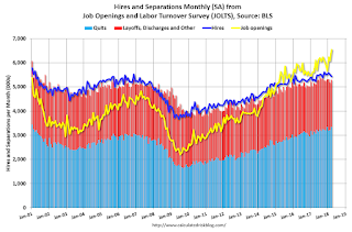
 10:00 AM ET: Job Openings and Labor Turnover Survey for April from the BLS.
 This graph shows job openings (yellow line), hires (purple), Layoff, Discharges and other (red column), and Quits (light blue column) from the JOLTS.
Jobs openings increased in March to 6.550 million from 6.078 in February.
The number of job openings (yellow) were up 16.8% year-over-year, and Quits were up 6.3% year-over-year.
10:00 AM: the ISM non-Manufacturing Index for May. The consensus is for index to increase to 58.0 from 56.8 in April.
10:00 AM: Corelogic House Price index for April.
7:00 AM ET: The Mortgage Bankers Association (MBA) will release the results for the mortgage purchase applications index.
 8:30 AM: Trade Balance report for April from the Census Bureau.
 This graph shows the U.S. trade deficit, with and without petroleum, through March. The blue line is the total deficit, and the black line is the petroleum deficit, and the red line is the trade deficit ex-petroleum products.
The consensus is for the U.S. trade deficit to be at $49.0 billion in April unchanged from $49.0 billion in March.
8:30 AM ET: The initial weekly unemployment claims report will be released. The consensus is for 225 thousand initial claims, up from 221 thousand the previous week.
12:00 PM: Q1 Flow of Funds Accounts of the United States from the Federal Reserve.
3:00 PM: Consumer Credit from the Federal Reserve. The consensus is for consumer credit to increase $13.5 billion in April.
No major economic releases scheduled.
Friday, June 01, 2018
U.S. Light Vehicle Sales decrease to 16.9 million annual rate in May
by Calculated Risk on 6/01/2018 03:25:00 PM
Based on a preliminary estimate from AutoData, light vehicle sales were at a 16.9 million SAAR in May.
That is up 1% year-over-year from April 2017, and down 1% from last month.
Click on graph for larger image.
This graph shows the historical light vehicle sales from the BEA (blue) and an estimate for May (red, light vehicle sales of 16.9 million SAAR from AutoData).
This was below the consensus forecast for May.
Note that the increase in sales at the end of 2017 was due to buying following the hurricanes.
Sales will probably move sideways or decline in 2018 after setting new sales records in both 2015 and 2016.

Note: dashed line is current estimated sales rate.
This is the lowest sales rate since last August.


